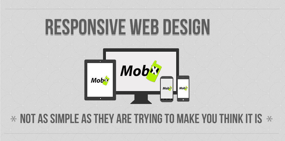
Responsive Webdesign: not as simple as they are trying to make you think it is.
Responsive Web Design...
1
This is just the begining
"Real life" projects tend to get more messy
The Image Nightmare
- How can something as simple get so complicated ? -
2
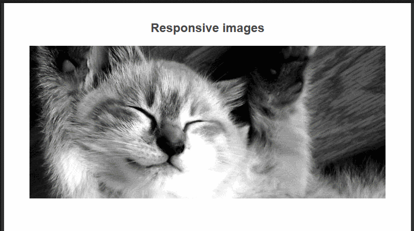
The “fluid image technique”
img{
	max-widht:100%;
	height:auto;
}
The High Density Nightmare
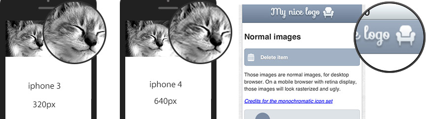
"Why are my images so blurry on the iPad3 retina super device ?!"
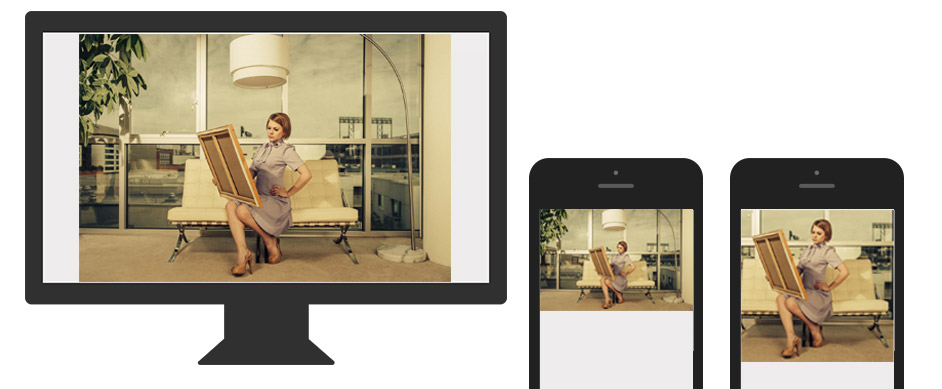
What about small screen ?
- Double the size, double the weight
- Extra set of images for small screens?
- What about retina mobiles? Tablets?
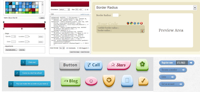
Is “shrinking” the right image strategy?
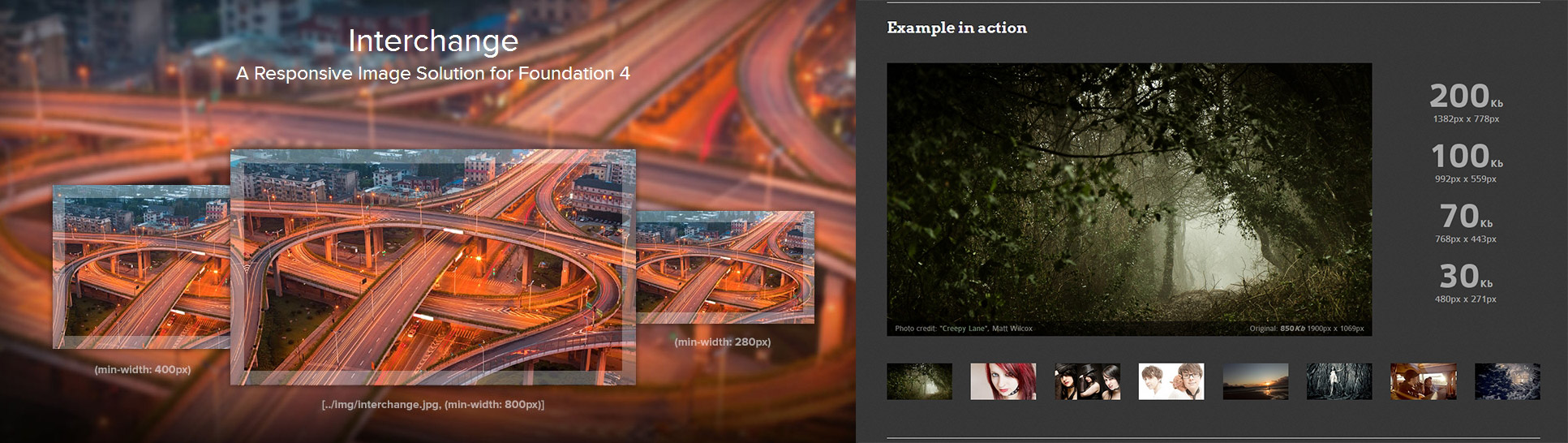
"Hacky" technical solutions
-
JavaScript to detect screensize and conditionnaly load images : Zurb Interchange
-
CSS media queries to target screen size and density
-
Server Side language to serve a shrinked version the image
detectmobilebrowsers.com
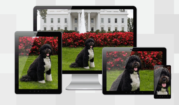
A more "future proof" solution : 2 image formats
<picture> versus <img srcset=" " >
Towards a pixel independent web
CSS3 effects to the rescue
Towards a pixel independent web

Pixel independant format like SVG
Towards a pixel independent web
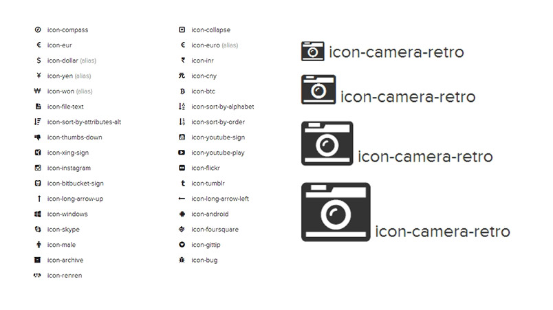
Font-icon for UI icons
One Step Further
- Embedding third part content -
3
Websites are not only composed of our client’s content anymore
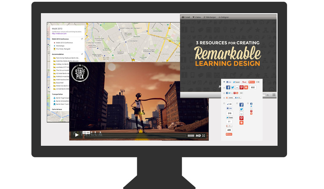
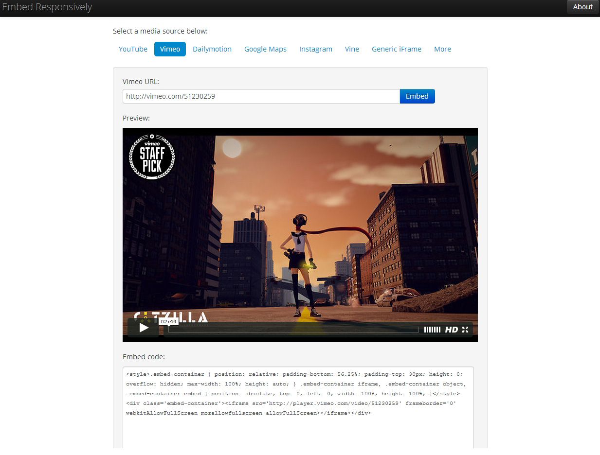
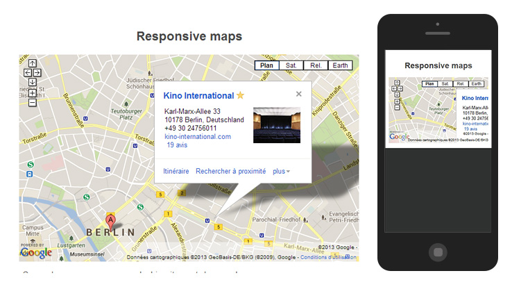
Iframes, when things get messy
- Lack of flexibility: fixed width/height
- Loses ratio when resized
- No control on what is loaded
- No control on how it looks
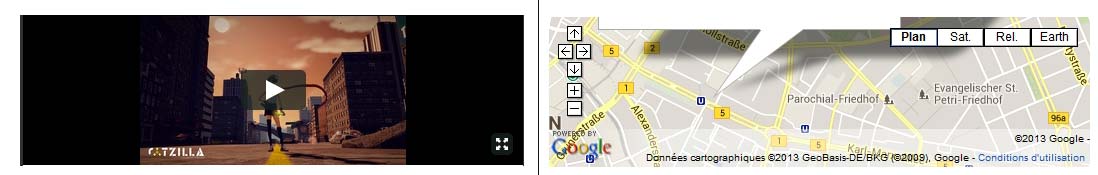
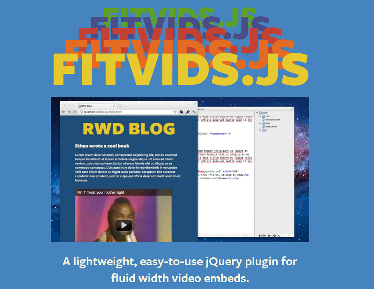
"Hack" videos into something flexible
A container and some CSS to “fixe” a ratio when it resizes
Shrinking is not always the best solution
So what can we do?
We need better APIs
Responsive Navigation
- How do we deal with that one? -
4
Better information architecture
- Keep it simple
- Links inside the text
- Contextual links at the end
Sticky navigation or not?
The sky is the limit
- No “perfect” solution
- Go and get inspiration
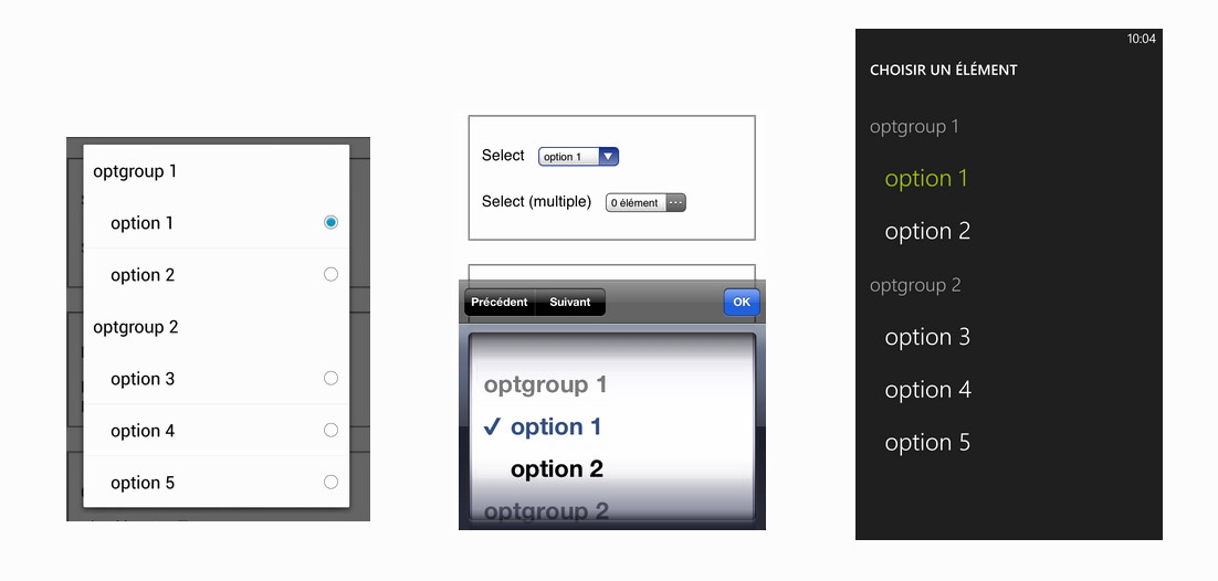
On Responsive Forms
- How can we enhance them ? -
5
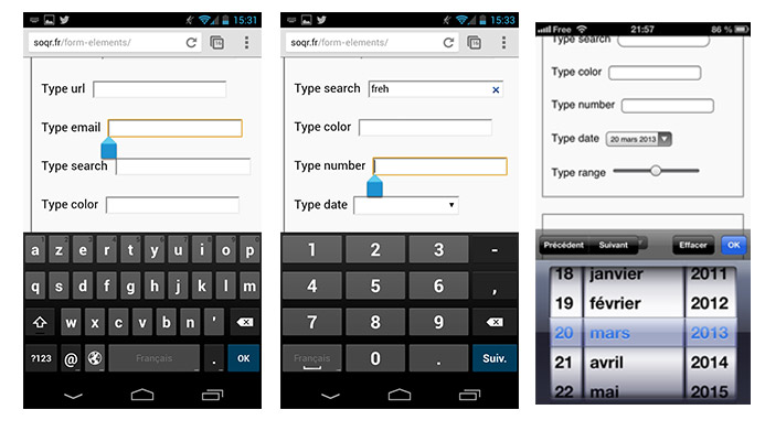
Using native standard elements
Using HTML5 form elements to enhance user experience
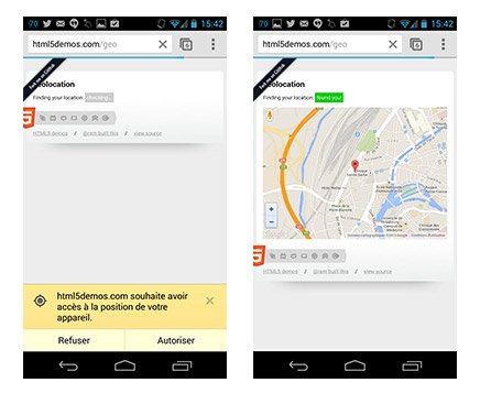
Beyond mobile forms inputs
Geolocation API
Again, just the tip of the iceberg
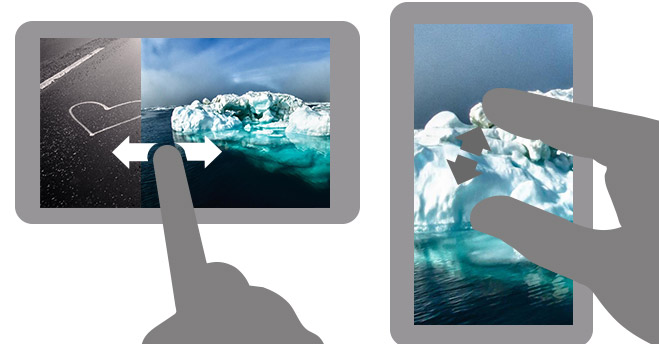
Using Touch Capabilities for a Better Experience
- Embrace the medium -
6
Compensate for lack of “hover” state
Embrace the medium instead of fighting it
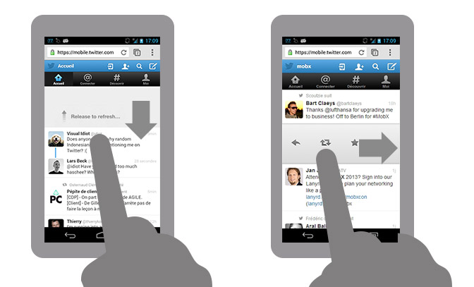
Use “common” gestures to enhance experience
Let the content become the interface
Rethinking The Way We Generate Content
7
Because in the end we won’t be the ones to fill our nice responsive web sites, but our clients.
Re-usable well written structured content
- Well written structured “re-usable blocks”
- Meta data: to help identify content
Change of mentality and process
- Content and presentation should be independent
-
End of the “write in Word and copy/paste into the CMS”
We need better content management tools
- Kill the “one big text area” and single image
- WYSIWYG that are holding us back
- Don't fear the tool and communicate
It was a long journey ...
Today is a nice day to start getting ready don’t you think ?
And it's just getting started