Pixels of the Week – April 21, 2024
Learning accessibility, 3 tips to secure a designer job and a AI tool evaluation sheet.
My curated weekly-ish online newsletter, where I share interesting articles, tools, and resources I found during the week. You can expect content about UX, design, user research, accessibility & tech, but also some processes, some inspiration, sometimes books, and a couple of videos and podcasts. Also, don’t forget to, subscribe to the newsletter to get notified, you will get the weekly links directly in your mailbox, and be notified when I publish other articles.
Now: what I’m currently up to

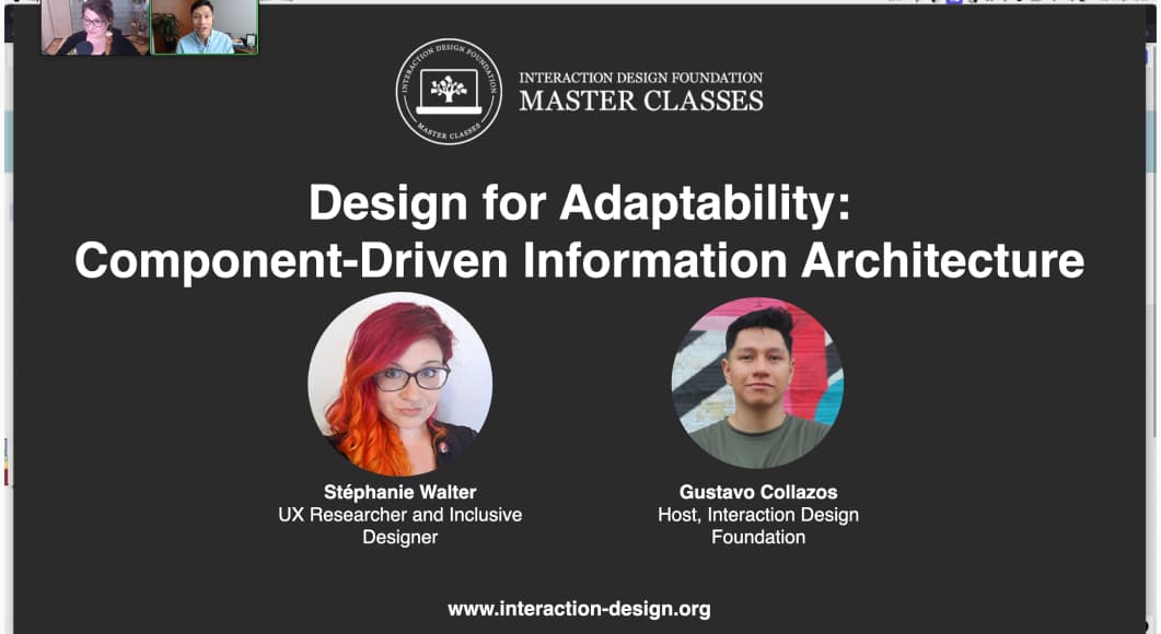
This Wednesday I run my Design for Adaptability: Component-Driven Information Architecture Master Class with IxDF. Feedback was awesome, a lot of people are super interested in my framework that should help them save time. If you are curious, you can now get the on demand video for my masterclass on their site. End of the week, I went to Amsterdam for a private training on my Accessibility for Designers workshop. It went really well, participants always have the most interesting examples and questions. So, yeah, I’m quite tired right now, it’s been a long week, but very happy about both of those.
Most popular content this week
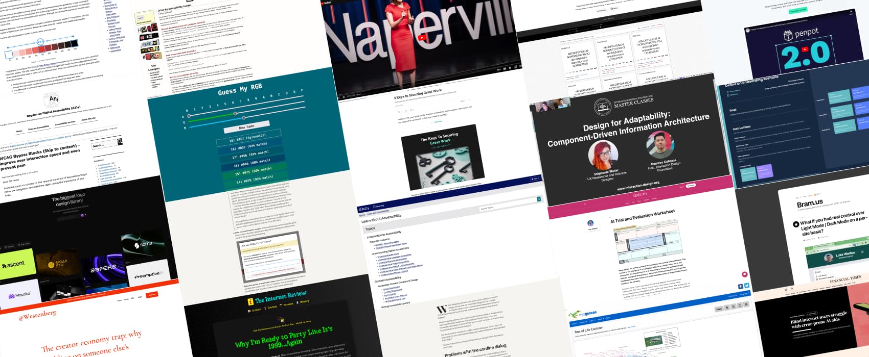
Learn About Accessibility a collection of articles on different topics, from page structure to colors, font choice keyboard navigation, focus, images, forms, data viz and more, by ta11y
Interesting articles that caught my attention
- Confirm or undo? Which is the better option? (8min) Josh Wayne argues that confirmation modals disrupts user flow and is often ignored. He proposes we use of an undo feature instead.
- The 3 Keys to Securing Great Design Work in an Increasingly Competitive World (7min) Today’s job market is a mess, you need to meet high standards because you compete with the whole word on remote jobs, provide and justify of your unique value, and mitigate hiring risk objections. Pat gives some interesting advice to help you with all 3 points.
- The creator economy trap: why building on someone else’s platform is a dead end (13min) When you put your content on third part platforms (TikTok, Insta, LinkedIn) you have to play by their rules, and they might change the game whenever they want. You are also limited in terms of content policies, and constrained monetization options. Joan Westenberg advocates for taking control of this, by building your own places (your own blog, newsletter, etc.). And then, use third part as ways to bring traffic to your own indie content. This is basically what I’m doing. Small things on social media, but, if you want to full content, you have my blog, and my newsletter. Related to this, Jared White wrote a fun one on bringing blogs back, with even a fun retro design: Why I’m Ready to Party Like It’s 1999…Again. Credits where due: those two very interesting articles are courtesy to Own Your Web, Matthias Ott’s newsletter.
Curiosity cabinet: non-design/tech rabbit holes I enjoyed
Evogeneao Tree of Life Explorer a nice data viz where you can click the names of species and groups to explore relationships and find common ancestors (via Jarango’s newsletter)
Useful tools & resources
- Guess My RGB a fun color game where you need to use 3 sliders to guess the right RGB value
- Logo System: get inspired by exploring a library of real and fictional logos, because sometimes serendipity is all you need
- Defining an onboarding experience a figma template to help you build onboarding for your products. It offers different methods and scenarios of onboarding you can choose from, depending on your needs.
- The fastest fonts are the one you don’t download. Modern Font Stacks offers a list of system font stack CSS organized by typeface classification for every modern OS
- AI Trial and Evaluation Worksheet Axbom created a worksheet to help evaluate AI tools, when your company is looking into those and has no idea how to assess them. The sheet comes with structured questions and topics for your analysis.
Cool and Interesting Videos
An ER doctor on triaging your “crazy busy” life ER doctor Darria Long shares a straightforward framework to help you take back control and feel less overwhelmed: know your reds, green tasks, but also your black ones, aka, the ones you can’t do anything about and should drop.
Tutorials
- WCAG Bypass Blocks (Skip to content) (10min) why and how to implement skip links, that will improve user interaction speed and prevent pain, by letting them bypass navigation
- Drive-by accessibility tweaks (3min) a couple of small code tweaks you can put in place to help with accessibility
- What if you had real control over Light Mode / Dark Mode on a per-site basis? Let the user decide which color-scheme they want on a per-site basis and store that: a nice proof of concept by Bramus here.
Latest news in the industry
- Penpot 2.0 is out and brings Grid layout (on top of the existing Flexbox) to the tool. This is very very cool!
- Blind internet users struggle with error-prone AI aids (8min): another episode of “despite their promises, accessibility overlay solutions might not always deliver and sometimes make the experience worse for disabled people.