Pixels of the Week – April 26, 2020
Every week I share a list of curated articles, resources and tools about UX, UI and mobile design, HTML, CSS, the web industry, process inspiration and more…
This week’s selection: a few articles on designing dropdowns, some CSS useful properties, CSS for internationalisation, portfolio tips, the peak end rule, responsive layout without Media Queries, CSS focus-visible trick, 98Windows UI CSS library, better mobile experience with HTML5 inputs, using Figma for remote note taking, an ebook on animation in design systems, CSS clip-path animations, Disney Imagineering and the Mickey Pal character, etc.
#Now – what I’m up to
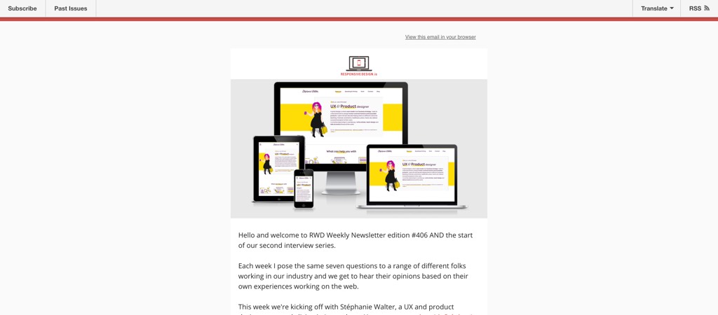
I answered a few questions about modern responsive web design for The RWD Weekly Newsletter. I talk about challenges, layout, responsive components in different context (container queries), optimizing for touch, etc.
If you speak French, I’ll be giving an online meetup in May on mobile web capabilities and how to use them to enhance user experience.
TL;DNR the one you should not miss
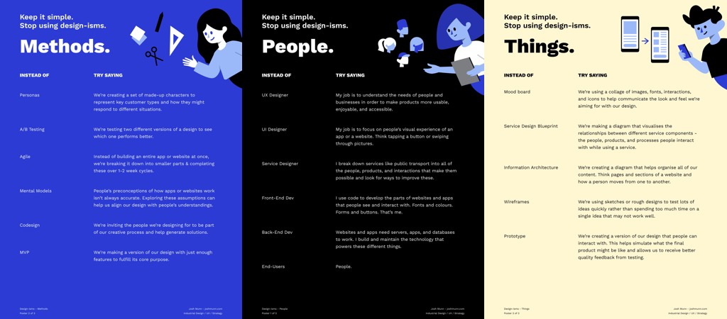
Poster prompts to avoid Design-isms, 3 posters to help you avoid too much jargon in your communication with colleagues by Josh Munn. I like this idea of having artefacts to help us communicate with less technical jargon
Interesting article
#UIElement
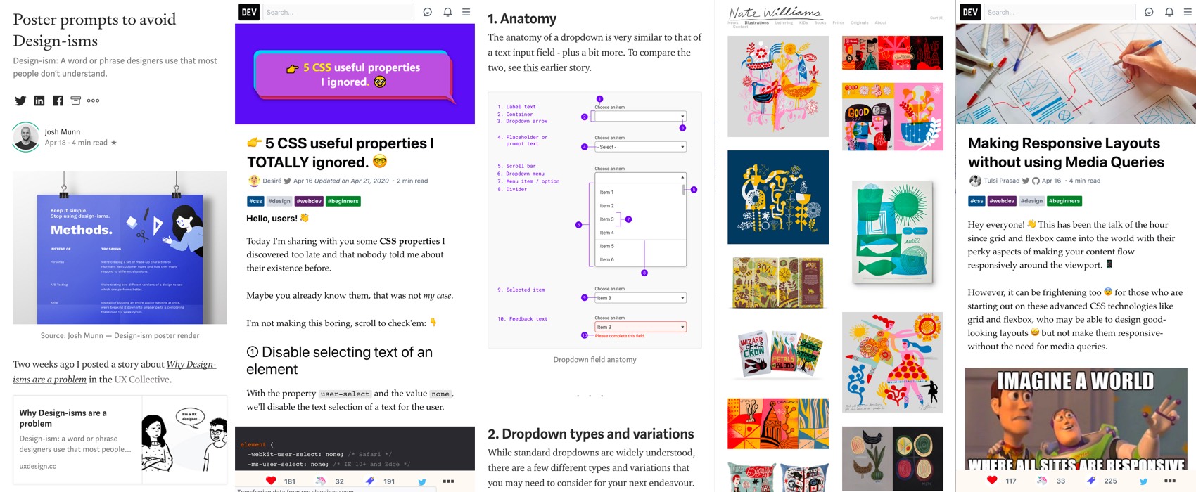
- “10 Ways to Improve Dropdowns in UI & UX Design” I don’t know why everyone is obsessed at the moment with dropdowns but here is another article about them. I don’t agree with 10. though, limit number of steps yes, but the date picker might not always be the best solution for that.
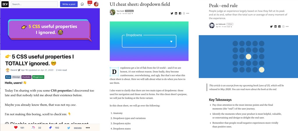
- “UI cheat sheet: dropdown field” by Tess Gadd It’s interesting to see all the different types, variations and states you can have for one single UI element, devil is in the details and even something simple might hide a lot of complexity.
- Listboxes vs. Dropdown Lists, a nice recap on when to use which in your interface:
Note that HTML <select> supports the “multiple” attribute but it does look strange on most browsers (example here). I also think I’ve seen this used in production on any website so far. That’s also maybe why many UI frameworks now create their own version of multiple select (like this or this)
#Bias
Peak-end-rule: “People judge an experience largely based on how they felt at its peak and at its end, rather than the total sum or average of every moment of the experience.” an interesting article on the Peak-end rule cognitive bias and how to design accordingly
#CSS
“Right pointing backhand index 5 CSS useful properties I TOTALLY ignored.” by
Désiré. I didn’t know about the “user-select:none” property and this will be SUPER handy on some of my project with big data tables where I know that user want to “just copy values, not headings”
#Remote #Postits
Why pay for Figma and Miro when you can turn Figma into a virtual whiteboard with post its? That’s a smart idea: “Figma makes note-taking in remote usability testing easy”
#Portfolio
“6 Secrets to Making Your Design Portfolio Stand Out” some good advice, but in the same time I’m always like “who has the time to write those super detailed case studies”
Inspiration, fun experiments and great ideas
#CSS
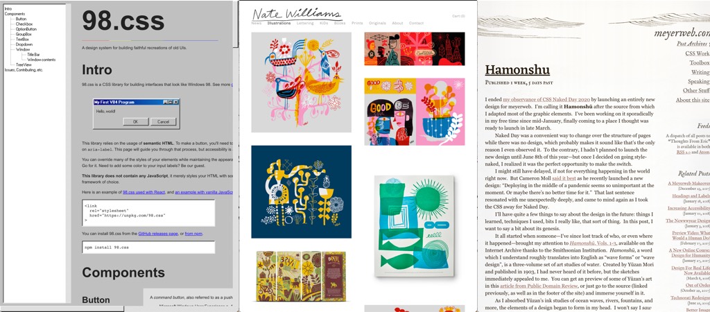
98.css, if you are nostalgic, here is a CSS library for building interfaces that look like Windows 98
#Illustration #Inspiration
Today’s discovery is Nate Williams’ portfolio, full of amazing colourful illustrations <3
#Inspiration
Ho I totally missed Eric Meyer’s redesign (that’s what happens when you mostly visit sites on mobile), it’s subtle, beautiful, easy to read with a nice old school Hamonshū illustrations touch
#Documentaries
If you have the occasion, I highly recommend you watch “The Imagineering Story“, a 6 episodes documentary on the history and creation of the Disney theme parks, it’s quite fascinating. And thanks a lot to Debbie recommending this in her UX podcast on the “Pal Mickey” (you should also totally watch this as well)!!
Ebook
#DesignSystem #Animations
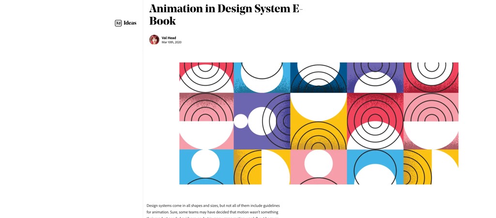
Animation in Design System, a free E-Book by Val Head that breaks down everything to include when integrating animation into your design system, and how to successfully pull it off.
Podcast
#UX #Agile
“UX and Agile Software Development“, Debbie Levitt gives a long & great presentation on why UX and Agile have such a hard time trying to blend together, why Agile seems to so deeply misunderstand or underestimate UX, and what we can do about it
Tutorials
#CSS
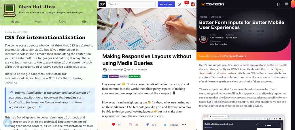
- CSS for internationalisation, an interesting first part article by Chen Hui Jing on :lang(), [lang=”zh”], CSS writing modes, logical directions in blocs, list, counters, text decoration and font variations in different languages
- Use :focus:not(:focus-visible) { outline: none } to gets rid of the annoying outline for mouse users but preserves it for keyboard users, and is ignored by browsers that don’t support :focus-visible, twitter tip by Lea Verou
- “Making Responsive Layouts without using Media Queries” unleash the power of CSS Grid Layout ans Flexbox 🙂
- Don’t you love those “let’s explain how the magic trick is done” articles? Here we go: “Creating Morphing Animations with CSS clip-path“
#Mobile
Better Form Inputs for Better Mobile User Experiences, a good wrap up of how HTML5 input types can help, also don’t forget about inputmode now that the support is better than it used to 🙂
Useful tools and resources that will make your life easy
#Product Design
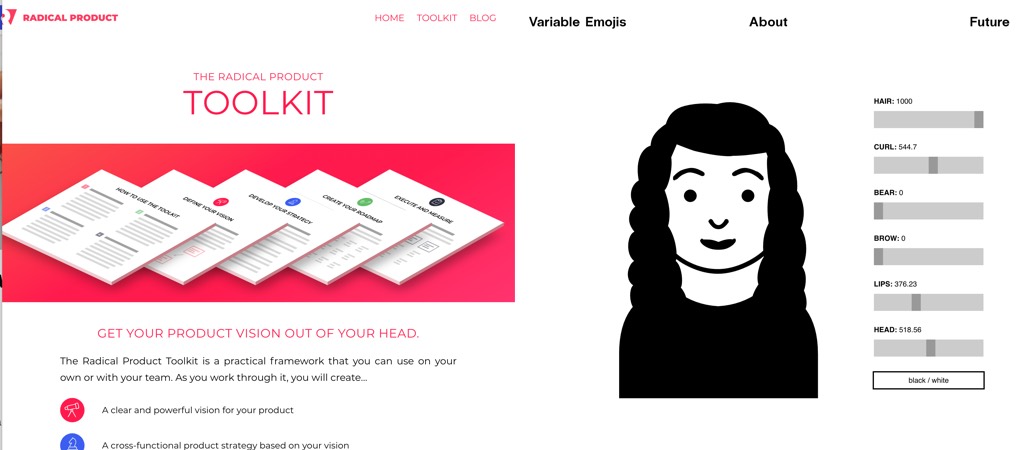
Radical offers an interesting Product Toolkit to help you define: a clear product vision, a cross-functional product strategy based on that vision, a detailed roadmap for delivering on your strategy, specific activities and metrics to guide execution
#Emojis
Variable Emojis, a tool that embraces the diversity of people and to let users choose individually and freely what their emojis look like (it’s missing glasses for me though ^^)
