Pixels of the Week – August 9, 2020
Every week I share a list of curated articles, resources and tools about UX, UI and mobile design, HTML, CSS, the web industry, process inspiration and more…
This week’s selection: CSS animations and UX, the UX of LEGO interface panels, some smart interface design patterns checklists, making motion accessible on the web, design fiction, some nice free illustrations by icon8, a set of tiny free icons, 90’s video game style tool to hangout online with people, dark mode with prefers-color-scheme, some really cool SVG and CSS animations, different CSS media queries to detect user preferences, etc.
#Now – what I’m up to
Dear readers, this was a supper busy week (well, actually month, since all you see here took a month to prepare). Here are a few cool thinks that went public this week:
#CSS #UX #Animations
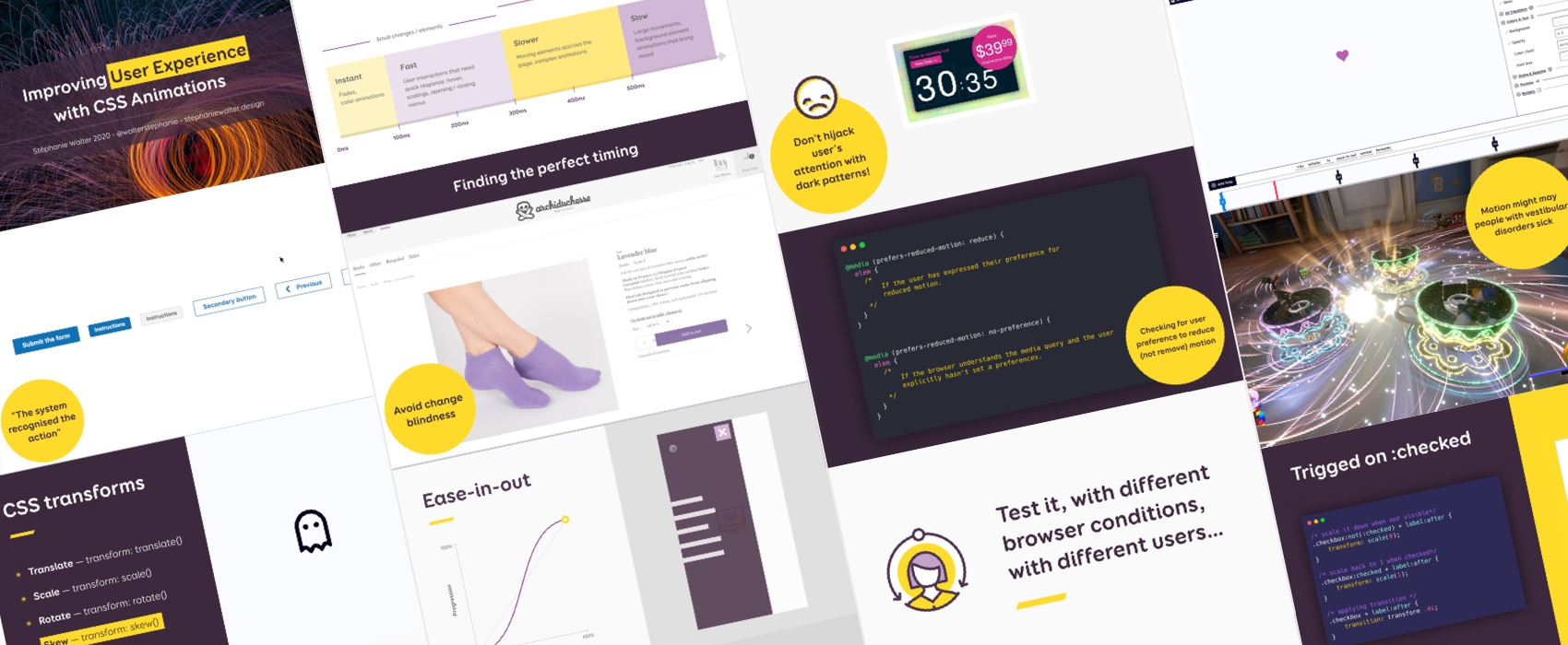
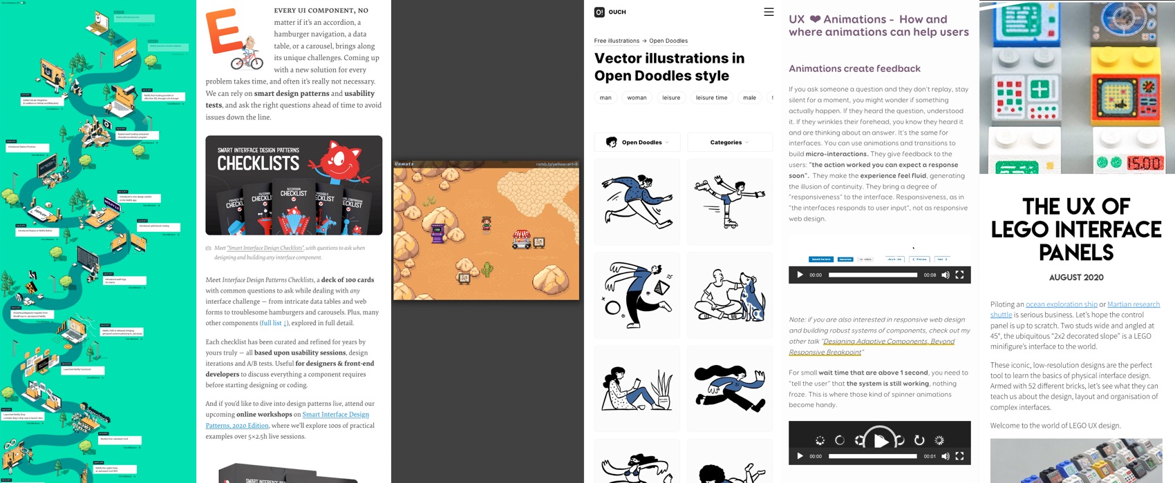
My Shiftconf talk on Enhancing User Experience with CSS animations was live this week. I published the transcript, slides and replay video in on the blog
Enhancing User Experience With CSS Animations
#UX #French
This is for my French speaker readers: Geoffrey Crofte an I decided to launch a medium publication dedicated to articles around design, UX design, design and accessibility in French: Design UX — Francophone. Those articles will be curated to insure high quality, and it will also be a place for authors to re-publish articles they wrote on their own blog that are still accurate and interesting for the French speaking UX Design community.
#Talk #LEGO
Aww the meetup #AskTheExpert sent me “Mini LEGO Speaker Stef” and she’s just so many levels of badass awesome, thanks a lot @jefbinomed!! The slides, transcript and videos of “designing adaptive components beyond responsive breakpoints” are here btw.
TL;DNR the one you should not miss
#Checklists
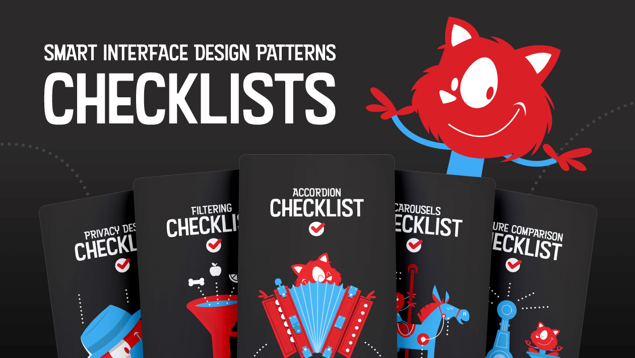
People, if you follow me, you know I LOVE a good checklist. So trust me when I say that you need THIS in your designer and developer lives: “Smart Interface Design Patterns In Your Pocket: Checklist Cards PDF” by Smashing Magazine
Interesting article
#Lego #interface
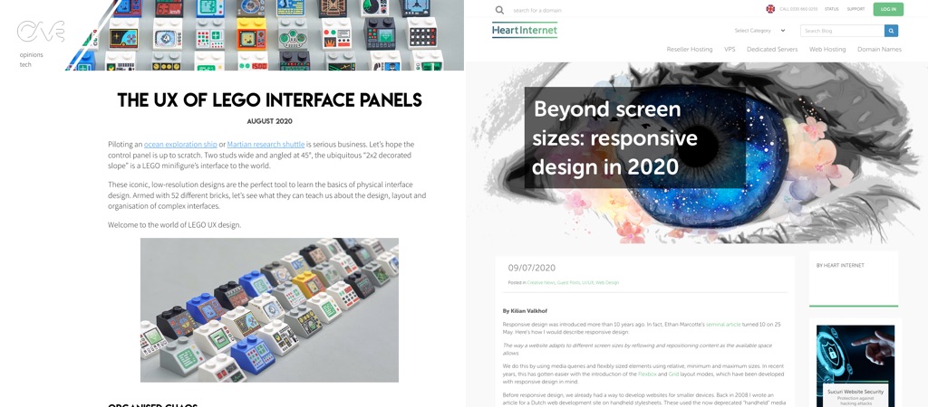
George Cave (@George_Cave) tried to organise the LEGO interface panels and wrote a fun article about this, if you like geeking out about LEGOs and interface design, it’s a must read!
#CSS
“Beyond screen sizes: responsive design in 2020” an interesting article on all the other things you can query to adapt your website: prefers-color-scheme, prefers-reduced-motion, prefers-reduced-transparency, inverted-colors, environment-blending, etc
Inspiration, fun experiments and great ideas
#Virtual
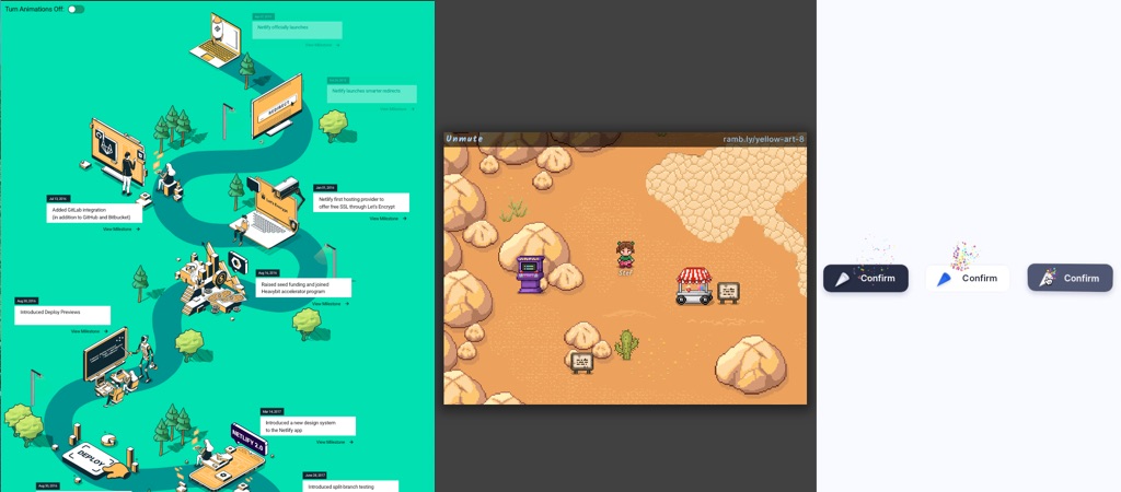
Haan this is a super cool idea, 90’s-style video game to hang out online with friends or during virtual events. Kudos to @ChrisFerdinandifor sharing this ^^
#Fiction #Photos
A visual exploration of possible futures around our relationship with technology and food under the concept of “Design Fiction”
#Animations
Toooot tooot, CSS and GreenSock Confirm confetti button by Aaron Iker (@aaroniker_me)
#Animations #SVG
Netlify has now 1 million users and the team, including Sarah Drasner built an amazing interactive SVG animation to celebrate and show the timeline
Podcast and talks
#Talk #Animation #Accessibility
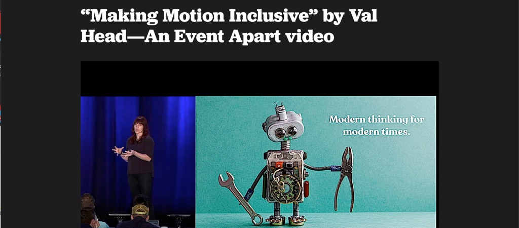
“Making Motion Inclusive” by Val Head—An Event Apart video, and amazing talk by @vlh (Val Head) full of practical advice to build accessible and inclusive animations
#Podcast #UX
Time to put on your critical thinking hat and talk about “Empath(et)ic Design Pros and Cons” with Debbie Levitt (@Delta_CX) and David Snodgrass
Tutorials
#CSS
Using CSS to detect and switch website themes to match system preferences by Joe Seifi (@joeseifi), great small tutorial on using prefers-color-scheme: dark/light media query to match your style to user’s preferences
Useful tools and resources that will make your life easy
#Illustrations #Freebies
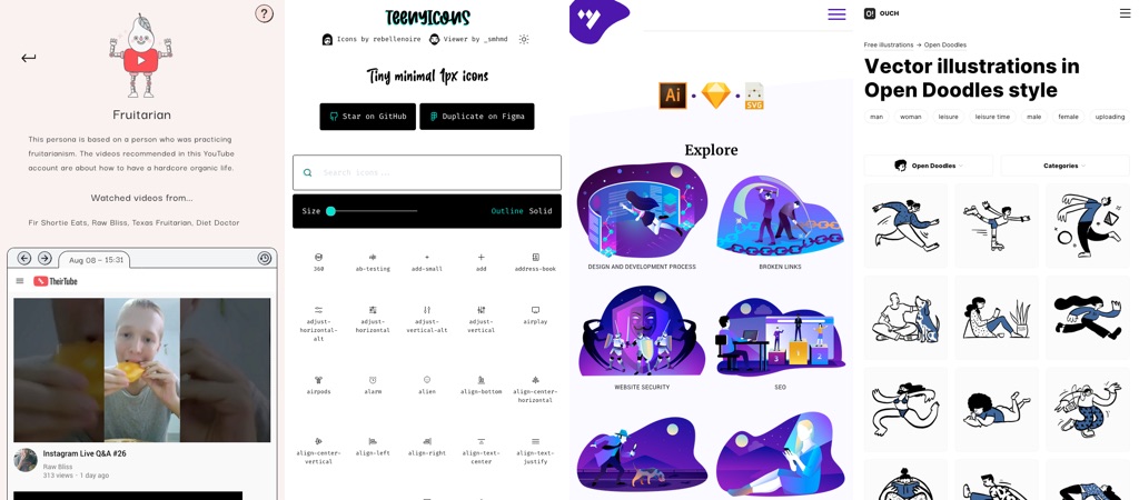
- Did you know that icons8 also offers some free illustrations in a wide range of categories and styles? I’m a super fan of the style of the “open doodles” series here!
- A collection of free illustrations for Commercial Use for your projects ( SVG, Sketch, AI and PNG formats)
#Icons
A set of really minimal 1px icons you can user for your project. Bonus point: there’s a Figma set available. Created by Anja van Staden (@rebellenoire)
#UXMyths
Remember the website http://uxmyths.com. You can now get the 16 first myths of that list, including people not reading, not reading and the 3 clicks myth rule in a nice little book (and a free ebook).
#Youtube #Recommendations
TheirTube – this is an interesting tool to understand how algorithm recommendation can build an echo chamber. It shows you what youtube recommended videos of 6 different personas look like
#Framework #Neumorphism
This is a full neumorphism UI kit, and, hum, I feel like this looks really strange and uncanny when applied to a whole page, so interesting visual experiment but, I don’t know, it’s just too much
