Pixels of the Week – December 23, 2018
Every week I post a lot of my daily readings about Web, UI and UX Design, mobile design, webdesign tools and useful resources, inspiration on twitter and other social networks.
This week’s selection: consistency in design, why HTML is not just spans and divs, designing for accessibility, design systems digest, UX diagrams, form usability, CSS gradients tool, frameworks, CSS discomfort, tools for UX designers, illustration tips, color advice, Safari and Firefox release notes, free fonts, an icon game and more
You can follow me on twitter to get a dose of links every days.
I wrote something
#Frameworks #UX
This week, I wrote 2 articles on the French part of the blog. They will be eventually translated in English in 2019.
- Expérience utilisateur Templates / Frameworks UI – partie 1, le constat – a lot of people are using frameworks to build products, but this doesn’t make those usable. I created an online study to try to understand why people use frameworks, how, and the role of the designer in a UI framework oriented workflow.
- Expérience utilisateur Templates / Frameworks UI – partie 2 : remettre l’humain au centre du processus de conception. – the second part of the article concentrates on how we can build usable products while still using UI frameworks, how to bring back the users in our process, how to do user research and design WITH the framework and not against it.
TL;DNR the one you should not miss
#Front-End
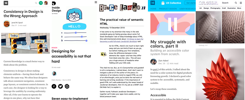
“The practical value of semantic HTML” by Bruce Lawson. Good, I wasn’t the only one rolling my eyes when I read “you just need to learn divs and spans” in the article about becoming a JavaScript developer. Bruce reminds us why semantic is important, and it’s not all just divs and spans.
Interesting article
#Accessibility
Designing for accessibility is not that hard, some basic tips to get you started, then ask an expert for an audit 🙂
#UX
- How To Improve UX of Web Forms, a few nice tips. Also for more specific mobile tips you can check my article on Smashing Magazine part 1 and part 2
- Making sense of all the data gathered during user research can be hard sometimes. Here are 10 diagrams based on 2×2 4 quadrants matrix that will help you see straight about it.
- “Consistency in Design is the Wrong Approach” by Jared M. Spool Interesting points. I also have the feeling that it’s getting worse because people are using a lot of frameworks and don’t even ask design questions anymore. There’s a placeholder in the input of the framework, let’s put one (even if it does make no sense). There’s a component for that, let’s copy paste it. Industrialisation of design through code and styleguides no question asked :/
#Design
- State of Design Systems 2018. I would say that we are stage 0,5 for the moment on most projects: Sketch components and styleguide, trying to work towards documenting the whole thing and having the code for the components
- Basics of Creating Vector Images, great read on lights, colors, perspective and more to help you build awesome illustrations
- My struggle with colors, part II – using hue, tone, shades to build an accessible color palette
- Signified Icon Game – a game that is supposed to test how well you know social tools based on UI icons but what this really shows is that most icons are hard to understand without context and/ or labels, interesting experiment:
#Front-End
- Stop Learning Frameworks – time is precious. Invest your golden time in transferable skills. Skills that will always be relevant.
- Handling broken images with the service worker
- Mandatory read for anyone who needs to style buttons, it’s not super hard, you just need to understand how those pseudo-classes are triggered with mouse, keyboard and touch: “When do the :hover, :focus, and :active pseudo-classes apply?“
Inspiration, fun demos and great ideas
#Fonts
I really like the ligatures of this font
#Code Demo
This is amazing and makes me want to learn motion design “Creating an Animated Login Form for TouchID”
#Glitter
OMG I love that guy “Package Thief vs. Glitter Bomb Trap”
#Paper
Ultimate satisfaction “Spiked Sculptures by Matthew Shlian Create Angular Geometry from Folded Paper”
Conference talk videos
#CSS
If you’re wondering why the web dev world seems split between “CSS is broken” and “CSS is great” Natalya Shelburne argues it’s fueled by the discomfort of cognitive dissonance that happens in all learning experiences : CSS at the Intersection
Webdesign news
#Browser
- Release Notes for Safari Technology Preview 71 -> Added Web Authentication as an experimental feature with support for USB-based CTAP2 devices WEEEEE 🙂
- Firefox 64 – The addition of CSS lvl4/5 media queries for prefers-reduced-motion, any-pointer and any-hover makes me happy <3. Also, accessibility inspector is cool.
Useful tools and plugins that will make your life easy
#Design systems
Design Systems Digest – Practical takeaways from great design system talks & articles
#Gradient
shapy.app, a tool to help you build CSS gradients
Another smart little CSS gradient tool generator, not mobile optimised though
#Free Font
Extra Cheese, a fun display font with a silly name
#UX
uxstore.com, if you are looking for Xmas gift for a UX designer friend, here is a few tools and resources you could offer them