Pixels of the Week – February 5, 2024
Customers are not "always right", rude fun birds & accessible metaphors illustrated.
My curated weekly-ish online newsletter, where I share interesting articles, tools, and resources I found during the week. You can expect content about UX, design, user research, accessibility & tech, but also some processes, some inspiration, sometimes books, and a couple of videos and podcasts. Also, don’t forget to, subscribe to the newsletter to get notified, you will get the weekly links directly in your mailbox, and be notified when I publish other articles.
Now: what I’m currently up to
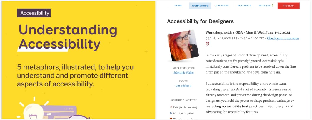
Struggling to explain accessibility? You are not alone. And, I’ve got something for you. I’ve created and updated 5 illustrations to explain and advocate for different aspects of accessibility, covering disabilities, the A, AA and AAA criteria, a people first approach, forms, and innovation. You can participate in the discussion on LinkedIn and get the PDF under creative commons CC-BY-NC-SA there.
I’m also happy to announce that I’m partnering again with Smashing Magazine to bring back this workshop. We’ve scheduled a next session online: June 3 – 12 2024. The format will be 4x2h of workshop + Q and A, 18:30 – 21:00 CET. Get your early bird ticket!
Popular content this week
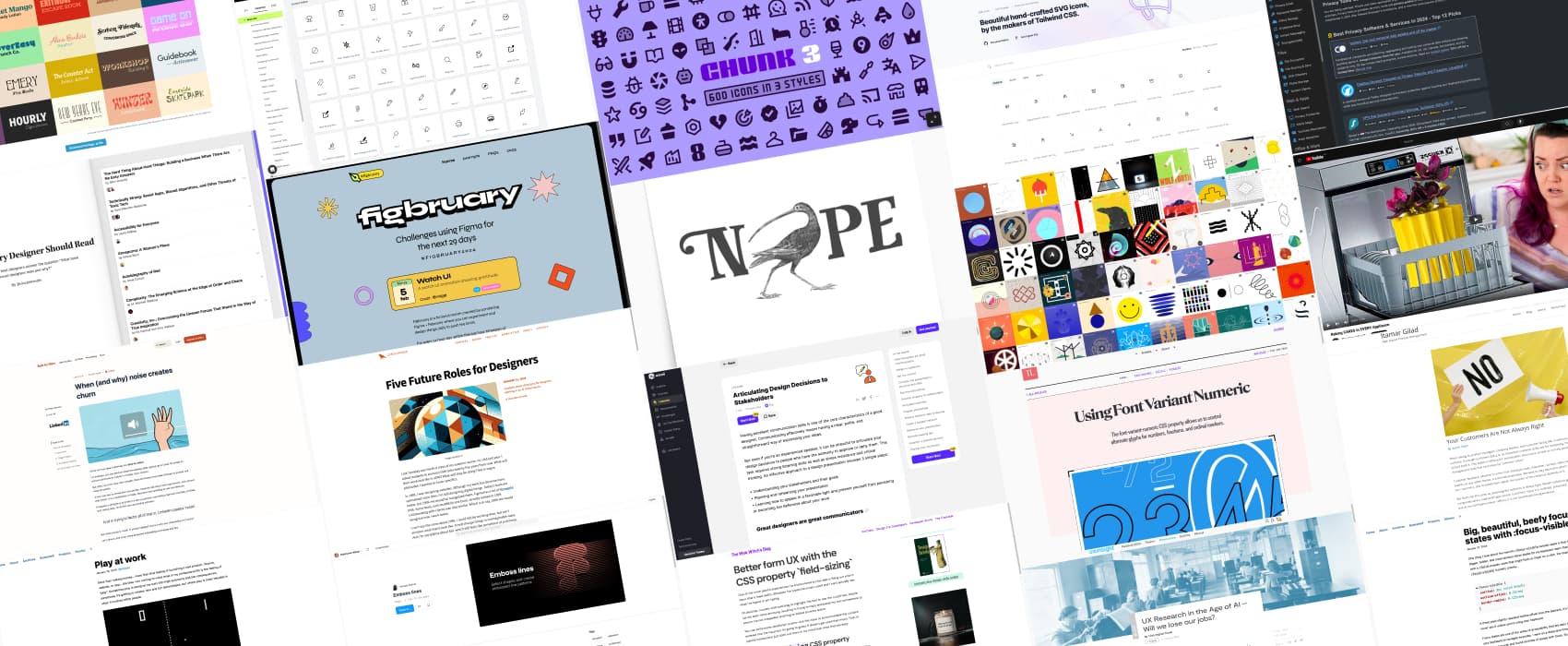
figbruary need to practice your Figma skills? Why don’t you participate in #figbruary: every day, for the whole month, you will get a challenge to create in Figma. And, this year, February has 29 days, whoop whoop. You can also share your work and tag it with #figbruary and #figbruary2024. Who’s going to participate?
Interesting articles that caught my attention
- Articulating Design Decisions to Stakeholders Lesson (15min) interesting generic tips, but also tips on how to structure your presentation, how you need to prepare research data to backup your design decisions. I don’t agree on the point on alternatives though, you open the risk to a Frankenstein where they might think they can pick part of 1 and 2. If you go for alternatives, you must be cautious about how they are each a specific proposal, no mixing!
- Your Customers Are Not Always Right (9min) There’s a misconception around UX research, that “talking to the users/customers” means something like “we will implement everything they ask for.” Itamar Gilad explains that, while customer feedback is important, customers are not always in a position to find the right solution for themselves. So, no, our job isn’t to collect feedback and turn them into a backlog of features. Especially since feedback can be biased. Instead, It’s important to understand the underlying needs behind this feedback, to go from “what they want” towards “what they need”, offer a solution, and evaluate it via testing. His example of Gmail is interesting: they go request from people asking to get a “log out” feature in the Gmail app. It made sense, from a customer perspective, because people shared a phone. But, the solution wasn’t to log out, but to help them discover the built-in multiple users support in Android instead.
- UX Research in the Age of AI – Will we lose our jobs? (9min) Christopher Kovel explains that, while LLMs at good at secondary research tasks (like analyzing and summarizing data), they fall short in conducting primary research. LLMs have difficulties to understand the background, goals, and context of research projects, and with collecting empirical observations. They also can’t generate new knowledge and answer unknown questions. So, until the arrival of Artificial General Intelligence (AGI), which is currently speculative, our job is safe. Yeah!
- Play at work (5min) incorporating a play element into professional work can help foster creativity and collaboration. Ever heard of the “hot potato process”? It’s when designers and devs do frequent back and forth to help improve the project, producing something greater than the sum of its parts.
- When (and why) noise creates churn (10min) a case study using the LinkedIn onboarding, to show how noise can be detrimental to user experience
- Five Future Roles for Designers (10min) Will you be a Meta Designer, a Chief Ontology Officer, a Coherence Generator or a Drifting Clarifier or a Pattern Wrangler in the future? Jorge Arango imagines 5 Possible career directions for designers working in an AI-driven world. Hard to chose for me, I like consistency and information architecture, so the chief ontology officer would be fun, but I also really like patterns. I also wonder where accessibility would go then, maybe into drifting clarifier, since it’s about ensuring customer needs? So, yeah, sounds like I’ll keep doing many things at the same time without 100% fitting a box in this hypothetical design role future. Thanks for the fun read, Jorge!
Curiosity cabinet: non-design/tech rabbit holes I enjoyed
Baking CAKES in EVERY Appliance can you cook a cake in a toaster, a rice cooker, a pan, an air fryer, a crock pot, a microwave, or even a dishwasher?
Inspiration: fun experiments, beautiful art, and great ideas
- Effin Birds: someone made me discover this shop, and, now I kind of need half of the content as mugs, stickers and prints. My favorite ones: the classic NOPE poster, Who’s In Charge of This Fucking Train Wreck Sticker, Fuck Off Until I Get Coffee Mug obviously, but also the I Stopped Listening Like A Fucking Hour Ago Mug and Can We Stop Talking And Actually Fucking Do Something? Poster
- Art of Symbols: a site dedicated to the history of many symbols across over 40 000 years of human history and how they were used, from the dot to the obvious pentagram to more obscure ones like crows feet, etc.
Books
Readinglist.design, yeah, I know, another list “books all designers should read.” But, hear me out, this one was curated by different people, and it brings some novelties beyond the classics we’ve all seen around. Each recommendation comes with a “why”. For instance, I’m now super curious about “House of Leaves”, because you don’t often see novels in “designers books” lists (and I’m out of novels to read). Also, triple yes for Sara Wachter Boettcher’s “Technically Wrong: Sexist Apps, Biased Algorithms, and Other Threats of Toxic Tech”. And, “ The Death and Life of Great American Cities” described as “an excellent handbook to understand the complex connection between a designer’s choices and the outcomes for everyday people” definitely will make it to my list, eventually, once I’ve finished the other 45 books I’ve bought and haven’t read yet.
Useful tools & resources
Small minimalist icons for UI projects:
- Chunk Icons: a set of 600 cute little 16x16px icons for your projects, available in 3 different styles (filled, hollow and duo). I really love their chunky style here (under CC BY 4.0 license, made by Noah Jacobus)
- Heroicons: a set of 288 small icons, available in 24, 20 and 16 px, because sometimes you need to go really, really small. You can copy paste the SVG and JSX directly from the site, or use in Figma (MIT license, made by Tailwind Labs and Steve Schoger)
- Nova Icons: a premium set of 10,686 premium icons, crafted to insure consistency and adhere to material design guidelines, perfect for interface projects. You can get SVG and PNG from the site, or get the MacOS app, Figma or Lucidspark plugin (premium pack, made by streamline)
Other cool tools:
- PrivacyTools.io a repository of tools and apps to help you reclaim your online privacy
- Emboss lines a Figma plugin to create emboss lines based on shape. Why would you need that? Not sure. But, it’s nice.
Tutorials
- The 3 secrets to Font Pairing: start with an anchor font, balance contrast and similarity and consider emotion vs the job the font is supposed to do
- Better form UX with the CSS property `field-sizing`: interesting idea, I wonder if it won’t break some layouts though
- Big, beautiful, beefy focus states with :focus-visible: cool demos on how to use focus-visible to craft bigger, bolder, and more obvious focus states than you normal would with focus, because you want to avoid the flash of the ring that lingers when you click too.
- Using Font Variant Numeric: there are so many options with the font-variant-numeric CSS property that allows us to control alternate glyphs for numbers, fractions, and ordinal markers. I really like the diagonal-fractions, it brings me joy. Don’t ask me why, I don’t know, friends don’t judge each other’s typography joy.
Latest news in the industry
Nightshade, the free tool that ‘poisons’ AI models, is now available for artists to use: University of Chicago developed a tool to turn AI against AI in case your art gets stolen. I’m curious to see where this is going
