Pixels of the Week – February 8, 2026
Different UI perception based on disabilities, list form controls & fun brain twister
Pixels of the Week is my weekly-ish curated newsletter for designers, UX folks, devs, and anyone building accessible, inclusive, usable (and let’s be honest, awesome) digital products. This week we dive into how the same UI is perceived differently for disabled users, how sound can improve UX, and how to choose the right list form controls. Also: data-viz inspiration, accessibility patterns, and a few brain-bending curiosities.
Subscribe to my newsletter to get this directly in your mailbox!
Now: MUI, labels and placeholders
I’m back to working with MUI. So, I got the MUI Joy UI Figma files (the paid version). I struggled to find the inputs with the label, to the point where I wondered if they existed, or if I needed to build the label + combo myself. Turns out they did, but, they were hidden by default in the properties of the component. By default, when you use the input component, it shows the placeholder, but not the label (you can check out what it looks like on LinkedIn, Mastodon and Bluesky). Took me 10min to find out that this was hidden under a Figma property. Which made me think: how are we supposed to push accessibility, when, the design system files we use, don’t even show labels by default for the fields. I’ll open a bug next week in their github and ask if we can show the labels by default, let’s see.
Most popular content this week
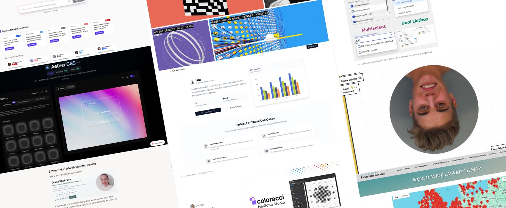
How the same content always has multiple different versions (10min) Same content, different impact: Diana Khalipina demonstrates how the same card component, will be perceived differently for different disabled users. Sometimes clarity for one person means confusion, stress or exclusion for another.
Interesting articles that caught my attention
Sounds on The Web (8min) I agree with Raphael Salaja here: sound has been overused and became annoying. But, sound itself isn’t the problem, it’s how and when it’s used. Sound should complement visuals, not replace them. It can add a powerful extra layer to your interface. Use sound only when it earns its place, adding feedback, presence, or emotional resonance that visuals alone cannot achieve.
Combobox vs. Multiselect vs. Listbox: How To Choose The Right One (6min) We often call “dropdown” any list of vertical options. But there’s a lot of different options on how to build those. Vitaly Friedman gives some great form UX tips by to help you understand the difference, and when to use which. The goal is really to be consistent when talking with the people on your project.
Curiosity cabinet: non-design/tech rabbit holes I enjoyed
World-Wide Labyrinth Map I’m sad to report here is not not a single labyrinth in my country. I might need to investigate and add them.
Inspiration: fun experiments, beautiful art, and great ideas
visualrambling.space cool dataviz and visualizations to explain concepts (like neural networks)
Thatcher Effect (rotation animations might be motion sickness triggering) Twist your brain, with the Thatcher effect: the faces are wrong, but they seem right upside down when you flip the eyes and the mouth, because our brain loves to make sense of things, even when they don’t (I overly simplified, check Wikipedia for the whole explanation of this optical illusion).
Useful tools & resources
Make Graph is a data visualization library to help you build graphs and charts. I like that it also has nice explanations for when to use each type of charts, with specific use cases. Very helpful when you are not a dataviz expert!
Halftone Studio a Figma plugin that transforms any image into halftone, for that retro vibe!
RageCheck a tool that analysis persuasive techniques used in articles and posts to help you understand if this was designed and written to make you angry
Aether CSS I personally hate liquid glass, I think it makes my iPad annoying and hard to read. But if you enjoy making liquid glass in CSS, well here you go.
Tutorials
Accessible faux-nested interactive controls (12min) Nest components, like buttons inside a clickable card, are always a tricky pattern. Eric Bailey shows you how to make it work, with a couple of CSS lines, and semantic HTML, do not nest links within buttons!
How an accessibility designer adds keyboard shortcuts to a web app (15min) Also Eric Bailey but on his own blog this time, he explains how to create keyboard shortcuts that won’t conflict with accessibility shortcuts used by assistive technologies
Styling ::search-text and Other Highlight-y Pseudo-Elements (10min) by Daniel Schwarz some interesting new pseudo-elements to more fun styling.