Pixels of the Week – July 11, 2021
Every day, I share on Twitter and LinkedIn a list of curated articles I read, resources and tools about UX Design, User Research, UI and mobile design, HTML, CSS, the web industry, some process, some inspiration, etc. This is an archive of everything I shared this week.
#Now – what I’m up to
My flat looked liked a Dexter crime scene the whole week because they were changing windows and painting the walls, but now it’s all good. So I’m back to turning talks into (long) transcript articles, playing League of Legends Wild Rift (they released Senna, yeahy new fun support!) and enjoying the sun for now.
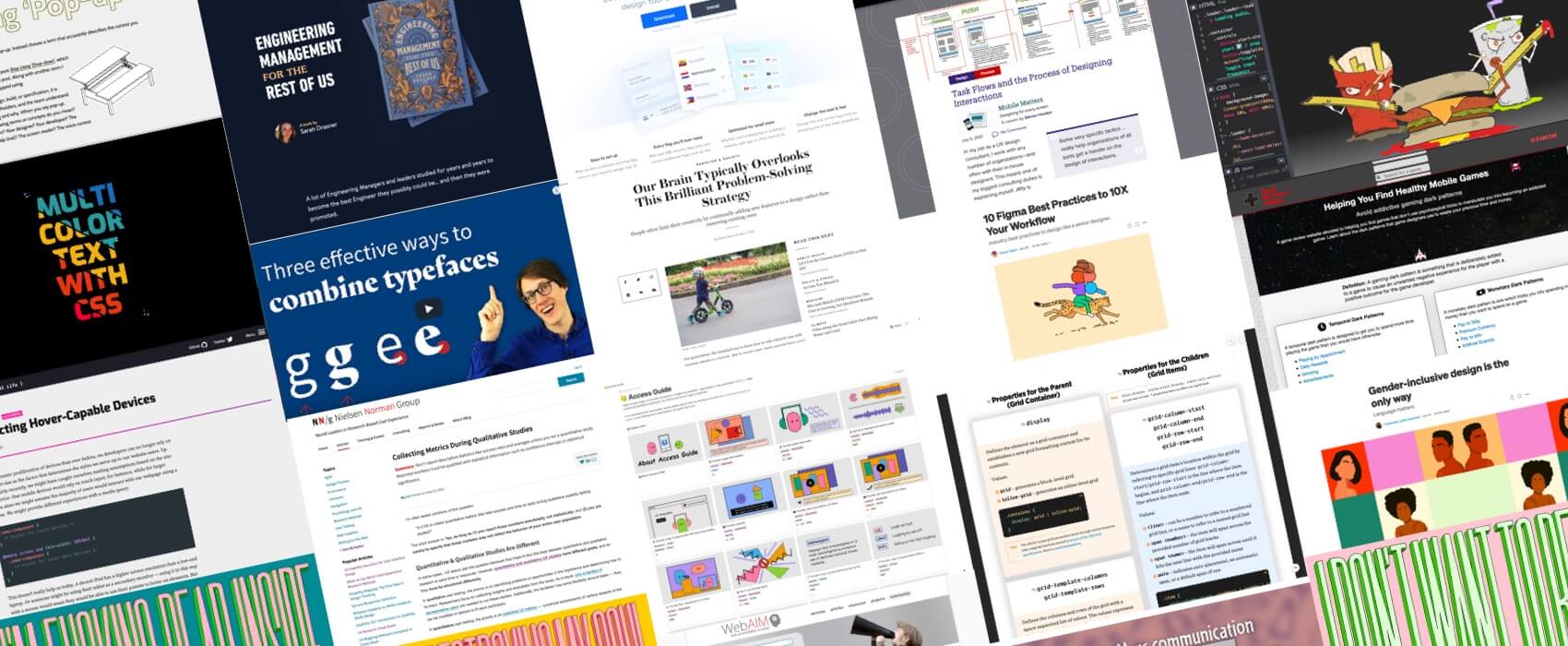
Part of me is also wondering if I should stop putting images in those articles (and just keep the main one) because this is hosting for things that are not really essential, requests, etc. What do you think? (you can reach out on twitter or email)
TL;DNR the one you should not miss
#Accessibility
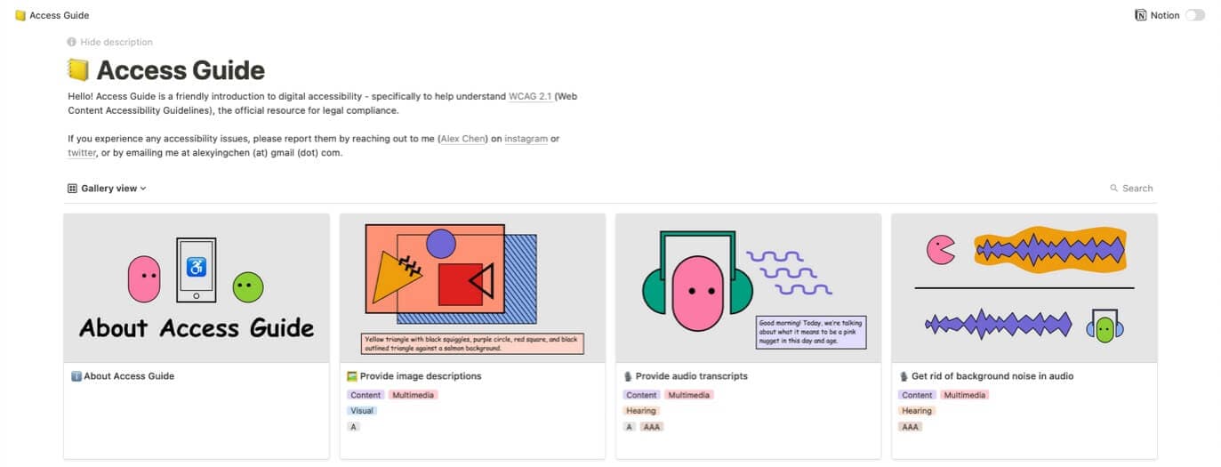
Access Guide, a introduction to WCAG 2.1 accessibility guidelines and attempt to make them easier to understand with example and resources, by Alex Chen
Interesting article
#Accessibility
- “Evaluating Color and Contrast—How hard can it be?” not as easy as you might think because there’s a lot of small details to be careful about. I really like the 15 points list at the end to wrap this up.
- It’s nice to see The Wall Street Journal talking about motion sickness with a little interview of Val Head.
- The Webaim screen reader survey results are here. JAWS is the main used (53%), then NVDA (30,7%) and VoiceOver (6.5%) for computer, while Apple’s iPhone, iPad or iPad touch is the main used on mobile (71,9%) with VoiceOver
- “Looking at WCAG 2.5.5 for Better Target Sizes” a interesting wrap up of a lot of things you need to consider when designing buttons and links that work on mobile, the key is to understand context of use of that link and style accordingly.
#Problem Solving
Our Brain Typically Overlooks This Brilliant Problem-Solving Strategy: “When faced with a problem, people tend to select solutions that involve adding new elements rather than taking existing components away” this is sooo true, we tend to forget that removing things is also a solution sometimes
#Qualitative Research
Collecting Metrics During Qualitative Studies. Don’t report descriptive statistics like success rates and averages unless you ran a quantitative study. Reported numbers must be qualified with statistical information such as confidence intervals or statistical significance.
#Figma
Here’s a few productivity tips if you are a Figma user
#Flows
“Task Flows and the Process of Designing Interactions“, an interesting article by Steven Hoober on how task flows help communicate interactions and the different steps to create them
#Naming
“Stop using the word pop-up. Instead choose a term that accurately describes the control you want.” by @aardrian. I think I mostly use “pop-up” for small modals with no obscurification of the whole page (like browser dialog, but framework built)
#ContentDesign
“Bringing my skills to content design and changing my career“by Anna Kruse, Rob Ingram, Sandra Valencia. I love the “If you feel a sense of panic, you’re on the right track” tip, it’s the same for information architecture ^^
#InclusiveDesign
“Gender-inclusive design is the only way” some examples on how to get your content more gender inclusive, from actual written content to forms, illustrations on your websites, etc. Language does matter. It shapes the way we see the world.
#NFT
If you wonder what NFTs are, how it works, why it’s a “big topic” in the art world at the moment, the promises and issues, here’s a interesting summary on how they mostly crystallize and reflect the problems of the art world.
#SEO
GeoIP redirect: location-based marketing tips and SEO issues to avoid
Inspiration, fun experiments and great ideas
#Inspiration
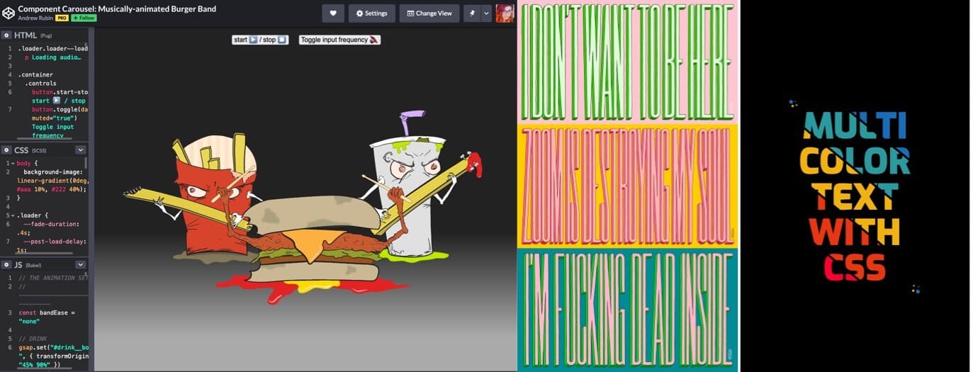
Passive Aggressive Zoom background to make people understand you didn’t want to be in THAT meeting by @Mr_Bingo
#Demo
A Musically-animated Burger Band using SVG and Gsap, because, why not ^^
#Generative
Some cute generative monochromatic plants and shapes by @natszafraniec
#CSS #Inspiration
This multi colored text with CSS background clip and gradients by @Shireen_dev
is just what I needed today 🙂
Tutorials
#CSS
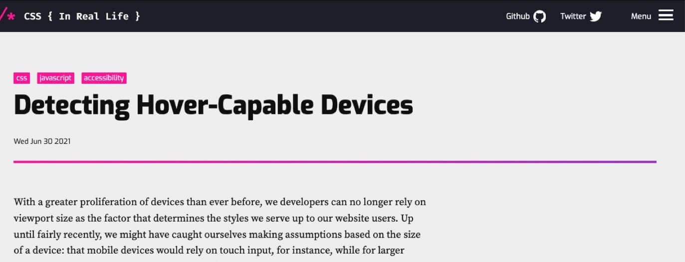
“Detecting Hover-Capable Devices” there are new media queries that will let you detect if the user primary pointing device is capable of hovering. I still wonder what happens to hybrid devices with those though.
Video and conference talks
#Conversation
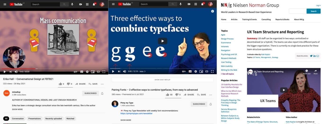
“Conversational Design with Erika Hall” a great 30 talk where Erika Hall explain how interfaces should be more conversational by using language in design. Note that this is NOT about chatbots, it’s broader topic on communication.
#Typography
“Pairing Fonts – 3 effective ways to combine typefaces, from easy to advanced“, a 12 minutes video to help you with font paring
#UXTeams
UX Team Structure and Reporting, an interesting 3 minutes video on how design teams can be organized in different organizations by @NNgroup
Useful tools and resources that will make your life easy
#GameUX #Psychology
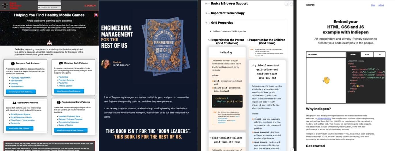
A list of psychological tricks that can be used to manipulate gamers. Note that some of those are core mechanics of some games (like grinding), on their own they might not be an issue, but if you combine them, it can become quite addictive.
#Book
Engineering management for the rest of us, a book by Sarah Drasner to help you lead a team of engineers
#CSS
A big guide and cheatsheet to help you understand and work with grid layout, you might want to bookmark this to come back to it later
#Code
indiepen.tech, a nice tool to embed HTML, CSS and JS code examples
#Flags #Icons
If you need some flag icons for your project, this should get you covered. Just remember that flag == country, not necessarily language.
