Pixels of the Week – July 21, 2017
Every week I post a lot of my daily readings about Web, UI and UX Design, mobile design, webdesign tools and useful resources, inspiration on twitter and other social networks.
This week’s selection: user experience tools, costs, slider design, mobile navigation, AMP, solving problems and getting back to basics, CSS resets, cools things in SCSS, PWAs, Newsletter design, performance, Sketch material template and UI animations.
You can follow me on twitter to get a dose of links every days.
TL;DNR the one you should not miss
#UX #Tools
You might want to bookmark this if you are starting in the field of UX: A Complete List Of UX Deliverables
Interesting article
#UX #Costs
What Goes Into The Cost Of UX Design – If you need to explain the different stages of user centered design process
#Design
Designed Degradations: UX Patterns for Hostile Environments, on providing possibilities for users with a not optimal configuration
#Design #Slider
Designing The Perfect Slider, long and really detailed read worth your time
#Mobile #Navigation
“Why Mobile Menus Belong at the Bottom of the Screen” Not quite sure about that one actually. Do you need the menu to be easy to reach? Navigation should be like a good friend, here when you need it, but not living on your couch. Won’t it interfere when users will scroll to read the content, will users miss tab on the menu instead of scrolling? How do you deal with complex multi level menus? It will open from the bottom to the top, then you open the 2nd level from top to bots, etc.? Where will we put the social link bar and ads if we put the menus on the bottom???? (Okay this might sound like trolling but still). Anyway, the idea is still interesting, I would be interesting to see some real life examples if you have some 🙂
#Mobile #AMP
The AMP is a lie, interesting opinion on the fact that the real speed boost in amp comes from perceived performance
#Design
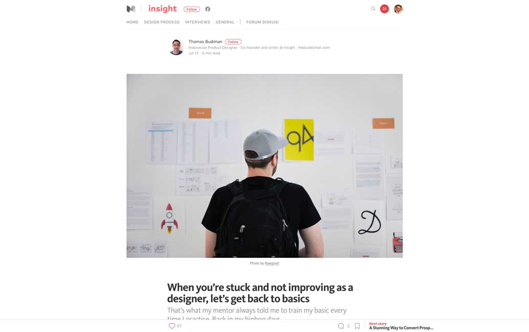
When you’re stuck and not improving as a designer, let’s get back to basics
#Design
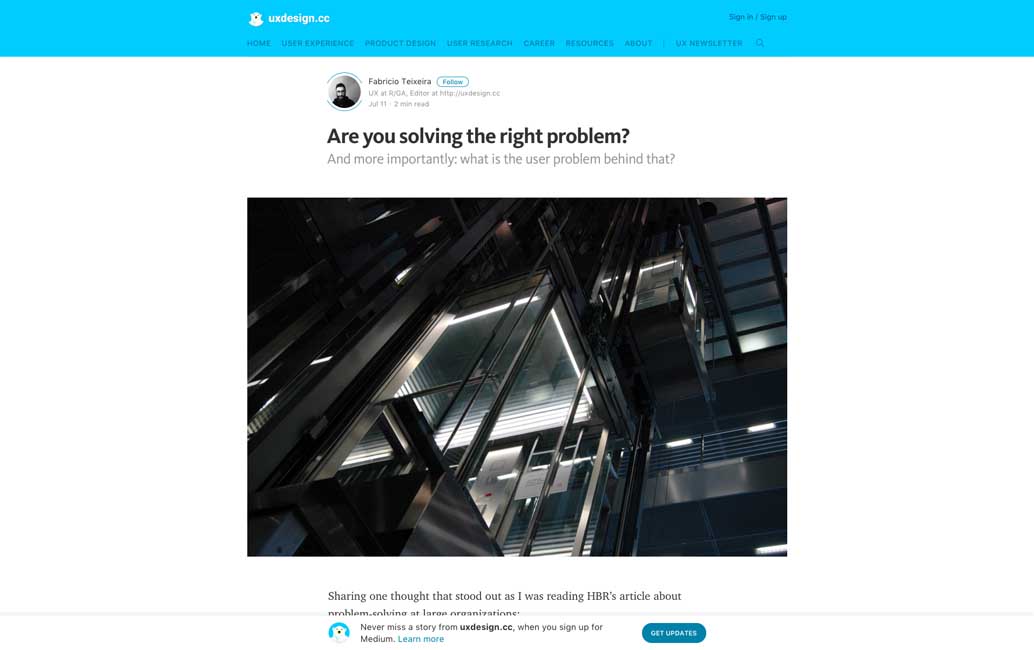
Are you solving the right problem?, sometimes you need to reframe the problem to find the right solution
#CSS
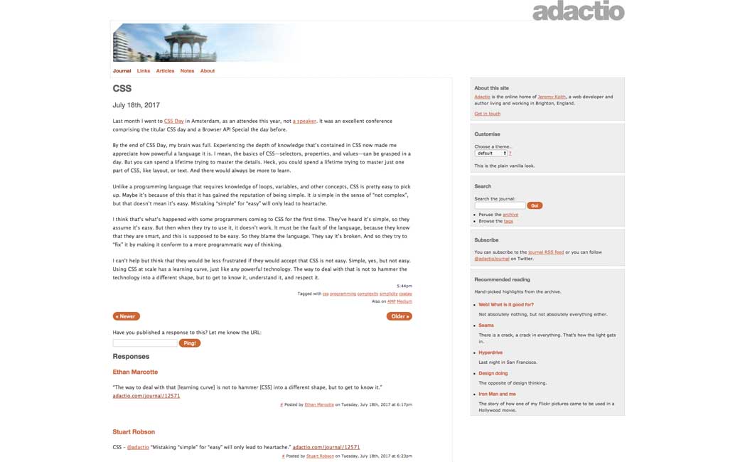
CSS, don’t mistake simple for easy by @adactio
#CSS
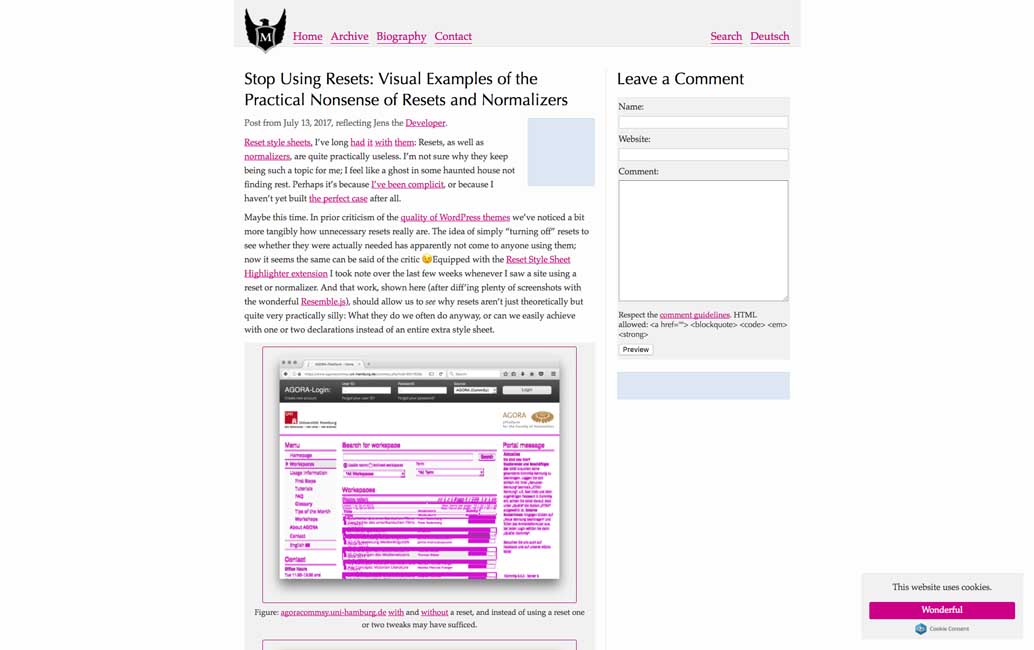
Stop Using Resets: Visual Examples of the Practical Nonsense of Resets and Normalizers, interesting visual comparison of sites with and without the CSS reset
#JavaScript
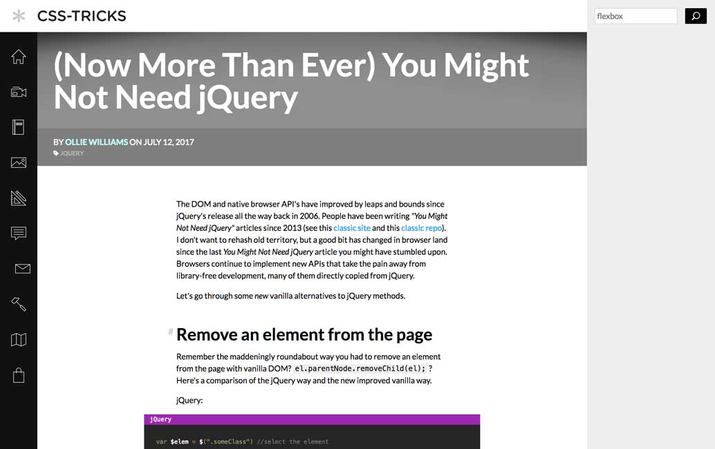
(Now More Than Ever) You Might Not Need jQuery (unless you support Edge and IE then you need a polyfill
#UX
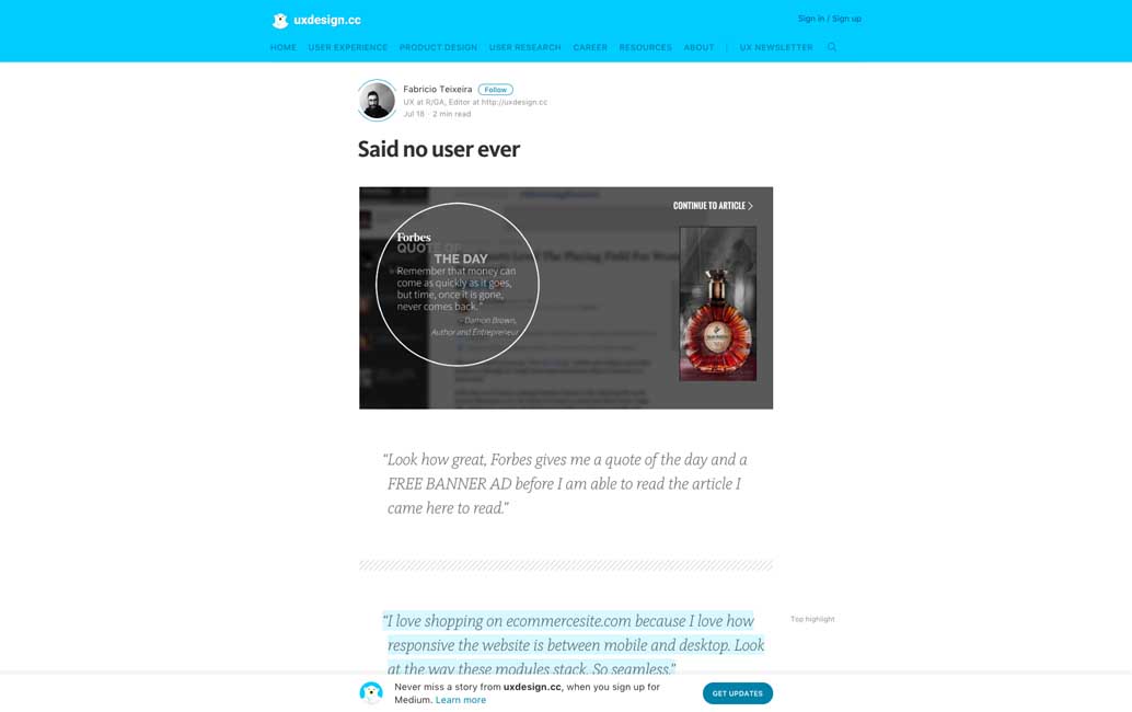
“... Said no user ever“, we should make a site with random quotes out of this list ^^
Inspiration and Great ideas
#Newsletter
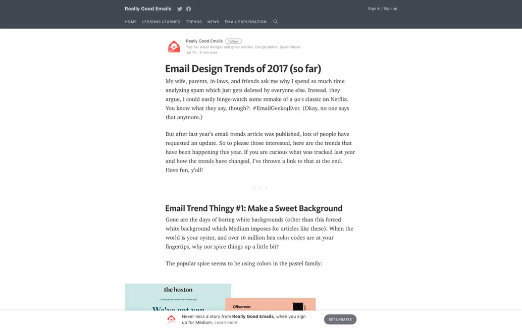
The Newest Email Design Trends of 2017, really cool to see the end of boring emails and some creativity here
Tutorials
#PWA
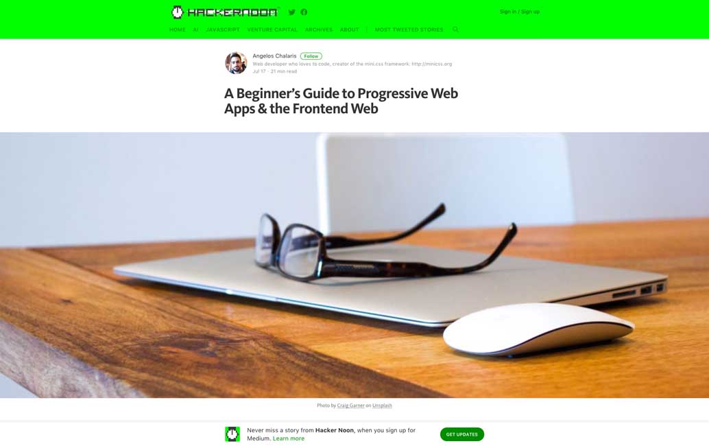
A Beginner’s Guide to Progressive Web Apps & the Frontend Web, really long and detailed tutorial
#CSS
Advanced SCSS, or, 16 cool things you can do with Sass
Useful resources, tools and plugins that will make your life easy
#First Users
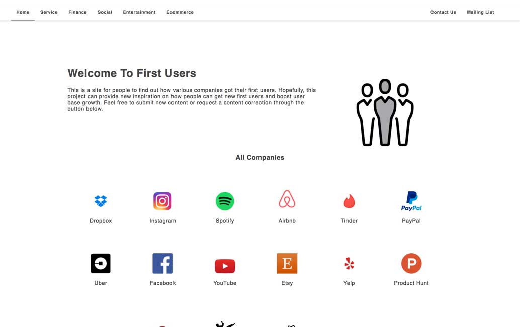
First Users, find out how various companies got their first users
#Design #Workflow
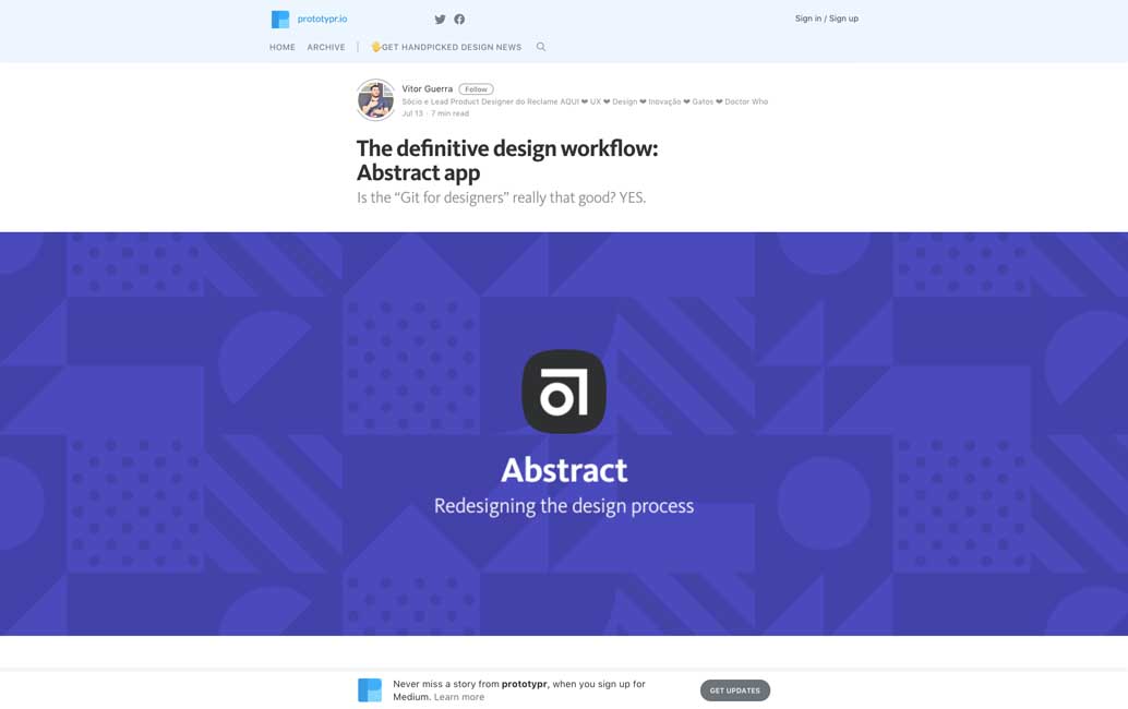
Abstract looks wonderful but I’m still wondering if applying a dev Workflow to Design is the best solution
#Performance
webspeedtest.cloudinary.com an online tool to analyse your image compression
#Sketch
Sketch Material – to help you quickly build material design systems in Sketch
#Tools
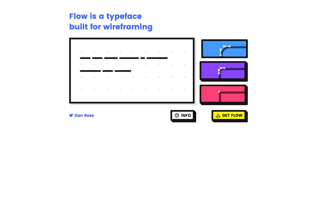
Designing for real content is important, but if you can’t: Flow is a typeface built for wireframing
#UX
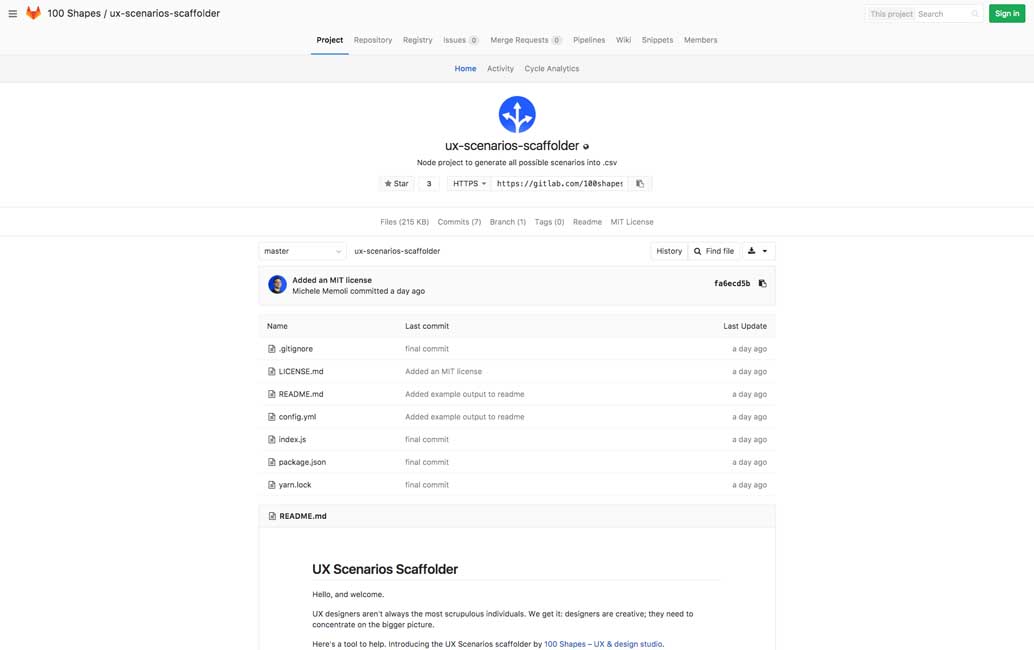
UX scenarios scaffolder, a nodeJS script to generate all the interface scenarios possible and export them in a CSV
#UX #Animations
uimovement.com is a great place to find UI motion inspiration
