Pixels of the Week – June 2, 2024
Hidden vs. disabled, accessibility text resizing & Victorian nipple rings
My curated weekly-ish online newsletter, where I share interesting articles, tools, and resources I found during the week. You can expect content about UX, design, user research, accessibility & tech, but also some processes, some inspiration, sometimes books, and a couple of videos and podcasts. Also, don’t forget to, subscribe to the newsletter to get notified, you will get the weekly links directly in your mailbox, and be notified when I publish other articles.
Now: what I’m currently up to

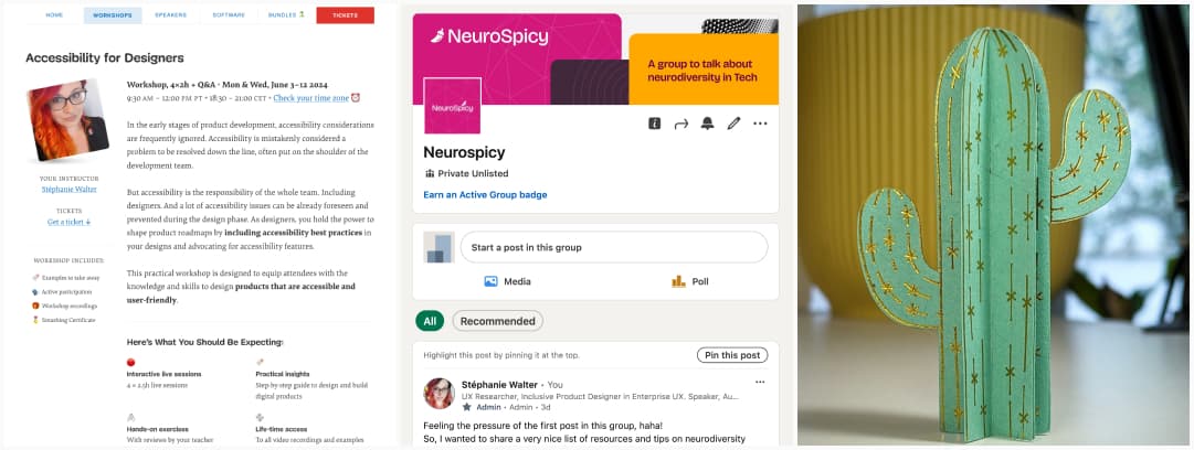
My accessibility for designer smashing workshop starts on Monday June 3, yeahy. I know it’s late (I’m very bad at keeping track of time), but, if you still want to participant, we have a 15% special last minute discount, you can register here.
Also, Myriam and I created a Neurospicy LinkedIn group. Because some people asked if there could be a nice place to discuss, and for now, this is the easiest.
On the fun craft side of my life, I’ve created a paper cactus, with, you guessed it, another session of hot foiling! You can check the making of on Instagram. It’s floating in an anti-gravity pot.
Interesting frameworks and concepts
What is a North Star Metric? It’s the core value, the one thing that your product delivers to customers. For example: Airbnb’s “nights booked” and Facebook’s “daily active users.”
Most popular content this week
Sensory Environment Checklist some guidelines to improve workplaces and environments for neurodivergent people, that focuses on visual, auditory, olfactory and tactile over simulations and issues. It brings examples of what to look for, what’s undesirable, and how to improve on each point. (created for BBC and brought to me by Gareth FW)
Interesting articles that caught my attention
UX research and design
- What is Funnel Technique in Qualitative User Research (15min) Begin with broad, open-ended questions and slowly narrow to specifics. This allows you to cover all the areas you need and get specific insights into areas of improvement. This can be applied to interviews, usability testing, information architecture and more.
- Want to convey how bad a user experience is? Talk about the user’s emotion (7min) “Humans are emotional creatures, which you’ve seen through user testing. However, businesses don’t make decisions based on users’ emotions. Storytelling helps to bridge that gap. By tying a user’s problems not to quantitative facts or user counts but to their emotional experiences around a product, you can convey why addressing this issue is essential”
- Hidden vs. Disabled In UX (8min) hiding important feature might hurt discoverability, so you need to understand when to disable them instead in a non-disruptive way
- What telephones can tell you about good design (5min) the design of the phone keypad we have today was tested, a lot. Key insights include the importance of usability testing over user preference, balancing speed with accuracy, and considering task-specific requirements.
- Do Users Prefer Chatbots Over Humans? It Depends… apparently, when purchasing embarrassing products, people prefer to talk to a chatbot. The study also emphasizes the importance of transparently identifying chatbots and avoiding over-anthropomorphising them in context of sensitive information. There’s no “one size fits all”, context is key when choosing between a chatbot or human operation. (by Dr Maria Panagiotidi)
- What no one tells you about personalization (8min) on trying to bring more personalization in the age of AI, while still keeping this user-centric, transparent to not make the user feel like they are being scrutinized all the time.
- Design interviews (8min) a list of potential questions Robin Rendle is asking, when checking design portfolios. Those should help you craft better portfolios. And for more tips, check Insights from design hiring managers about what they look for in resumes and portfolios
Accessibility and Front-End
- Old Dogs, new CSS Tricks (8min) overwhelming release pace, browser compatibility concerns, and habitual reliance on old methods didn’t really help with the adoption of new CSS features. It’s now up to developers to start exploring and finding ways to integrate them in their stack.
- “AI” and accessible front-end components: is the nuance generatable? (12min) another interesting take on why LLMs can’t help with writing accessible code, because it’s all in the nuance, and often in the “it depends” which makes it hard to statistically predict and automate.
Last but not least…
Don’t Give Every Minute a Job (5min) on the importance of having a buffer in your planning
Curiosity cabinet: non-design/tech rabbit holes I enjoyed
Victorian Nipple Rings, a not safe for work (well it’s only sound but still) episode of the Love of History, talking about the trend of nipple rings of Victorian area. I love the fact that, having a piercing meant you were wealthy, because you had enough money to take care of the piercing. How perception have changed!
Inspiration: fun experiments, beautiful art, and great ideas
A cool AI Vid with a hand, getting the color and textures of what it touches
Useful tools & resources
Figma stuff
- OKLCH Color Variations: a cool Figma plugin to create variation using the OKLCH color space, with different shades of the same color. You can play with Lightness, Chroma and Hue.
- Figma Apple collection: if you design for Apple products, you’ll be happy to learn that there’s a whole official Figma collection to help you
- Vector to 3D I don’t know if I need a Figma plugin to turn vectors into 3D illustrations, but I sure had a lot of fun with this one. Free version lets you play, you need to pay to export.
The other ones
- Open Database of Design Salaries a list of salaries of designer, across industries, experience level and geographic location. There’s less data outside of North America, so people, they need you to participate!
- Glob Explore a AI powered search engine that changes the structure of the results based on what you search. It offers an interesting exploration in adaptive content and information architecture
- slash pages a guide to common pages you can add to your website, including /about, /now (to tell what you are working on, but also /chipotle so that your friends know your chipotle order. I feel like I need a /sushi one instead. (via Stefan Judis’s newsletter)
Cool and Interesting Videos
What Happened To Etsy? Interesting video on how Etsy’s focus on growth has pushed them away from their core mission (link crafters and small home made business with clients all over the world). I can’t disagree, it’s been a giant mess of drop shipping things you can also find on amazon now.
Tutorials
Rethinking Text Resizing on Web (15min) interesting techniques to help support user changing font size, either by zoom, or by changing it in the browser, by Steven Bassett
Latest news in the industry
- We’ve Got Container Queries Now, But Are We Actually Using Them? due to their novelty, browser support concerns, and the flexibility of modern CSS layout methods like CSS grid and fluid typography, adoption of container queries is slow
- The Screen Wake Lock API is now supported in all browsers that’s cool, interesting cases for example on cooking sites.
- 8 new accessibility updates across Lookout, Google Maps and more: interesting new features to help with different aspects of accessibility coming to the Google products. Also, a couple of new ones for Apple too.
- Google promised a better search experience — now it’s telling us to put glue on our pizza yeah, what a giant mess. I’ve shared a similar content on LinkedIn this week, I’m still amazed that previous issues with AI didn’t teach us to do better.