Pixels of the Week – June 21, 2020
Every week I share a list of curated articles, resources and tools about UX, UI and mobile design, HTML, CSS, the web industry, process inspiration and more…
This week’s selection: design systems, improving user interviews, a few talks (UX navel gazing, inclusive design, psychology and decision making, design metrics, cognitive biases), CSS grid, user states we tend to forget about, Figma resources, PWAs and what you can do with those, dark modes, cool GreenSock animations and 3D models, CSS Z-index, accessible conference tools, colors and gradients, building task flows, etc.
#Now – what I’m up to
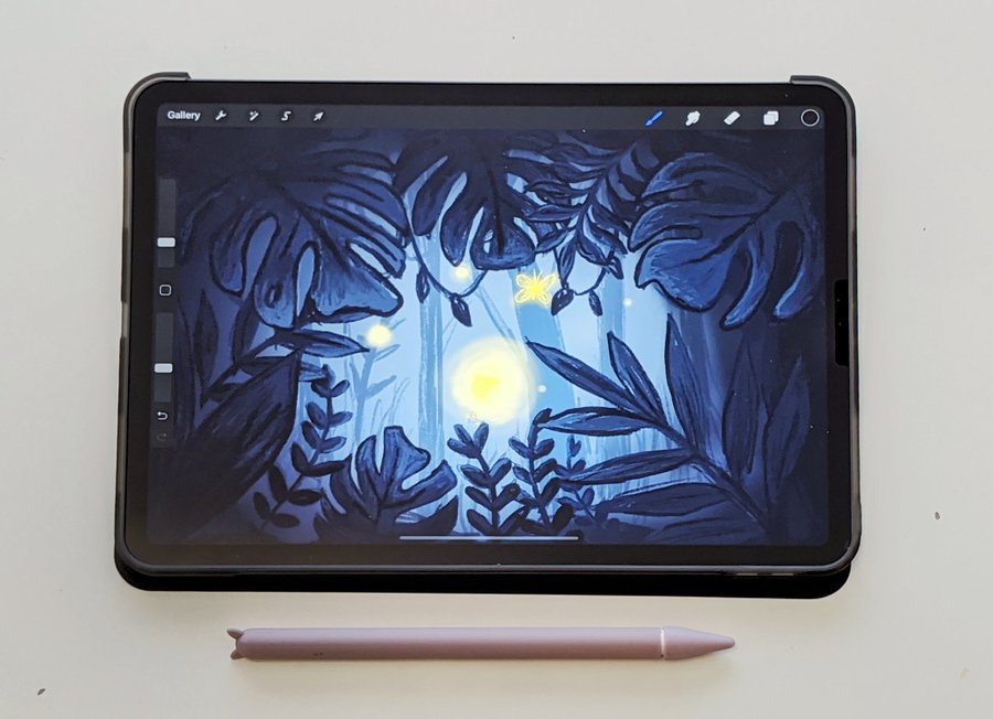
I’m currently having a lot of fun with Procreate on the iPad for a little illustration project I have. This is the concept art, next step is to bring that to Illustrator to turn this into SVG illustration. Wish me luck 😀
Also: Wednesday, 1st July 5:30PM WAT (that’s 6:30CEST), I’ll be talking about bringing your website’s mobile user experience almost to the level of a native app experience with HTML5 APIs and PWAs with the Developer Circle: Akure. Feel free to join us!
TL;DNR the one you should not miss
#UXDesign
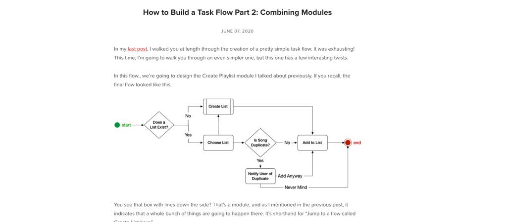
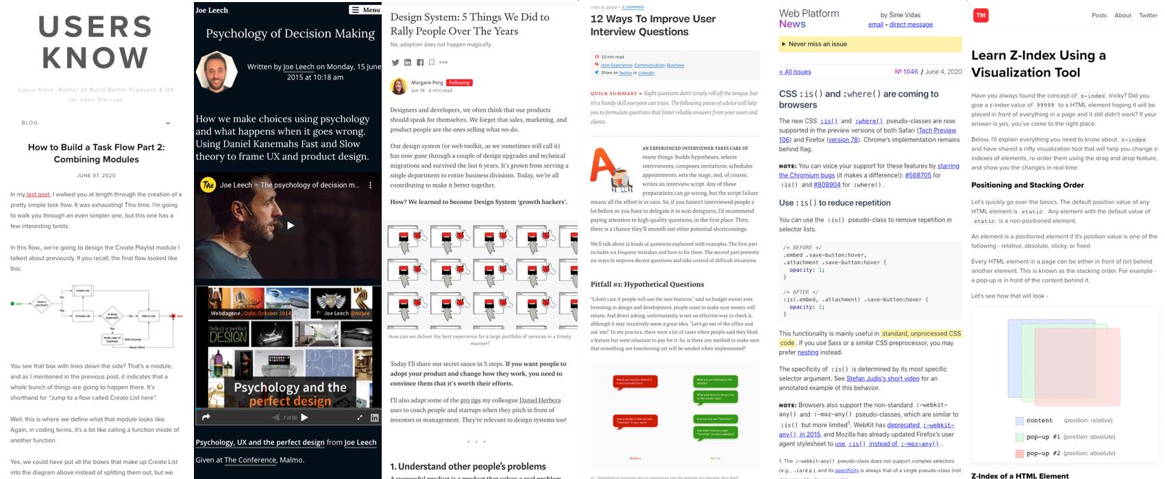
“How to Build a Task Flow Part 2: Combining Modules” in this second article, Laura Klein explains how to create other flows and modules and have them fit in with different flows
Interesting article
#Design System
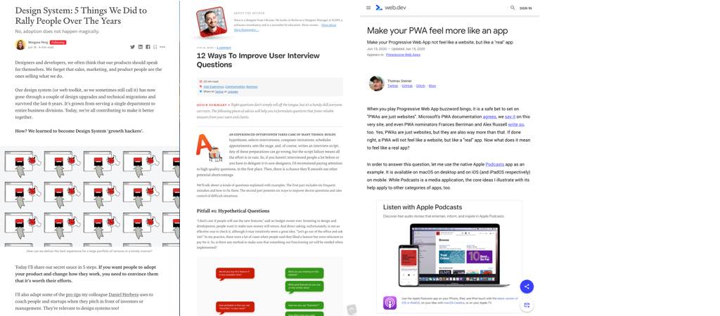
Design System: 5 Things We Did to Rally People Over The Years a great to get some perspective on building design systems
#BackToBasics #Design
I still really like this illustration from Andy Rutledge’s “Contrast and Meaning” article (2007), it shows in an elegant way the different “tools” we have to convey meaning, hierarchy and contrast in the digital world
#UserInterviews
12 Ways To Improve User Interview Questions by Slava Shestopalov a great read on avoiding the pitfall of user interviews. And yes this is hard and requires practise but the more you interview, the better you get at it.
#Usability #Accessibility
6 Things to consider when doing usability testing with disabled people and some tips and ideas to help you all the way from recruitment to the test
#Inclusion
Building the Woke Web: Web Accessibility, Inclusion & Social Justice
#PWA
Make your #PWA feel more like an app and bring this all to the web: offline support, downloadable content, sharing and interacting with other apps, hardware key controls, multitasking, push notifications, media control widget, launch icon, etc.
#DarkMode
“Is Dark Mode Such A Good Idea?” interesting article quoting resources debunking the “dark mode is better for the eyes and battery”. On a personal level I hate dark mode except for multimedia consumption in the Dark (Netflix)
#CSS
CSS :is() and :where() are coming to browsers: use is() to reduce repetition and target specific element, where() to keep specificity low (does the same as is() but doesn’t increase the overall selector’s specificity (to make them easy to override)
#Tools #Accessibility
“Which Video Conferencing Tools Are Most Accessible?” that is a good question
#Sketch #Figma
“Transitioning our Design System from Sketch to Figma” , interesting feedback if you ever decide (and can) switch from one to the other
Inspiration, fun experiments and great ideas
#Gsap #GreenSock
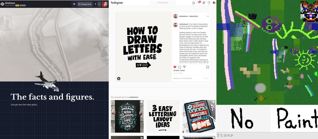
Airplanes: a really cool demo using the GreenSock scroll trigger with a 3D model plan to explain how “plane work” <3 (by Steve Gardner)
#Typography #Lettering
A cool small 4 steps tips to draw letters (on Instagram)
#Fun #Paint
Here is a nice experiment of co-generated art to procrastinate this morning (it plays sound)
#Color
For my color geek friends: “Perceptually Smooth Multi-Color Linear Gradients”
Tutorials
#CSS
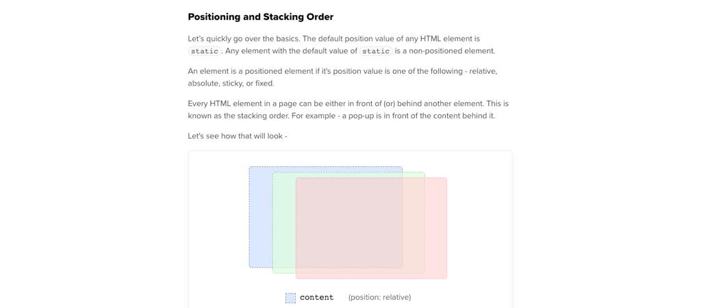
Learn Z-Index Using a Visualization Tool: this article embeds a visual tool that lets you play directly with Z-indexes inside the tutorial to better understand how they work
Talks & Podcasts
#Talk #UX
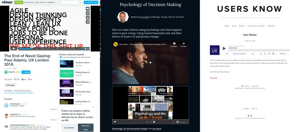
“The End of Navel Gazing: Paul Adams, UX London 2018” a great talk about UXD not being the center of the universe and the need to collaborate with other teams like marketing, sales, support who might actually talk to the users more than us UXers
#Talk #Psychology
Psychology of Decision Making: how we make choices using psychology and what happens when it goes wrong. Using Daniel Kanemahs Fast and Slow theory to frame UX and product design.
#Podcast
Another great episode of What is Wrong with UX, this time @lauraklein
and @katerutter talk about all the different states designers tend to forget in their mockups
Useful tools and resources that will make your life easy
#CSS
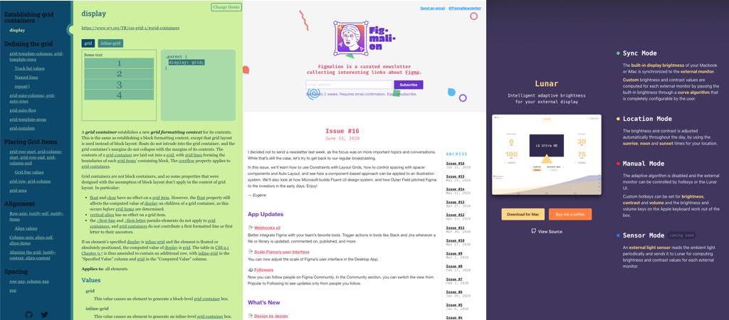
A useful CSS grid cheat sheet
#Figma
A newsletter with Figma articles and resources
#Tools
Lunar is nice tool lets you either synchronise the brightness and contrast of your external monitor with your MacBook, use your location or manually adapt it to your needs (helped me a lot since I spend too much time on the screen)
