Pixels of the Week – March 28, 2021
Every day, I share on Twitter and LinkedIn a list of curated articles I read, resources and tools about UX Design, User Research, UI and mobile design, HTML, CSS, the web industry, some process, some inspiration, etc. This is an archive of everything I shared this week.
#Now – what I’m up to
I had a lot going on this week: the usual hour of teaching class for a master degree. Then we recorded a panel about design around the world and it was awesome (I want to share the link but the content is currently restricted on Linkedin I need to check how to solve that). Then I gave a talk about design systems and reusable components (the video won’t be online this time though) and I gave 3 hours of teaching class in a row. This is the first time I have such a long teaching class session. It’s quite exhausting but also fun. And the good is that keynote finally lets you have notes in the “present into windows” mode which is super useful to still see the chat while you teach (because keynote goes full screen on top of almost any app in the regular presenter mode).
TL;DNR the one you should not miss
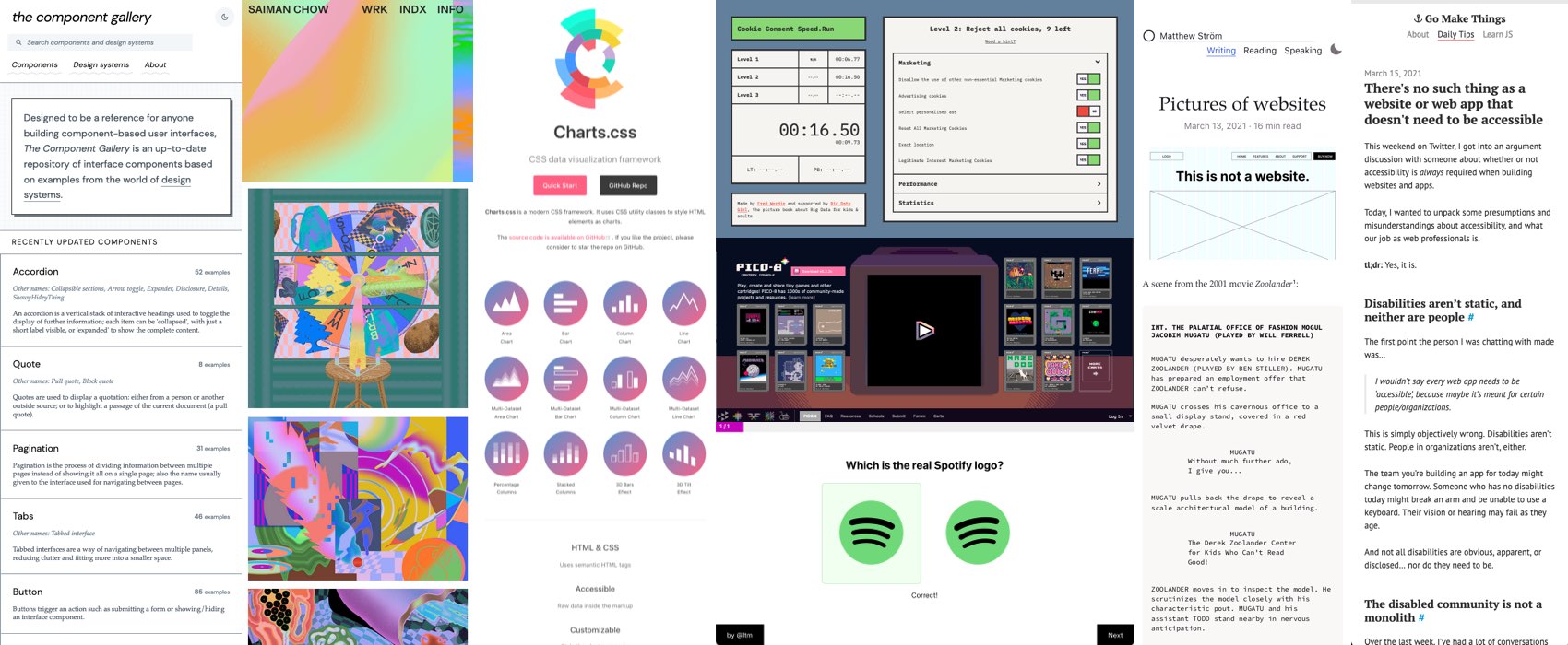
#DesignSystem
This is gold: a repository of different UI components with examples from different design systems for your inspiration (also to help you name your components) by @iainmbean
Interesting article
#DeceptivePattern
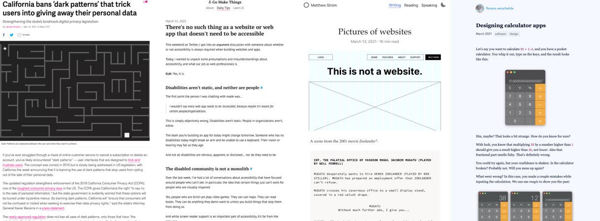
I sometimes get the question “but if deceptive pattern work why should we not use those”? Well first, ethics?!! And also: at some point people might get tired and start passing laws so that companies can’t continue abusing their users? Like this one: California bans ‘deceptivedeceptive patterns’ that trick users into giving away their personal data
#Accessibility
Please read this: “There’s no such thing as a website or web app that doesn’t need to be accessible ” by Chris Ferdinand (@ChrisFerdinandi)
#DesignProcess
♫ A picture of a website is not the website… ♫ Matthew Ström (@ilikescience
) goes through the 3 different types of “pictures” (discover, define, deliver) what they are for and how to improve those
#Design
“Designing calculator apps” by Florens Verschelde (@fvsch) an interesting take on skeuomorphism, reproducing the physical world and going beyond that. TBH I never use calculator app in the MB, I always type the calculation I need in spotlight ^^
#Excel
Scientists rename human genes to stop Microsoft Excel from misreading them as dates – sometimes it’s easier to rewrite genetics than update Excel (via @cassidoo)
Inspiration, fun experiments and great ideas
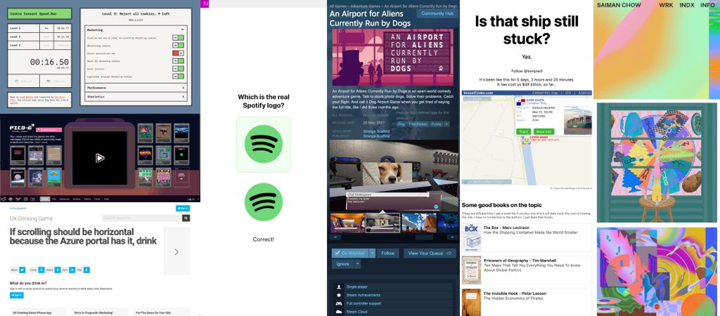
#UX #Game
The UX drinking game, I would advice tea or coffee though. “If highly paid outside vendors create hollow UX patterns that you must follow, drink up”
#Game
I think I want this game (but I can’t because no Win computer, meh): An Airport for Aliens Currently Run by Dogs
#Cookies
Play the “cookies speed run” game to show how good you’ve become at not allowing cookies, but there’s traps! I wish this was just a satyr but this is actually pretty close to the real shady experience of cookies banners on today’s websites :/
#WTF
Is this ship still stuck, a website to follow the ship stuck in the panama canal sad saga
#Inspiration
If you are into surrealist illustrations with a lot of neon pastel colors, you might like the work of saiman chow (@saimanchow). Warning: a lot of colors and things moving around on the website, might be trigger motion sickness
#Logo
A fun “which is the right company” logo quiz. 13/15, not bad considering that the 2 I got wrong are companies I never heard of. (Might be difficult if you are colorblind tough, some differences here are only in the colors)
#RetroGaming
This is fun if you are intro retro looking pixel art games: play, create and share tiny games and other cartridges! PICO-8 has 1000s of community-made projects and resources
#RandomFact
Did you know that wikipedia has a whole article on the different colors of “Shades of chartreuse”. Yup, don’t joke with colors and chartreuse!
Videos and podcasts
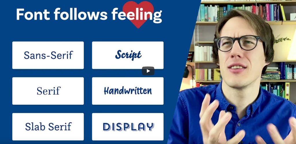
#Typography
“Font Follows Feeling – A brief type classification and the moods they create” by Oliver Schöndorfer (@glyphe) this should help you understand the different font categories and how to use them.
Tutorials
#CSS
” Taming Blend Modes: `difference` and `exclusion` ” a awesome and super detailed article by Ana Tudor (@anatudor) on what you can do with those CSS properties.
Useful tools and resources that will make your life easy
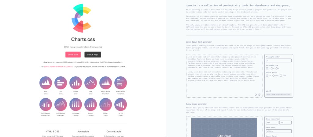
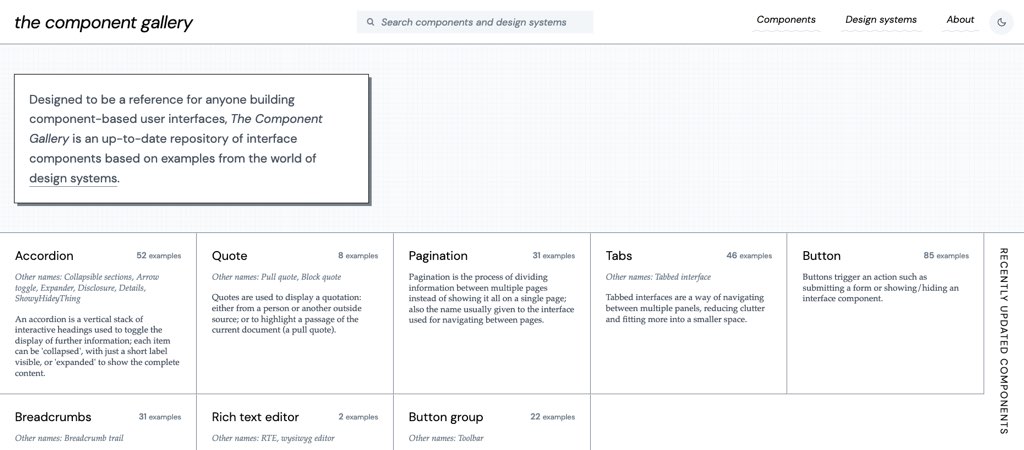
#Dataviz #CSS
This is an interesting concept: Charts.css uses CSS utility classes to style HTML elements as charts.
#Tools #Placeholders
Because sometimes you need text, image and video placeholders for you designs, this could be useful. Also if you work with fake content, make sure that structure and size is close to the real one 🙂