Pixels of the Week – May 1, 2015
Every week I post a lot of my daily readings about Web, UI and UX Design, mobile design, webdesign tools and useful ressources, inspiration on twitter and other social networks.
This week’s selection: mobile navigation (burger menu, overflow pattern), Eric Meyer on the universal access of the web, some mobile user datas (screensize), the myth of the fold, Chrome 42 mobile notifications, flexbox CSS4 and Webdesigner ressources
TL;DNR the one you should not miss
#UX
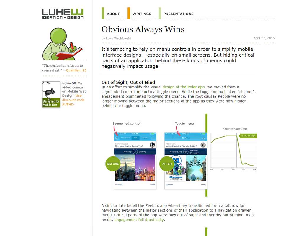
Obvious Always Wins: “It’s tempting to rely on menu controls in order to simplify mobile interface designs —especially on small screens. But hiding critical parts of an application behind these kinds of menus could negatively impact usage.”
Interesting article
#UX #SEO
Why a Good User Experience Is the Most Overlooked SEO Strategy: site speed, responsive and mobile first design, well crafted, call to actions, many of those things can influence your SEO.
#Talk #Universal Access
Take 15 minutes to listen to This Web App Best Viewed By Someone Else – Eric Meyer on the universal access of the web
#Mobile Data
Defining Mobile: 4-5.5 Inches, Portrait & One-Thumb Mobile data: 67% of smartphones range between 4 and 5.5 inches and 94% of the time they’re used in portrait orientation
#Form #Usability
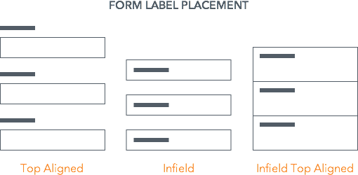
Introducing the idea of “infiled top aligned labels”, what do you think?
#Navigation
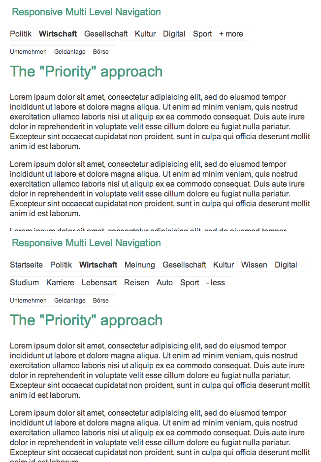
The Priority+ Navigation Pattern, maybe in case you REALLY can’t work the information architecture?
#Webdesign
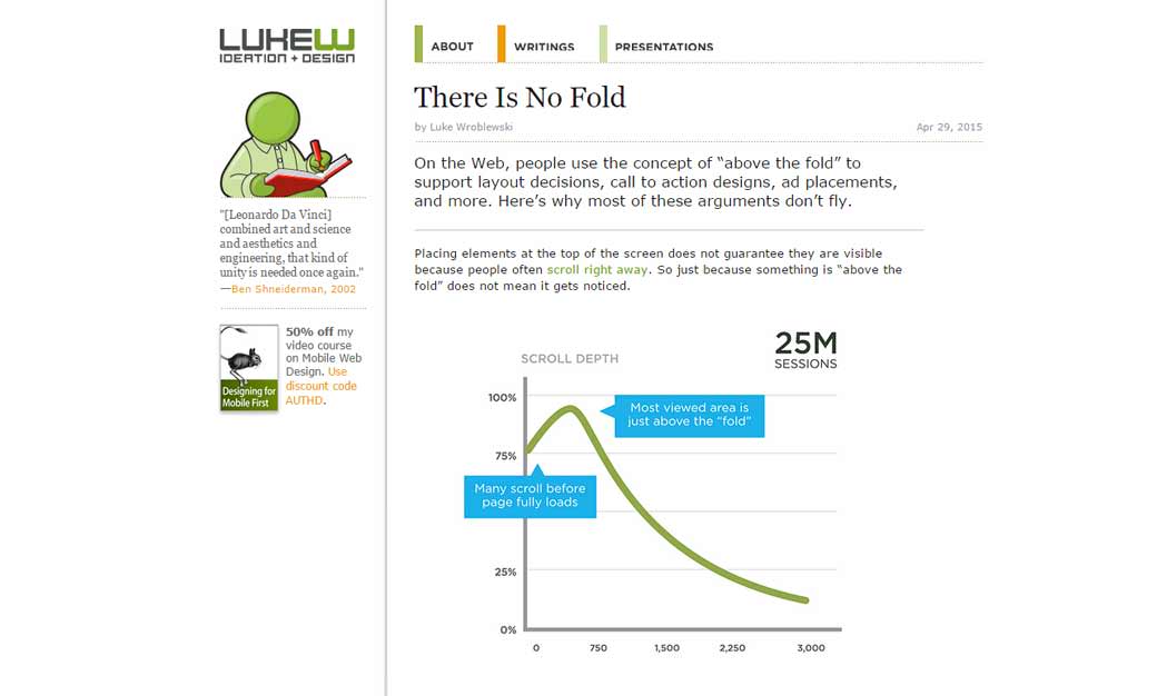
Repeat after me: There Is No Fold
Inspiration and Great ideas
#Typography
36daysoftype an instagram account to follow for my letters and typography lover friends
Designer news
#Chrome Mobile
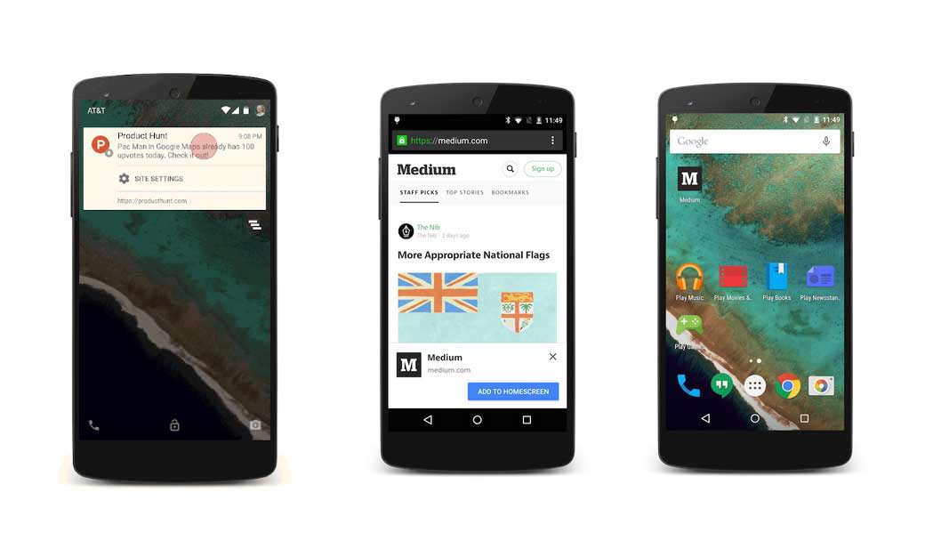
Chrome 42 on mobile allows push notifications and promoting homescreen icon
#User Testing
Mavelapp introducing UX testing tools
Useful ressources
#Webdesign
Webdesignstack.com a selection of essential web design and development tools, news, and inspiration
#Flexbox
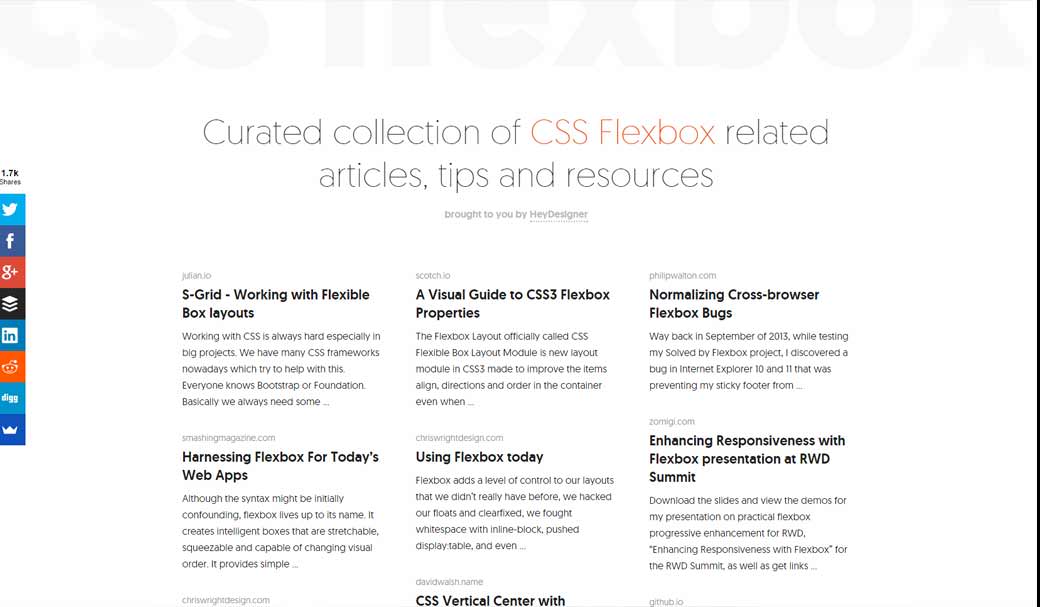
Curated collection of CSS Flexbox related articles, tips and resources
