Pixels of the Week – May 10, 2020
Every week I share a list of curated articles, resources and tools about UX, UI and mobile design, HTML, CSS, the web industry, process inspiration and more…
This week’s selection: self hosted/local design tools, a glitch art generator, when bad UX is Good, accessibility and browsers, remote workshops, CSS border tricks, UI grids examples, a podcast on UX design, Design System interview questions, Technical resume advice, some designer slacks, CSS content accessibility, exciting things for CSS Layout, CSS dark mode and variable fonts, etc.
#Now – what I’m up to
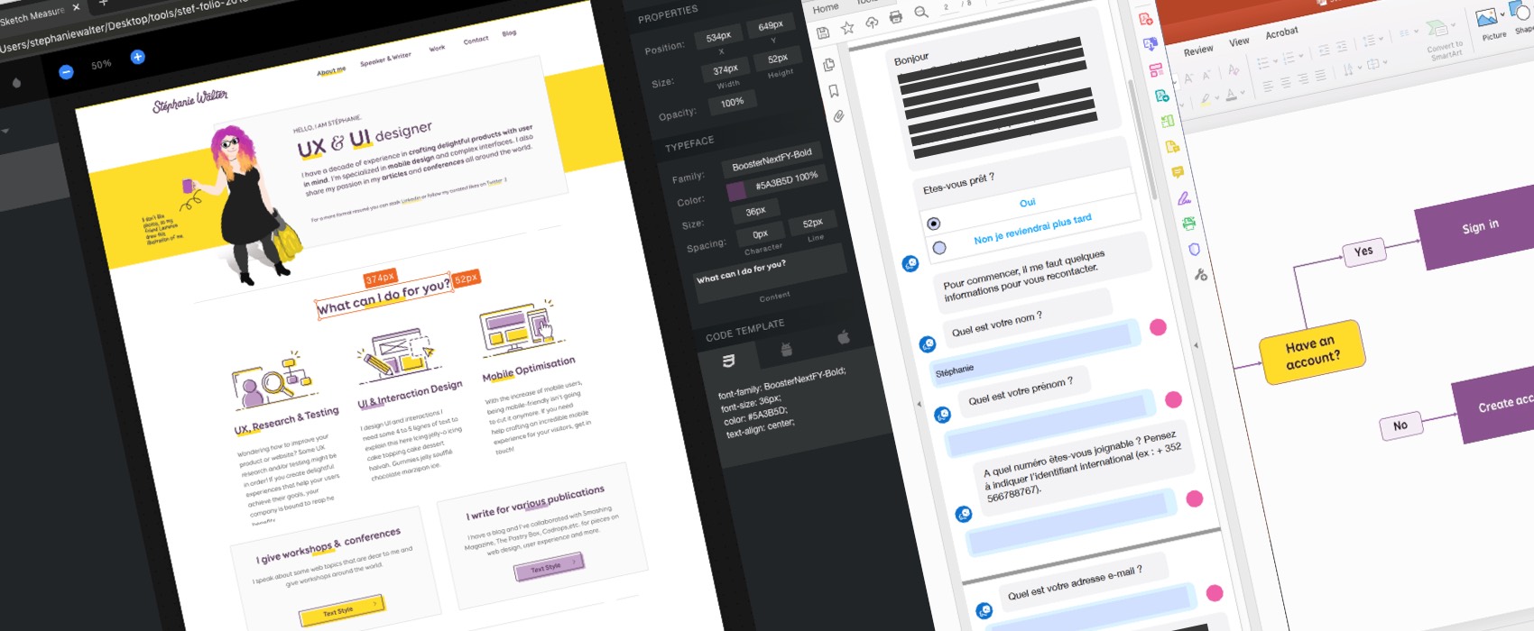
I have decided to offer a free 30 minutes feedback session to help women and non binary people in TECH get into public speaking. I build a calendly for that. If you identify as woman or non binary, you can book a feedback session here.
This week I was invited to French meetup UX Design Brest, since everyone is going remote at the moment, so was I. Here’s my setup. I don’t remember who on twitter advised to log into the online conference tool with a second screen to watch the chat but could not thank them enough. Since Keynote goes fullscreen on top of all apps, this let me see the chat and what the talk looked like (to make sur I didn’t crash).
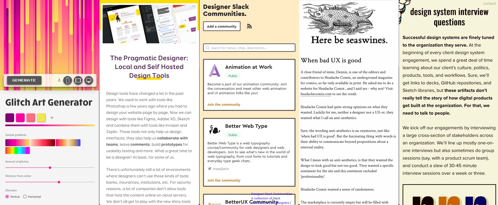
I also wrote a long article on the blog this week: The Pragmatic Designer: Local and Self Hosted Design Tools
TL;DNR the one you should not miss
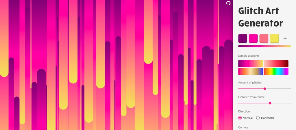
Here is a Glitch generator I have no idea were I could use that but I am super happy that is exists
Interesting article
#UX #Usability
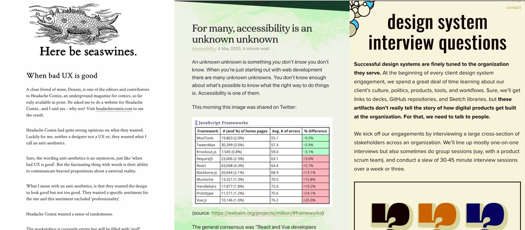
“When bad UX is good” I enjoyed the article, I agree with the topic, but I disagree with its title. The site they present (http://headachecomix.com) hasn’t a bad UX, it’s quite usable, content is easy to read & conveys the idea of what the shop is about. If you ask me, that’s actually what a good user experience is about. Sadly, the term “UX” became synonym for “aesthetically pleasing polished websites with a lot of features”. I’ve even heard “this is not really UX”. People, “not really UX” does NOT mean anything. For me, user experience design is about creating AN experience that matches user’s needs and expectations, while still also not forgetting about business goals. Sure, most of the time, users expect a nice, easy to use experience, something pleasing. But sometimes, user expect to be scared, challenged, chocked, etc. And that’s also fine, you don’t need your website to follow the shiny polished 2020 UI trends to have a “good” experience 🙂
#Grids #Beginner #UIDesign
For anyone starting with UI design, here are some common grid examples from websites and apps
#UIElement #Textfield
UI cheat sheet: text fields: interesting wrap up on a lot of details you need to think about when designing text fields (I don’t agree with 2. about splitting fields though, especially on mobile, masks are a nice solution for that)
#Accessibility
“For many, accessibility is an unknown unknown” interesting ideas about what browsers and people could do to make it a first class citizen in browsers. How about a linter that triggers errors on div onclick=? I would add “be careful when you write tutorials with inaccessible HTML, people WILL learn by copy pasting your code” (yes I’m talking to you, how doesn’t want to add for and ids to the form tutorials because “it’s not about the HTML but the JS” or some other low excuse)
#CSS
Exciting Things on the Horizon For CSS Layout: Chrome grid inspector, gaps support for flexbox in Chrome Canary, “native” mansonry in Firefox Nightly (no JS needed whoop whoop)
#Workshop #Remote
“The quest of turning an event from physical to digital” Some feedback on what worked and what worked less, I like the idea of using Miro like a physical space with photos of people, plants, etc. to make it more human and less digital
#Design System
Building a design system is like any other project, you start by interviewing stakeholders and users to understand workflows, needs, fears, hopes, pain points, etc. Here are Brad Frost’s questions to help you with that
#Career
” Advice for Writing a Technical Resume ” by Sarah Drasner from format to what to put in the resume and other interesting tips
Outlook is not an Email Client, Neither is Gmail. Nor is Yahoo.
Inspiration, fun experiments and great ideas
#Drawing
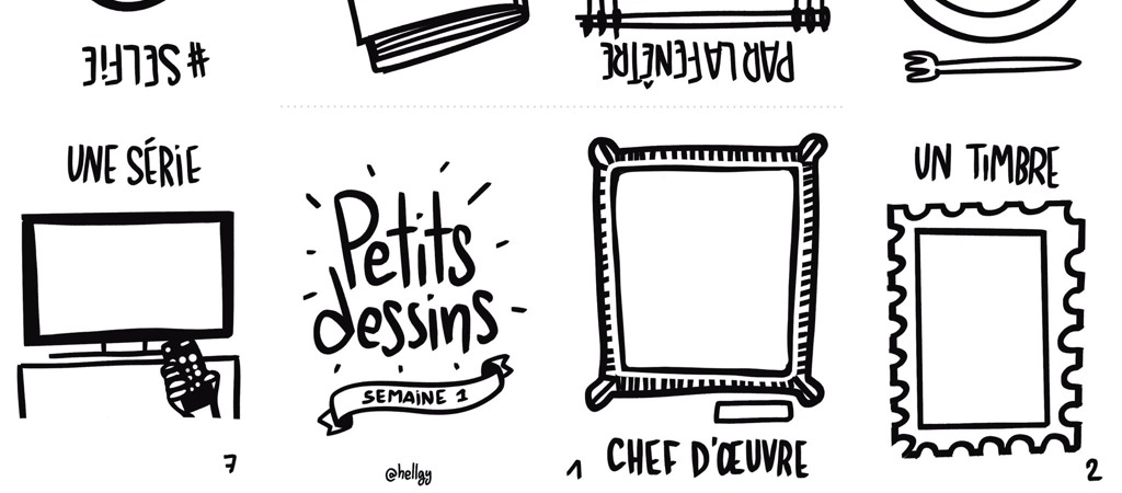
My friend Laurence created a small drawing sheet (in French) if you want to have fun, print it and draw something this week.
Podcast
#UX
UX Trends, Roles & Function: a #podcast about why & how UX became in high demand & some strong opinions about the UX/UI profile, “everybody in the company is a designer”, the lack of actual practise in the industry, putting UX in front of everything, etc.
Tutorials
#CSS
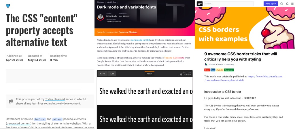
- 9 awesome CSS border tricks that will critically help you with styling, some cool simple little tricks
- Dark mode and variable fonts, haaa and attempt to fix the old “white text on dark background looks bolder than the same dark text on white background” issue fixed
#CSS #Accessibility
“The CSS “content” property accepts alternative text” (missing Firefox and Safari support) and some attempts to make this more scalable and maintainable (especially if you do multi languages)
Useful tools and resources that will make your life easy
#Design #Slack
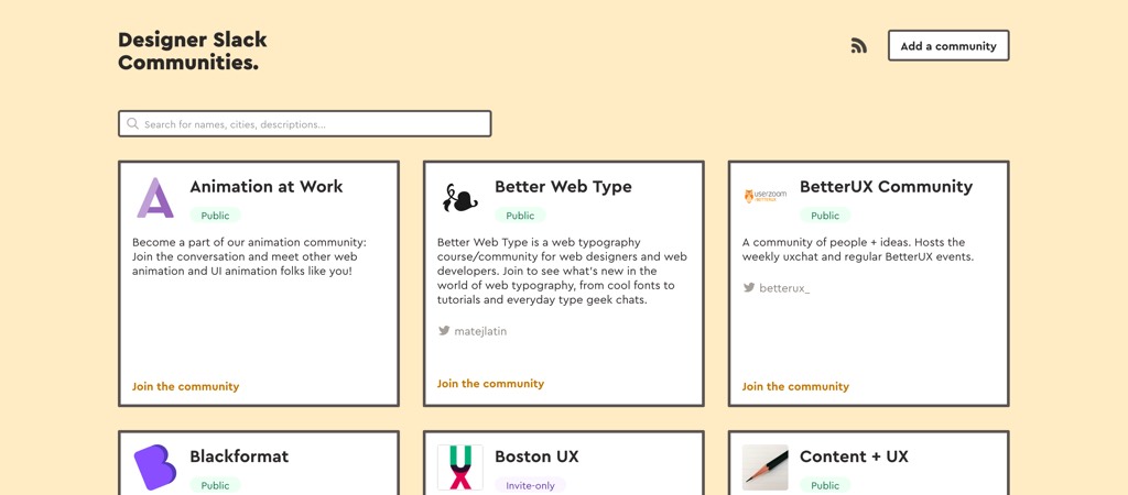
If you are looking for some places to connect with other designers take a look at those designer place communities
