Pixels of the Week – May 12, 2024
Figma variables, form accessibility and cool shapes
My curated weekly-ish online newsletter, where I share interesting articles, tools, and resources I found during the week. You can expect content about UX, design, user research, accessibility & tech, but also some processes, some inspiration, sometimes books, and a couple of videos and podcasts. Also, don’t forget to, subscribe to the newsletter to get notified, you will get the weekly links directly in your mailbox, and be notified when I publish other articles.
Now: what I’m currently up to

May 16 is Global Accessibility Awareness Day, it’s going to be a busy week for me.
- May 14, I’ve partnered with TestingTime to host a free “What UX professionals need to know about accessibility“ webinar. Get you ticket.
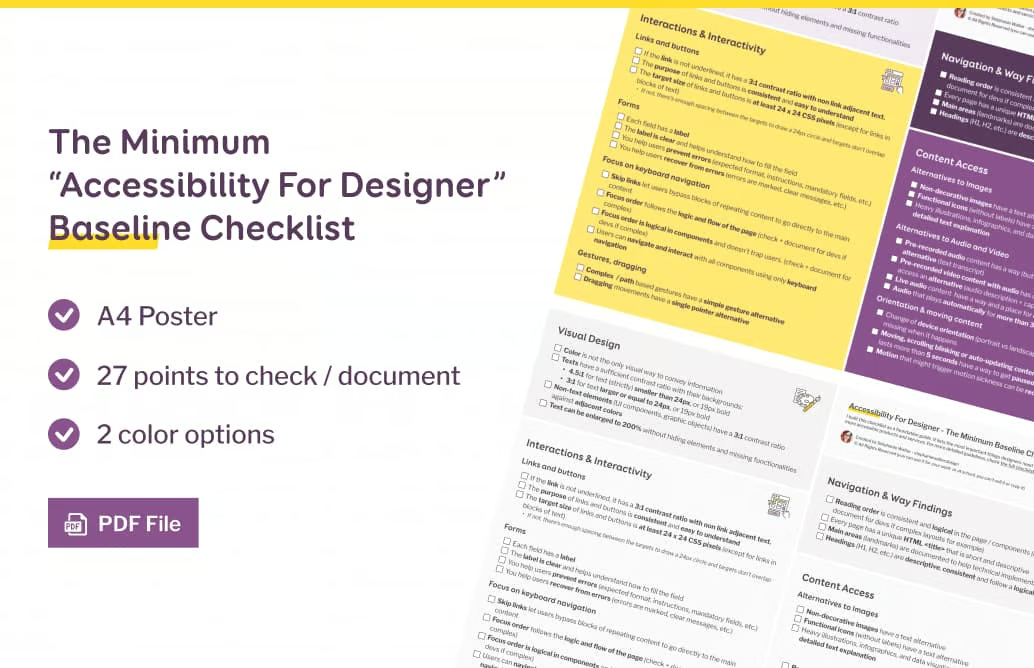
- I’ve prepared a small new little resource: A A4 poster version a “Minimum Baseline Checklist”, with 27 items you need to check as a designer to make your products more accessible. It’s already part of my Web Accessibility Tools for Designers (if you’ve bought this before today, you should get a link to download the extra resource). The A4 poster will also be available for a limited time for the webinar attendees. And, of course, it will be sent to my dear newsletter subscribers!
- I’m running some private events for some companies. If you are interested in me, coming to talk to your employees, reach out.
- If I find time (ahah) I might publish some content on accessibility and dark mode. But, no promise here.
Most popular content this week
Variables a nice tutorial that covers all you need to know about Figma variables, from type, to how to create, use them, organizing with groups and collections, how to prototype with them and more.
Interesting articles that caught my attention
UX research and design
- How the meaning of colour varies per culture (14min) Each continent, country, and culture has its unique way of using colour. This usually comes from its history, climate, and the exclusivity of shells, paint, and other objects. So, You need to test your product with its specific target audience.
- Selling the Vision, Building the Reality (5min) selling products to a B2C audience is not the same thing as to a B2B audience, Pat explains different approaches, common pitfalls to avoidant the key to success: collaboration and communication.
- The Deutsche Bahn (DB) App Sets You Up To Be Fined (11min) Debbie’s tail of a frustrating experience with the Deutsche Bahn (DB) app leading to a fine, due to unclear ticket purchasing options, language barriers, and unhelpful ticket inspectors. Meanwhile, we keep hearing people pretend “UX is just common sense and we don’t need specialist for that”.
- Don’t use the maxlength attribute to stop users from exceeding the limit (3min) when users get to the limit, or copy and paste longer text, it gets ignored, not a great experience at all.
- Creative ways to playback research (8min) a really cool idea, on how to use graphic recordings instead of reports to share research findings with participants by Bootcamp Aysha Brown
- Measuring Users’ Mental Models (7min) understanding user mental model is important for designing user friendly interfaces. To measure and analyze them, you can use methods like think-aloud protocols, retrospective interviews, a series of what-if questions, or even methods like relatedness ratings, card sorting and pathfinder networks.
Accessibility
- How to design accessible forms in 10 steps (8min), the bare minimum you can do for form accessibility, by Bethan Phillimore
- “Who’s Afraid of Little Old Me?” by Taylor Swift Resonates with Me as a Disabled Person: Here’s Why (7min) interesting read by Kathleen Downes on how society views disabled people
The other interesting ones
- Looking for AI use-cases (12min) when spreadsheets were new, people didn’t know how useful they could be until someone showed them. It’s the same issue with AI tools: you can do a lot of things, but it’s hard to figure out what specifically.
- We need more calm companies (10min) To contrast with the chaos of layoffs an unsustainable business practices from many startups, we need calm companies. Companies that prioritize purpose, healthy profitability, flexibility, and fun, on top of employee’s life quality. According to Justin Jackson, this would come from inde smaller companies. Via cassie’s newsletter.
Curiosity cabinet: non-design/tech rabbit holes I enjoyed
I Made a Graph of Wikipedia… This Is What I Found (19min video): 1000% my kind of nerdy dataviz topics, this is a deep dive into the network of Wikipedia and some of the the most interesting, bizarre, and unique articles on the website.
Inspiration: fun experiments, beautiful art, and great ideas
- Same Energy Snap. A collection of images which Twitter users have described as having the Same Energy. Your challenge: match the 6 pairs.
- 3D ISS Tracker: for my space geeks, this tracker shows where the International Space Station (ISS) is right now, with a live video feed.
- I Animated 2412 Pieces of Craft Felt if you have a cricut (or silhouette) you could cut 2412 pieces of felt to create an animation. The process is long, tedious and geniusLove that. The final animation is on Instagram
Books
Books About Food a great repository of books about food and cooking
Useful tools & resources
- The Chili Game if you are bad at small talk, you might want to consider some of the questions from this spicy game. Also, if you like chaos, 4 level spices should work nicely.
- Storyset: Freepik launched a Figma plugin that gives you access to their whole library, directly from your design tool. I like that you can choose the level of background details and can easily recolor them
- AI color palette generator yes, yet another one, but I kind of like that to you change manually change some colors, ask it to refine it, and get some inspiration of what it could look like.
- Pushkeen.AI a curate collection of push notifications, for your inspiration
- coolshapes I don’t know who needs those abstract shapes with cool grainy gradient, but, they do look very very cool indeed. You can copy paste the SVG, JSX code, download SVG and PNG, or open them in Figma.
- LogoFav a curated collection of logos, from real companies, for your inspiration
- Moodist another cool web app that plays sounds in the background if you need to focus and this helps. I usually like rain sound, storm and fire.
Tutorials
- Things That Can Break aspect-ratio in CSS useful list in case you wonder why your nice ratio image is broken
- Printing music with CSS Grid (13min) I love such experiments that push CSS grids and SVG to the boundaries of technology (also via cassie’s newsletter)
Latest news in the industry
Typography Variables in Figma Are Here this is really nice and will be super useful for sure