Pixels of the Week – May 24, 2020
Every week I share a list of curated articles, resources and tools about UX, UI and mobile design, HTML, CSS, the web industry, process inspiration and more…
This week’s selection: bringing back XP style in CSS, CSS Grid Calendar, designing interfaces for expert users, user research synthesis, accessibility of conference calls, accessibility of dataviz, of images, animations and accessibility, text for proofing fonts, CSS Grid tutorial, Microsoft’s Fluent UI design system, on splitting form inputs, words created by machine learning, CSS no comma color functions, etc.
#Now – what I’m up to
I cancelled my dribbble pro account because I didn’t really use it anymore and it was an epic journey with a lots of clicks and deceptive patterns…
Last week Laurence Vagner and were remotely invited to Zurich to give a talk on cognitive biases. We presented our set of 52 UX cognitive bias cards and how to use them. You can see the slides here:
TL;DNR the one you should not miss
#CSS
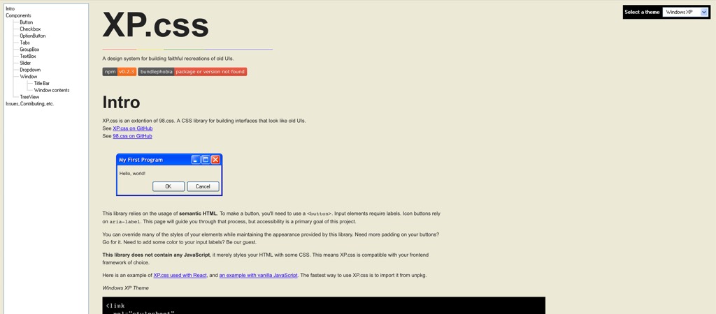
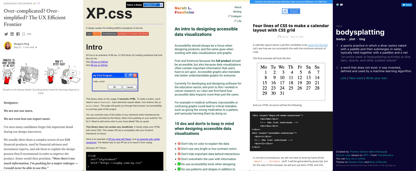
Remember 98.css, a CSS library for building interfaces that look like Windows 98? Meet XP.css, an extention of 98.css. to bring back the XP style!!
Interesting article
#UX #Complexity #Expert Users
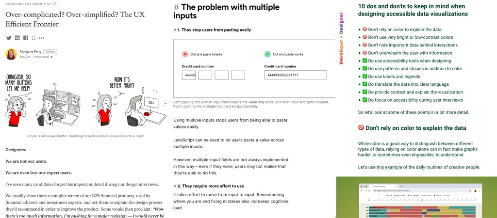
Over-complicated? Over-simplified? The UX Efficient Frontier, Morgane Peng talks about an unexpected Design x Finance theory to help us better design for expert users
#UserResearch
“Using Trello for User Research Synthesis” interesting if you want to gain time in synthesis & kind of already know the main directions it will go when you start the research. I feel more comfortable writing on paper but it might work for you
#Form #Inputs
“Form design: multiple inputs versus one input” by Adam Silver. Interesting take on the problems of masks as well! As usually, I would advice to test a solution when you can to make sure it doesn’t create usability issues.
#Accessibility
“Ten things to improve conference call accessibility” Watching for background noise is a really good point in my case, my low attentions span gets lower on video conferences. I left a webinar because the host had a wind pipe behind him and I could not concentrate on anything he was saying. I’m hyper sensitive to noise and background repeating noise is that worse. May I add “be careful with things that move behind you” like fans? Again, people with short attention span might have issues concentrate if something is moving every 2 secs, a little bit like automatic sliders on a website haha (but they could hide your video while muting the person who presents with the wind pipe noise is more complicated)
#Accessibility #Dataviz
“An intro to designing accessible data visualizations” great advice by Sarah L. Fossheim
News in the industry
#CSS
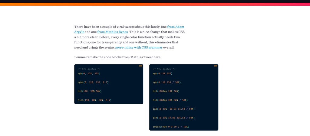
“ No-Comma Color Functions in CSS ” I like this idea because I tend to forget some of those commas but the /50 % at the end takes some getting used to but you can also still use the old 0.5 syntax: rgba(0, 128, 255, 0.5) -> rgb(0 128 255 / 50%) hsla(198, 28%, 50%, 0.5) -> hsl(198deg 28% 50% / 50%)
Tutorials
#CSS
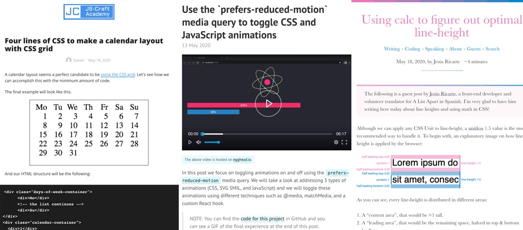
- “Four lines of CSS to make a calendar layout with CSS grid” this is amazing, remember how annoying it was to create those with floats?
- Using calc to figure out optimal line-height by Jesús Ricarte
- “Deep Dive into CSS Grid” a long article that presents the CSS Grid spec properties
#Accessibility
- Accessible Images For When They Matter Most
- “Use the `prefers-reduced-motion` media query to toggle CSS and JavaScript animations” this is nice for people who might have motion sickness issues with animations. Note could just reduce them instead of totally disabling them.
Useful tools and resources that will make your life easy
#Machine Learning
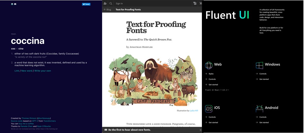
This is what happens when you let a machine learning algorithm invent and define words and it’s quite fun and impressive. Can we keep the relaxationist?
#Typography
Text for Proofing Fonts, a little bit more complex than the quick brown fox but way more efficient to test fonts
#DesignSystem
Microsoft has a design system called Fluent UI to bring consistency to all the platforms
#Happynews
Tired of all the gloomy news? Here are selected happy news from all around the world <3
