Pixels of the Week – November 19, 2023
Improve UX research reports, don't disable buttons and enjoy an open source survey tool!
On Twitter, LinkedIn, and Mastodon, I share curated articles I read, resources and tools about UX Design, User Research, UI and mobile design, HTML, CSS, the web industry, some processes, some inspiration, etc. This is an archive of everything I shared this week. And some extra links that I decided to only share for the blog readers. Also, subscribe to the newsletter to get notified when those are published!
Now: what I’m currently up to
I’m speaking next week in Malaga at Wey Wey Web and running my Designing adaptive reusable components & pages workshop. I think there’s still a few tickets left if you are around! I’ll be honest with you, I’m looking forward to the talk and workshop, but, after 3 weeks of rain here, I’m also looking forward to the sun and enjoy it with the participants! Also, I’ll bring some stickers, if you are around, come and say hi!!
TL; DNR: the one you should not miss
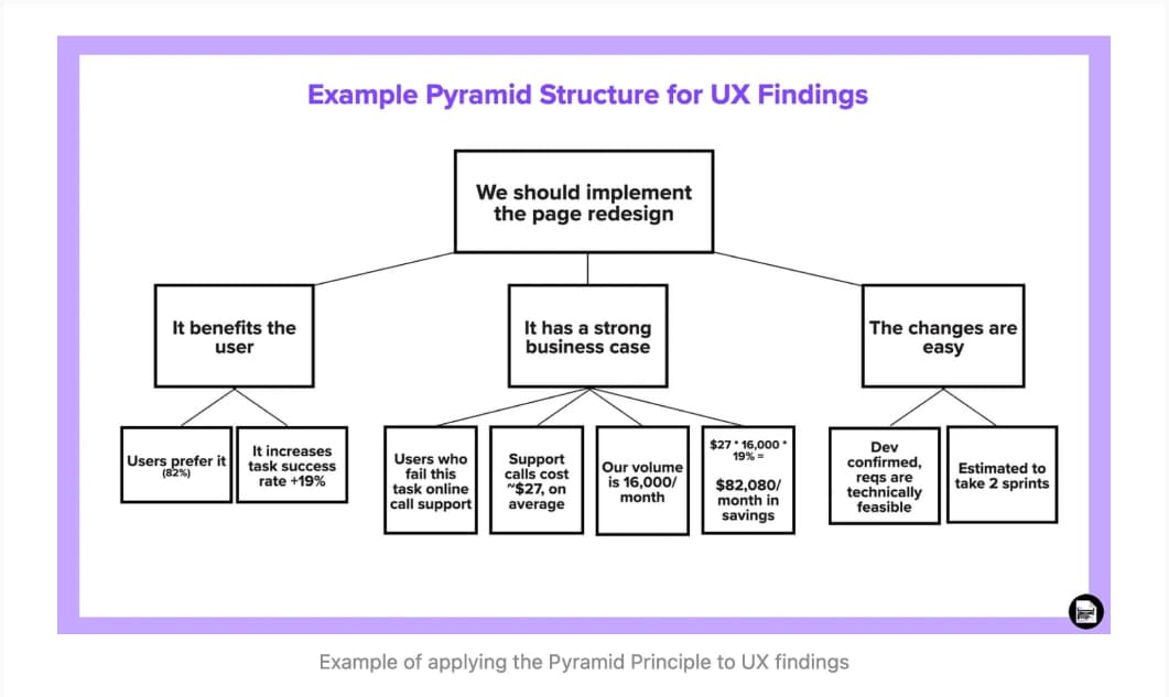
How to make better UX research reports (7min) great tips by Thomas Stokes to craft reports that help communicate your findings and recommendations effectively and persuasively to your stakeholders and colleagues. Love the idea of applying the Pyramid principle to organize findings
Interesting articles that caught my attention
UX, process, and UI
- My process when starting a new job very important tips by Amy Hupe when you start with a new client. It’s important to emphasize that you can’t and should not be expected to deliver value right away. You need time to listen, understand and absorb information!
- Never, ever disable buttons — Why not? (9min, maybe paywall) I’m not a big fan with absolutes, like, “never”, but still, very compelling arguments on why disabling buttons is rarely a good idea. I’m recently removed those from our tool too, same issue, we made users guess what the rules behind it were, and it was annoying (and more development) by Daniel Berryhill
- Guide to Concept Testing: Overview, How-to & Examples (17min) introduction to different concept testing methods, how and when to use each, how to introduce follow up questions, mistakes to avoid, etc (via vitaly)
Accessibility and Disability
- Creating Inclusive AI: A Strengths-Based Approach to Accessible Design (7min) By Dr Maria Panagiotidi. Avoid the deficit based perspective on disability and go for a strength based approach to design more inclusive intelligent systems. Involve users with disabilities, co-design, empower them and conduct usability research that help understand their lived experiences. Also, I don’t think those only applied to the design of AI systems, but for any product you want to make more inclusive.
- Creating Accessible UI Animations (13min) from user research to adapting to reduced motion preference, a nice tutorial full of examples to help you adapt your animations for who might need less motion. I like the idea of classifying them into unessential (to be removed) and essential (that needs adaptation) by Oriana García
- Totally remdom, or How browsers zoom text (5min) Some OS and browser will resize text in px too, but, not all, so keep using relative units (rems). Still, interesting tests by Manuel Matuzović
- Why Aren’t Disabled Astronauts Exploring Space? (10min) we need to be wary of technoableism and look at intersectional, cross-disability communities for expertise, and for creative visions of a future that cuts no one out. Disabled people have unique skills and perspectives to contribute to future space missions successful.
- Front end devs really don’t understand accessibility (6min) different flavors of comments on hackernews, from people who don’t understand accessibility to pure ableism, collected and answered by Chris Ferdinandi
- How long until your website is accessible? (8min) Karl is spilling some hard truth here, people want solutions, not an audit with list of problems to fix, and accessibility experts need to be more proactive in helping to fix those.
- To hell with the business case (5min) Matt May explains why trying to sell accessibility and inclusion, using business cases isn’t the right way and not working
Curiosity cabinet: non-design/tech rabbit holes I enjoyed
Are you Maiden Mother or Crone? I’ve got this song stuck in my head, and, it works, like, the lyrics work so nicely.
Inspiration: fun experiments, beautiful art, and great ideas
The 30 Goofiest New MN State Flag Design Submissions: it’s always fun and strange when they ask people to redesign the flag of their state. If you want to scan the whole 2000+ submissions, be my guest.
Useful tools & resources
- Monaspace a superfamily of fonts for coding, that comes with 5 fonts, 3 variable axes (640k styles in total) and a bunch of very nice code ligatures. That’s, hot. Yup.
- Formbricks: an interesting open source survey tool. The free version has up to 2500 users / month and some logics in the fields. You can also self host it, which is nice for privacy.
- Atlas Politica a live, visual news site on global news, geopolitics, conflicts and more.
Tutorials
- Don’t Use Fixed CSS height or width on Buttons, Links, or Any Other Text Containers (6min) it’s an accessibility mess, and often a localization one as well. By Ashlee M Boyer.
- How To Design Useful and Usable Focus Indicators great tips to help you design useful focus indicators that are also accessible (and when a focus indicator is needed)
- 13 HTML Attributes You Should Know About Any new one you never heard of in the list? (by Shefali Jangid)
- Use the accessibility shortcuts on iOS to speed up your testing workflow some quick useful settings (by Eric Eggert)
Latest news in the industry
CSS prefers-reduced-transparency: all you need to know about adjusting your UI to people who prefer en opaque UI (might cause headache for some people for example). I love we get more CSS to respect user’s preferences (by Adam Argyle)