Pixels of the Week – October 16, 2022
Every day, I share on Twitter and LinkedIn a list of curated articles I read, resources and tools about UX Design, User Research, UI and mobile design, HTML, CSS, the web industry, some process, some inspiration, etc. This is an archive of everything I shared this week.
#Now – what I’m up to
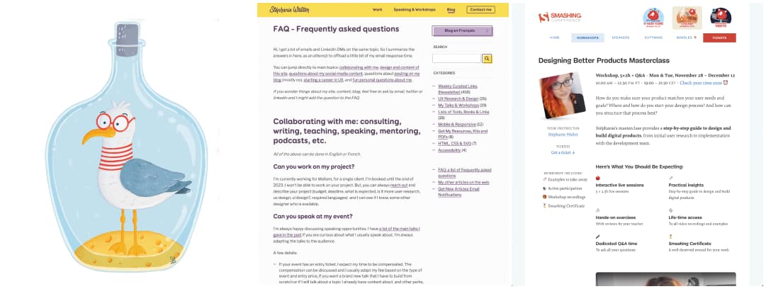
This Friday, I recorded a “Spooky Halloween SEO horror stories” podcast with Myriam and Jack where I tell the listeners all about the shady SEO people trying to sneak into this blog. It will be published on October 31, stay tuned! I also finished my Steve Seagull illustration, and decided to order transparent stickers! I also prepared a FAQ on my site, to answer some questions I got a lot. Take a look if you are curious. Or send me a fun question to add to the last part.
If you want to learn how to build better products, from user research to information architecture, content modeling, building reusable components and usability testing, I got you covered. You can grab a ticket to my 5×2 hours master class that starts end of November!
Next week, I will be in Nantes, for the devfest, talking about accessibility. If you are at the conference, come and say hi. I will bring stickers.
TL;DNR the one you should not miss
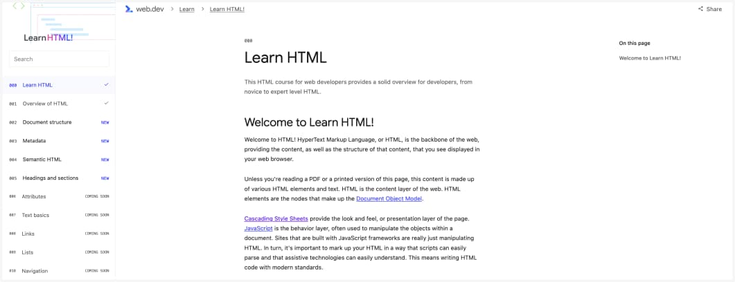
In case you missed it, Estelle Weyl started writing a whole course that will teach you all you need to know about writing HTML
Interesting article
#Design
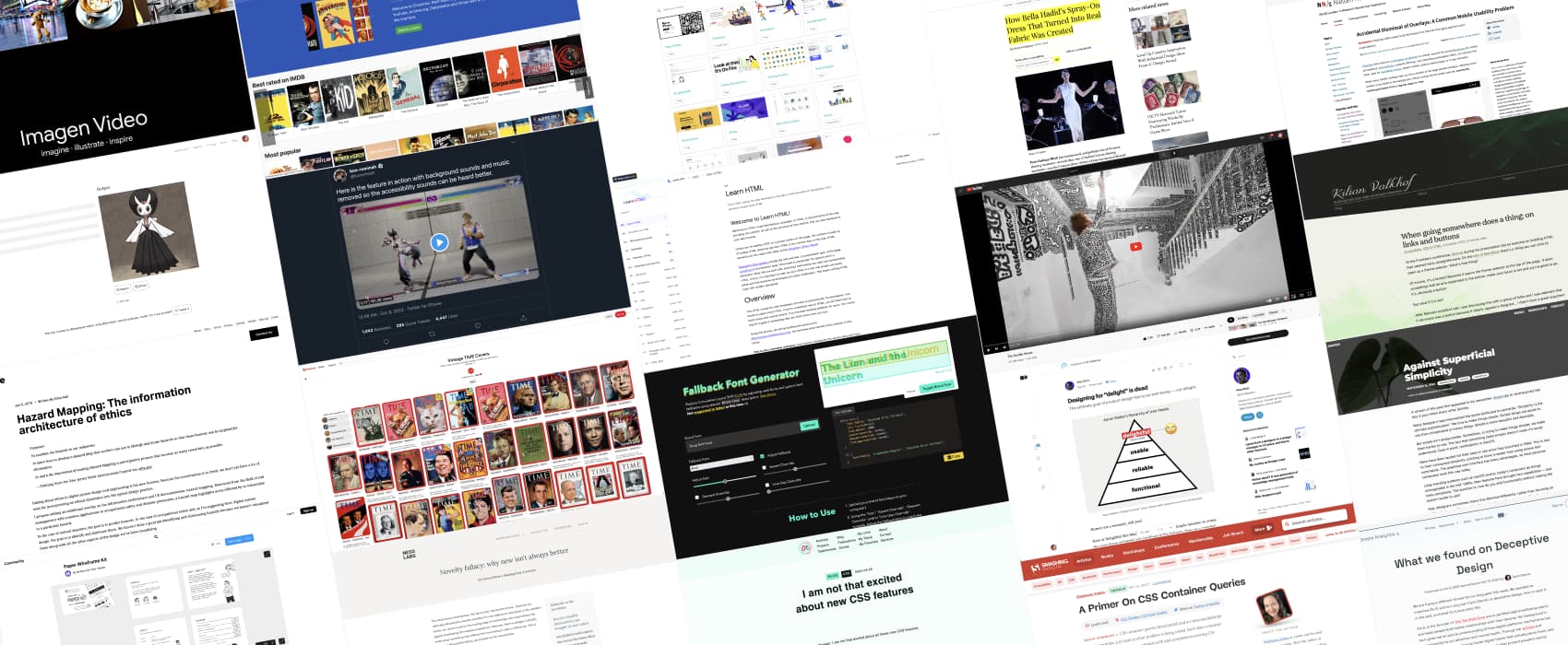
- What we found on Deceptive Design: very interesting interview of Clo founder of This2ShallGrow on deceptive design patterns, what they are, how to spot them, etc.
- Since I work in enterprise UX, the whole “delighting the users” felt quite off to be honest. I really love the sarcastic introduction here and the idea of designing for well-being, on top of functional, reliable, usable.
- In praise of single-purpose devices. I work mostly in enterprise UX, in my world, users want one tool, to do it all. So, the idea of “single purpose devices” is quite intriguing for me. I also wonder about the cost, in terms of money, but also, space in a flat. What do you think?
- “Sometimes, in trying to make things simpler, we make them harder to use. The fact that something looks simpler doesn’t mean it’s easily understood.” couldn’t agree more: Against Superficial Simplicity
#HTML #Semantics
When going somewhere does a thing: on links and buttons, button vs link, it’s not always that binary, what about anchor links?
#CSS
- A few interesting points about all the excitement and hype around the new CSS features
- Everything you need to know about CSS container queries, oh yeah, by, another awesome Stephanie (Stephanie Eckles)
#Psychology
We all love shiny new things, but it’s important to make sure we take rational decisions to avoid falling prey to the novelty fallacy. You will find interesting strategies to avoid that in this article.
#Risk Management
The interesting concept of “hazard mapping” to map the different risks (for example data privacy, abuse/target attack, attention hijacking) of your website (by Erika Hall)
#Mobile UX
Overlays can cause a lot of usability issues on mobile, here’s some examples and what designers can do to build better overlays that match user expectations
#Motion Sickness #GreenIT
I know people do that to save energy on their site, but sites like this one, using some kind of low def pixelated images are a nightmare for me. When I scroll, all the points on the images move and it triggers the motion sickness. I’m not trying to be mean or anything, just pointed out that sometimes, you might not foresee that some things you put in place might damage the experience of some people.
Inspiration, fun experiments and great ideas
#Fashion
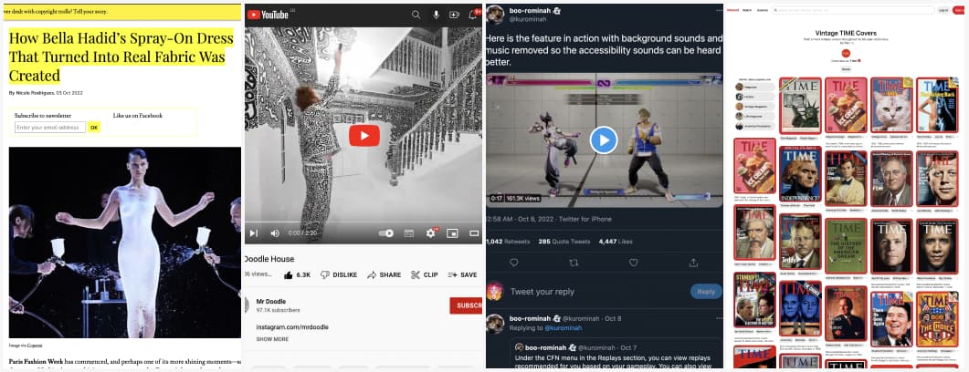
Ha, I was curious about that:”How Bella Hadid’s Spray-On Dress That Turned Into Real Fabric Was Created”
#Inspiration
A fun video: the doodle house
#Accessibility
Some interesting demo of accessible fight game
#Inspiration
TIME’s most notable covers throughout its 89-year-old history.
Useful tools and resources that will make your life easy
#AI
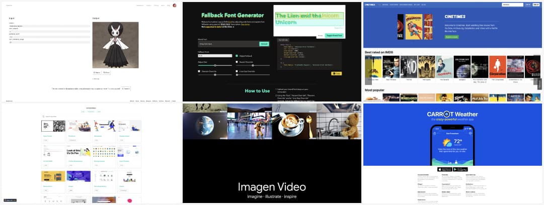
I played with the text-to-pokemon generator and it’s actually cute. So this would be “Stéphanie Walter”, as a pokemon
#Illustrations
A collection of 80+ places to find free illustrations for you next project
#Font #Performance
Fallback Font Generator: a cool tool to help you define some adjusted alternative for fonts to reduce the CLS (cumulative layout shift)
#AI #Video
Imagen Video: in case you missed it, Google launched a tool to generate videos based on text prompts. I kind of like the strange over saturated aesthetics of some of those examples
#Movies
#CLI
Do you ever type git marge instead of merge? I got a fun script for you: git-marge on github.
#Wireframe
In case you need some paper looking wireframe kit in Figma, here we go
#Apps
Meet Carrot, the weather app with voice dialogs and hilarious personalities you can chose from
News in the industry
#NFT #Finance
Oh, interesting: if NFTs are actually closer to stocks, and considered to be securities, should they follow the same disclosure rules?
