Pixels of the Week – September 1, 2024
Experts vs. imitators, the 20/80 rule for accessibility & Figma UI3 tips
My curated weekly-ish online newsletter, where I share interesting articles, tools, and resources I found during the week. You can expect content about UX, design, user research, accessibility & tech, but also some processes, some inspiration, sometimes books, and a couple of videos and podcasts. Also, don’t forget to, subscribe to the newsletter to get notified, you will get the weekly links directly in your mailbox, and be notified when I publish other articles.
Now: what I’m currently up to

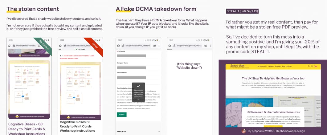
This week’s I’ve shared on LinkedIn, Mastodon and TwitterX that I’ve discovered that a shady website stole my content, and sells it. I’d rather you get my real content, than pay for what might be a stolen free PDF preview. So, I’ve decided to turn this mess into a something positive, and I’m giving you -20% off, on everything in my UX Template Shop. until Sept 15, with the promo code STEALIT.
Most popular content this week
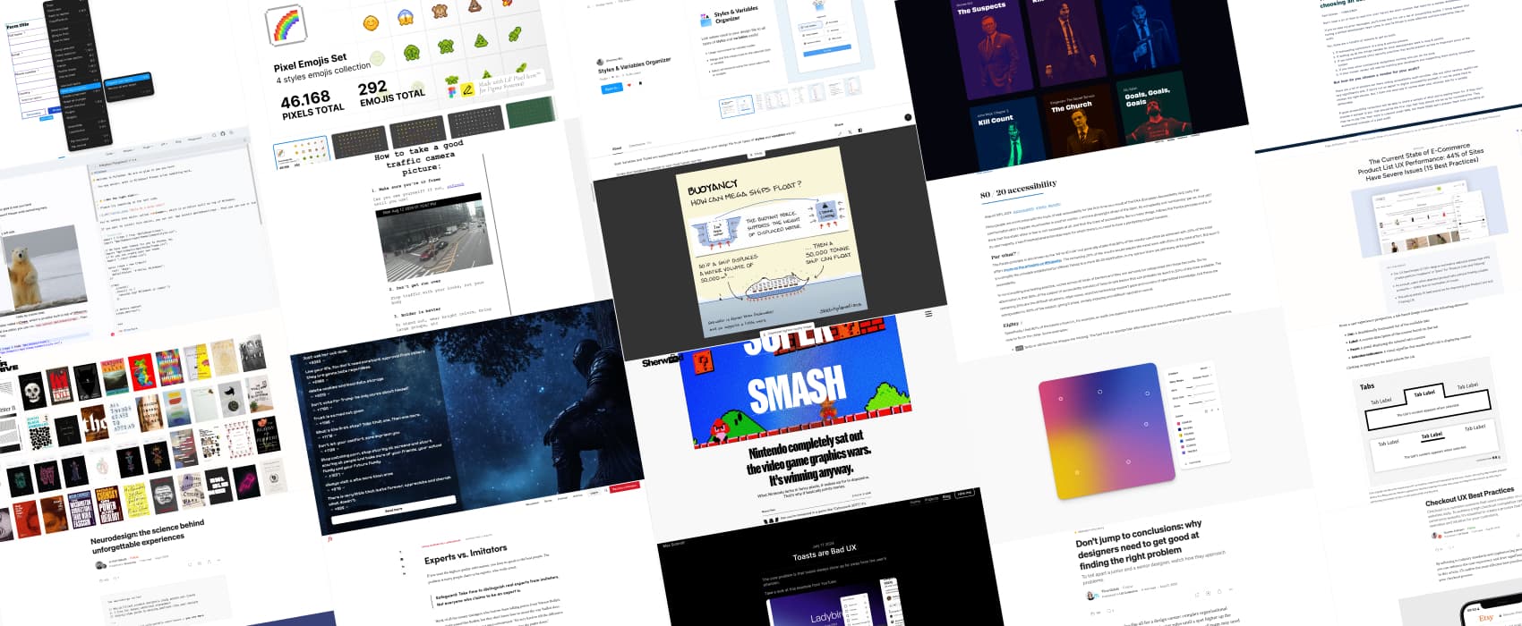
Experts vs. Imitators (4min) Not everyone who claims to be an expert is. Take time to distinguish real experts from imitators. Also, remember that the person with real expertise is often not the person who made the subject popular, but, popularizers often get mistaken for experts. Sadly, this is even more true on LinkedIn. A lot of people are good at fluff, the surface level, summarizing content, but then, get mistaken for an expert. I would not call them imitators, more like. It gets worse with AI. By Farnam Street
Interesting articles that caught my attention
UX design and research
- Tabs, Used Right (16min) Tabs are everywhere, but do you use them properly? Distinguish between types of tabs, design them for visual clarity, and structure their content for usability. by Evan Sunwall
- Don’t jump to conclusions: why designers need to get good at finding the right problem (6min) on how you can’t expect the same things from juniors and seniors, yet a lot of companies expect juniors
- Toasts are Bad UX (3min) by Max Schmitt “The core problem is that toasts always show up far away from the user’s attention.”. Yup. I blame bootstrap and material UI for making this “better than noting feedback mechanism” popular.
- Neurodesign: the science behind unforgettable experiences (7min) a few examples on how different brands use neuroscience: by focusing on emotional impact, personalization, anticipation, and rituals. By Jo Ash Sakula
- Checkout UX Best Practices That Help You Achieve High Completion Rate (7min) in case you are working on an ecommerce website, you’ll find, by Eugene Arkhipov. And for more ecommerce advice, I recommend you also check The Current State of E-Commerce Product List UX Performance (15 Best Practices)
- Nintendo completely sat out the video game graphics wars. It’s winning anyway. (13min) What Nintendo lacks in fancy pixels, it makes up for in dopamine. They focused on accessibility, fun, innovative gameplay, and didn’t even try to compete in the graphics war. And, it works.
Accessibility
- 80 / 20 accessibility (7min) 80% of the subject of accessibility consists of fairly simple basics that can probably be learned in 20% of the time available. The remaining 20% are the difficult situations, edge cases, assistive technology support gaps and corners of specialized knowledge, but these are extrapolated to 100% of the subject, giving it a bad, anxiety-inducing and difficult reputation overall. So basically: start with the 80% that are easy to fix! By Marcus Herrmann
- The most important thing to look at when choosing an accessibility auditor (6min) ask them to provide a sample of deliverable, to make sure they don’t just offer a list of issues, but also guidelines to help you fix those.
Curiosity cabinet: non-design/tech rabbit holes I enjoyed
Why Italy Fell Out of Love With Cilantro this makes me sad, I imagine we could have had cilantro pesto and all.
Inspiration: fun experiments, beautiful art, and great ideas
- Website Turns Traffic Cameras Into Photobooths on the Street the project provides access to 900 city traffic cameras that live stream. People can go on the site on their mobile, pause, and get their “selfie” from the traffic camera. I love such creative projects.
- You Have Already Visited This Website visit, leave some advice, read other people’s advice, then, continue your journey (via Cassidoo’s newsletter)
- Visu when dataviz and the love of movies meet, George Hatzis creates infographics on film, television and sport’s finest moments. For example: kill counts for John Wick (which weapon, etc) joke counts for MCU, etc.
- Book Cover Archive for my fellow book lovers, a very nice collection of excellent book cover designs
- Buoyancy – Sketchplanations You need to know that buoyancy is one of my favorite words in the English language, because of the way it sounds. It’s also a fun concept to understand how ships float.
Useful tools & resources
- Styles & Variables Organizer a plugin to clean up the mess with styles and variables, that lets you merge them, link them to each other and so much more.
- Pixel Emojis Set yes you absolutely need a set of pixel emojis (292 icons in total) in Figma!
- Milkdown A plugin driven framework to build WYSIWYG Markdown editor.
- Image to Mesh Gradient: I love gradients. This is a nice little tool that lets you create meshed gradients with different options.
Tutorials
- Assessing components and patterns for WCAG 2.2 (5min) small decisions trees to help you understand the new WCAG 2.2 criteria and how to test / implement at component level. This includes alternatives to dragging interactions, proper target sizes, focus not obscured, consistent help placement, avoiding redundant data entry, and allowing pasting during authentication. (by Mike Gower)
- 8 Figma tips for UI3 (8min) those are really nice tricks, the “follow prototype” to know in which artboard you are when debugging a prototype and the “ignore auto-layout” for overlay are going to be a life changer for me. Thanks Allie Paschal
- Basic keyboard shortcut support for focused links (6min) what you need to know if you ever have to recreate links with JavaScript, in terms of expected keyboard behavior. But, if you can avoid and use a real link, do it. By Eric Bailey
- Pushkeen.AI in case you need inspiration for push notification design