Pixels of the Week – September 11, 2015
Every week I post a lot of my daily readings about Web, UI and UX Design, mobile design, webdesign tools and useful ressources, inspiration on twitter and other social networks.
This week’s selection: a lot of really nice articles with some data about the burger menu usage, how to use underline on the web, cards interface design, checkboxes and alert use, the myth of the “mobile web”, how to avoid animations that might cause nausea. Don’t miss the cute cartoon in the inspiration section and the really cool CSS Demos.
TL;DNR the one you should not miss
#Mobile
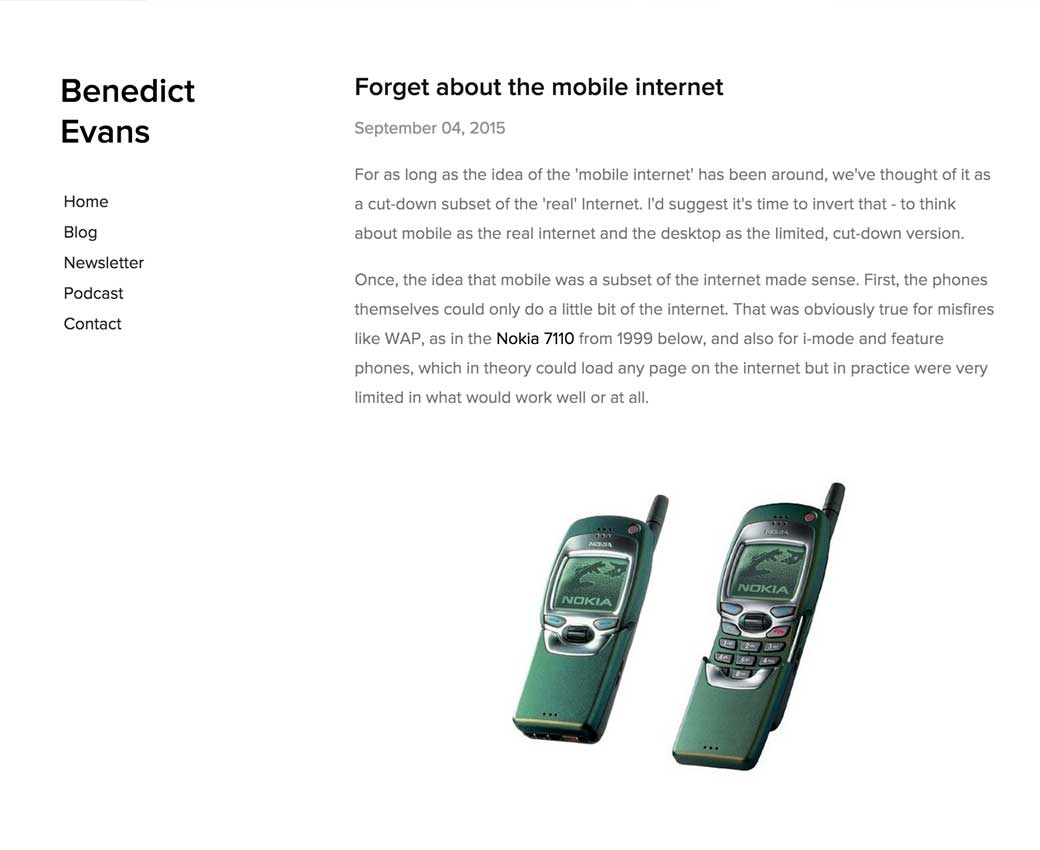
“Forget about the mobile internet” Tldnr: there’s no “mobile internet”, just the internet with universal access
Interesting article
#Burger menu #Eyetracking
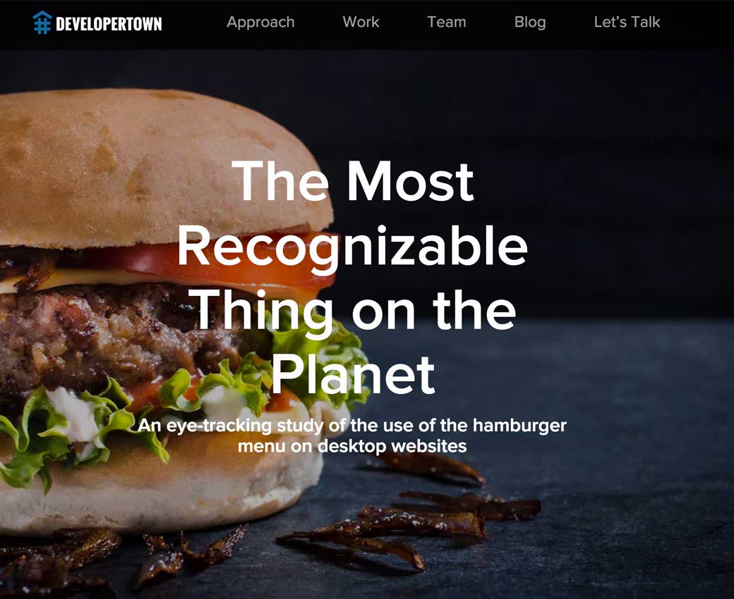
Yeah, some tests: The Most Recognizable Thing on the Planet – An eye-tracking study of the use of the hamburger menu on desktop websites
#Usability
The underline at the intersection of UX design and usability
#Cards
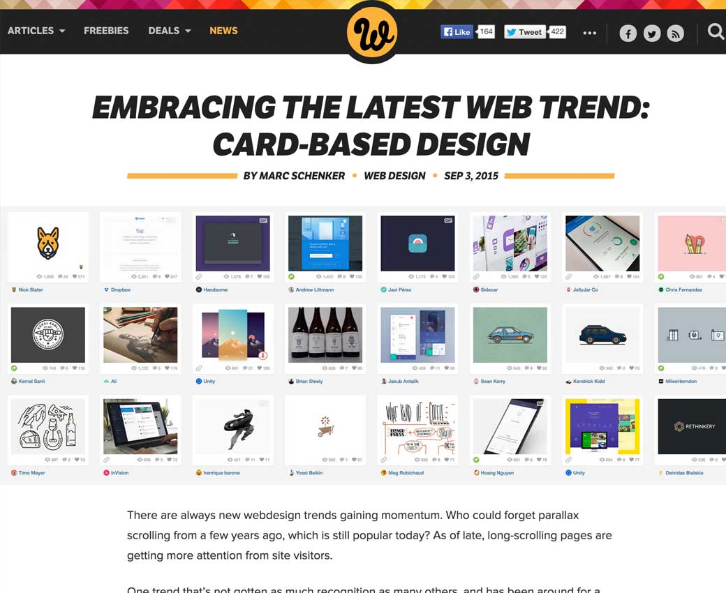
Kind of like the visual of card design, but it’s pretty complicated when you can’t predict the amont of content :/
#Usability
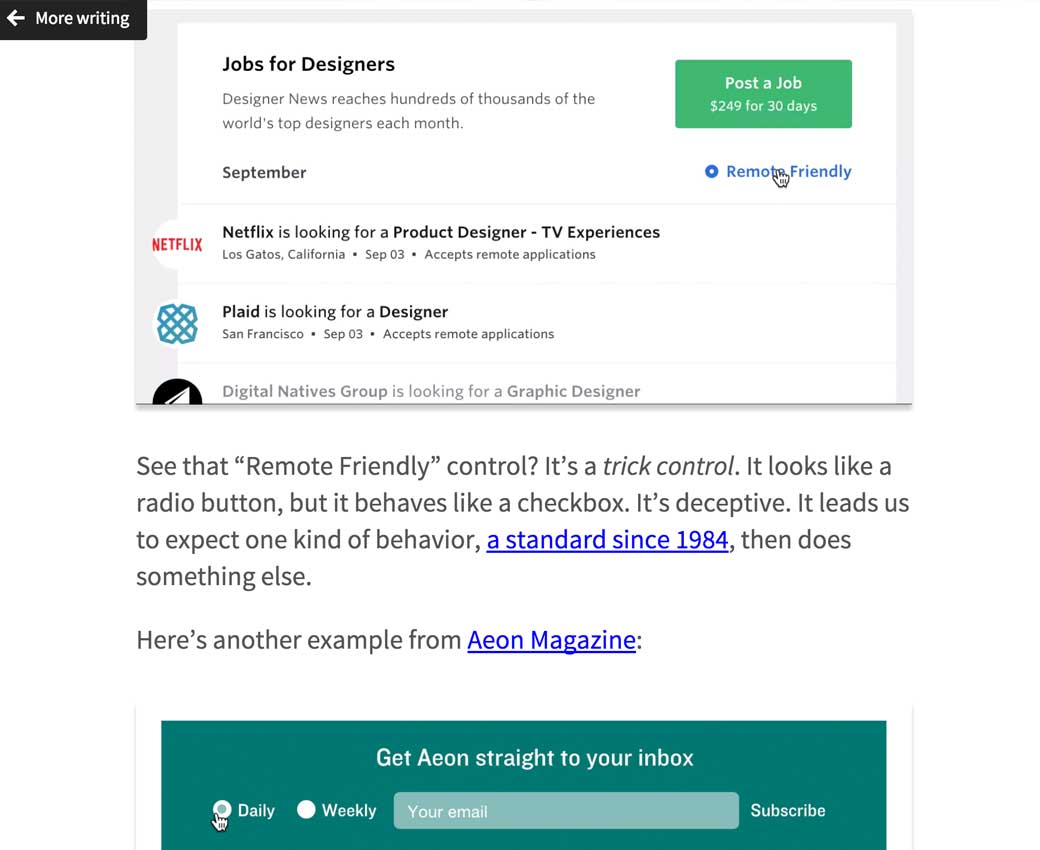
Checkboxes Are Never Round, on perceived affordances
#Navigation
Audience-Based Navigation: 5 Reasons to Avoid It (and a few tips if you need to make the work for your site)
#Animation
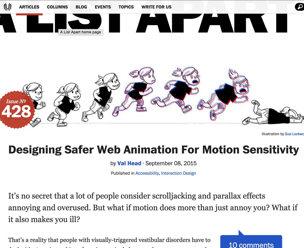
Designing Safer Web Animation For Motion Sensitivity
#Design
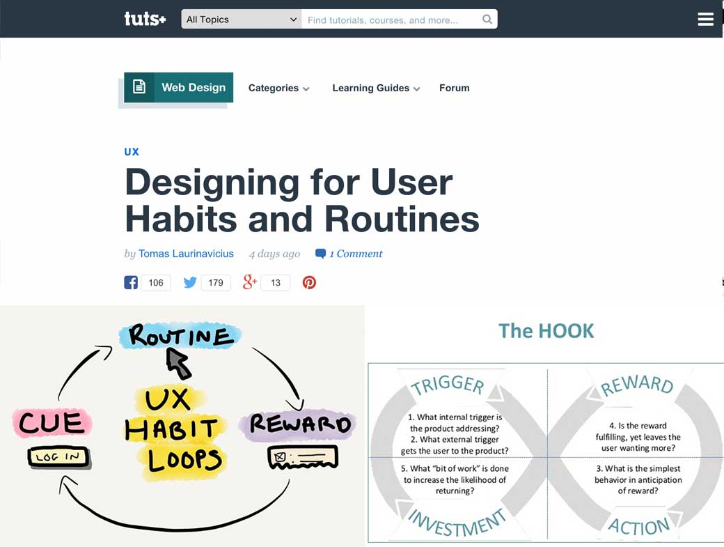
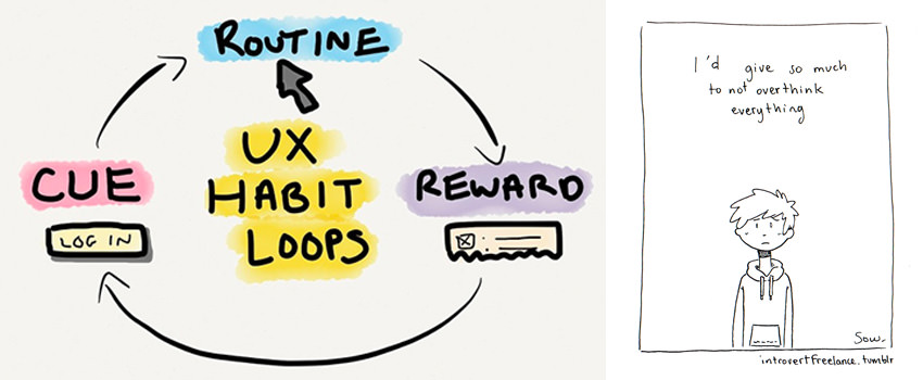
Designing for User Habits and Routines
#Design #UX
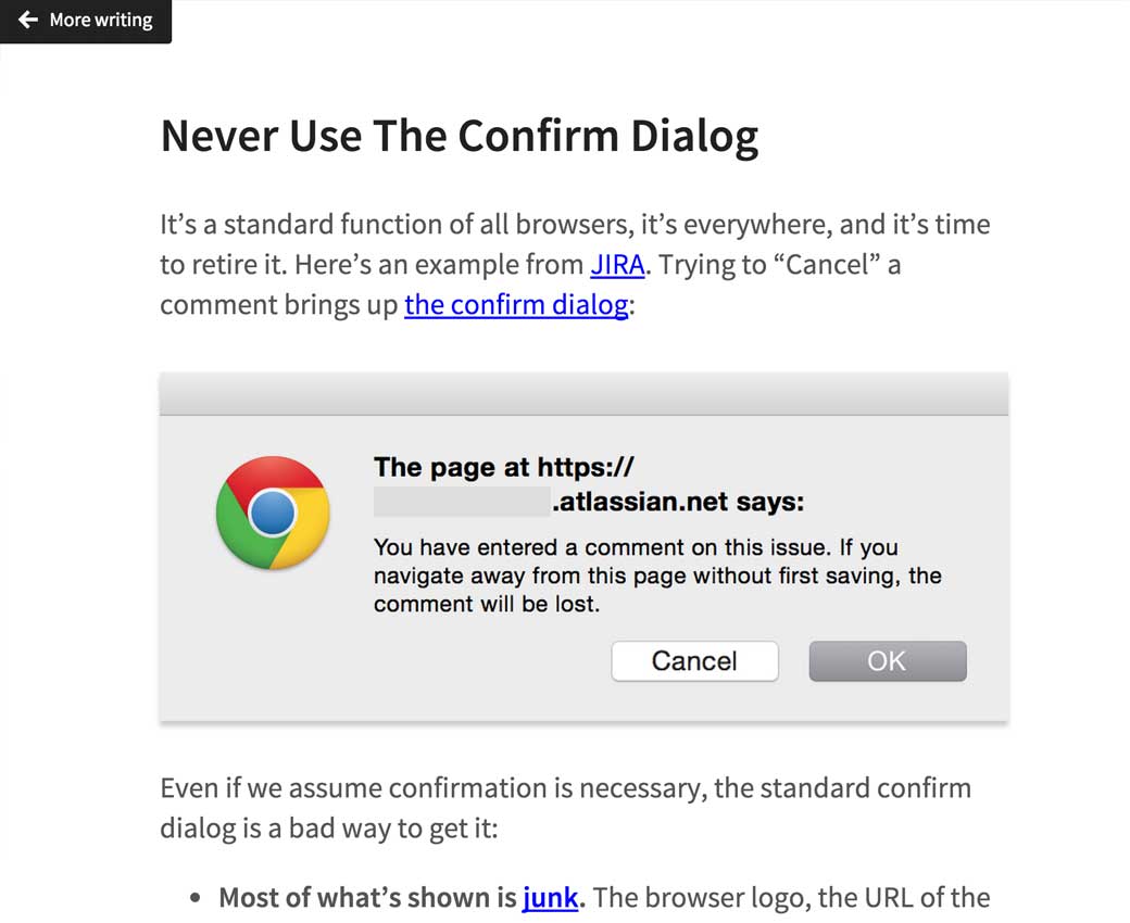
Never Use The Confirm Dialog (aka alert box)
#Inspiration
#Typography
7 Golden Rules of Combining Fonts for Mobile, you can remove the mobile part, those apply to any site ^^
Designer news
#CSS #W3C
Yeah, there’s a proposal for CSS transitions between pages (Editor’s Draft)
Tutorials
#HTML5
Principles Of HTML5 Game Design
Useful ressources, tools and plugins that will make your life easy
#Browser
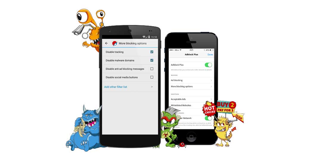
So adblocker browser is out. Could be interesting especially when you travel since data roaming is so expensive :/
Fun, games, experiments and demos
#CSS
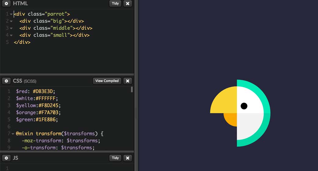
Cute parrot CSS hover animation demo
#CSS
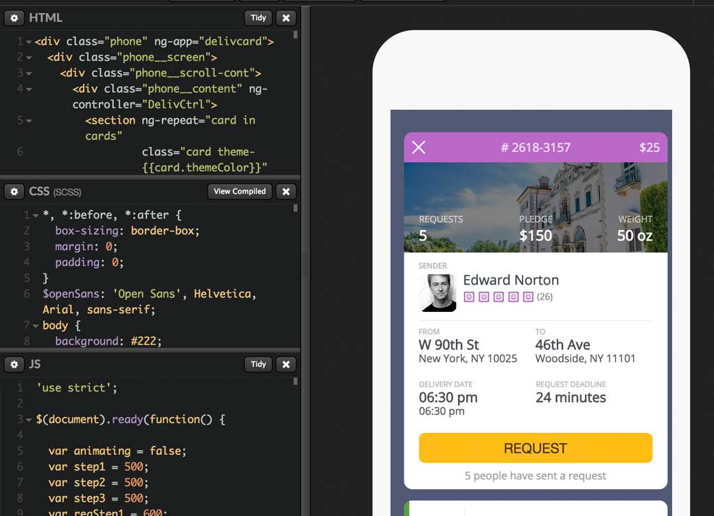
Nice demo of the day: Delivery Card
