Pixels of the Week – September 24, 2023
Real space food, the comic latte color and some cool UX resources
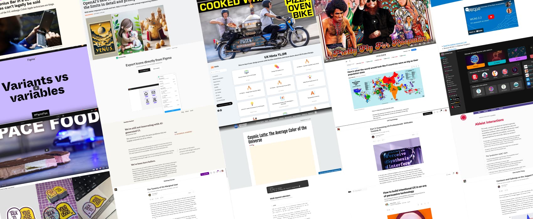
On Twitter, LinkedIn, and Mastodon, I share curated articles I read, resources and tools about UX Design, User Research, UI and mobile design, HTML, CSS, the web industry, some processes, some inspiration, etc. This is an archive of everything I shared this week. And some extra links that I decided to only share for the blog readers. Also, subscribe to the newsletter to get notified when those are published!
Now: what I’m currently up to

Next week, Myriam and I are facilitating a workshop on user interviews, in French, at ParisWeb. She is also giving a talk on biases in SEO research. I decided she needs some tentacle earrings with glitters and glow in the dark vinyl, so here we go, full reel on Insta.
I’ve also had some glitter “talk to your users” stickers printed. I’ve added those on my sticker page, in case you want to order some. I’ve also restocked some stickers and prepared some custom order for a few people. It’s very fun to be able to bring digital artwork to physical format.
TL; DNR: the one you should not miss

UX Hints: a couple of PDF small bite size resources and cheat sheets around design, accessibility, user behavior, UX research and more.
Interesting articles that caught my attention
Design and user research
- The Tyranny of the Marginal User (8min) an essay on why products get worse over time: they are designed to cater to the marginal user. Someone with short attention span and no tolerance for complexity. Meanwhile, features that appeal to more sophisticated users are removed in order to maximize the number of users who keep using the app.
- The “Most Advanced Yet Acceptable Products (MAYA) Win (10min) successful products are designed to be both advanced and acceptable. They strike the right balance between the novel and the familiar in design. This means that they should be innovative, but also easy for people to understand and use.
- Multi-layered calendars (10min) interesting concept of a calendar the goes into multiple layers and dimensions. It kind of speaks to me because I use my calendar as a giant todo list and my mail box too
- How to build intentional UX in an era of persuasive technology (14min) we need to consider the ethical implications of our work. And intentionally design experiences that promote critical thinking and mindful decision-making.
Accessibility and handicap
- Ableist interactions (6min) how a product launched a “production ready” code that is not accessible, and their community went full ableism on the accessibility experts who pointed this out. I wish this was an exception, but it sadly happens too often.
Artificial intelligence
- Centaurs and Cyborgs on the Jagged Frontier (11min): a study on how AI helped people work more productively on certain tasks. BUT, for more complex tasks that are AI can’t come up with a correct answer, people overly relied on the AI and performed more poorly. They let the AI take over, instead of using it as a tool. He called this “falling asleep at the wheel”, and it can hurt human learning, skill development, and productivity.
- Part 2: Examining UX Professionals’ Attitudes Towards AI (10min) This study suggests that UX professionals are cautiously optimistic about the future and mostly willing to accept AI in their work as long as the appropriate regulations are in place and risks are mitigated. Organisations should invest of reducing risk and educating UX professionals on new technologies to address their concerns and increase the acceptance of AI tools.
- We’re still not innovating with AI-generated UI. (6min) Especially when so-called “production ready” code is making what gets built not accessible. And, we continue to not solve the same problems that we largely conjured out of no where.
Curiosity cabinet: non-design/tech rabbit holes I enjoyed
Real space food vs fake space food: important information you didn’t ask for, but, like, it’s fun to know what astronauts eat.
Inspiration: fun experiments, beautiful art, and great ideas
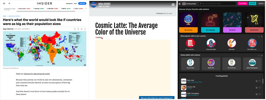
- Here’s what the world would look like if countries were as big as their population sizes: interesting dataviz, and no, I’m not even trying to find my country on the map, haha (data is from 2015 though)
- So, the answer to everything is 42 and the average color of the universe is a sad beige called “Cosmic Latte“. Where do we go from here?
- Need some music (or voice) to work in the background? OneStop radio is an internet-based radio platform that lets you access 65,000+ radios from 230+ countries
Useful tools & resources
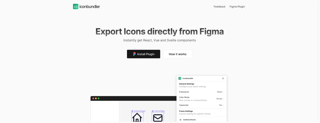
iconbundler a plugin to export icons directly from Figma to React, Vue and Svelte components
Cool and Interesting Videos
- I Built a Bike that COOKS Pizza on its way to You!!! Solving problems, none has, but, this is awesome. And, yup, sounds a lot like tech industry
- DJ Cummerbund – Pretty Fly For Rasputin this, is, well, sorry not sorry, you get to blame my friend Marie Cécile for that.
Tutorials
Variants vs variables: a video tutorial on differences between variants and variables (plus modes), and determine when it makes sense to use each one
Conferences
WCAG 2.2 – An Overview of the New Accessibility Guidelines. A 50min webinar on the new criteria that enhance guidance, especially for two groups: people with mobility disabilities and people with cognitive disabilities
Latest news in the industry
- OpenAI’s new AI image generator pushes the limits in detail and prompt fidelity. This is starting to become impressive. And, I love the potato prompt.
- The Genius Bar in a country where iPhones can’t legally be sold (8min) In the land of the U.S. embargo, Cuba’s Apple technicians are kings.


