Pixels of the Week – December 16, 2016
Every week I post a lot of my daily readings about Web, UI and UX Design, mobile design, webdesign tools and useful resources, inspiration on twitter and other social networks.
This week’s selection: AMP, Facebook Instant Articles and Apple News, decision process, designing with Sketch and Zeplin, Responsive typography, BEM, CSS shorthand syntax, psychology and user experience, font-icon performances, browser storage and user testing. There are also a few CSS, progressive web apps and accessibility tutorials and a repository for meetup video talks.
You can follow me on twitter to get a dose of links every days.
TL;DNR the one you should not miss
#Mobile
Your Guide to Mobile Publishing Formats: AMP, Facebook Instant Articles, and Apple News. So basically we went from mdot sites to responsive. Then we added crap to those responsive sites and made them unusable and slow. So to avoid slow and bad UX we nicely offer our content to closed platforms instead of building performant user friendly sites on our owns. Sorry, I just don’t get it :/
Interesting article
#Decision
Before You Know It: How Feeling Confident Triggers Our Decision-Making
#Process
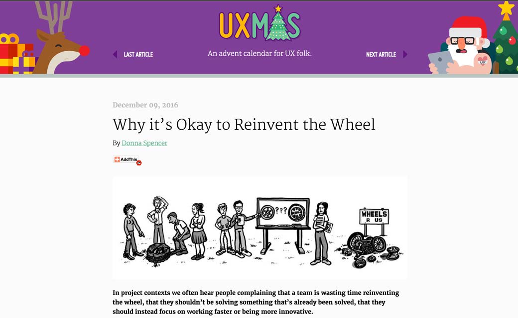
Why it’s Okay to Reinvent the Wheel
#Process #Design
“How to Share a Design System in Sketch, Part 1: Cloud Services”
#CSS
BEM and Maintainable CSS, a CSS method
#CSS #Typography #Responsive
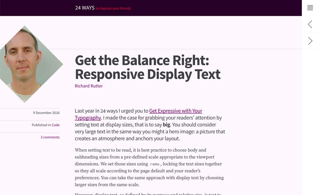
Get the Balance Right: Responsive Display Text. Interesting I wonder if a really big font is still readable on a 24”
#Process
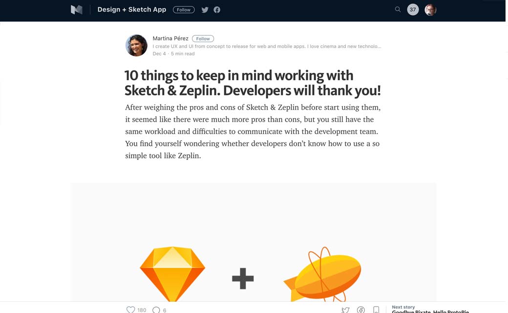
10 things to keep in mind working with Sketch & Zeplin. Developers will thank you!
#Psychology #UX
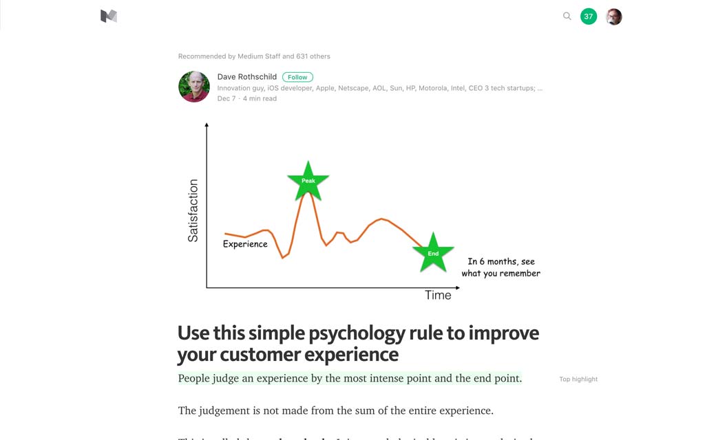
Use this simple psychology rule to improve your customer experience. The peak-end rule: people judge an experience by the most intense point and the end point.
#CSS
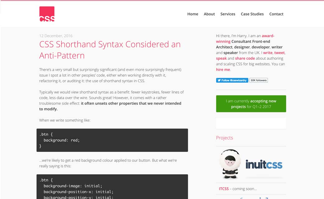
CSS Shorthand Syntax Considered an Anti-Pattern by @csswizardry, some interesting points
#Perfomance Font
Saving the internet 2000 terabytes a day: fixing Font Awesome’s fonts, a few really interesting points in the comments as well
#Usability
#Design #Sketch
5 things to do before starting your next design file in Sketch, some things can be adapted to other design tools
#Data
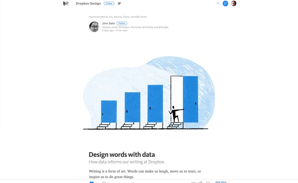
Log in? Log on? Sign in? Sign on? Design words with data, a few interesting tools and techniques
#Storage
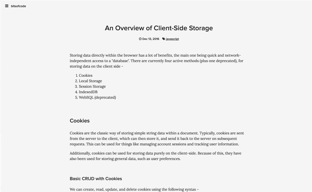
An Overview of Client-Side Storage, excellent article very well detailed on what type of browser storage you can use
#Snapchat #Design
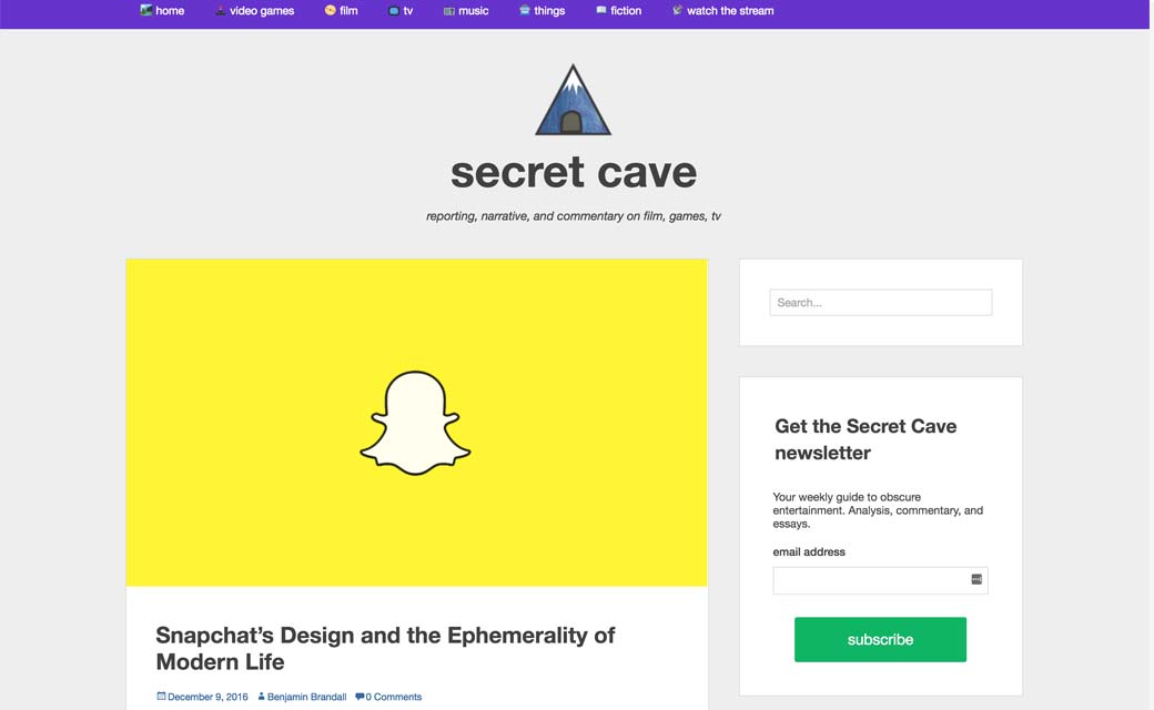
Snapchat’s Design and the Ephemerality of Modern Life — secret cave, interesting read on why Snapchat’s Design is so strange and unconventional
#User Testing
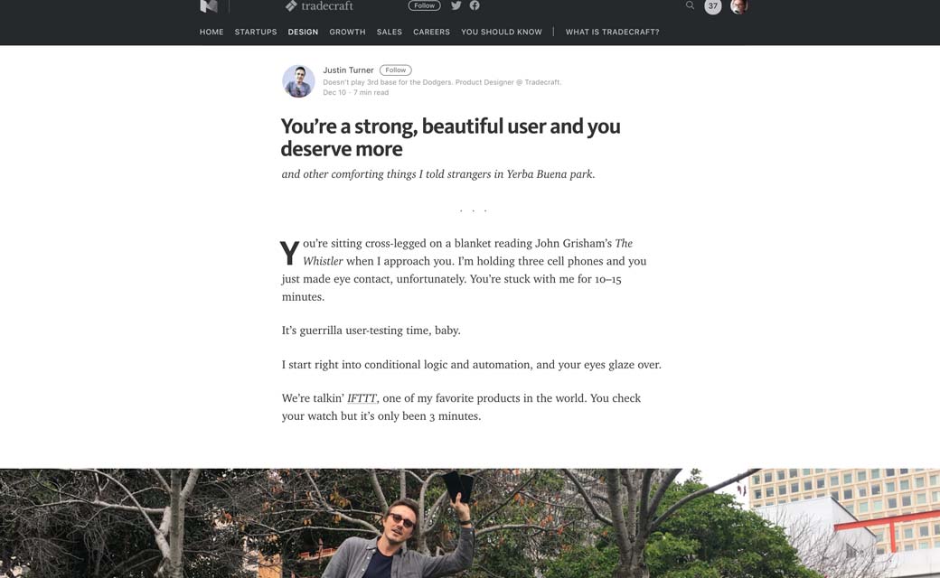
You’re a strong, beautiful user and you deserve more, on guerilla user testing the IFTTT applications
#Process
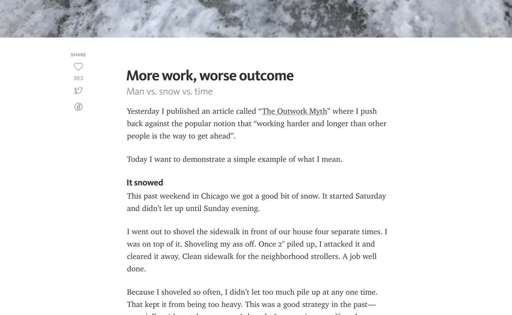
More work, worse outcome a case when it wasn’t about how much, it was about how little when.
Inspiration and Great ideas
#Web History
Jeremy Keith wrote a book called Resilient Web Design on different approaches to web design that have proven to be resilient
Tutorials
#CSS
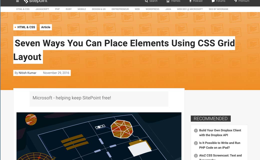
Seven Ways You Can Place Elements Using CSS Grid Layout
#Progressive Web Apps
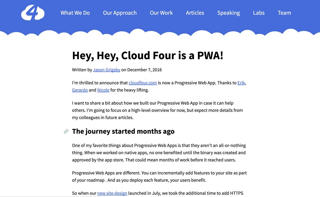
How cloudfour turned into a Progressive Web App with offline, notifications, etc.
#JS #A11Y
Useful resources, tools and plugins that will make your life easy
#Talk #Conference
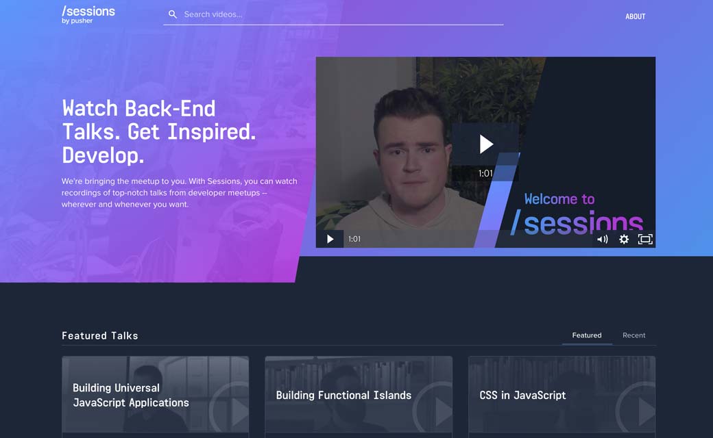
Sessions, an online repository of recorded creative, front-end, back-end talks
#Clients
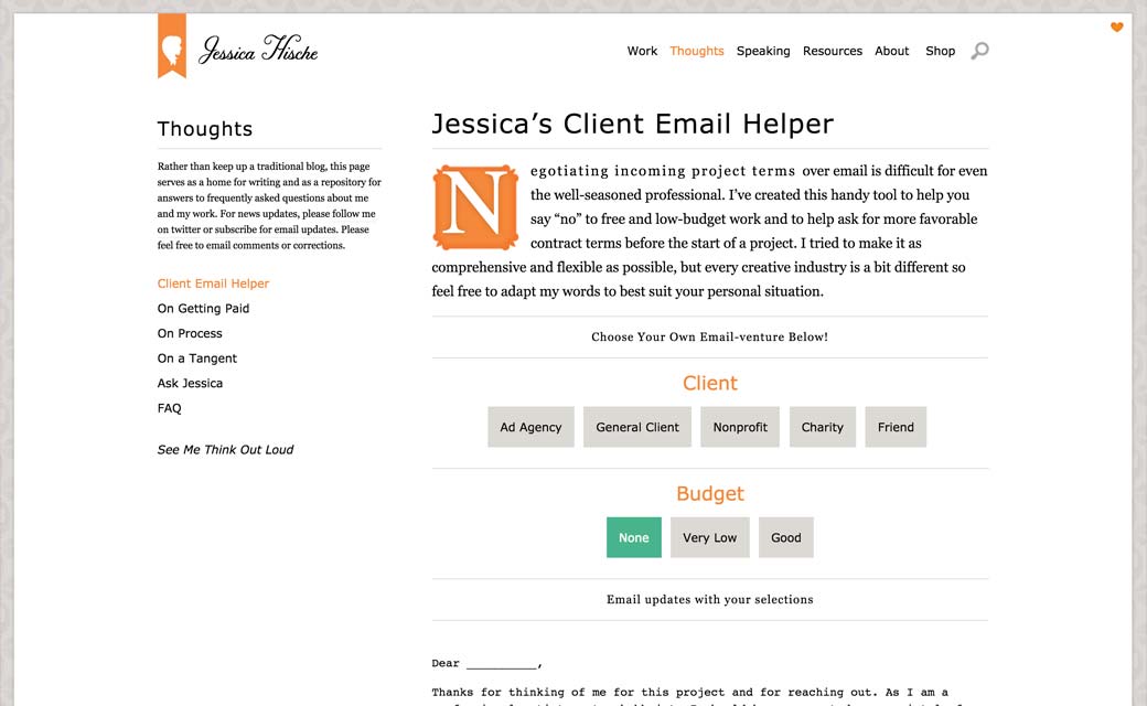
Jessica Hische built a nice tool to help you answer to clients
