Pixels of the Week – December 9, 2016
Every week I post a lot of my daily readings about Web, UI and UX Design, mobile design, webdesign tools and useful resources, inspiration on twitter and other social networks.
This week’s selection: user experience and radio buttons/checkboxes, card UI design, Bauhaus history, design sprint, user testing, CSS and responsive typography, shopping card abandonment, Sketch vs Photoshop on Windows, optimistic UIs and the future of the web. Also some CSS grid layout, an animation tutorial and some progressive web apps with a few CSS and JS demos.
You can follow me on twitter to get a dose of links every days.
TL;DNR the one you should not miss
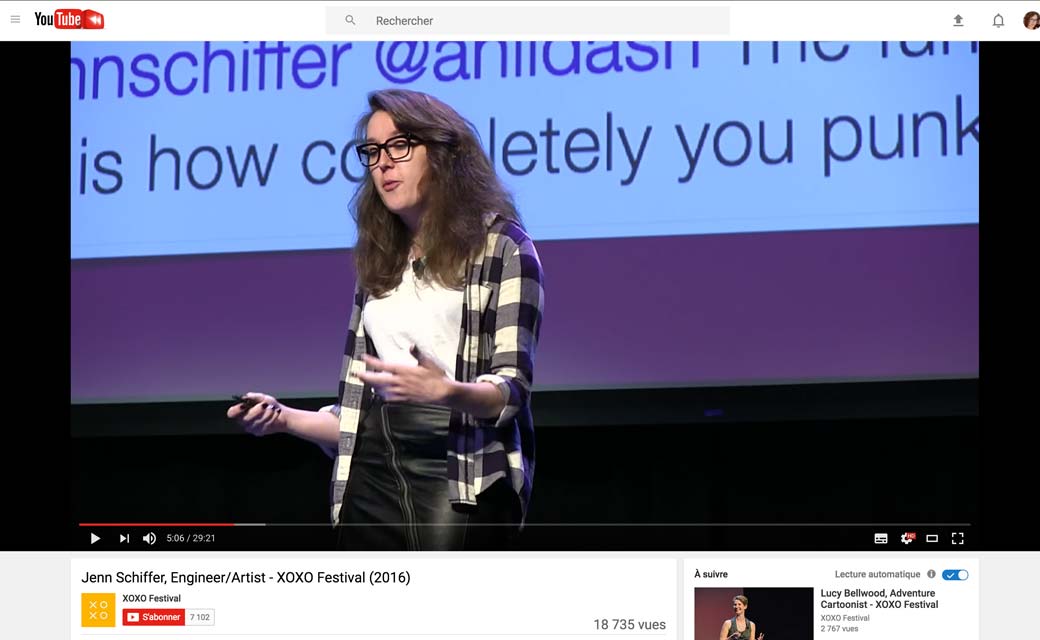
#Talk #Community
“My character is a young web dev blogger who has the confidence of a mediocre white male upper management”, an amazing talk by Jenn Schiffer on trolling and how aggressive our industry can sometimes be
Interesting article
#UX
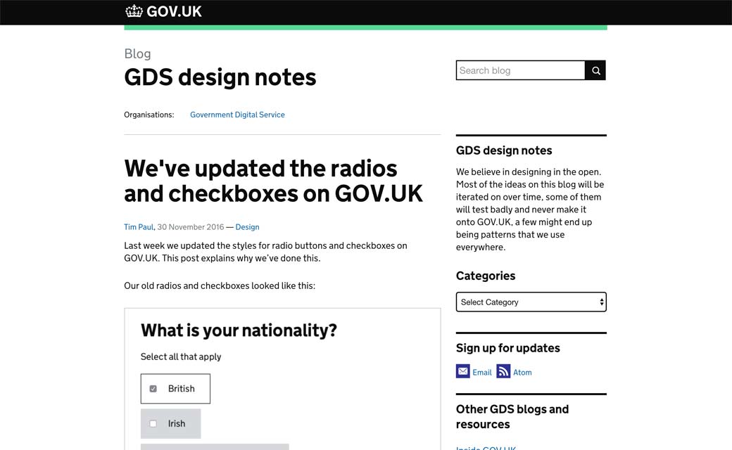
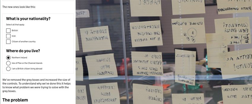
We’ve updated the radios and checkboxes on GOV.UK
#Design
#Cards
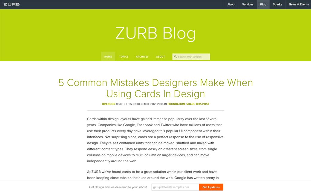
5 Common Mistakes Designers Make When Using Cards In Design
#Design
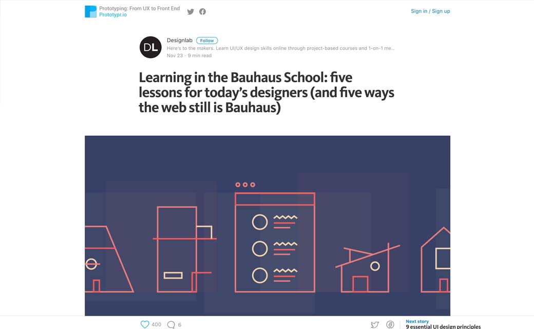
#Design
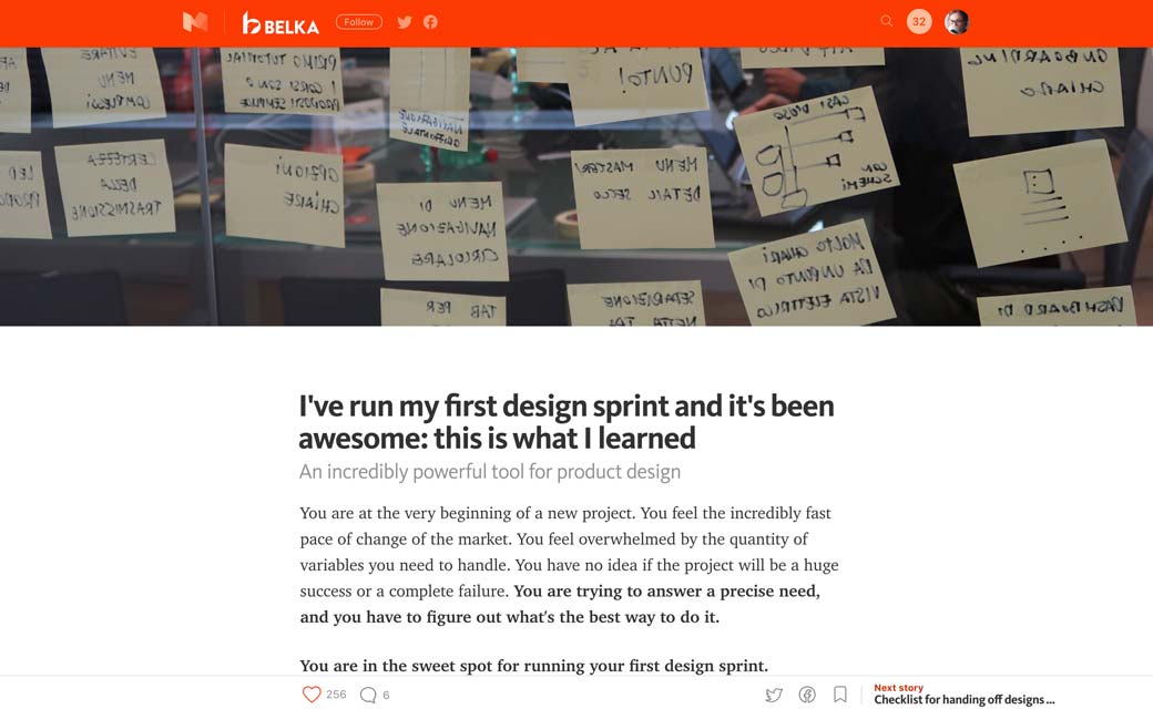
I’ve run my first design sprint and it’s been awesome: this is what I learned
#UX #User Testing
I Sat Through Hours of User Testing Sessions. Here’s What I Learned.
#CSS
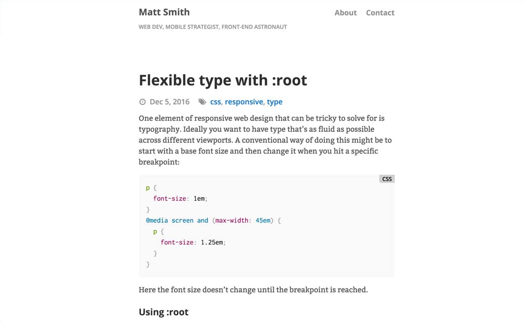
Interesting approach to responsive typography using :root
#Sharing
The Simplest (and Most Performant) Way to Offer Sharing Links for Social Media
#Ecommerce
Proven Tactics to Avoiding Shopping Cart Abandonment
# Sketch #Tool
Three reasons why my (Windows+Adobe) team moved from Adobe to Sketch
#Chatbot
#UX #UI
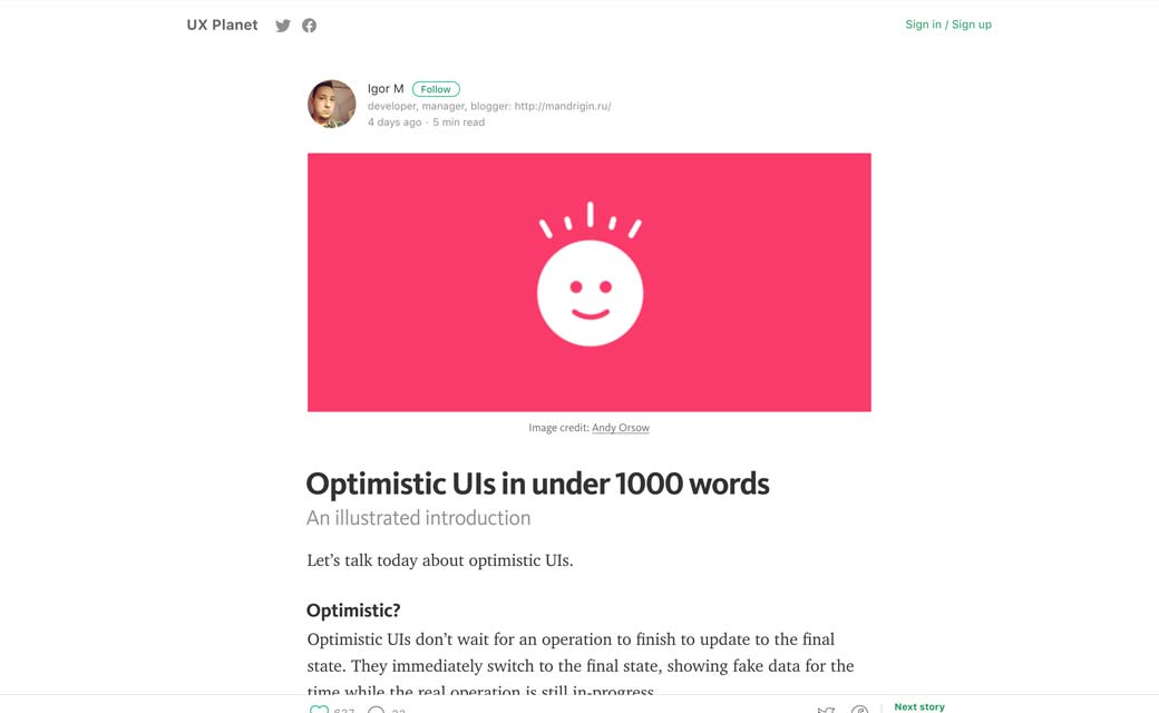
Optimistic UIs in under 1000 words (and how to help perceived performance)
#Future
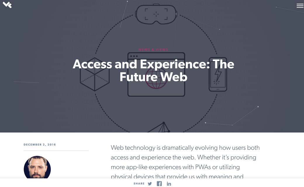
Access and Experience: The Future Web: PWA, physical web and more
#Placeholder
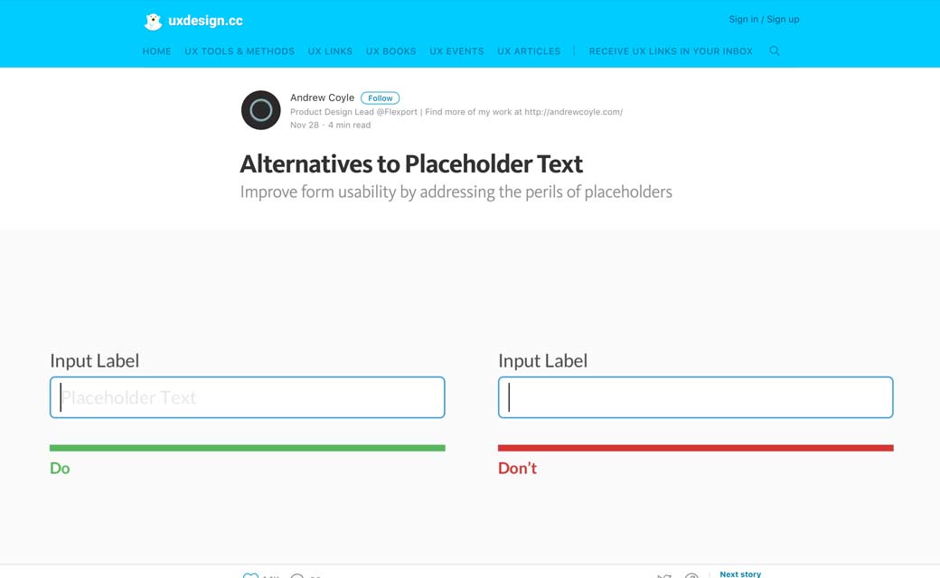
Alternatives to Placeholder Text – The more I read about placeholders, the more I wonder if there’s a legit usecase where they won’t harm users
#Icons
#UI
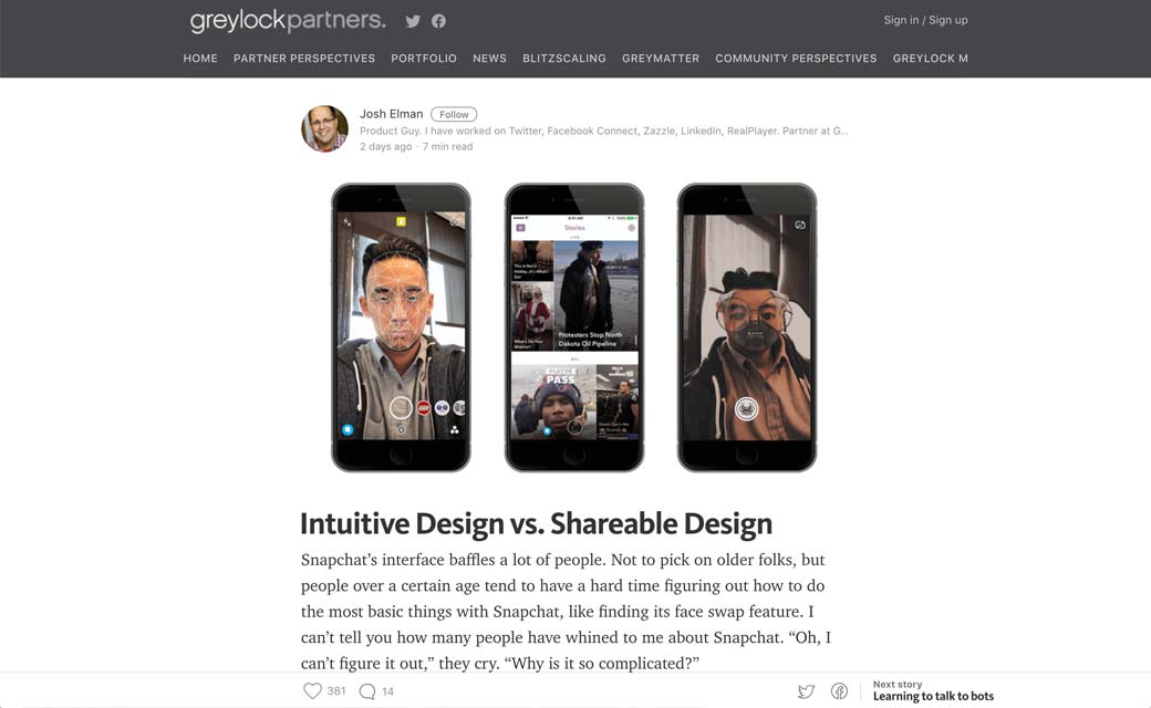
Intuitive Design vs. Shareable Design, So, hum,Snapchat was designed in a non intuitive way to encourage users to share with other users how to use it?
#Forms
How not to design web forms – A somewhat-snarky look at mistakes web designers often make when building forms, with tips on building forms right.
Webdesign news
#CSS
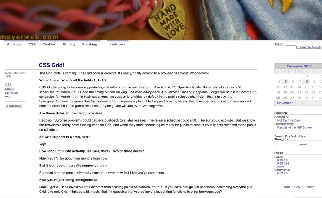
CSS grid is coming in March 2017!! And any browsers that understand Grid will also understand @supports()
Tutorials
#Animations
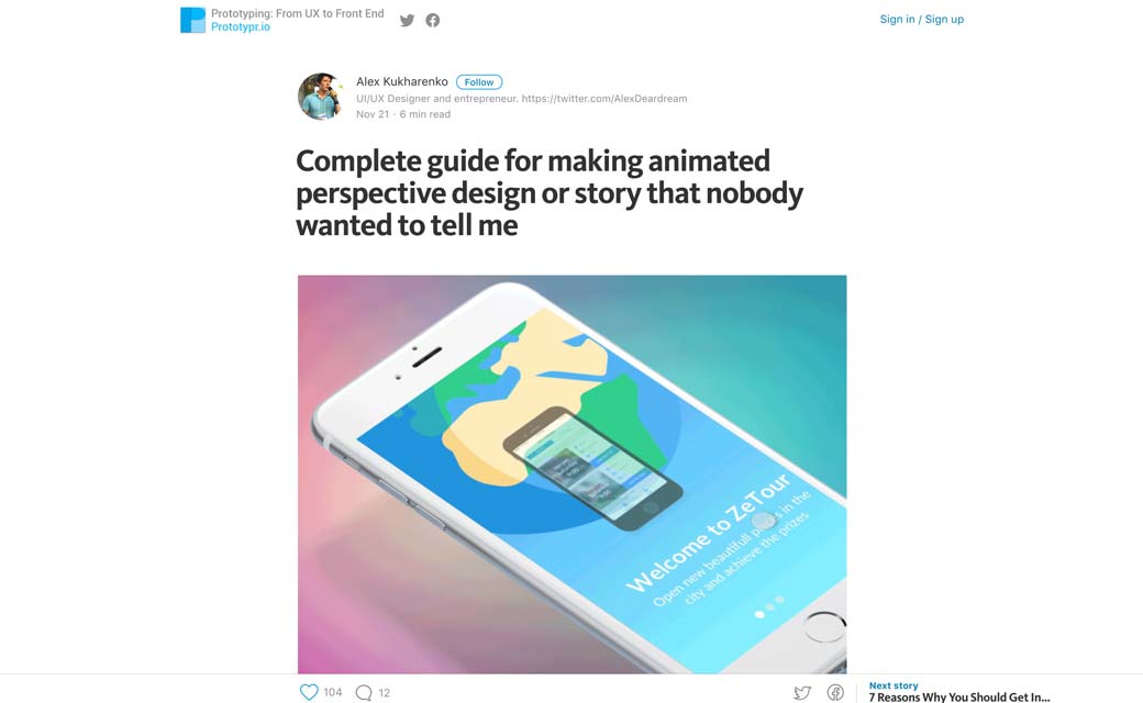
Complete guide for making animated perspective design or story that nobody wanted to tell me, how to make a nice animation using Sketch, Flinto, AE
Useful resources, tools and plugins that will make your life easy
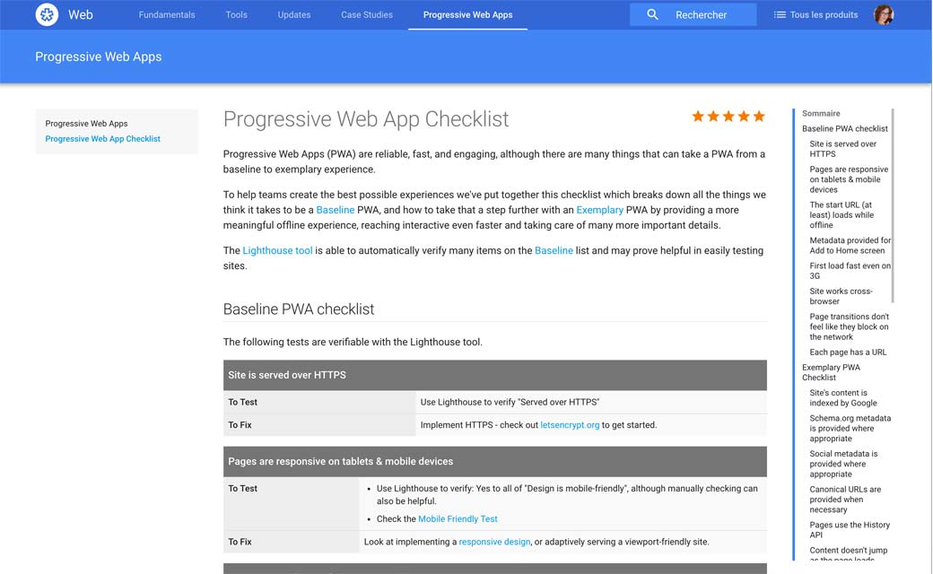
#PWA
#UX
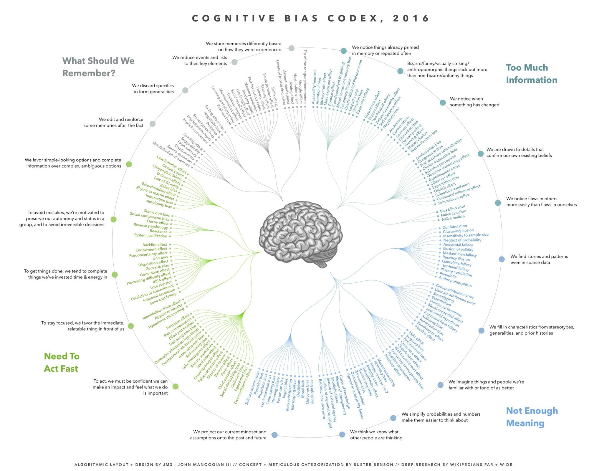
Cognitive bias cheat sheet, a really nice cheat sheet
Fun, games, experiments and demos
#Confirmation #Lol
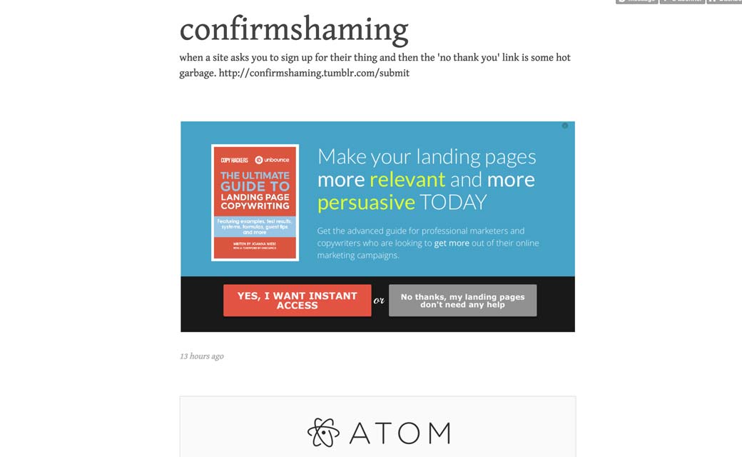
Confirmshaming.tumblr.com when a site asks you to sign up for their thing and then the ‘no thank you’ link is some hot garbage.
#CSS
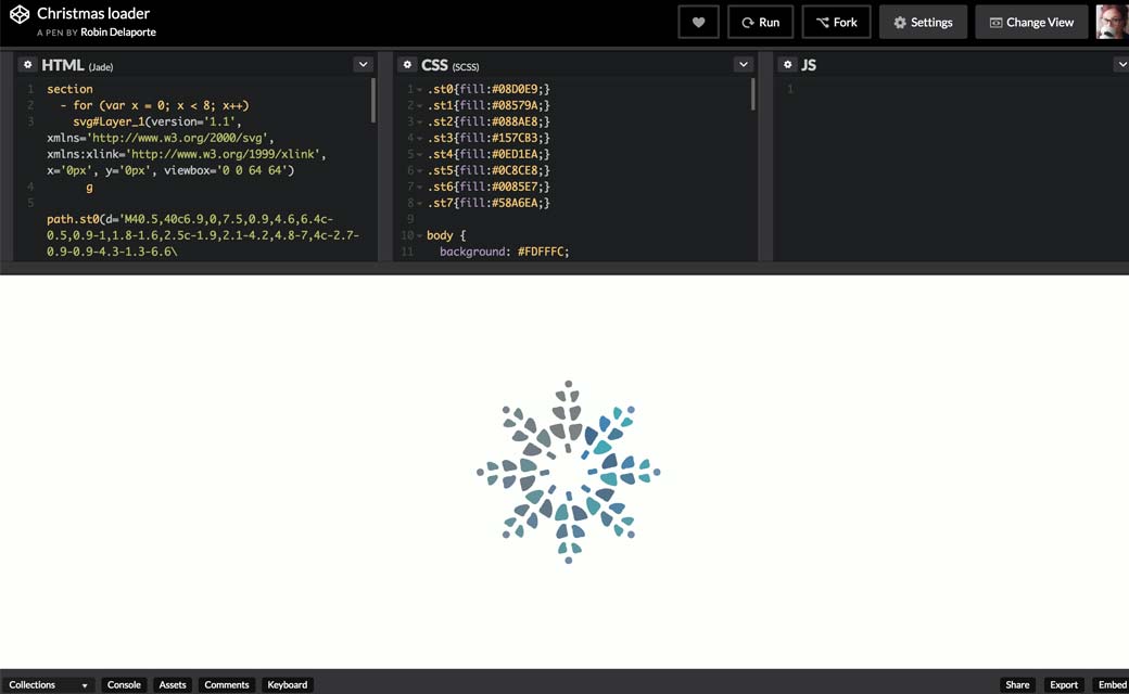
Cute demo: Christmas Loader
#Audio
Musical procrastination level 100
