Pixels of the Week – June 16, 2017
Every week I post a lot of my daily readings about Web, UI and UX Design, mobile design, webdesign tools and useful resources, inspiration on twitter and other social networks.
This week’s selection: modal windows best practises, hated advertising techniques, delete technics, SVG, conversational UI Design, dropdowns guidelines, design process, why you don’t need a mobile app, some really nice principles of visual design, a cute game to teach kids digital citizenship, a few Sketch and Web Components tutorials.
You can follow me on twitter to get a dose of links every days.
TL;DNR the one you should not miss
#Usability #Modals
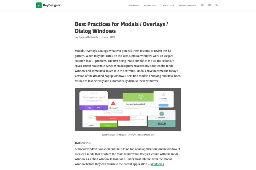
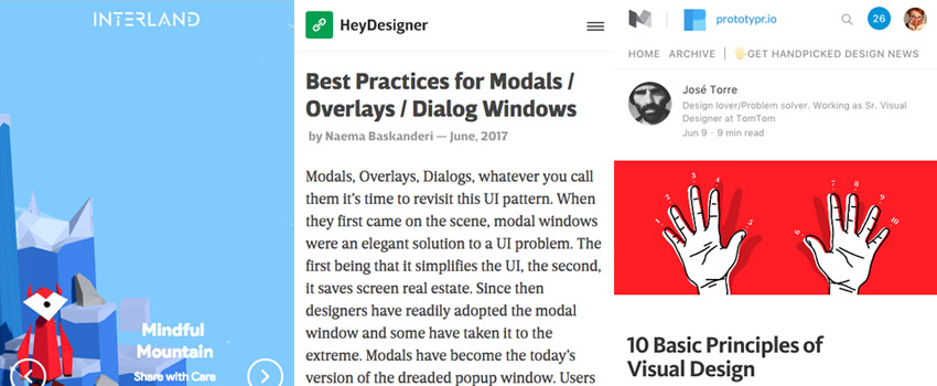
Best Practices for Modals / Overlays / Dialog Windows
Interesting article
#Usability #Delete
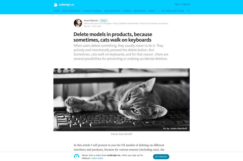
Delete models in products, because sometimes, cats walk on keyboards – a few methods and techniques here
#SVG
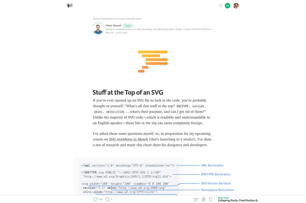
Stuff at the Top of an SVG, and what you can safely delete and what you should leave there
#ConversationalUI #ChatBots
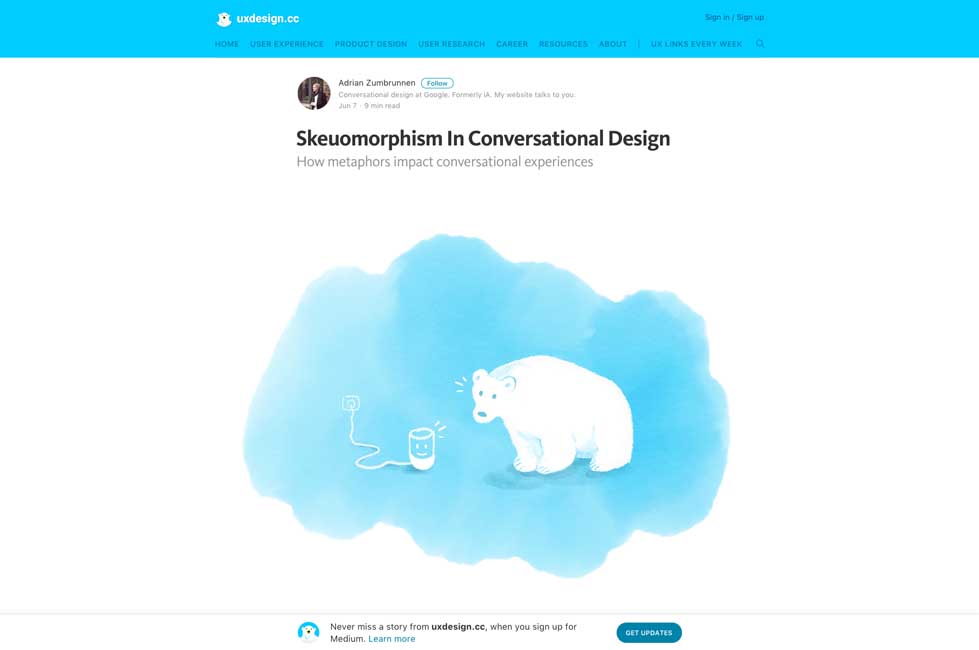
Skeuomorphism In Conversational Design, great read on how to enhance chatbots and conversational UIs
#Design #Committee
Avoiding the Camel, on how to avoid design by committee and gather useful feedbacks instead
#Usability
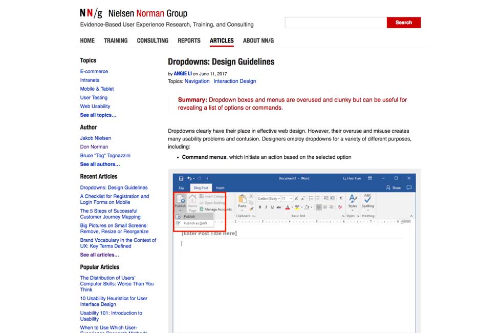
Dropdowns: Design Guidelines by @NNgroup
#Notifications
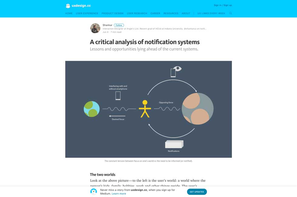
“A critical analysis of notification systems“. Also Android has an option to help you choose which kind of notification you allow
#Design #Process
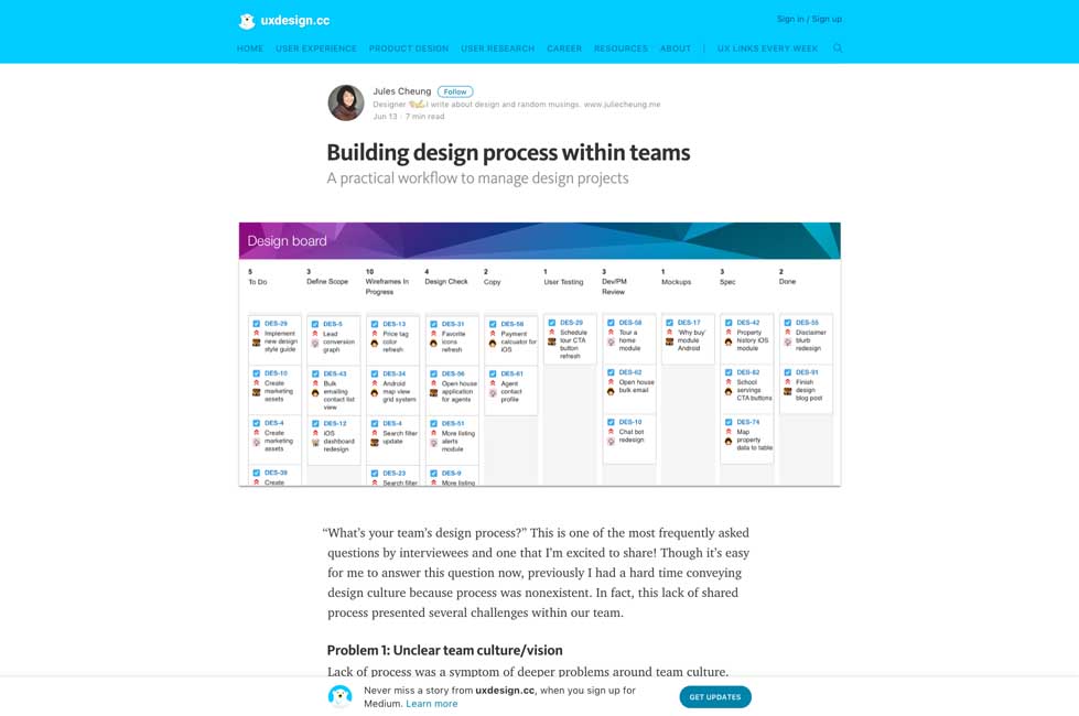
Building design process within teams – an interesting process based on boards and cards
#Mobile
People Don’t Need Another Mobile App
#Design #portfolio
“What delayed my portfolio redesign for 3 years and how I finally launched it” a few good tips
#Design
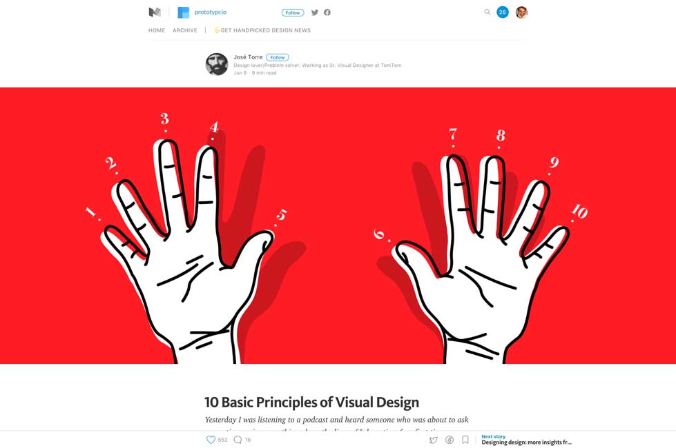
10 Basic Principles of Visual Design explained with small gifs
#UX
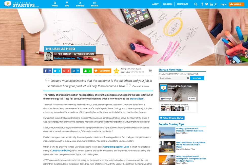
The User as Hero, on storymapping your user’s experience
#Usability
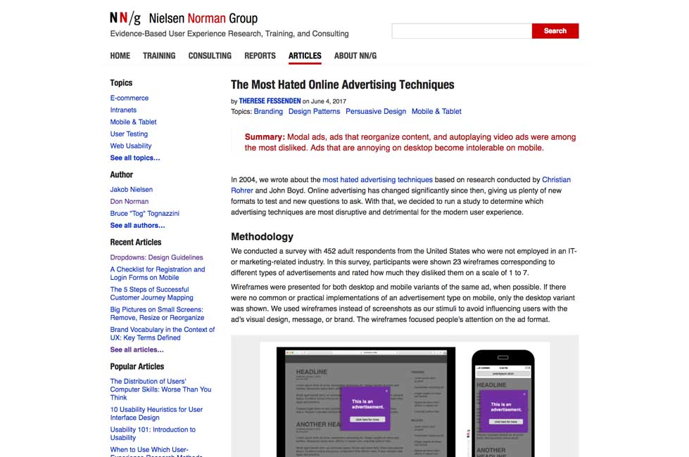
The Most Hated Online Advertising Techniques
Inspiration and Great ideas
#Game #Safety
Interland, a game that teaches kids the fundamentals of digital citizenship and safety so they can explore the online world
Tutorials
#Web Components
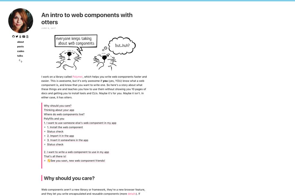
An intro to web components with otters by Monica Dinculescu
#Sketch
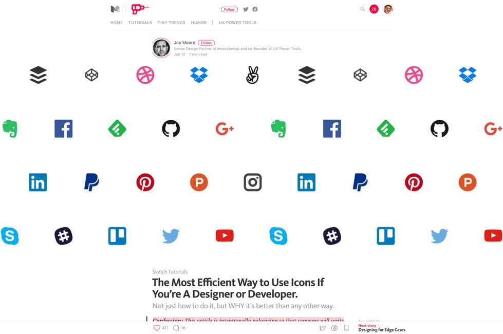
The Most Efficient Way to Use Icons If You’re A Designer or Developer – interesting Sketch workflow
#Responsive #Sketch
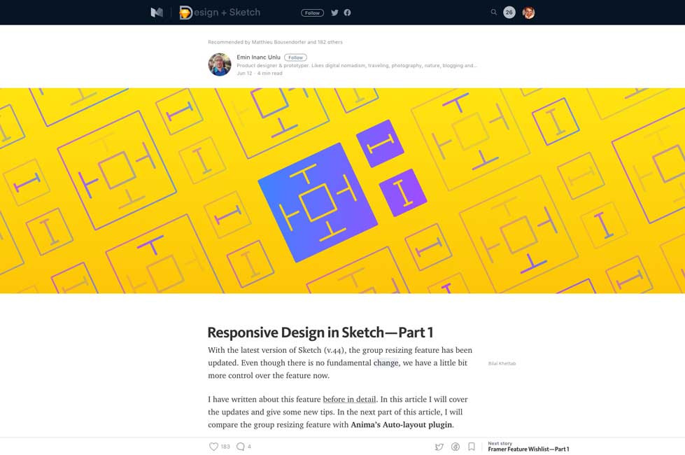
Responsive Design in Sketch — Part 1 – Design + Sketch
Useful resources, tools and plugins that will make your life easy
#Tables #Responsive
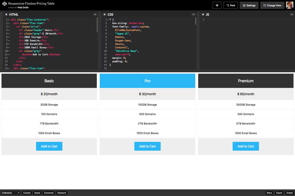
Responsive Flexbox Pricing Table – a nice small codepen.io demo
ResetCSS #Forms
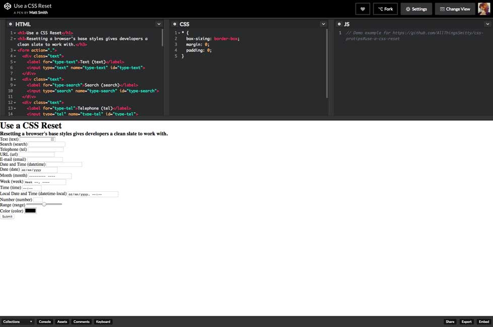
Use a CSS Reset. Also this is a cool page to test HTML5 form inputs ^^
Fun, games, experiments and demos
#UX #Evil
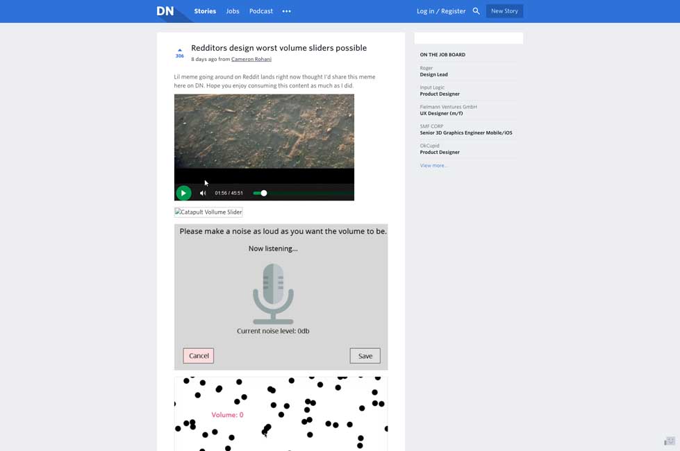
Redditors design worst volume sliders possible – evil UX
