Pixels of the Week – June 2, 2017
Every week I post a lot of my daily readings about Web, UI and UX Design, mobile design, webdesign tools and useful resources, inspiration on twitter and other social networks.
This week’s selection: forms, design for forgiveness and errors, emojis, data driven design, Progressive Web Apps, patterns behind color names, job interviews ethics, notifications, floating labels issues, product designer definition, some prototyping in Sketch, CSS grid layout and flexbox and some font tools
You can follow me on twitter to get a dose of links every days.
TL;DNR the one you should not miss
#UX #forms
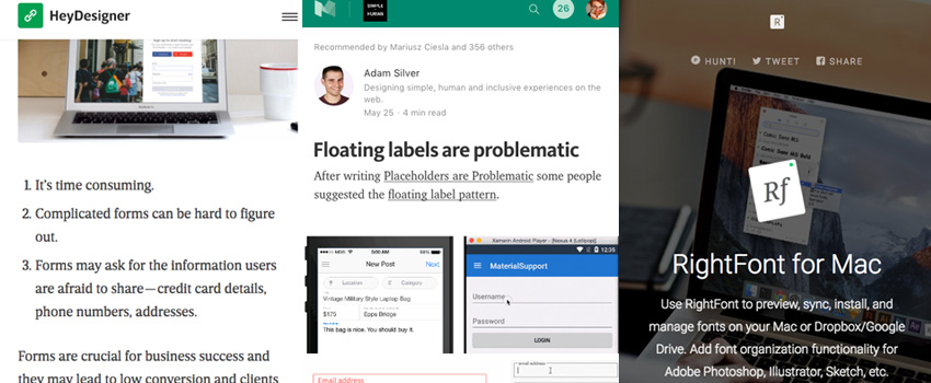
How to Design Great UX for Sign Up Form, great wrap up of what to do and not to do
Interesting article
#UX #Design
Designing for Forgiveness, a few good tips
#Erros
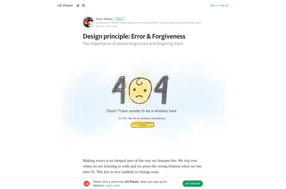
Design principle: Error & Forgiveness, another great article on the topic
#Design #Data
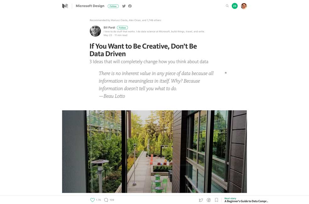
If You Want to Be Creative, Don’t Be Data Driven – really interesting read here to give you perspective 🙂
#Emojis
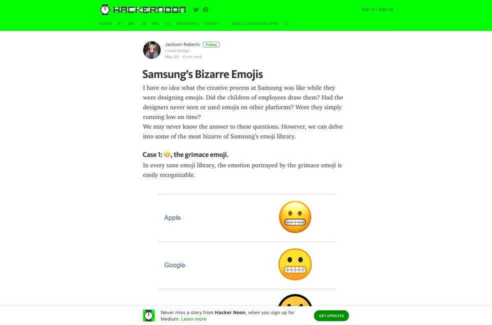
Samsung’s Bizarre Emojis, hum, yep ?
#PWA
Progressive Web Apps The Right Way
#Color
The surprising pattern behind color names around the world, a very interesting video on colors and cultures
#Job
“Are design tasks ethical in a job interview?” For me the issue is not that much about stealing ideas but about time. Not everybody has the time to produce mockups, what about people who already have a 40 hours job, kids and family? It can be really complicated to find time to participate in “job interview homework” especially when they require more than 2hours work.
#Notifications
“Notifications: A Tragedy Of the Digital Commons“. I like the idea of a respectful smart notification center ?
#CSS
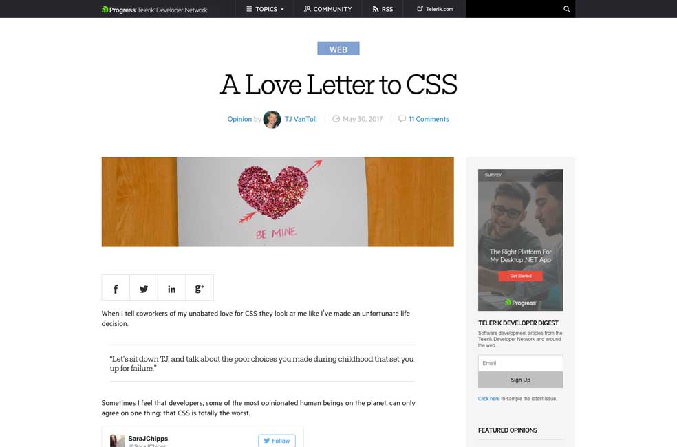
A Love Letter to CSS, by comparing to styling options in other languages, really interesting to read.
#Labels
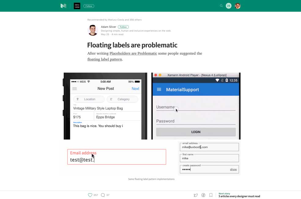
“Floating labels are problematic” hum, yes, especially when poorly implemented like on some examples
#iOS #Navigation
“Why Reach Navigation Should Replace the Navbar in iOS Design” iOS users, what do you think about this pattern?
#ProductDesigner
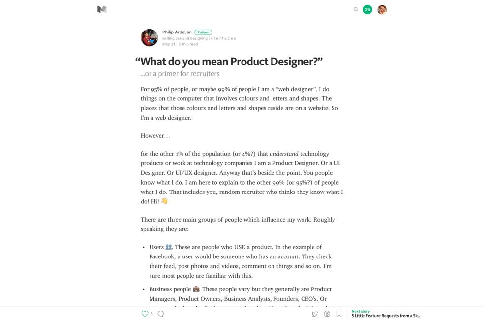
“What do you mean Product Designer?” excellent definition and explanation on what a product designer does
Inspiration and Great ideas
#Music
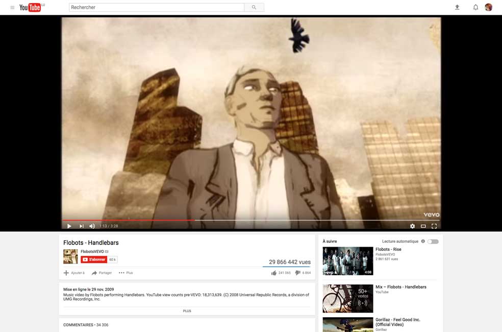
Handlebars, this song, the lyrics, the video <3
Webdesign news
#Sketch #Prototyping
“Prototyping in Sketch is officially available now and here is my review! ? ” (the author’s review, not actually mine ^^)
Tutorials
#CSS #Flexbox
“11 things I learned reading the flexbox spec“, cool CSS tips 🙂

#CSS #Grid
An introduction to CSS Grid – really good step by step
Useful resources, tools and plugins that will make your life easy
#Fonts
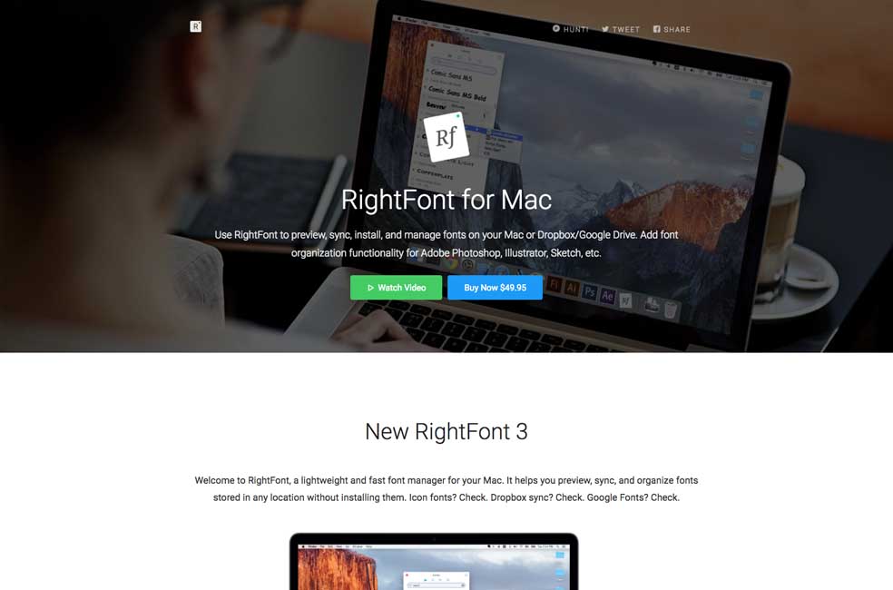
I’m currently in love with rightfontapp.com and it is going to replace suitcase to handle my font library on Mac <3 thanks
#Fonts
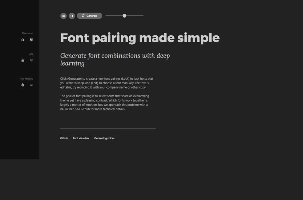
Fontjoy – Get smart font pairings in one click. Fun but you will get some strange combinations ^^
Fun, games, experiments and demos
#CSS
Single Div Violin, the hell why not. Really cool to see usage of CSS vars


