Pixels of the Week – October 28, 2016
Every week I post a lot of my daily readings about Web, UI and UX Design, mobile design, webdesign tools and useful resources, inspiration on twitter and other social networks.
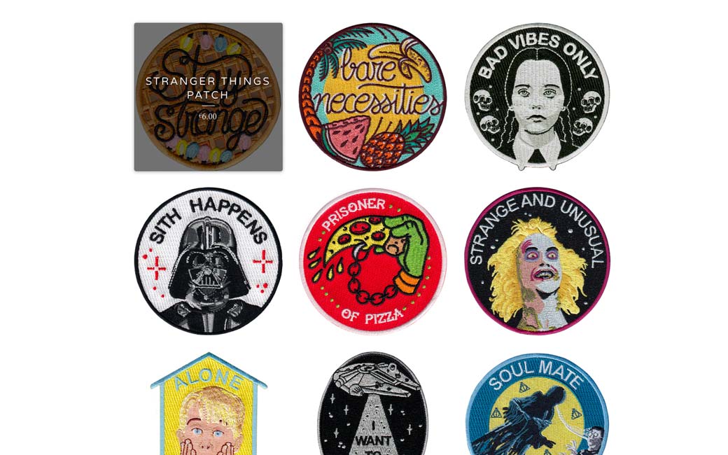
This week’s selection: progressive web apps, e-commerce UX, a little bit of typography with nice examples and retro patchs, Service Workers explained, pull to refresh UI pattern and user’s negative biases. You’ll also find a few lettering, push notifications and CSS gradients and variables tutorials.
You can follow me on twitter to get a dose of links every days.
TL;DNR the one you should not miss
#Mobile
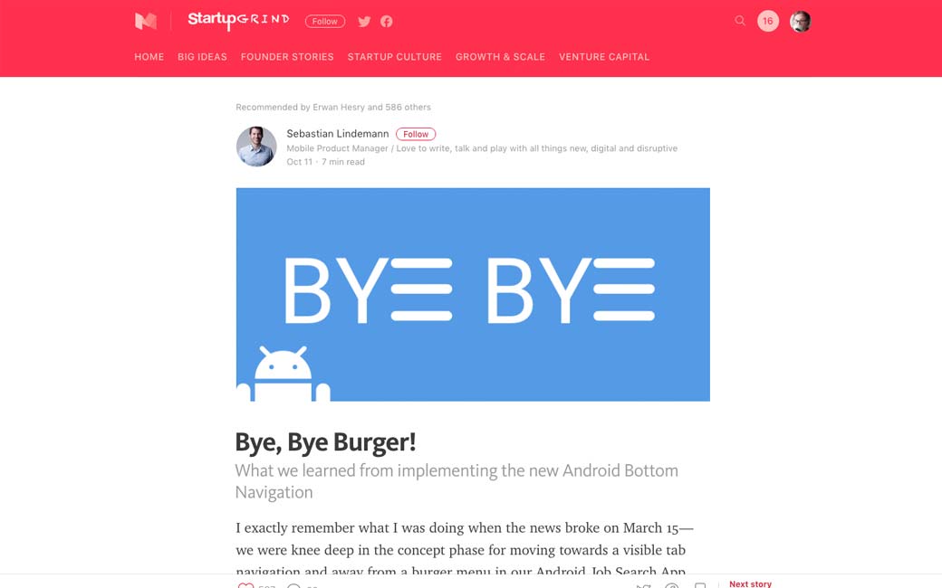
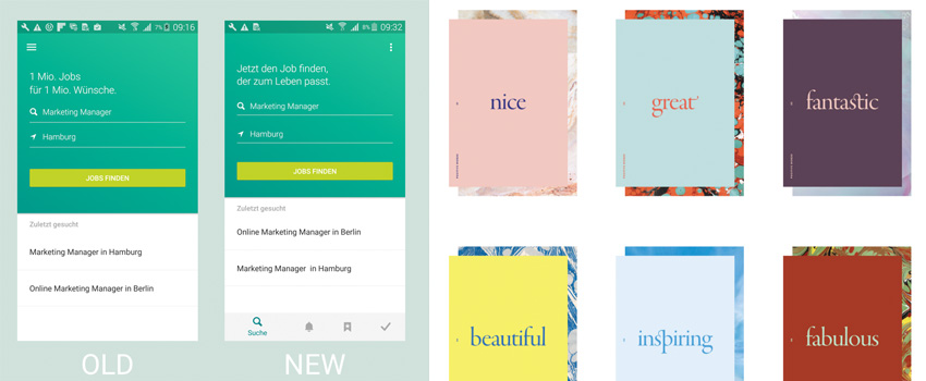
Bye, Bye Burger! What we learned from implementing the new Android Bottom Navigation
Interesting article
#PWA
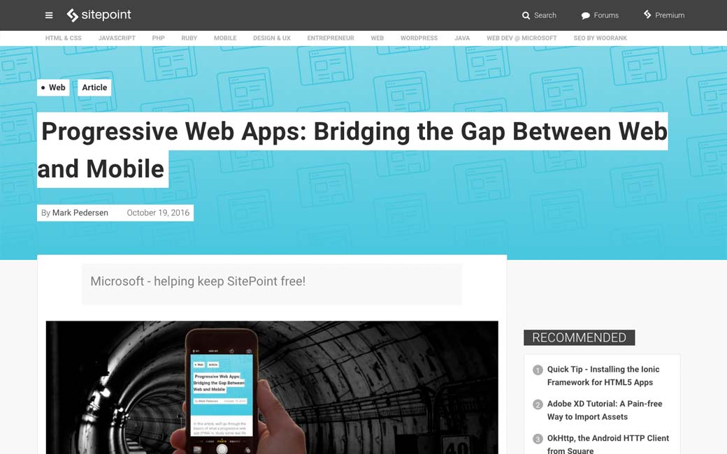
Progressive Web Apps: Bridging the Gap Between Web and Mobile
#UX #Ecommerce
Trends
Product Sorting UX Trends For eCommerce Websites
#Typography
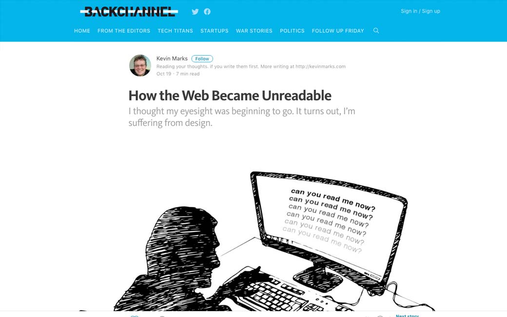
How the Web Became Unreadable: Interesting points, though I don’t fully agree with the “make you type black” I think we can find a dark gray with enough contrast to make the text readable without going full #fff and #000
#Typography
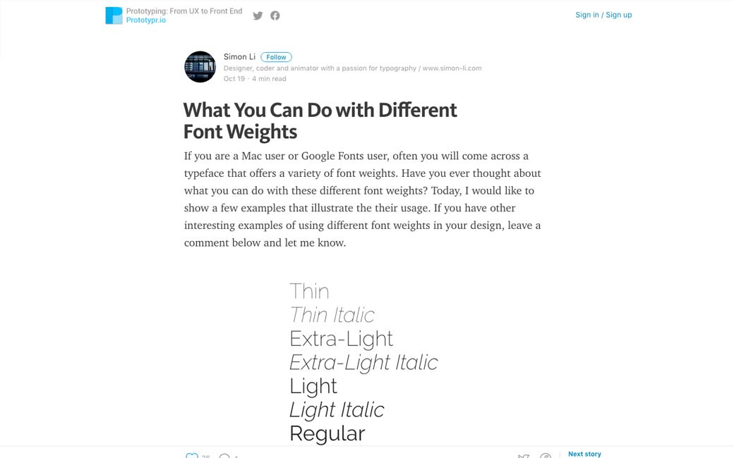
What You Can Do with Different Font Weights
#Service Worker
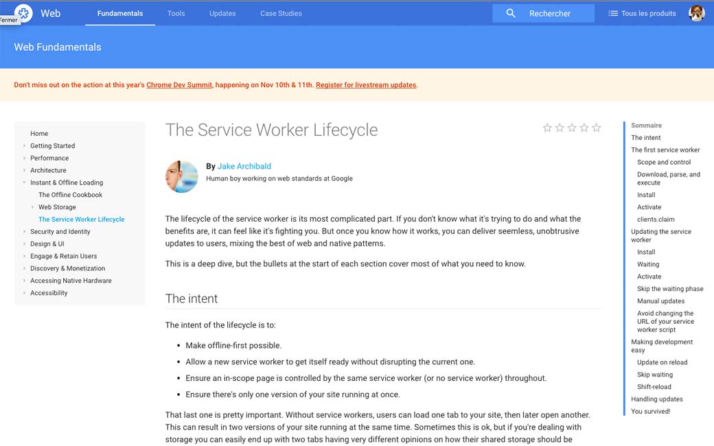
The Service Worker Lifecycle by @jaffathecake
#UI
How To Build Honest UIs And Help Users Make Better Decisions
#UI
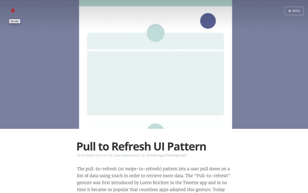
Pull to Refresh UI Pattern, when to use and not to use this pattern + few tips
#Mobile #sign up
Stop Making Me Sign Up! why would some products and services ask you to sign up on the mobile app when you can read/access the same content on the web without signing up?
#UX
The Negativity Bias in User Experience: People remember the bad more than the good. Users’ tendency to identify flaws in designs raises the bar for what they consider acceptable
Inspiration and Great ideas
#Typography
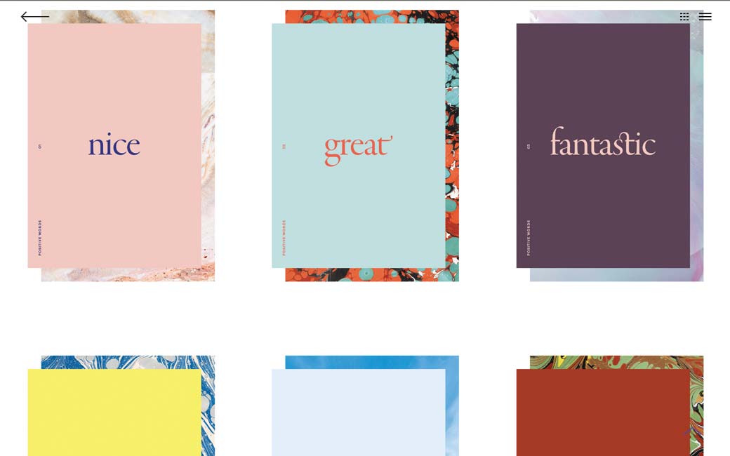
Positive words, beautiful typography, nice idea
#Game #mobile browser
paperplanes.world a fun mobile browser experience
#Motion
Motion design explained in a really nice GIF
Tutorials
#Typography
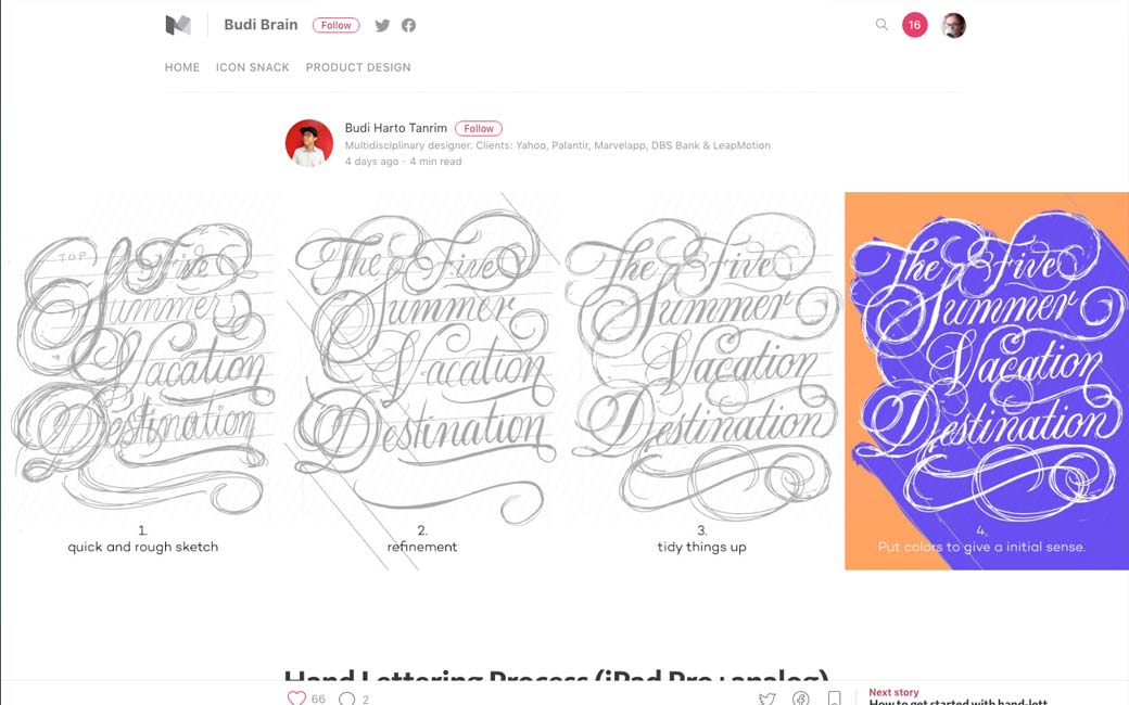
Hand Lettering Process (iPad Pro+analog)
#CSS
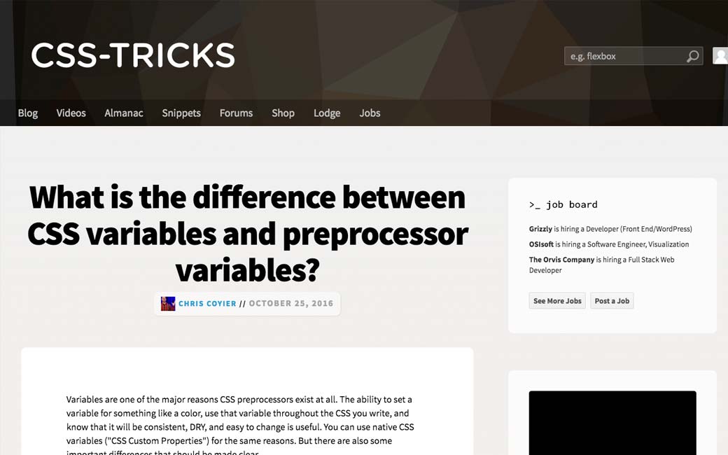
What is the difference between CSS variables and preprocessor variables?
#CSS
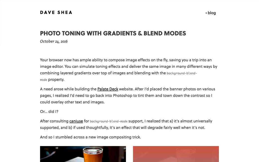
CSS Gradients and blend mode used for photo toning, this is pretty nice since you don’t need to treat every image upfront in Photoshop 🙂
#HTML #Form
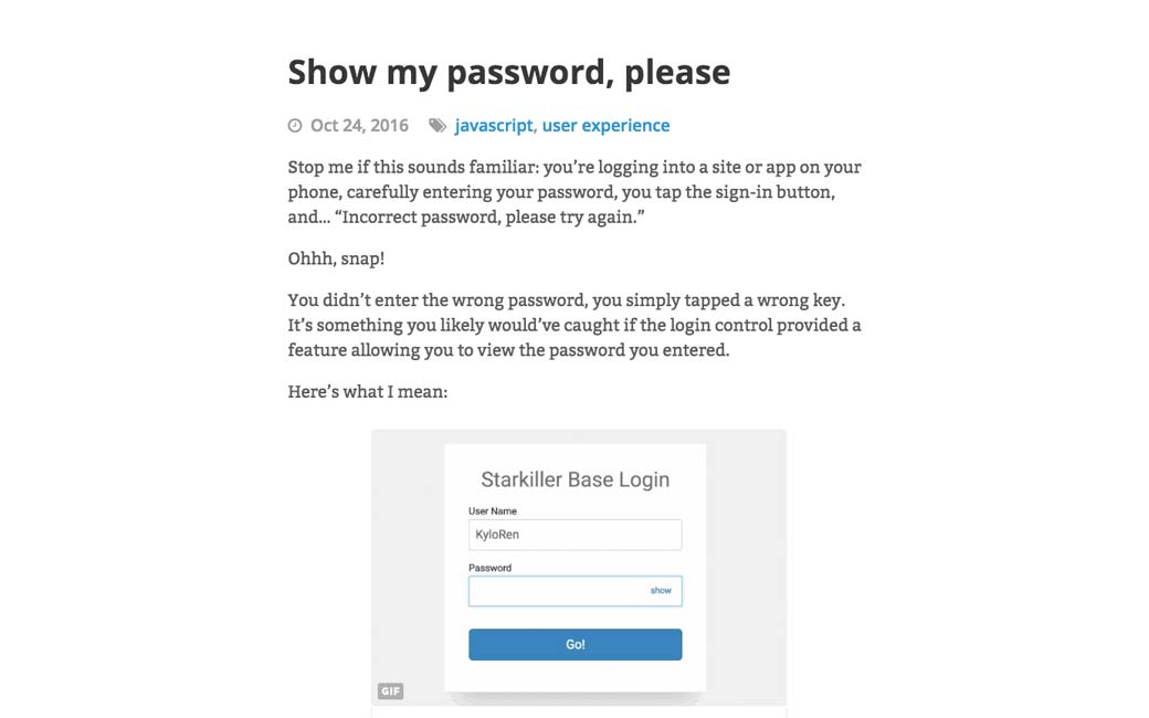
Show my password, please, a little tutorial on how to implement a show password button for forms
#Notifications
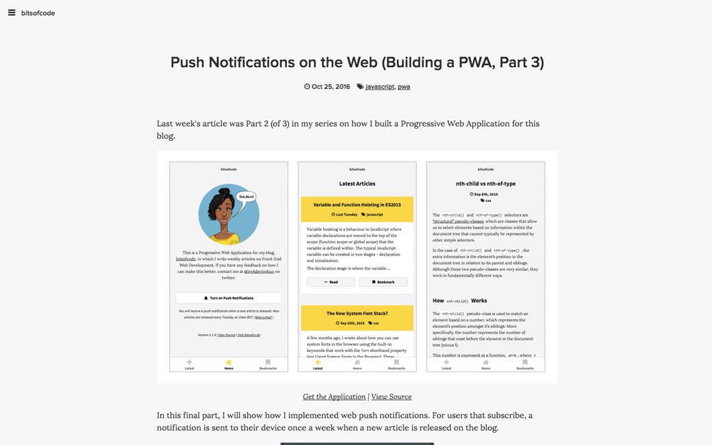
Push Notifications on the Web (Building a PWA, Part 3)
Useful resources, tools and plugins that will make your life easy
#Color
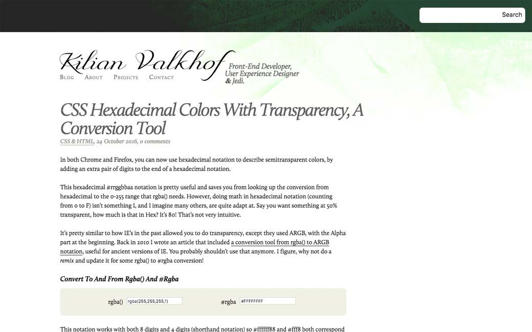
CSS Hexadecimal Colors With Transparency, A Conversion Tool
Fun, games, experiments and demos
#Machine Learning
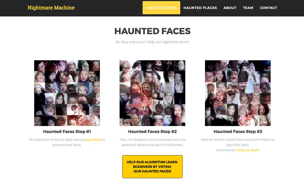
nightmare.mit.edu, horror images generated by artificial intelligence
