Pixels of the Week – September 15, 2017
Every week I post a lot of my daily readings about Web, UI and UX Design, mobile design, webdesign tools and useful resources, inspiration on twitter and other social networks.
This week’s selection: mobile design, designing for the new iPhone X, UX checklists, Flat design and usability, UX process and design process, inclusive illustrations, animations, interaction design, UX for forms and error messages, the new branding of Atlasian and a JavaScript form tutorial.
You can follow me on twitter to get a dose of links every days.
TL;DNR the one you should not miss
#Mobile #Design
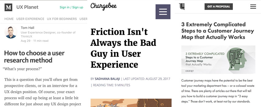
The designer’s guide to mobile — shifting design across platforms. Tips on how to design for Android and iOS and the differences between the 2 interfaces
Interesting article
#UX #Checklist
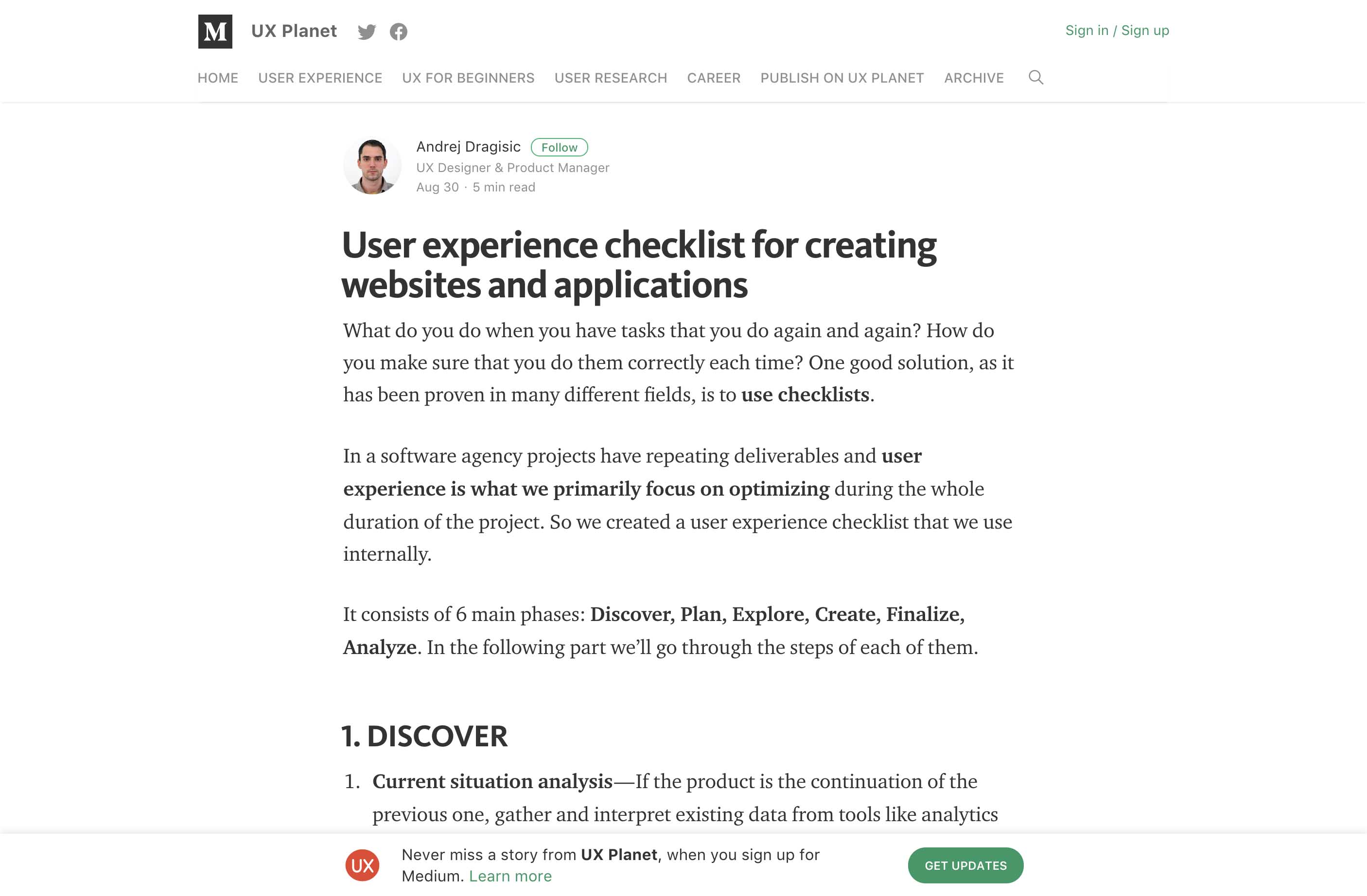
User experience checklist for creating websites and applications – a good start if you look for UX methods
#UX #Flat
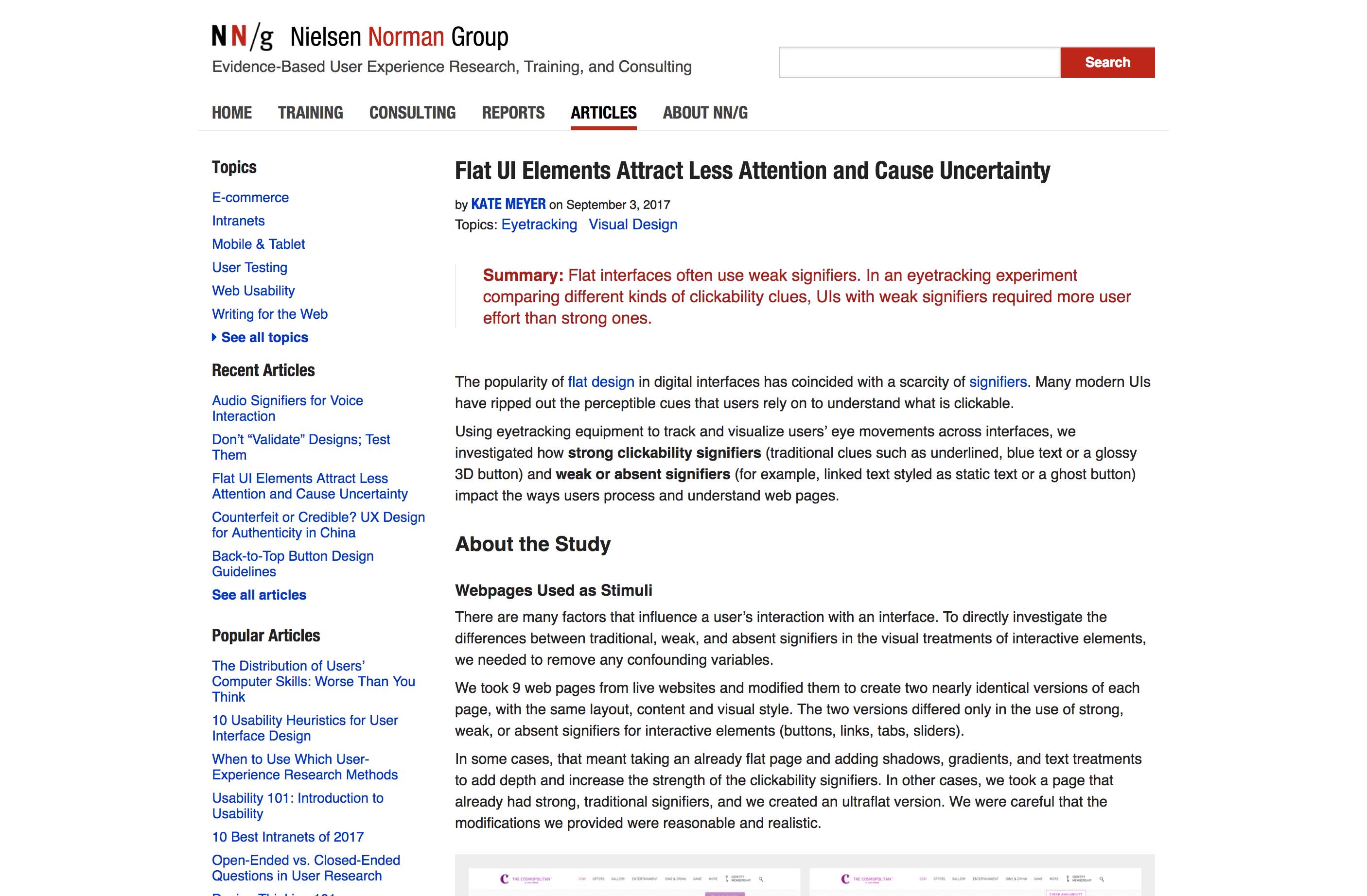
Flat UI Elements Attract Less Attention and Cause Uncertainty, interesting findings: Flat interfaces often use weak signifiers. In an eyetracking experiment comparing different kinds of clickability clues, UIs with weak signifiers required more user effort than strong ones.
#UX #Process
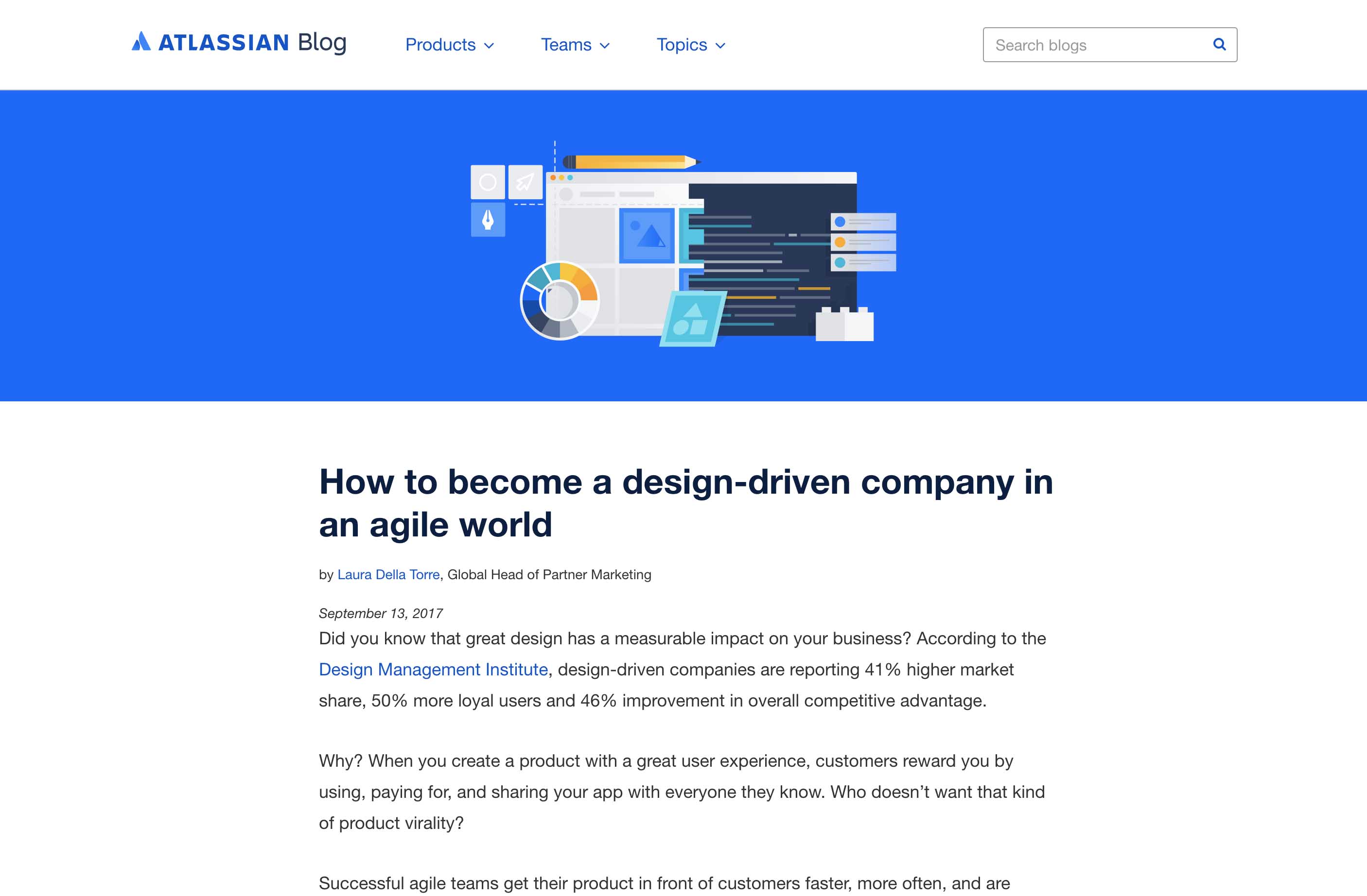
How to become a design-driven company in an #agile world
#Information Architecture
Information Architecture Lenses – really interesting process and a lot to think about
#Illustration #Inclusive Design
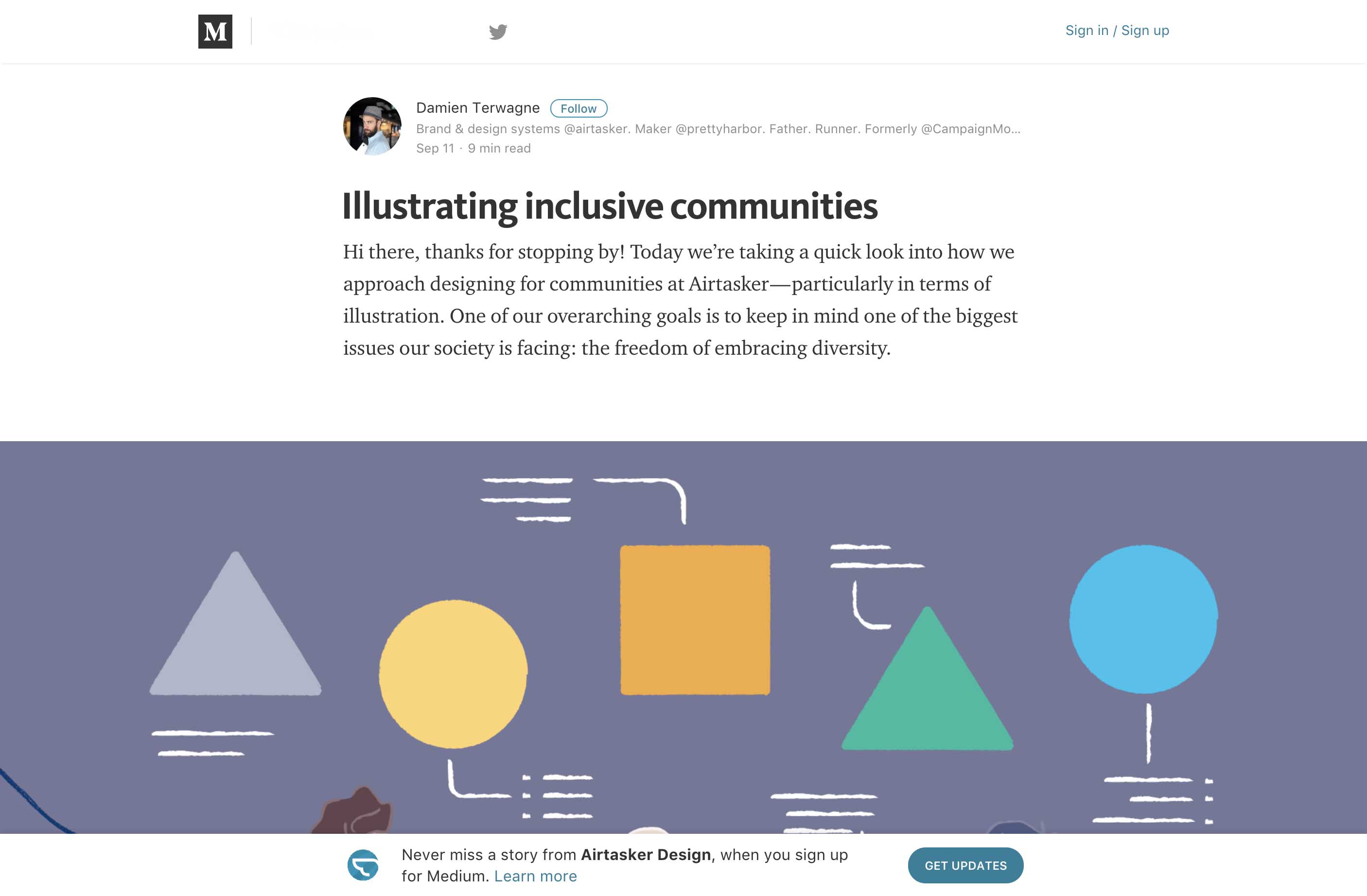
Illustrating inclusive communities
#Design #Interaction
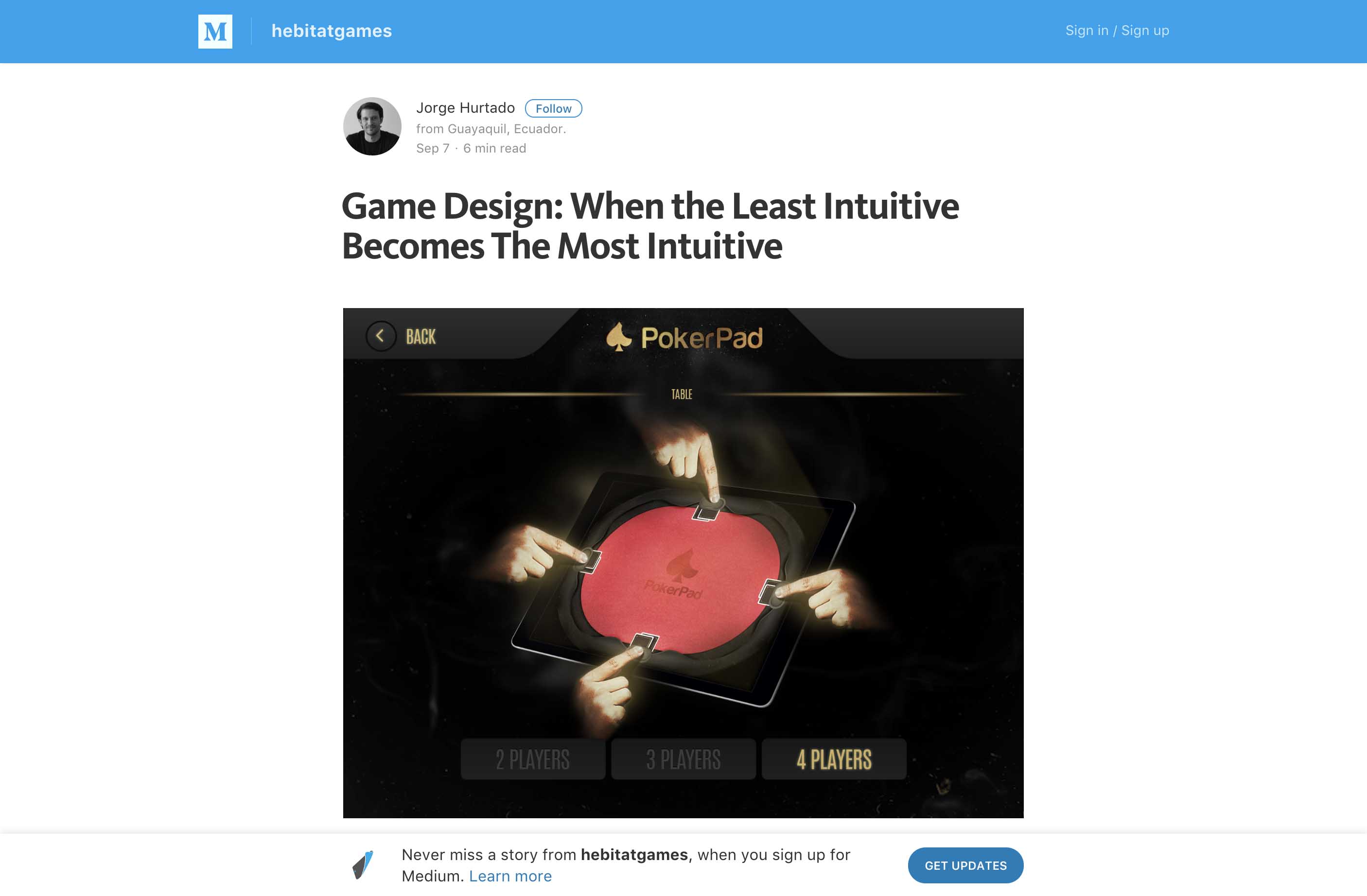
Game Design: When the Least Intuitive Becomes The Most Intuitive – interesting interaction 🙂
#Design #Process
The teapot model: how to explain a fuzzy design process to anxious clients – I really like this metaphor 🙂
#Form #UX
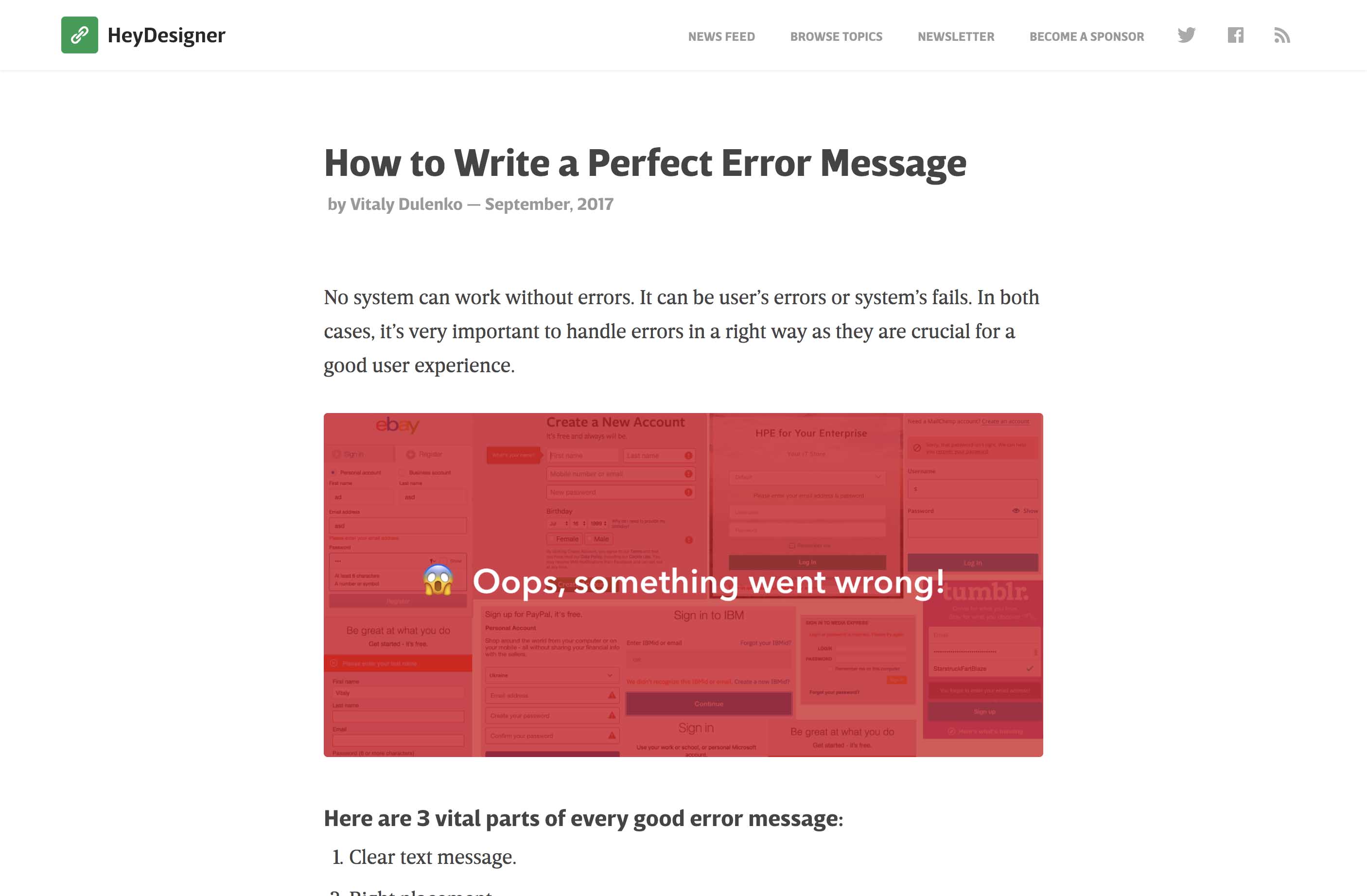
How to Write a Perfect Error Message – a few quick basic advice to remember about error messages and accessibility
#Design #iPhone
#Design #iPhone
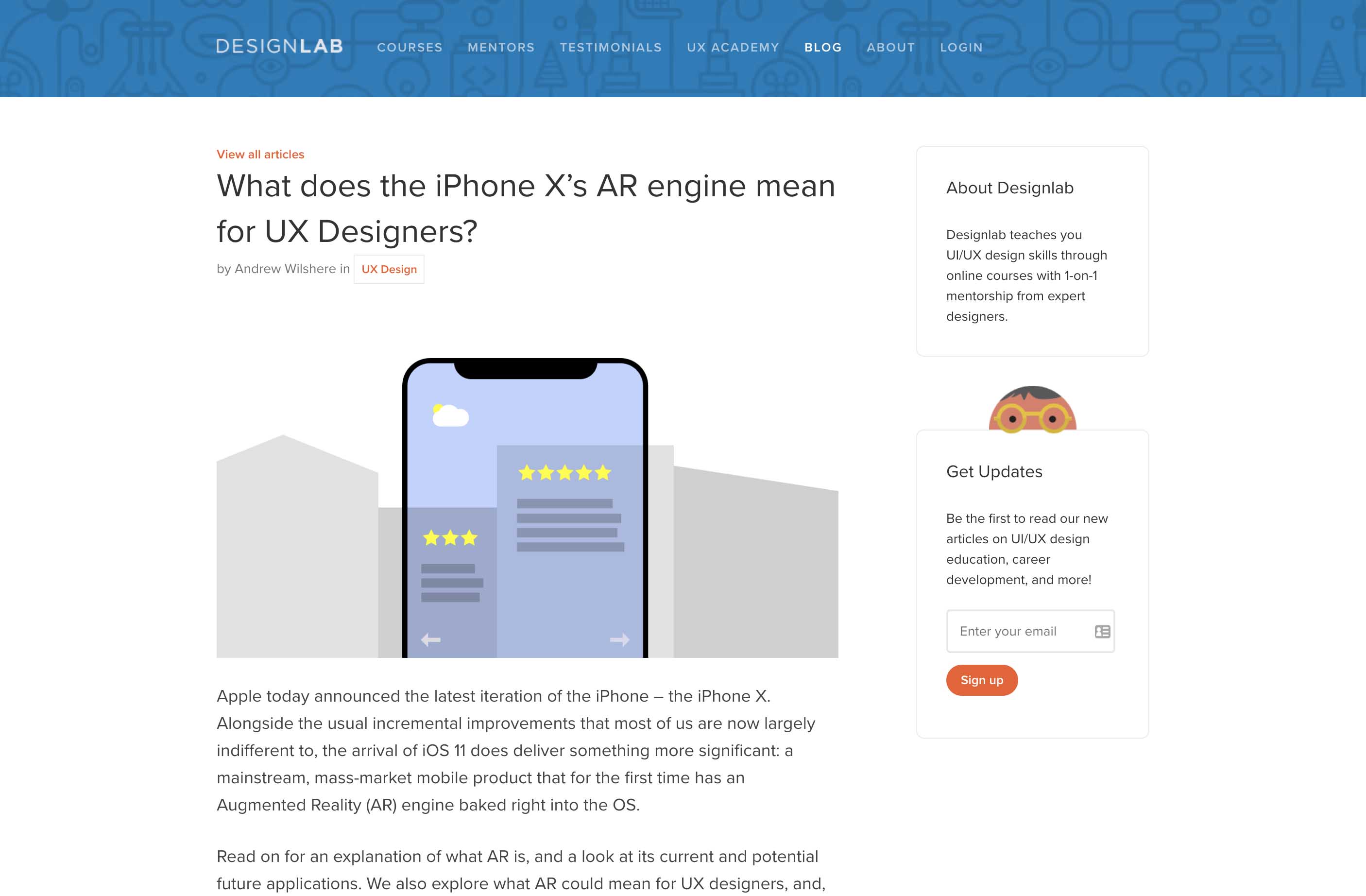
What does the iPhone X’s AR engine mean for UX Designers? Interesting read, we’ll see how it goes
#Patterns #Animations
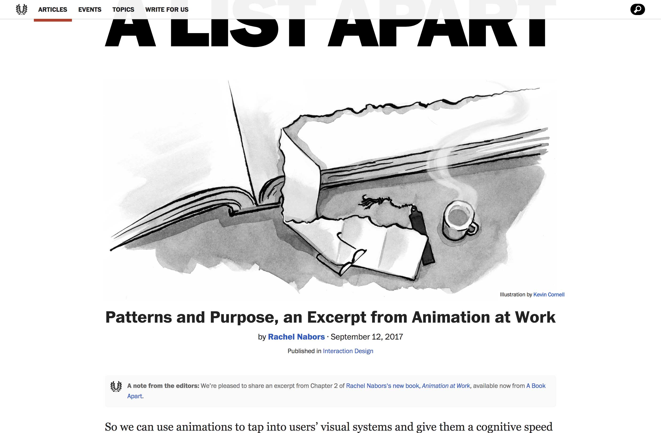
Patterns and Purpose, an Excerpt from Animation at Work by Rachel Nabors
Inspiration and Great ideas
#UI
Little UI Details, some small design tips to enhance your UI
Webdesign news
#Branding
Atlassian’s new brand identity: really monochrome blue so far but clean and nice
Tutorials
#JavaScript
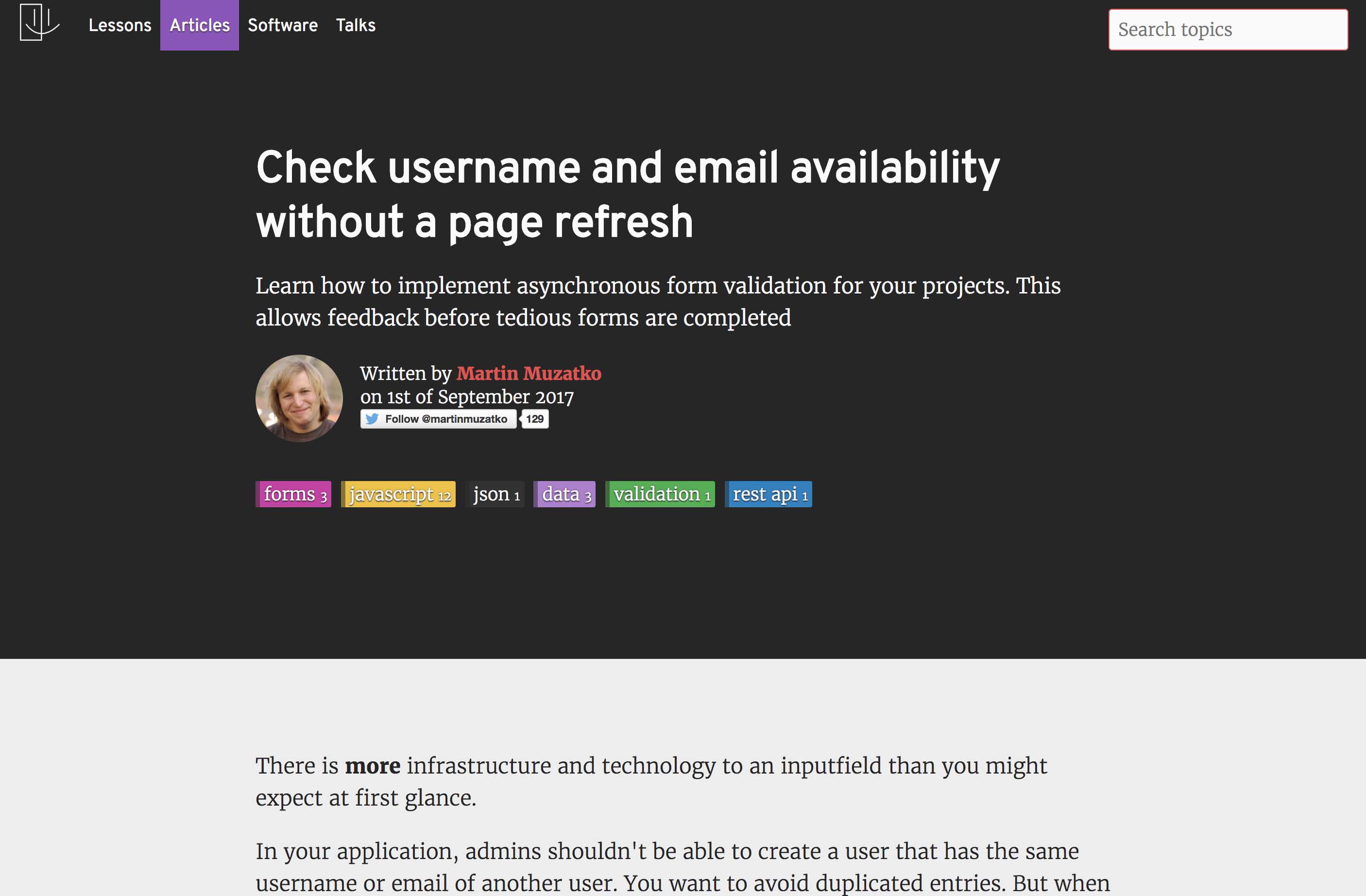
Check username and email availability without a page refresh

