Color accessibility: tools and resources to help you design inclusive products
I wrote a quick tweet about teaching the basics of accessibility and colors to design students a few months ago that go quite some attention. It brought up some interesting discussions on color accessibility, inclusive design an interesting discussion about the use of emojis.
A few people asked me for advice on how to chose accessible color palettes for their projects. So I thought I would share the resources, tips and tools I regularly use to build and check the color accessibility of my products in one single place for future reference. I will keep on updating this article with new resources regularly. Enjoy.
Last update: July 2024
** Cet article existe aussi en Français **
Contrasts and accessibility: a few basics on color
When building products with diversity in mind (digital ones but this could also apply to other products), color choice is important. Color choice is all about communication and is usually a decision marketing and visual design sometimes fight over. The color can convey your brand identity, help users understand information, etc. Unfortunately, not everybody gets to experience colors the same way. Some users might be color blind, some users might be visually impaired, some users might be in different environments. This is why you need to be careful about accessibility when you are using color in your products.
I will not enter in all the details since I’m no accessibility expert. What you need to understand about accessibility is that there’s a list of criterion you can find under the WCAG 2.2 guidelines to help you. For this small introduction, I will stick to the AA criteria. Those look scary, a little bit like the HTML specification, I know. In this big list, the 1.4 section is dedicated to “making it easier for users to see and hear content including separating foreground from background.”
So for inclusivity, accessibility and colors, there’s 3 big things you need to remember:
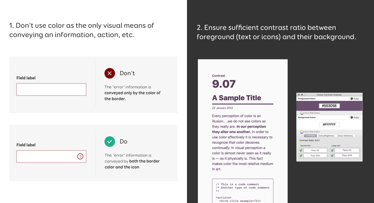
- Don’t use color as the only visual means of conveying an information, action, etc. (WCAG 1.4.1)
- Ensure sufficient contrast ratio between text and its background. (WCAG 1.4.3)
- Ensure that non-text elements (UI components, focus indicator, graphic objects required to understand context) have a 3:1 contrast ratio against adjacent colors (WCAG 1.4.11)
Text against background minimum contrast ratio
For the first criteria, it means for instance that if you create a graph, you should have some secondary way of helping people understand the different sections. Trello has a nice example for that. If you have a form, you can’t just use a red border to show there’s an error. There’s more example on the Understanding Success Criterion 1.4.1: Use of Color page.
For the second criteria, 1.4.3, it means that the contrast between text (or foreground elements) and color should be:
- 4.5:1 between text and background for text (strictly) smaller than 24px, or 19px bold
- 3:1 between text and background for text larger than (or equal to) 24px, or 19px bold
Note that decorative graphics and text part of logos don’t need to meet those criteria.
The conversion points > pixels isn’t super simple but if you want more details you can check Understanding Success Criterion 1.4.3: Contrast (Minimum)
Basically: small text under 24px (or bold text under 19px) need to follow the 4.5:1 rule, bigger text over 24px (or bold text over 19px) need to follow the 3:1 ratio rule.
Non-text elements to adjascent minimum contrast ratio
The contrast ratio rule also applies to non text elements: graphical objects and user interface components that need to be identified by the user must have a contrast ratio of at least 3:1 with adjacent colors.
This applies to icons, charts, buttons, hover, focus and active states, interactive components, form inputs, etc. Note that this doesn’t apply to purely decorative elements and inactive states.
Okay, so now you might wonder “but how am I supposed to measure this 4.5 or 3 contrast ratio, do I need to do maths for each color combination?!”. Don’t worry, I have a selection of tools and resources to help you get started with inclusive design and color accessibility.
Beyond colors: Accessibility for Designers – Practical Workshop
Design mockups that work for everyone and meet the new European Accessibility Act. In this hands-on workshop, you’ll learn to spot and fix accessibility issues early in your design process. We’ll cover visual design, interactions, navigation, and content, with exercises and real examples.
Color blindness simulators tools
The first criteria is about making sure that the information isn’t only conveyed by color. You can of course start by checking your mockups and hunt down any places where this criteria can be applied. Forms, infographics, graphs, tags, statuses are usually a good place to start. Also, product colors pickers if you are doing an e-commerce website (more about that in the articles in next section). Then, you can use color blindness simulators to check your color choice against different types of color blindness.
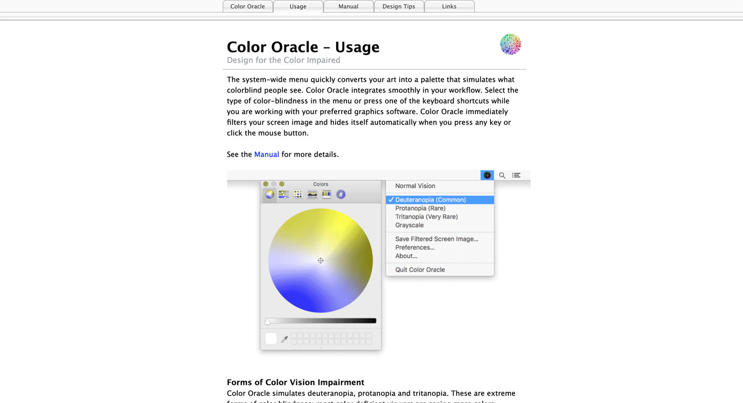
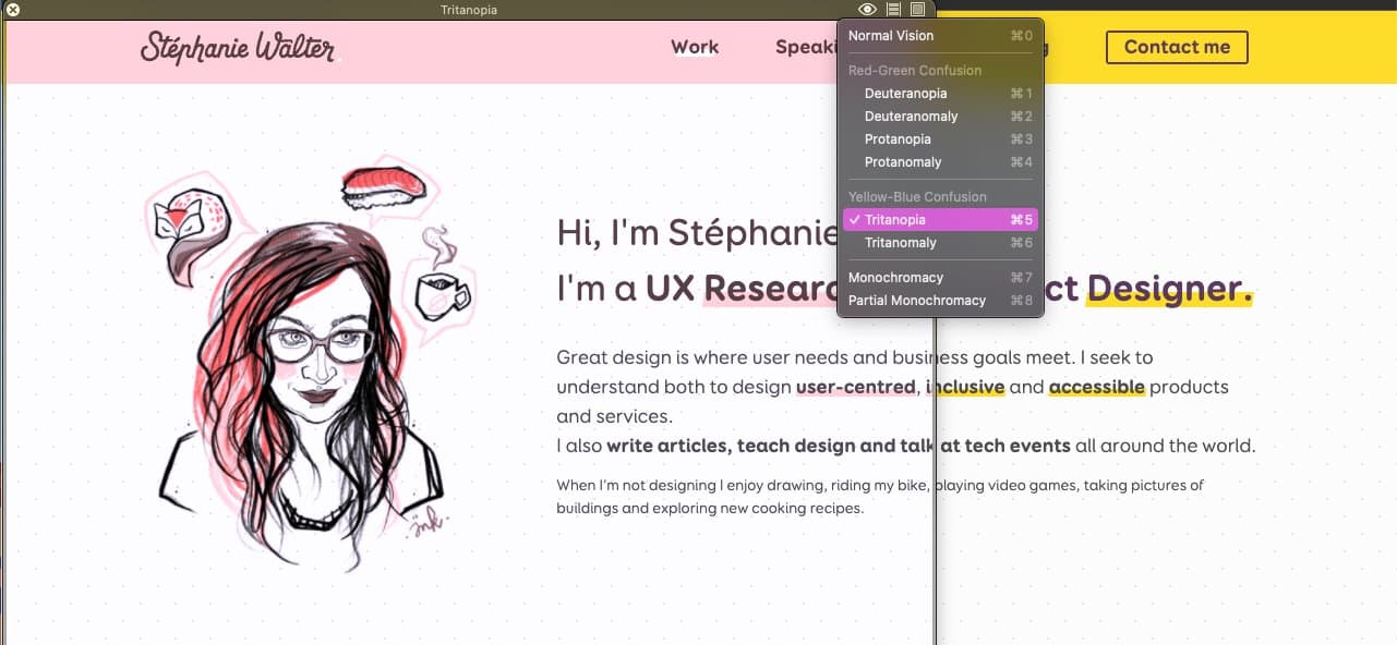
Color Oracle 
Color Oracle is a free colorblind simulator that works for Windows, Mac and Linux.
Sim Daltonism for Mac
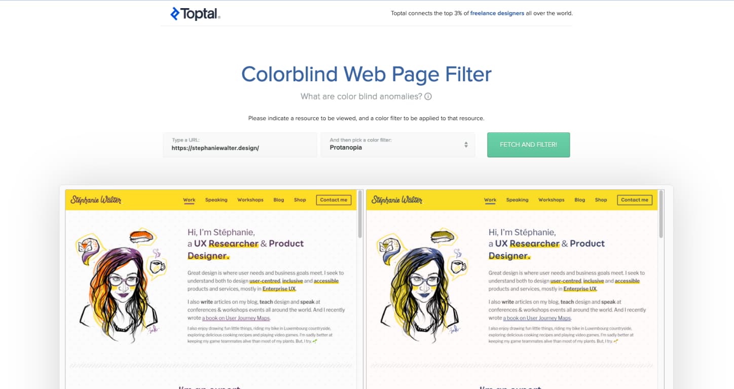
Toptal’s colorfilter
Checking the contrast ratio in your mockups
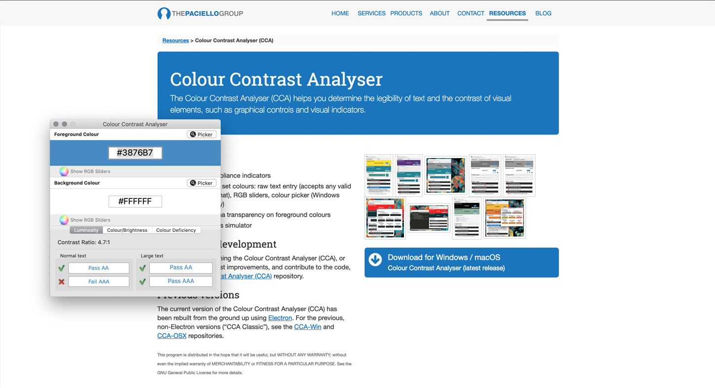
Contrast Analyser
This is THE tool you can install on Windows, macOS and Linux. It lets you grab a color with the color picker and check the contrast ratio. I would be careful with the picker though, depending on my screen setup I sometimes had issues and the hexadecimal it grabbed wasn’t exactly the right one, so for now I stick to “copy pasting” hexadecimal colors in the tool
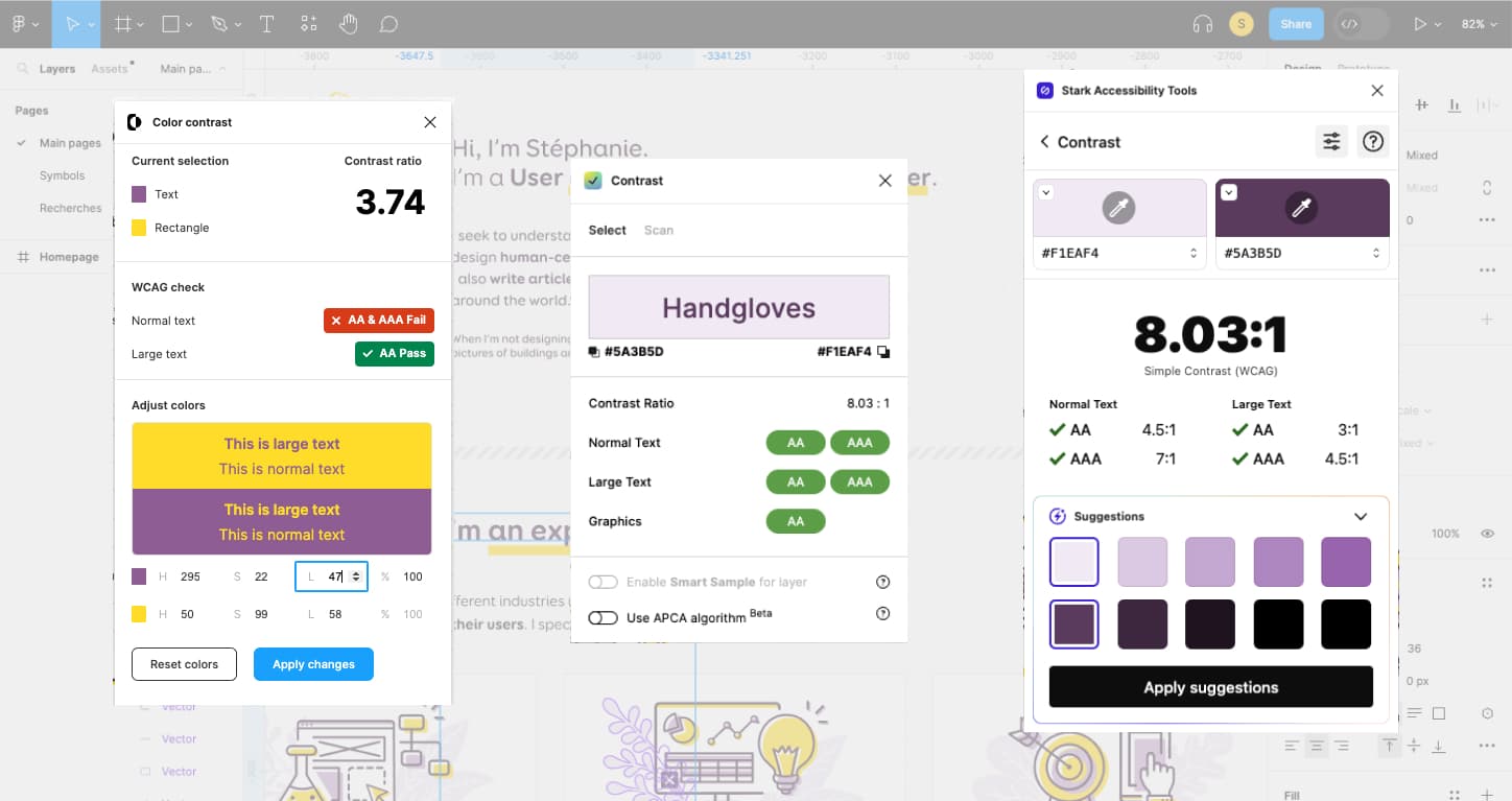
3 Figma Color Contrast plugins
So, when it comes to Figma, the perfect plugin, for me would:
- check the contrast of 2 layers I’m selecting (because sometimes the background is not in the same group)
- check for Normal, Large text AND non text contrast (the 3:1 rule)
- offer suggestions and / or let me directly tweak the colors from the tool to find the perfect contrast
None of those 3 have all 3 features, so, up to you to decide what is the most important.
Color Contrast
My favorite one so far, it does point 1 and 3 very well. I can select whatever layer I want, and then if the contrast isn’t high enough, I can live edit the HSL values to tweak until I find the perfect one. Not having the “non text” one is okay since I can just check the ratio for the text and see if it’s above 3:1
Figma Contrast
This one does good on 1 and 2. I can picke whatever layer I want and get the ratio. It also has this “graphics” option that checks for the 3:1 contrast ratio for non text elements. Bonus: it has a “scan” option. This lists all the color combinations on your mockup so that you can hunt down those who lack contrast without having to manually check for all elements.
There is no option to change the color directly from the plugin, or some suggestions though.
Stark
This is a whole suite of tools, and it contains a “free” accessiblity checker. It fits 1 and kind of 3. You can check wathever layers you want. You can’t “directly” tweak the colors, BUT, you can open the color picker and modify it from there. You get suggestions, but, you need to pay to apply them directly. There is no direct option for non text contrast though
Tools that help check contrast and help you find alternatives compliant choices
The second criteria is the contrast ratio between text (or foreground elements) and background. As I told you here, you won’t need to do the maths yourself, there’s plenty of tools to help you with that.
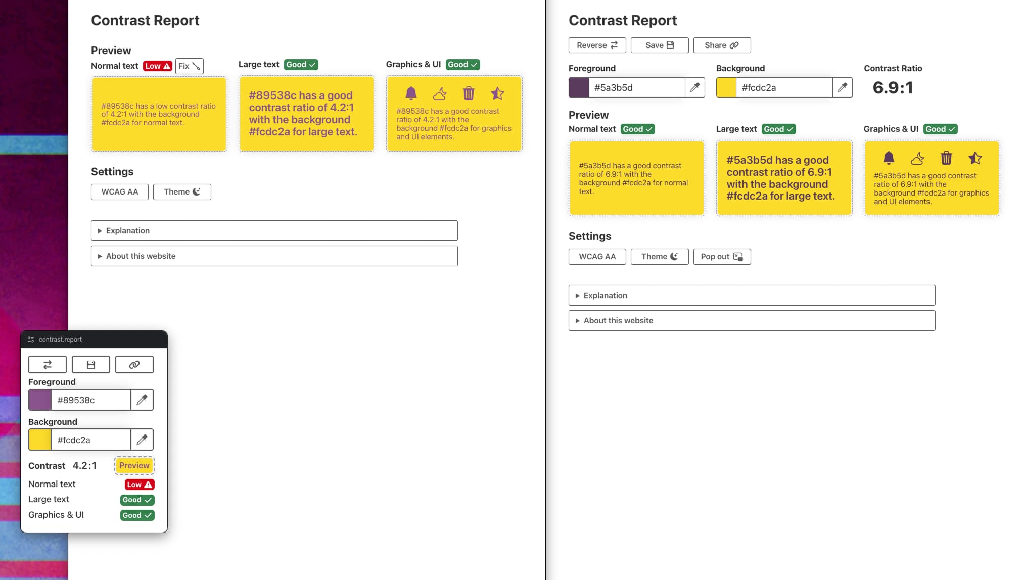
Contrast Report
I think this is my new favorite online contrast checker tool, because it includes a lot of features I need (or didn’t know I needed but like):
- check for AA and AA
- option to check for normal, large text and graphics and UI elements (the 3:1 rule)
- option to “fix”, that will automatically recommend a color combination that is as close as possible to the original.
- a picture in picture mode (not supported in Firefox) that gives you an eyedropper, in an overlay to select any color on screen
- PWA, aka, you can “install” it on Chrome/ Edge
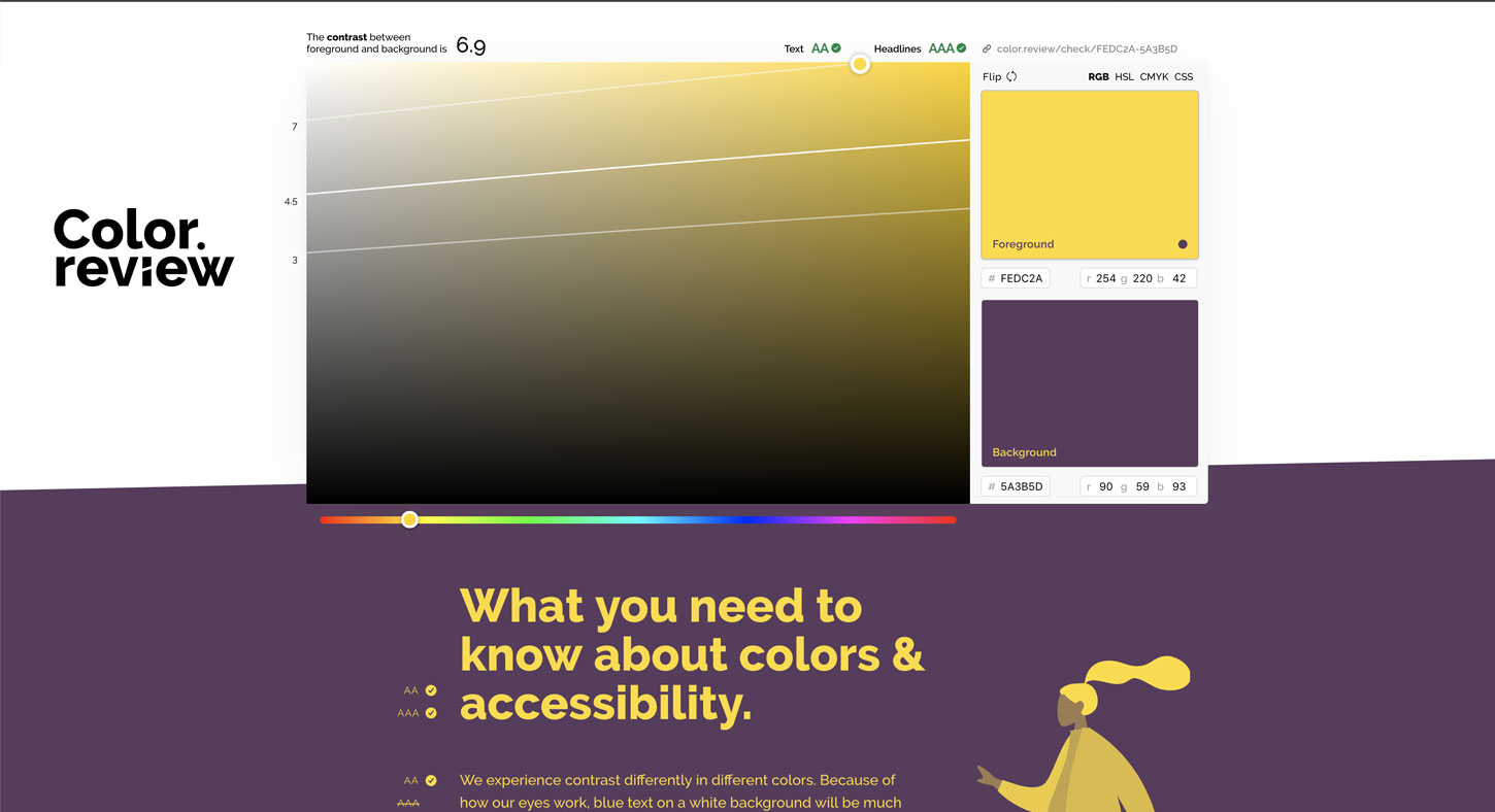
Color Review
This tool lets you check the contrast ratio between two colors. It shows you a preview of what the color combination would look like. The picker on the left helps you find an alternative if the colors you picked won’t work.
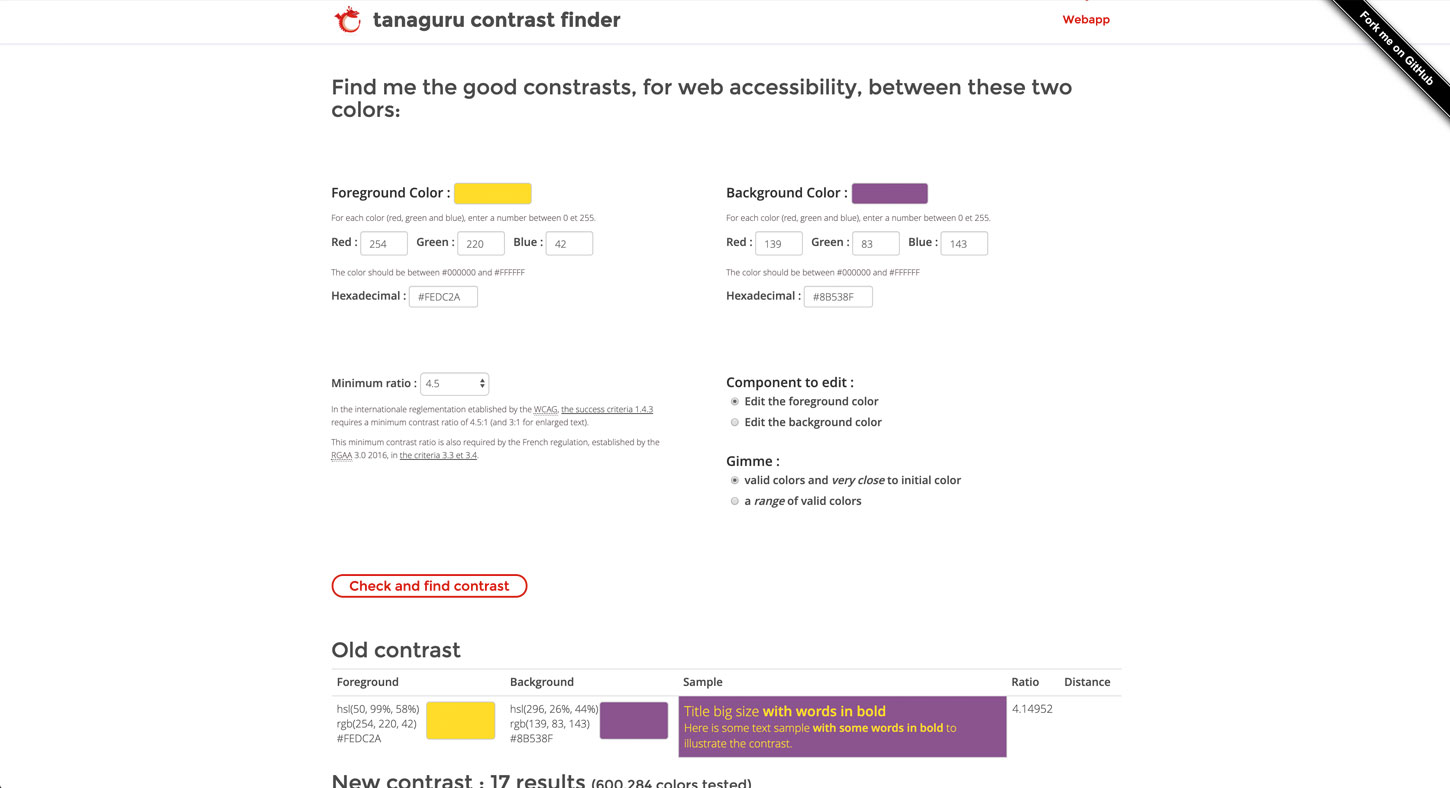
Tanaguru Contrast Finder
not only lets you check the contrast ratio between two colors, it also helps you find a new color if the one you chose didn’t match the desired contrast ratio. You can learn more about that in my article Tips to Create an Accessible and Contrasted Color Palette.
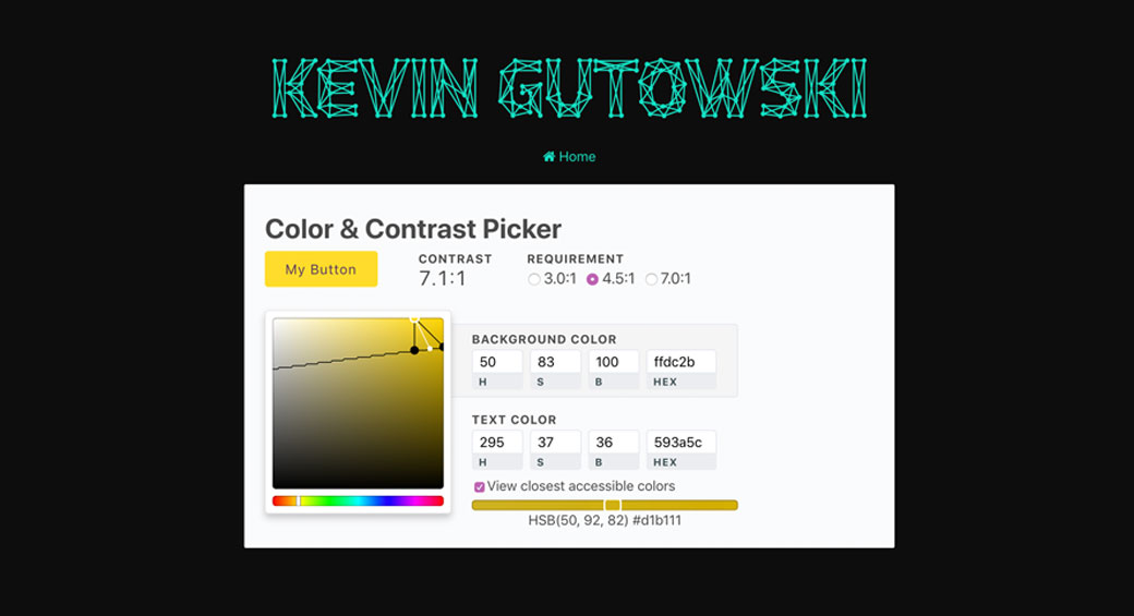
Color & Contrast Picker
This one let’s you pick a background and foreground color and gives you the contrast ratio. You can then play on the color picker to find the closest accessible color combinations.
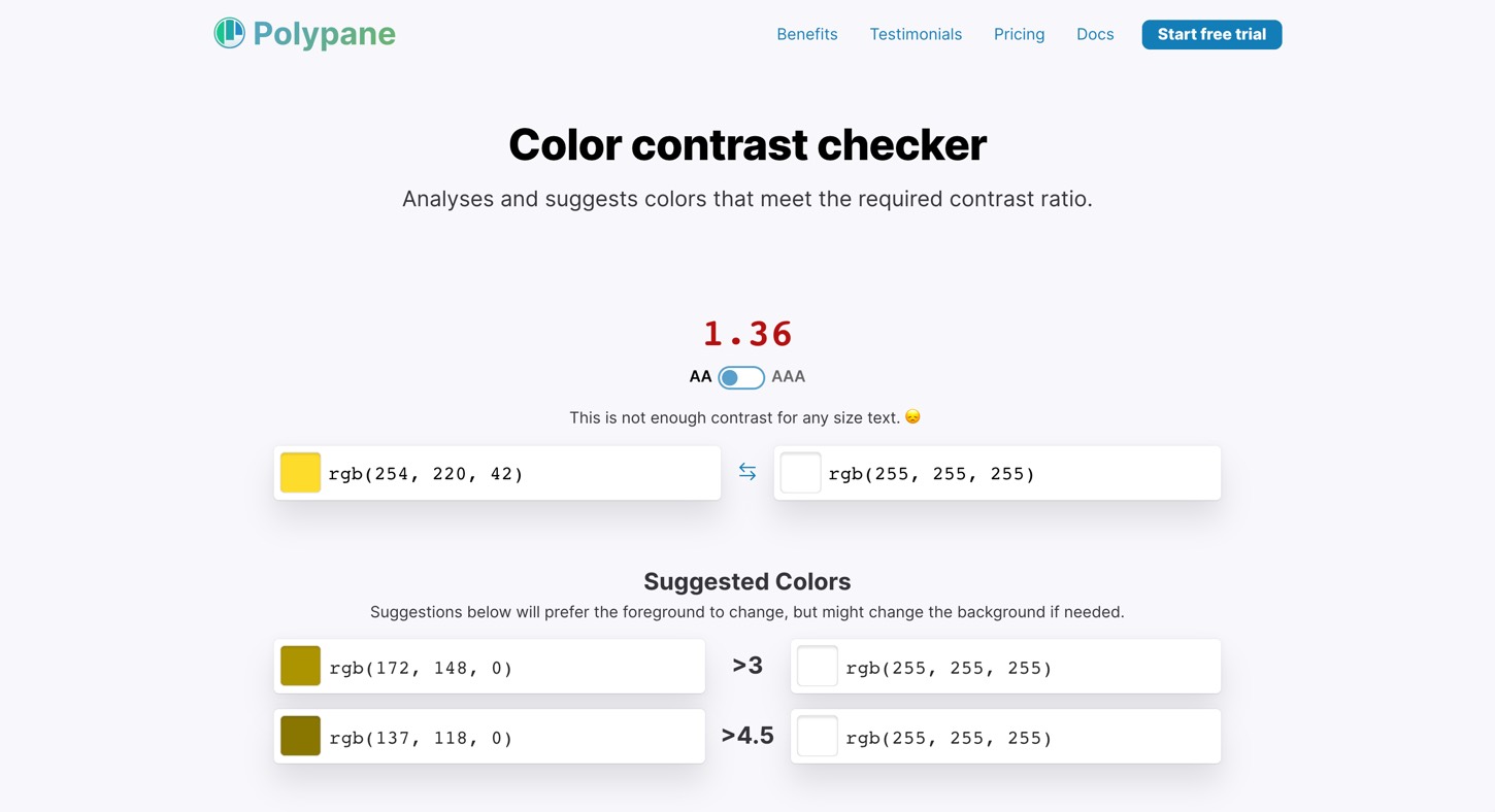
Color contrast checker from polypane
This is another tool that both analyses and suggests colors that meet the required contrast ratio. You can choose between AA and AAA and the tool will suggest other colors that will work with a sufficient contrast ratio.
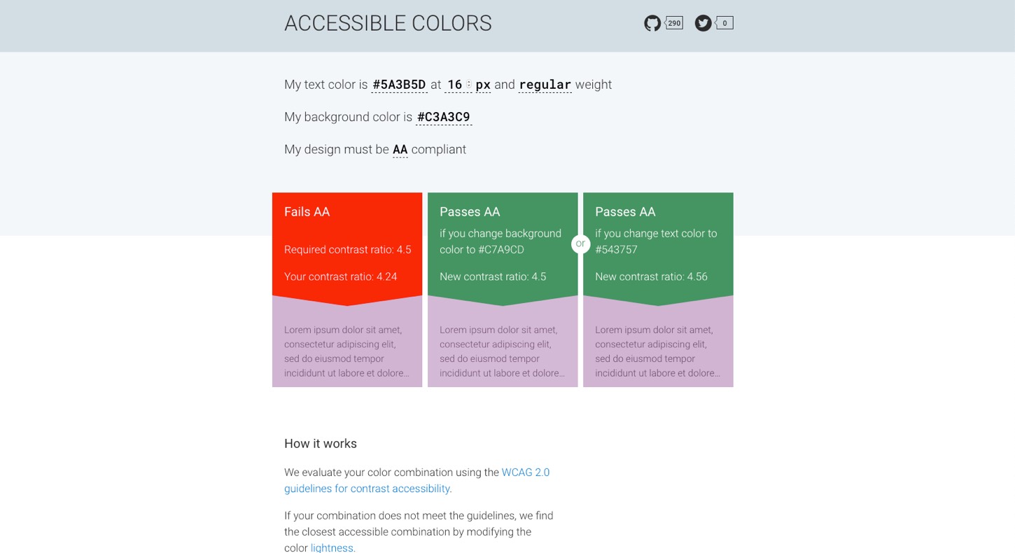
Accessible-colors.com
This is another nice color contrast checker online tool: enter 2 colors but also font-size /weight gives and you get 2 alternatives if your color combination is not AA/AAA compliant. Guess who slightly changed her purple yesterday on her site?
Other online tools to check contrast ratio
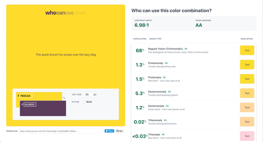
Who can use this color combination?
I really like this one. It is a tool that not only lets you check a foreground/background color combination contrast ratio, it also let’s you preview this combination with different colorblindness simulations and the percentage of the population that is targeted.
If you want to test a whole site you can use Checkmycolours.com this tools lets you enter a URL and will then create a report of all the contrast issues if found on your site. Be careful with the results though, sometimes it has issues grabbing the right background.
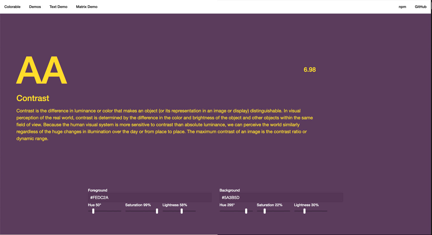
Colorable
Another online tool that will let you check text/background contrast ratio. I like this one because you can enter the text color, the background one, preview what it will look like. Then if the contrast ratio isn’t high enough you can play with the little Hue, Saturation and Lightness levers to find a color that will wor
Building an accessible color palette for your product
Now that you have some tools, here are a few more articles and resources to help you get started and build accessible products.
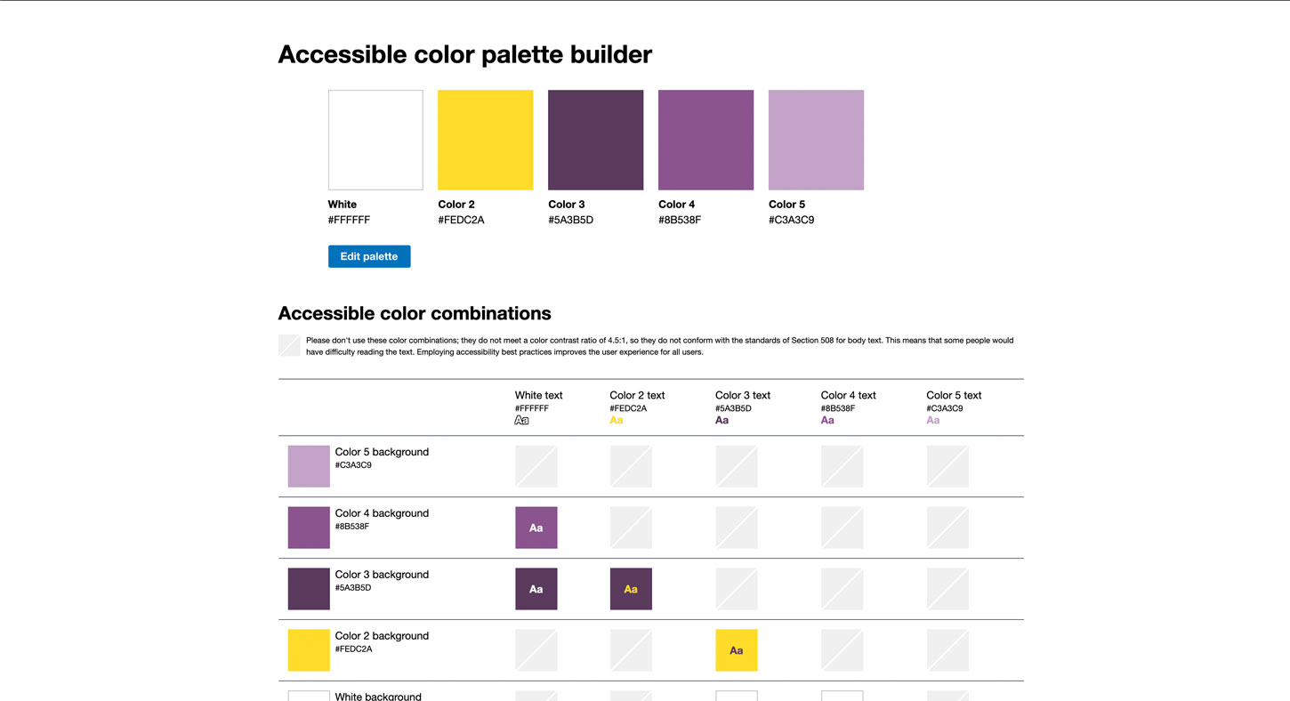
Accessible color palette builder
This is one of my favorite tool. You can enter up to 6 colors and it will build you this color matrix and let you know what colors can be combined.
This one is limited to 6 colors, if you want a more complex matrix with more colors you can check this tool as well.
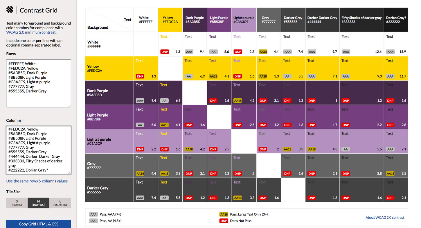
Contrast Grid
This takes the concept of a grid of foreground and background combos and brings it to the next level. In this tool you can chose what specific colors you want for lines and columns and build your own custom grid (via Mickaël G.)
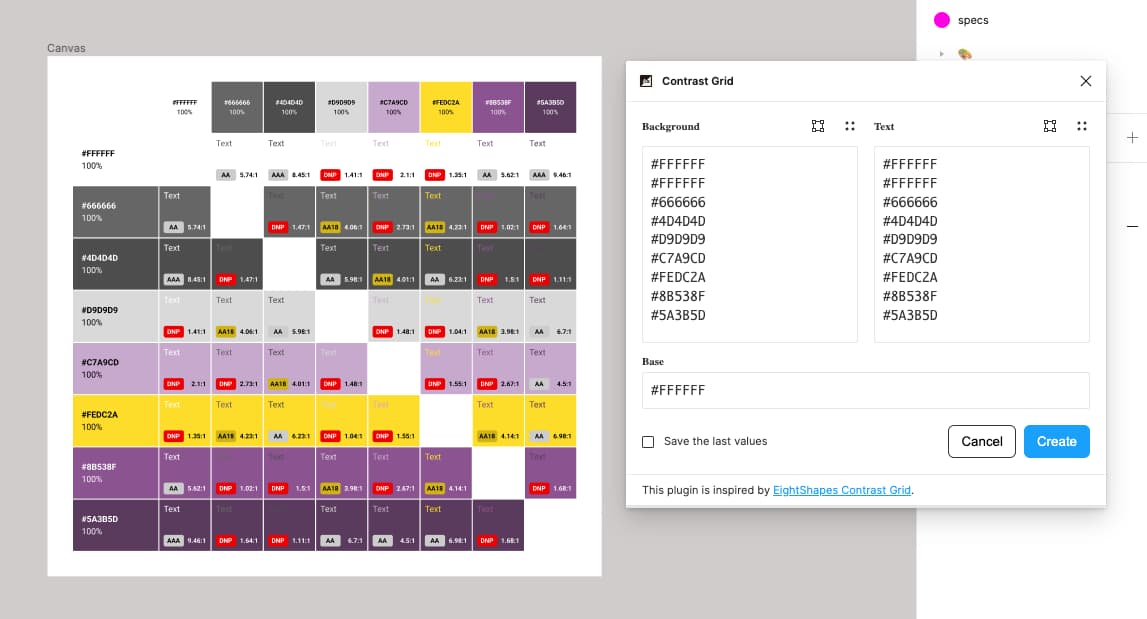
There is also a Contrast Grid for Figma plugin. It does the exact same thing: you can list your palette colors and it will generate the grid.
For more palette color tips you can read My struggle with colors – Demystifying colors for accessible digital experiences and My struggle with colors, part II – Building an accessible color system from scratch. I applied the method of the 10 shades with the 5-steps method on a few projects, it works quite well.
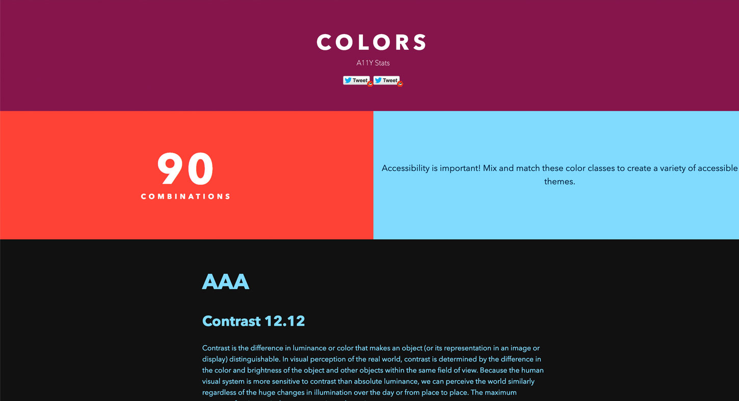
90 combinations
This page shows, well, hum, 90 combination of text/background color that are have sufficient contrast ratio. Be careful about the ratio though, some of those have a 4.1 AA large ratio which means you can only use them for text bigger than 18pt (or bold text bigger than 14pt). If you lack inspiration, this site a place to starts, but…
But from a designer perspective, I think that you might want to avoid half of the 90 combinations. Purple on yellow or green on violet might pass the 4.5 ratio, but they are still super annoying to read. Just because you can doesn’t mean you should!
Helping color blind users understand your content
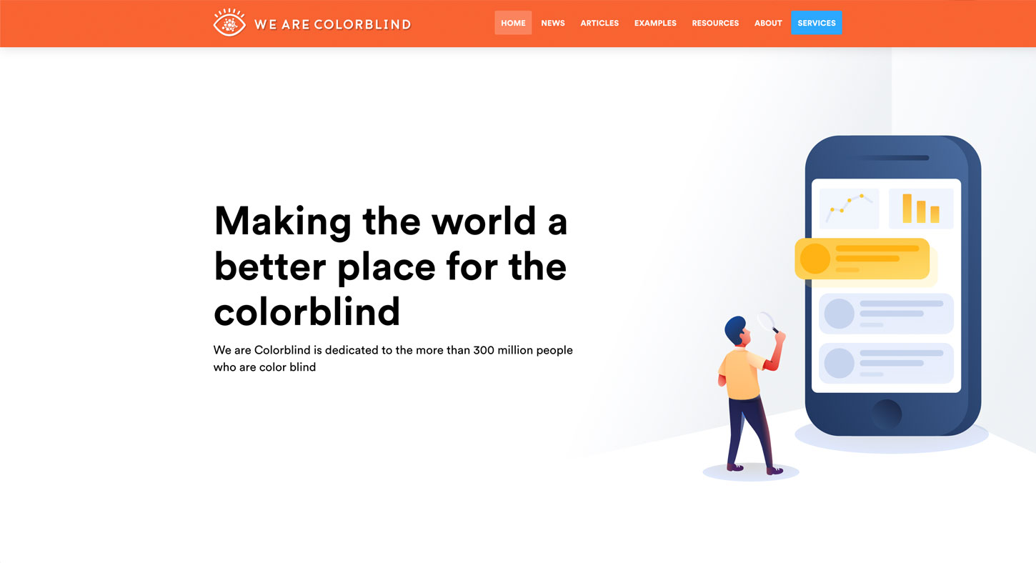
We are Colorblind
This is a website with resources, articles and examples dedicated to help other people understand color blindness.
- Designing UI with Color Blind Users in Mind 7 tips to help you design for color blind users, from patterns and textures to symbols, labels, etc.
- Color Blindness Considerations for Designers and Content Managers, some quick tips to help you design for color blind people
- 5 Ways to Improve Your Ecommerce Design for Colourblind Users, this one is specific for ecommerce, which brings its own issues of “how am I supposed to chose a tshirt if I can’t make the difference between the colors on the screen”
- Colorblind accessibility in video games – is the industry heading in the right direction? An interesting article in the game industry where color blindness plays a big role for some games
Geri Coady’s ressources
Geri Coady is an amazing designer who put a lot of resources out there to help you:
- Color Accessibility Workflows the book at a book apart
- Colour Accessibility, the basics on 24 ways
Be careful with CSS background images
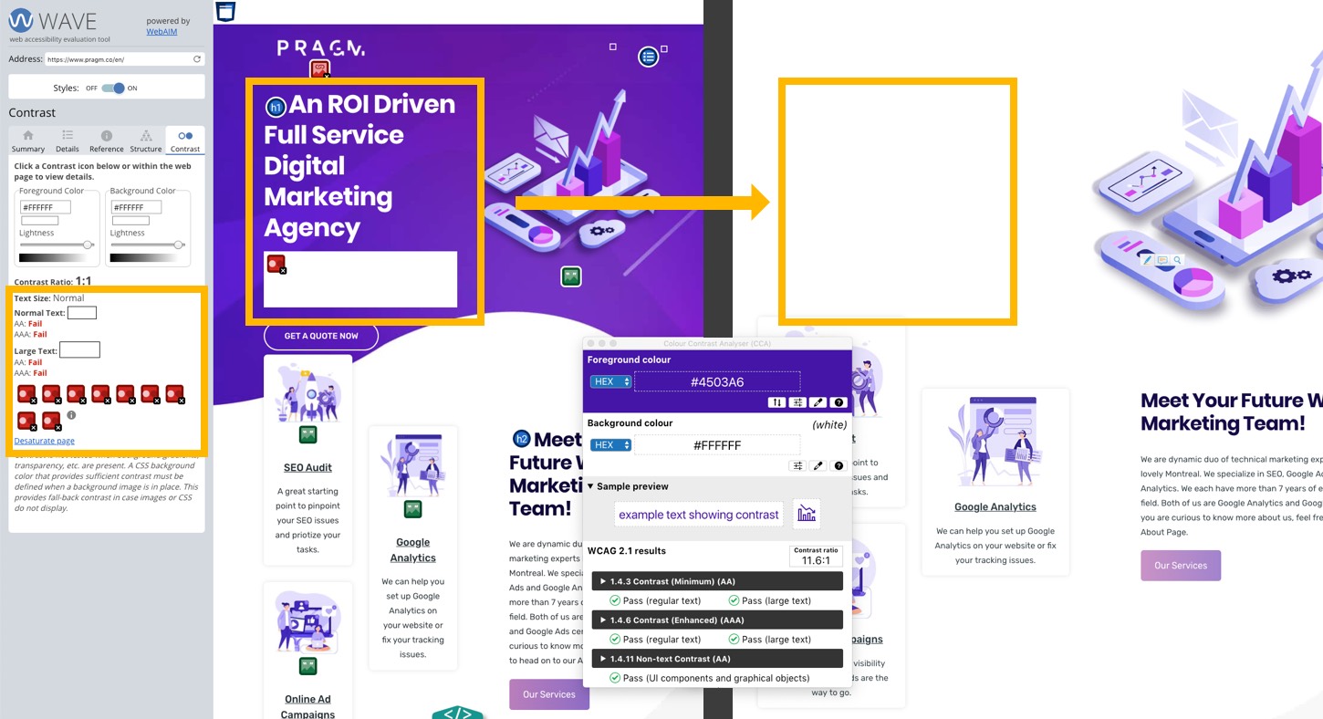
Now that you know a little bit more about color and accessibility, there’s one last thing you need to be careful about: CSS background images. Let’s take my friend Myriam’s pragm.co site as an example. Myriam did a nice job with color choice. If you take a look at this dark purple in some of the tools I mentioned above, you will see that the ratio is good. Yeahy for Myriam’s purple!!!
Nevertheless, when taking a look at her site with an automated accessibility checking tool like Wave (an online tool that will give a report about accessibility issues including some contrast issues), you see that she has some contrast issues in the header. You might wonder: how is it possible that the contrast ratio between this purple background and the white text on the screen is 11:6, that should be enough? This is because tools like wave (and other automated tools) are considering the background of this section is white (#ffffff). Why? Because Myriam’s theme only adds the background image without any fallback color. As you can see on the right part of this screenshot, in the case the image is not loaded, Myriam has indeed a problem: a white text on top of a white background.That is why those automated tools trigger warning for such cases.
How to fix this? Make sure that you have a fallback background color for the element if the color is conveyed by a CSS image. It can be done by providing fallback background color to your CSS background images. This works well for JPG images. But if you need transparency (like Myriam does), you might have to find another way to have this background color somewhere, maybe on another element. Test your site with CSS images disabled and you will see where users can’t read the text.
Help, I’m stuck with the client’s branding
Sometimes, you have to work with client branding. Some of them won’t like it if you tell them that you want to change their corporate color because of contrast issues on the website. For those cases, a last solution is to use a style switcher to provide a conforming alternate version.
A few more articles to help
Finally, here a few more articles with some tips to go a little bit deeper in this topic
- A guide to color accessibility in product design another nice article to help you get started
- Color in Design Systems 16 Tips for Setting Up a System That Endures, tips 13 to 16 are all about accessibility
- Color Contrast for Better Readability an article to help you establish and use an accessible color palette.
- Chrome DevTools: Accessible Colors
If you have more tools and ressources to share, the comments are open.
Also thank you Geoffrey Crofte for the proof reading and adding one tool to the list 🙂
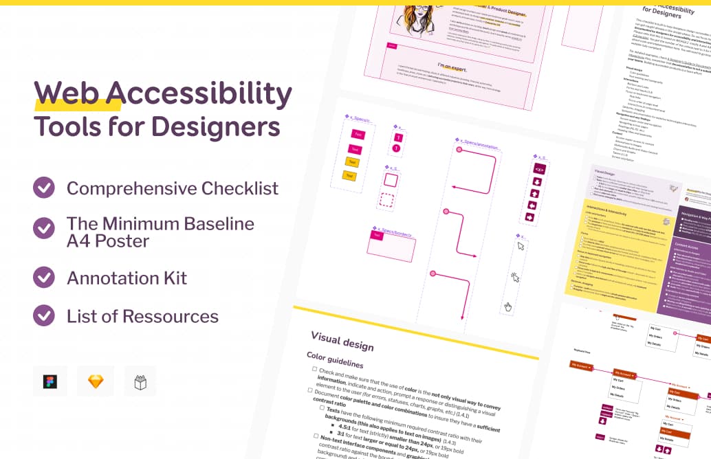
Accessibility checklists & Interactions Documentation Kit
Wow. That was a lot. But don’t worry, if you don’t remember everything that you could document, I prepared a checklist for you. And some Sketch and Figma Annotation kit, to streamline your design process and save you time. You can now get it on my brand new shop.
