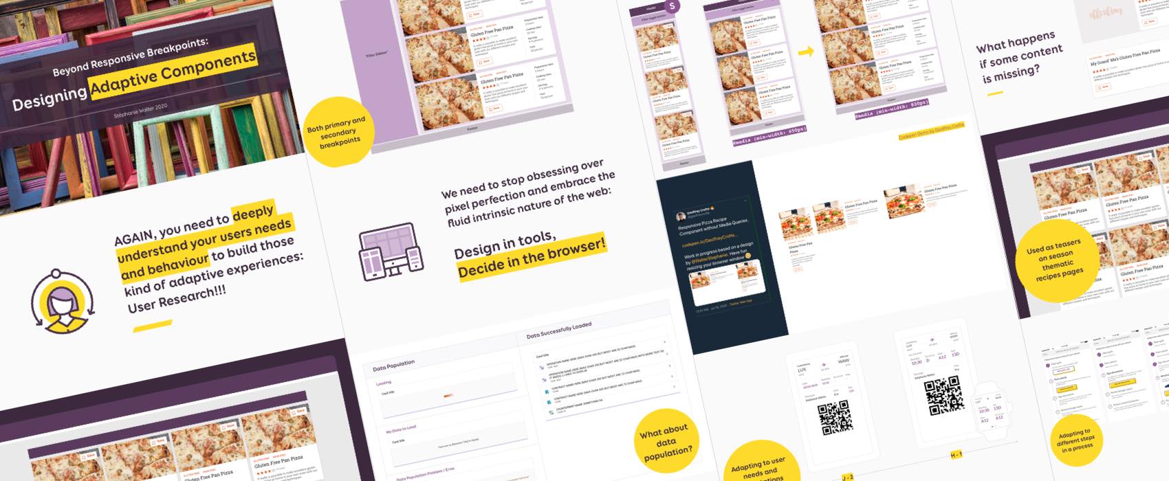
Designing beyond the pixel-perfect idealistic case
I was invited to “Ask the Expert”, an online meetup where experts share their knowledge around different topics related to building the web.
In the talk and article, I show how I design systems of components that go beyond responsive adaptation to different screen/viewport size and can also be used in different layout and container contexts. I also try to make sure that my components work beyond the perfect “happy path perfect situation”: what happens with super long text, missing images/content for example? And how about adapting components to user needs across specific points in their journey and build truly adaptive systems?
I address here, among other things, the concepts of content model, content priority, information architecture and user journeys to help you design adaptive components. Your developers will thank you (or thank me)!
In this article you will find a short transcript, the slides, a video of the talk and some demos and resources.
This talk has a lot of examples and is highly visual. I encourage you to also check the slides while going through the transcript (I didn’t want to overload the article with all the images).
Beyond arbitrary mobile screen sizes
The first part of the talk concentrates on adapting beyond arbitrary mobile screen sizes. Usually students or people on twitter ask me ““320px? 768px ? 1024px? What breakpoints do you recommend?”. And unfortunately, there’s not perfect answer for that. My main advice: don’t define your breakpoints on exact device widths that you are looking to target, base them on your layout and content.
I introduce the concept of primary and secondary breakpoints. Your grid and content choreography will define Primary CSS media queries breakpoints. They trigger major changes in your layout (like the content changing from 1 to 2 column). Secondary breakpoints are used to adapt the design at component level. It’s easier to decide those in the browser when the content “breaks” in the component.

I then explain how to build a content model of our recipe teaser and how to prioritize the content priority using the metaphor of luggages in a plane when you travel. You get 3 different types of luggage: hand luggage, cabine luggage and checked luggage and you arrange your items in those depending on how important they are for you during this journey. It’s the same for your content:
- Does this content belong to my hand bag under my seat? (aka super important users we need all the time)
- Does it belong to the cabine luggage? (aka important content they need quite often but not as important as hand luggage)
- Does it go in the checked luggage, directly to the hold? (secondary content that could be hidden on small screens following the principle of progressive disclosure and displayed later on demande)
So to put is short: to take clever design decisions regarding the content of your components you need to do your user research. This will help you understand your users priorities regarding that content, what is important to THEM and not to your HIPPO (highest-paid person in the room’s opinion) stakeholders.
Towards Automagic* Ideal Condition Layouts
* not a typo ^^
Once we have decided about how those components might adapt to different screen and browser size, how about we see if we can also re-use those components adaptation in different layouts or containers.
If we take the small version of my recipe teaser, would be re-use it in other places? For example:
- Used as teasers on season thematic recipes pages
- Used in a sidebar on a blog post
- Used as “Related recipes” slider item on a recipe details page

How to design reusable components that can adapt to different layouts and containers
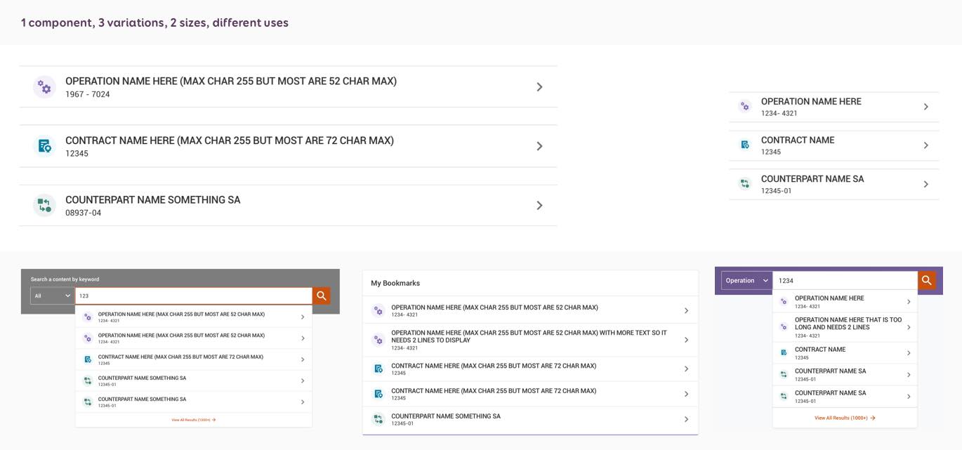
Then the question is “How do we build those robust reusable components?”. To answer I use another example of one component that we call “link item” in our system.
- Prepare a content model: for my component it’s quite simple, it has a name, an identification number, an icon (and a link). It is used for operation links.
- Check if they are variations or other contents that could use the same component? For my example, yes we could use the same to display links to contracts and counterparts.
- Identify where those components can be re-used. In my case those components could be re-used in a few different places across the interface. They could also be used at 2 different sizes: medium and big.
- Document this. If you are building re-usable components, help your dev team find where those components are re-used in your system by documenting it.
From “ideal condition” in design tools to the browser
Jen Simmons in 2018 in a talk in “Everything You Know About Web Design Just Changed” at An Event Apart spoke about the term “Intrinsic Web Design” And I really like the concept. She also talks about this in the Big Web Show podcast: 176: Intrinsic Web Design with Jen Simmons.
Jay Freestone in his article “Should we still be selling responsive web design?” summarizes the concept in an interesting definition:
Instead of changing styles based on the size of a viewport (or how big the screen of the device is), components automatically lay themselves out based on their own ‘ideal’ conditions.”
And I really like this idea. For me, as a designer, my job is to show my developers this “ideal” conditions. Then we discuss how it will adapt in the browser.
Adam Argyle built an interesting of what this could technically look like. He uses flexbox to build a form that adapts to 4 different layouts with not a single media queries. Those layout depend on the size of the parent (by default the browser but you could have those into containers). The demo is available on codepen.
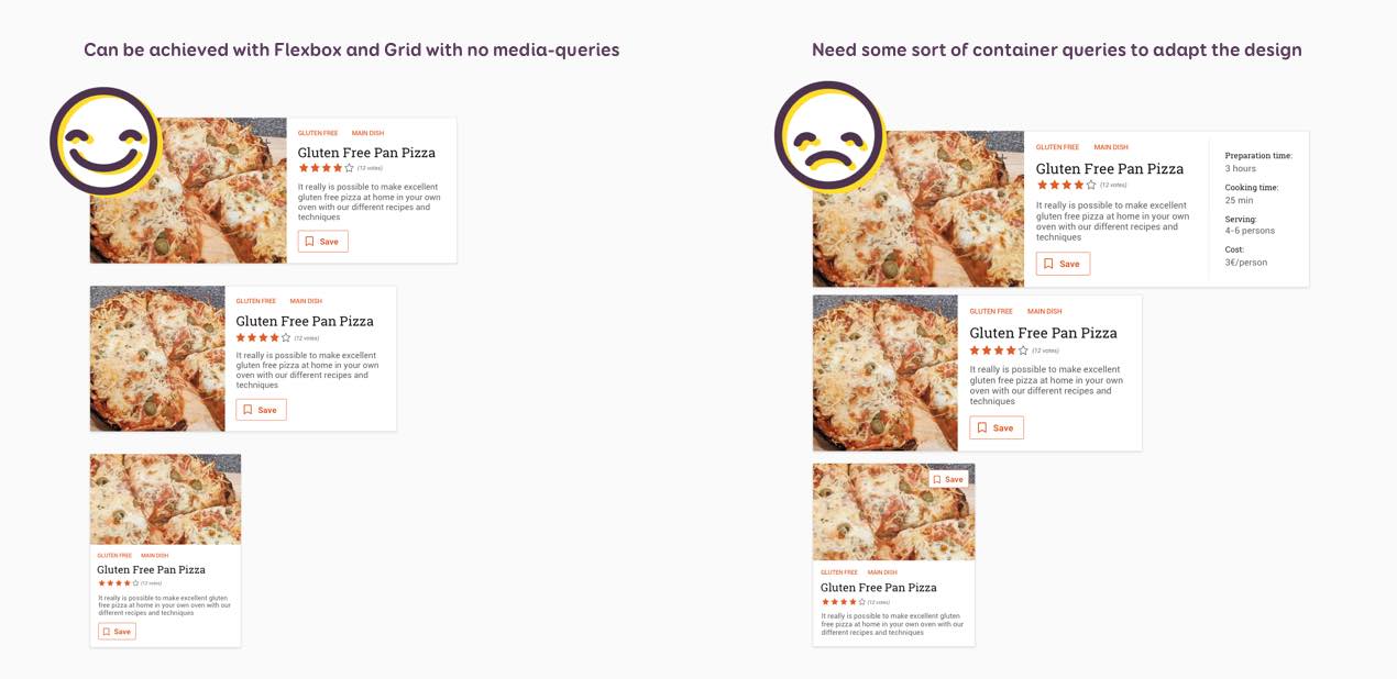
And if you are wondering “could we build Stéphanie’s pizza teaser that way”, the answer is yes. Geoffrey Crofte built a small demo for that purpose where he uses flexbox to build a version of my component that adapts to 3 layouts without media queries. Also he wrote a tutorial after building this demo for my talk: How to Make a Media Query-less Card Component .
So, you can use Flexbox, Grid Layout and more to build responsive layouts without media queries. If you are interested in this, there’s plenty of articles on the topic:
Also, please take a look at Jen Simmon’s Layout Land Youtube channel, you will learn a LOT of cool stuff that you can do with modern CSS.
Faking container queries
Unfortunately, there’s only so much we can do with layout. If you want to go deeper into the kind of adaptations I showed at the beginning of the talk (like showing/not showing part of the component based on size), you will need the grail we are all waiting for: container queries. Those used to be called “element queries”. With media queries you can adapt content based on viewport (and other parameters). With container queries, you could be able to adapt based on specific parent size.
There were quite a few proposals, and you can check “The State of Container Queries” and “Let’s Not Forget About Container Queries” for more details. There’s no real implementation or solution at the moment. Some clever people like Philip Walton tried to emulate those with a little bit of JavaScript. You can play with his demo if you are curious about how it would work in a browser.
Anyway, whatever the technical part, my job, as a designer, is to design those ideal conditions. Then my dev teams are providing guidelines in CSS. But we are leaving the precise implementation up to the browser. This means
- that we need a strong designer/developer collaboration so that designers can understand the technical limitations as well
- that we need to test the components in the browser as soon as possible
- that the designs mockups are not the absolute picture of the final product, but some guidelines to develop the components
- that we need to stop obsessing over pixel perfection and embrace the fluid intrinsic nature of the web: Design in tools, Decide in the browser!
Beyond “Happy Paths and Perfect Content”
Most designers tend to provide one version of the component, the “happy perfect content”. Here you go, Okay thanks BYEEEEEEEE 👋. The next step to design solid systems of components is to think beyond this and start thinking about “what will happen when things go wrong, don’t load, are bigger etc.?”
Here are a few examples of what we, as designers, need to not forget (check the slides for visual examples) when it comes to content situations:
- What happens if the title needs 2 lines? What happens if the name is super long? Not everyone is called John Doe!
- How does it behave in a gallery with different content length? Do we keep the height of the card, do all the cards have the same height and we have white space at the bottom of the cards?
- What happens if some content is missing? Like, this image, do we have a placeholder? Do we remove it and the component adapts to a version without the image?
- What happens if we don’t have value for some contents?

Here are my top tips to achieve this:
- Don’t use Lorem ipsum. If you use “fake content”, make sure the structure is close to the real one.
- If you are a designer: ask the devs for the limits of those fields in the database, ask for min, max and average content length.
- If you are a developer: if something is missing, ask the designer how it should behave.
Then, we also need to think about different states of the UI component, but also about different states of the page:
- What happens for interactive states (for example for forms)?
- What about data population: what happens when the content of the component is loading, when there’s no data to load, a loading error, etc.
- What happens for 5 items + ? Pagination? Scroll?
I don’t need to “design” all of them, just “decide” what will happen and communicate this to / with the dev team.
Here are some tips to think beyond the happy path:
- Know where the data/content comes from (ask devs).
- Investigate the amount of data that might get displayed.
- Investigate what might go wrong with this data.
- Build some flows (user flows, task flows, whatever helps) to make sure you don’t forget some paths and go beyond this “happy path”.
Adaptive Systems towards User’s Context
Let’s talk about adaptive systems. Avi Itzkovitch define them as “a process in which an interactive system adapts its behavior to individual users based on information acquired about its user(s), the context of use and its environment.”
Adapting to step by step processes
The first level of adaptation we can think of is if the interface is built around a clear step by step process. For example: when you buy something on amazon and go into your “orders”, the interface changes based on the step of the process you are in: dispatch, out for delivery, etc.
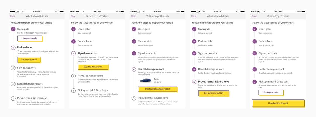
In the talk I give the example of an app that would let users bring their car outside of opening hours. When doing research and analysis, we build user flows where we identified 5 main steps for this task. And this is reflected in the app screens. The UI components adapt automagically to the step the user is currently in.
Using sensors to adapt to user environment
Our devices, especially mobile devices are packed with a lot of interesting sensors that can give you information about the user environment. We can use those to build smart interfaces and components that adapt accordingly.
For example, most GPS apps now detect if the user is in a tunnel (position + ambient light in the car can help). Based on this, they automatically switch the UI to night mode.
You could imagine a lot of use-cases. A few years ago, I wrote “The (Not So) Secret Powers Of The Mobile Browser” where I imagined what would happen if interfaces could adapt to user’s current needs and context. If you are curious about more of those, I also have a whole talk where I explain how we can use some of those HTML5 APIs to enhance mobile browser user experience.
Check the talk article on browser APIs
Adapting to user needs and expectations across the journey
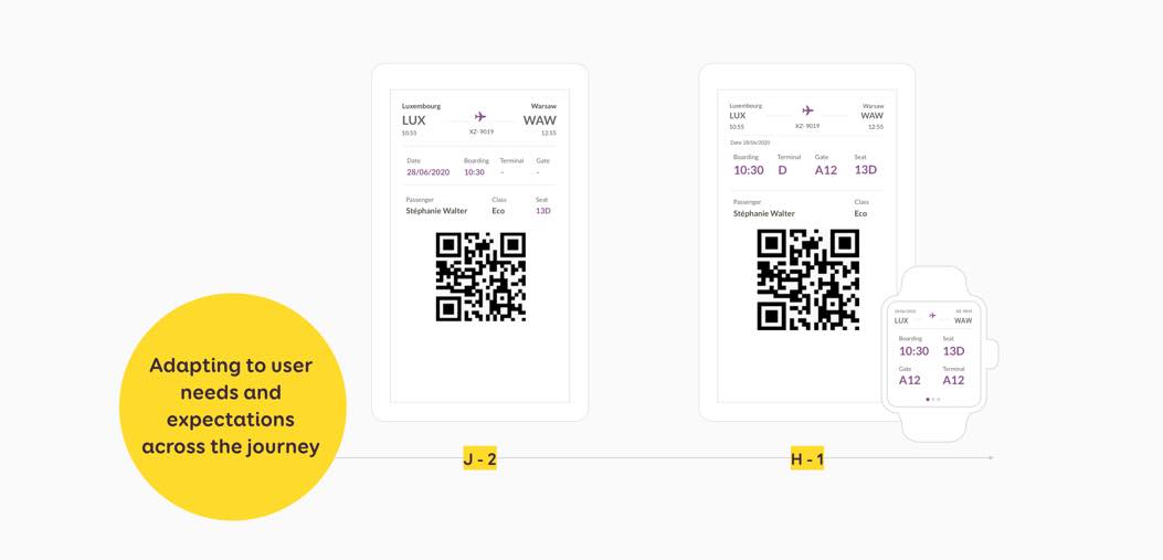
This one is a little bit more experimental, but could we imagine an interface that adapts to user’s expectations at specific points in a journey? Let’s take the example of a boarding pass. A few days before the trip, the user mostly needs the name of the airport (anyone living in a city with 2 airports or more will agree), the date and time of the boarding.
But what about h-1? There’s a good chance that the user is already at the airport 1 hours before the flight (I hope, otherwise it might be complicated to catch it). What do they need then? Do they still need to have the airport name in super big font on the boarding pass? Would they not be more interested in the boarding time, terminal, gate, and then seat?
This is what a small adaptation like that could look like on mobile and smart watch:
This last part is more “experimental” and I would be careful with it and heavily test it because it might go against the “predictability of the interface”. So be careful.
Also, no one likes a “I know better than you” interface. Here is an example on Google’s forum where users ask how to stop one of those “automatic adaptive” feature. The GPS changes from drive to walk when they are doing deliveries which makes them waste a lot of time. So this kind of adaptations might sound smart, but still, make sure you allow users to keep control on those adaptive features if they need to.
How to design for adaptive features
AGAIN, you need to deeply understand your users needs and behaviour to build those kind of adaptive experiences: User Research!!! User journey maps is a tool I use a LOT to understand user’s expectations across the whole journey. I wrote a small introduction to user journey maps with some free templates and resources linked at the bottom of the article to go deeper in this topic.
Read the Introduction to User Journey Maps
We already talked about using user’s device sensor to gather information about their environment.
Last but not least, you could use machine learning and big data to predict user needs and behaviour.
For example, at the moment (July 2020), when I search for “reproduction rate” on Google, the top results point to epidemiology reproduction rate. Meanwhile, resources about the demographic notion of reproduction rate rank lower at the moment. This is due to the current COVID crisis: people hear about the “reproduction rate” and Google is changing the content displayed based on what other people are also looking for (also based on my previous research but I did the test in anonym mode).
Trust me, I am not a big fan of those techniques. But it can help build interfaces that truly adapt to user’s needs and expectations, if done properly. If not, well, you end up like amazon in the example in my article about building notifications that will not annoy your users: trying to push yet another pair of rubber boots. Hi, I’m amazon, would you like another fridge with the fridge you already bought? Seriously, amazon is full of great examples of machine learning and personalisation done wrong.
To sum it up…
This is the main points you need to remember:
- Think beyond screen size
- Build re-usable components that can lay themselves out based on their own “ideal” conditions
- Design beyond happy path/content
- Conduct user research and use content model and information architecture to take design decisions
- It’s a collaborative process with your development team!
If you are interested in this talk for your conference or meetup shoot me an email.
Check the slides
This talk has a lot of examples and is highly visual, the slides should help you understand better all the concepts I explain.
Watch the video(s)
Latest version of this talk was done at Web Stories in 2021:
The talk was recorded on July 2020 so you can see the video of the talk and the almost 45 minutes Q and A here:
I also gave this talk at FrontEndLive 2020 on October 25, 2020, here is the recording of my talk (and the rest of the talks):
That’s all folks, I hope you liked the talk 🙂
