Pixels of the Week – December 16 , 2018
Every week I post a lot of my daily readings about Web, UI and UX Design, mobile design, webdesign tools and useful resources, inspiration on twitter and other social networks.
This week’s selection: thoughts on front-end and JS gatekeepers, design options, debug CSS, typography ressources and free fonts, building a great portfolio, prototype in code, shadow DOM, UI & UX trends, design 404 pages, naming colors in CSS and in design tools, design tools survey, accessibility, CSS, risk of homogeneous web with browser uniformisation, etc.
You can follow me on twitter to get a dose of links every days.
TL;DNR the one you should not miss
#Front-End
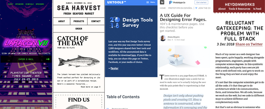
Reluctant Gatekeeping: The Problem With Full Stack “The value you want form a CSS expert is their CSS, not their JavaScript, so it’s absurd to make JavaScript a requirement.” Yes so much yes 🙁
Interesting article
#UX
- A UX Guide For Designing Error Pages. Answer: who caused the issue, what happened & why, when will it be solved, how can user solve it. Then tie if to brand identity and try to delight users
- 2018 design tools survey is out, interesting data about our industry. Main finding: Sketch became the tool for everything, from user flow to wirefame to UI design (or is there a sampling bias here?)
- Unraveling a complex UX problem: how to solved information architecture problems with competitor’s analysis, user flows and card sorting
#Mobile
- This is sad “Is there a cold war between Android and Chrome because of PWAs?” If you think Apple doesn’t want a good PWA experience on iOS, remember that Google with the Android and Play Store teams might want the same thing.
- Proof That iOS Still Hasn’t Gotten Undo Right. I’m not sure about Procreate iPhone bur on iPad I remember having a button to undo. My issue is with copy paste though, I suck at the 3 fingers thing and end up drawing instead :/
#Front-End
- What is the Shadow DOM?
- What do you name color variables? Currently team primary/secondary in CSS, but team blue-100 or blue-dark in Sketch. Maybe I should make up my mind 😀
- How and when to use the tabindex attribute, useful for accessibility 🙂
- Why isn’t it <style src=””>? – Hum, legit question, interesting answer
#Design
- “Stop showing design options and commit“, yes yes and yes, to do that you need to trust your designer. But if not one option, the general rule is the more people in the room, the fewer options to discuss.
- My struggle with colors – building an accessible color palet and naming the color in a consistent way is not easy. I also use the HSL and lightness to name mine on some projects, works well. For instance gray-10 gray-95, etc.
#Browsers
- Risking a Homogeneous Web – great read on Google’s domination on the Web standards, AMP, Microsoft switching to Chromium, etc.
- Speaking about sad state of the web, The State of Web Browsers for 2018
#Portfolio
Advice from women in design on building a great portfolio
#Prototype
“Prototypes and production” great read on 2 different mindsets. Of course it should go without saying that you should never, ever release prototype code into production. Of course… But so many people still do that mistake
#Game
“Fortnite Is so Much More Than a Game – Teens have always created their own spaces to experiment, socialize, and indulge idle curiosity“
This kind of makes me want to try the game even if I suck at FPS
#Conference
Mandatory read if you organise or talk at a conference!!!!!!
Inspiration, fun demos and Great ideas
#Retro
Larcon VII, That retro conference site is awesome <3
#Inspiration
Inspiration of the day, beautiful site: Sea Harvest <3
#Trends
2019 UI Trends (and a few UX stuff), “Deep flat is the new flat” made me giggle
Useful tools and plugins that will make your life easy
#CSS
Debucsser – a tool with an unpronounceable name to help you debug CSS
#Font
- Cunia is a sans serif font with slightly rounded corners #font #freebies
- Hello typography lovers. Pentagram designed a Harry Potter logo and font
- And here’s more about the WALLE movie font