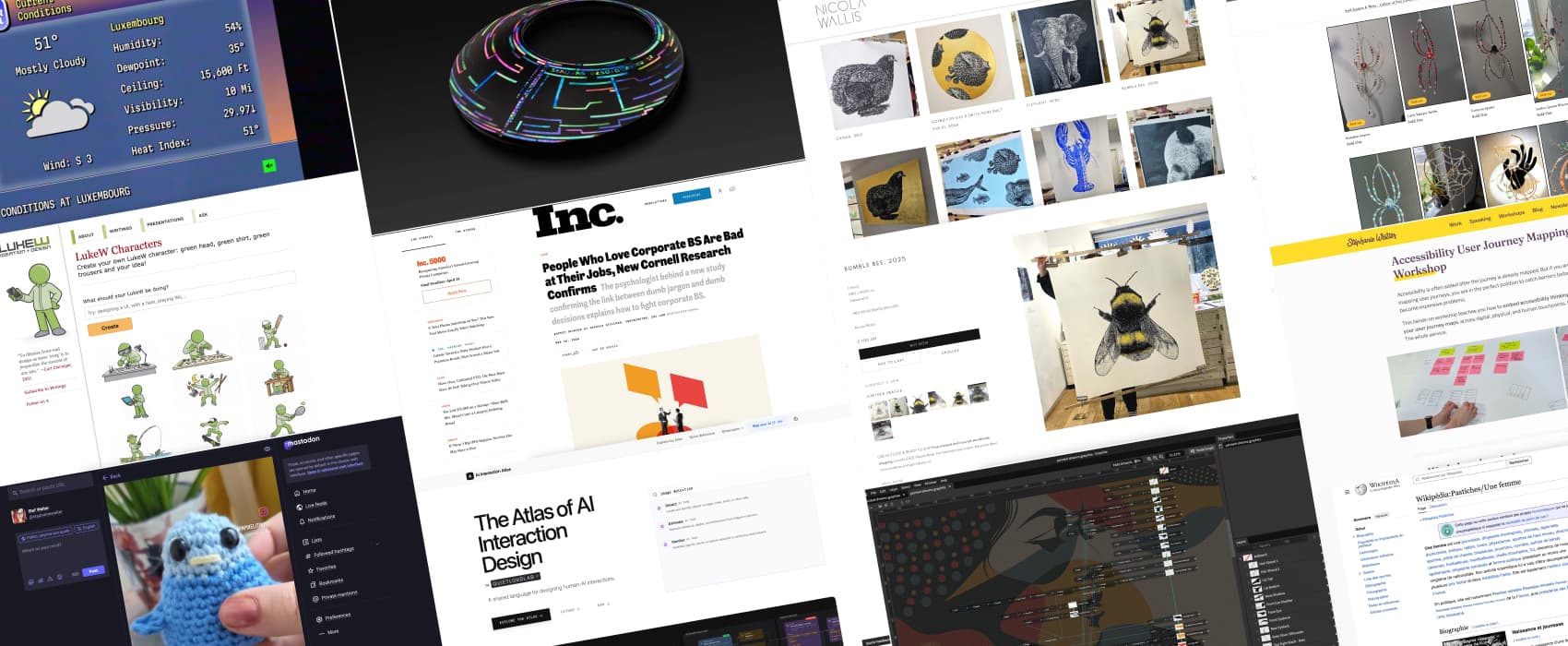
Pixels of the Week – April 12, 2026
People using corporate BS are bad at their job, accessibility journey mapping & linocut art.
Pixels of the Week is my weekly-ish curated newsletter for designers, UX folks, devs, and anyone building accessible, inclusive, usable (and let’s be honest, awesome) digital products. This week we explore designing AI experiences that build trust, a new accessibility user journey mapping workshop, and research proving people using corporate BS are bad at their job. Also: a free open-source vector editor, linocut art, and why crochet is basically engineering.
Subscribe to my newsletter to get this directly in your mailbox!
A new workshop to map accessibility across user journeys
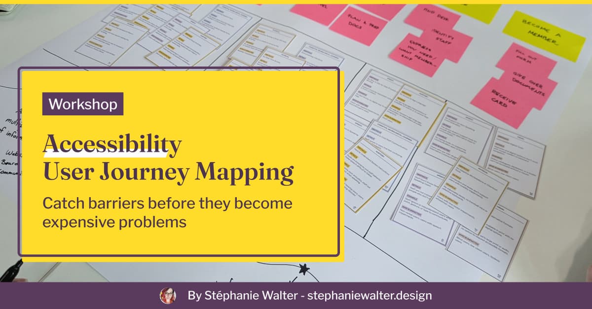
I’m happy to announce my brand new workshop: Accessibility User Journey Mapping Workshop. Accessibility is often added after the journey is already mapped. In this hands-on workshop, I will teach designers and project teams how to embed accessibility barriers directly into a user journey maps, across digital, physical, and human touchpoints. You know me, I love cards, so of course I created a dedicated deck of “accessibility barrier cards”. It’s available as a 2-hour intro or a 6-hour applied session, in English and French.
Check out my Accessibility Journey Mapping Workshop
On a personal note
I’ve been having a lot of fun with crochet since October last year. Last week I crocheted a small “flip the bird” for a friend. It also means that now, I can know how to crochet hands… muuuhhaaaa. This week, I was targeted by one those fake VP job. I took the picture of the person and did a Google image search. I discovered that, a lot of people share the same fake avatar. Be careful out there! Please enjoy my silly LinkedIn post about this.
Most popular content this week
People Who Love Corporate BS Are Bad at Their Jobs, New Cornell Research Confirms (10min) The more you love corporate BS, the less well you’re likely to perform at work. Ever had to work with someone who spewed corporate bullshit all day long, yup, that person. Science proved what we all knew all along: they are bad at practical decision making and analytical thinking. Good at corporate BS, bad at actual work. No wonder I have a hard time dealing with those. Analytical thinking is basically what my brain was created to do. Also, here’s The Corporate Bullshit Receptivity Scale full research, if you are curious about the method.
Interesting articles that caught my attention
Designing AI experiences people actually use (15min)
Surprise surprise (no): most users don’t trust or find useful an AI tool that opens with a blank page and a giant “What do you want to make?” Why? Because this assumes users already know their goal. But often, they open a tool precisely because they don’t. If we ignore this gap, three things break: trust in the system doesn’t build, value becomes hard to see, and the cognitive effort of using the AI tools feels too high. What can designers do? Instead of asking users what they want, show them something real first, a trend, a pattern, a concrete result. Replace blank prompts with structured starting points that propose a direction. And most importantly, keep the human in control: let them validate and override the AI result before it does anything on their behalf. by Buzz Usborne
Also, in case you must design an AI system and need help, check AI Interaction Atlas: a library of interaction patterns for AI systems.
Consistent Character Maker Update (7min) I am quite impressed by the results of LukeW’s new character generator. Those tools become scaringly good at consistency as well. You apparently still need to tweak a lot at first though.
Curiosity cabinet: non-design/tech rabbit holes I enjoyed
Wikipédia:Pastiches/Une femme this one is for French speakers. Une Femme is a satirical Wikipedia page, that compiles all the articles dedicated to the accomplishments of women where they refer to her as “a woman” instead of her name in the title. The page has a whole fake life story of “a woman”, based on those. It’s fun, and sad at the same time. I wonder if the same exists in other languages
Inspiration: fun experiments, beautiful art, and great ideas
Linocut artwork by Nicola Wallis the details and precision in Nicola’s work is exquisite and highly impressive. If you ever tried linocut, you know how hard it is to even align things. That bumble bee is giant and perfect.
Ann’s Window Suncatcher (warning: spiders) Michaela created beautiful beaded sun catcher little spiders. My windows are not sun exposed enough, but still, I think those would look awesome on my monstera.
TYPE 9 Ikeda Limited Edition the level of craftsmanship on this 43000 EUR watch is stunning.
The Weather Channel watch the weather channel like it’s 1999, with some retro smooth jaz and all the amazing retro visual elements. Weather is crap, but, at least, we are having fun, right?
Books
I’ve just started the Dungeon Crawler Carl book series, and honestly it’s quite fun. So, friends, if you ever try to sell me a book where the side character is a sassy talking cat that has more intelligence and charisma than the main character, start with that fact.
Useful tools & resources
Graphite is a free, open source browser based, 2D vector editor. It’s currently in Alpha version. It has an amazing non destructive editing workflow feature inspired by VFX compositing. This brings a lot of flexibility, for example: coming back on a specific edit to revert it. It co-exists with a layer based approach, giving you both ways of working.
Cool and interesting videos
”Crochet is the OG 3D printing. Knitting /beadwork is the OG pixel art. Weaving is the OG programming. (etc.) All called the woman’s work. And it IS! But it is also TECHNOLOGY & ENGINEERING.” This quote from Alex’s instagram video has been stuck in my head for a week now. And actually, yes, I couldn’t agree more. Alex Tomic is a designer and language scientist living in Tromsø, Norway. They design and crochet amazing crocheted lamps and fidget toys.
Tutorials
Managing icon component sizes (10min) Alice Packard explores the pros and cons of different Figma methods to have flexible icon sizes in a design system. I currently re-use a design system that uses the icon wrapper components and I can confirm that it’s quite annoying when the icon is used in buttons and you have to deal with nesting.