Pixels of the Week – April , 30 2023
This week's dinobsession, PWAs cool news Designer vs or with AI, you chose.
On Twitter, LinkedIn, and Mastodon, I share curated articles I read, resources and tools about UX Design, User Research, UI and mobile design, HTML, CSS, the web industry, some processes, some inspiration, etc. This is an archive of everything I shared this week. And some extra links that I decided to only share for the blog readers. Also, subscribe to the newsletter to get notified when those are published!
Now: what I’m currently up to
Rooooaaar, I’ve spent the week playing around with dinosaurs and new craft material. Here’s a couple of the fun things
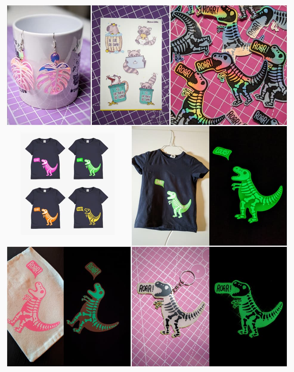 Craft, stickers, moar crafts…
- I played with white adhesive vinyl and some iridescent PVC and created some space monstera earrings.
- The cute “little beasts” sticker sheet arrived. I might end up setting a shop (or maybe a notion) with the stickers I sell. Let me know if you are interested.
And then the dinobcession…
- I created a dino two colors illustration. I wanted to create a shirt for my nephew. Since I never worked with HTV (heat transfert vinyl) because, I decided to start with a first MVP. I sublimated (apparently that’s the fancy word crafters use when they stick stuff on other stuff) a pencil case with a vibrant pink glow in the dark dino.
- Step 2: the real shirt. I went for a glow in the dark green dino with white bones, and, yeah, it was very cool. I was surprised at how easy to weed that cheap HTV was. I lost a couple of the small bones, but, they were like 1mm, so, to be expected. Check the making of on Insta
- I also still had some holographic paper from a previous project. I wasn’t super happy with it, when I printed with inkjet. But I figured the black and white dino could work. So I gave it another try and use a laser printer this time to print the black part and kept the holographic as light parts. I have 2 versions of it, and, well, I’m just super happy with the result (check it on twitter).
- Last but not least, I also got some glow in the dark shrink plastic, because, why not? So… yeah you guessed, another version of the dinosaur. This time: glow in the dark dino keychain. I inverted it, kept the white as background with dark bones. I messed up the size, I thought it would shrink 3 times, I actually shrunk only 2 times, so that keychain is GIANT. But, it was fun. I was expecting an epic fail because I never really used that sort of material. Happy to report, it was not.
Meanwhile, I’m also working on some workshop. Kind of. I admit this week was more craft than anything else. But I also feels nice to not to (too) tech related stuff.
TL; DNR: the one you should not miss
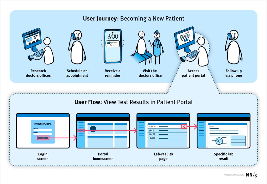
User Journeys vs. User Flows: a nice summary of the difference between the two, I know my students struggle with that at the beginning, so I guess it could help a couple of junior UX designers!
Interesting articles that caught my attention
User research and psychology
- Using deceptive patterns to overcharge for pizza: Dominos is not a pizza company it’s really a technology company, that just so happens to sell pizza. And it shows on how they try to deceive the users.
- “In the early phases of a project a spreadsheet can be a more useful design tool than Figma”, yes, to all of this! A great article on how to start your site with the content, structure it, so that you can plan your design for actual content needs (length, etc.) Spreadsheets before stylesheets
- Get the Best of Both Worlds with a Hybrid Team: pros and cons of being embedded into the product team, vs being outside and proving search as a service
Accessibility
- Visually Accessible Data Visualization: some tips on how to not only rely on color to make your data visualization (graphs, charts) more accessible
- Meeting WCAG Level AAA very interesting case study, including a pragmatic use of some media queries (like prefers-contrast) to provide AAA confirming contrast colors on demand for people who need it
Designer vs AI or designer with AI, who knows…
- Design as a craft will not die out because of new technologies : Designers are craftspeople who can create our best work on napkins, aka, you won’t be that obsolete so fast
- Understanding the Role of AI in User Research: use AI tools to help to analyze data, to personalize user’s experience in a product, to help automate tasks. Be careful about biases, and overreliance on technology: combine human expertise with it!
- The Cliffs Notes paradox “It doesn’t matter how much we summarize, at some point, effort is required. More summaries won’t automatically lead to more understanding”. Seth talks about chatGPT here, but this applies to so many situations. You can’t learn and grow from summaries, you need to do work at some point.
Technology and change
- The joys of having too many remotes: a fun personal opinion article exploring how technology changes the way we live, through the lens of remote controls
- How the Push for Efficiency Changes Us. How layoffs push for more efficiency from the people who stay: Who do you become when efficiency is your guiding principle?
Front-end
- Read-only web apps: you wouldn’t expect Gmail to provide Core features without JavaScript, but, you should be able to read your emails, view docs for Gdocs, etc.
Curiosity cabinet: non-design/tech rabbit holes I enjoyed
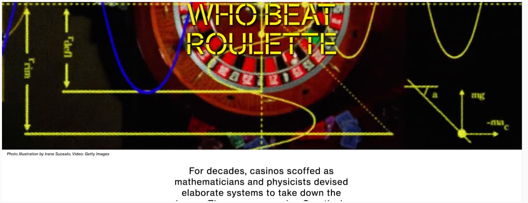
The Gambler Who Beat Roulette (trigger warning: there is a giant spinning GIF at top of the article): a very long but fascinating article about casino roulette and how someone was able to predict results and won a lot.
Inspiration: fun experiments, beautiful art, and great ideas
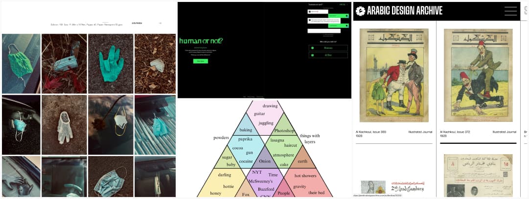
- Human or Not?: Chat with someone for two minutes, and try to figure out if it was a fellow human or an AI bot.
- DIS·POSED – A 2020 Quarantine Study: a collection of photos of masks, gloves and other items used to protect ourselves in 2020 during the peak of the pandemic. Disposable masks and gloves have now joined the pantheon of styrofoam cups and plastic straws as our unintended legacy.
- Arabic Design Archive: a non-profit initiative that seeks to enable knowledge production about Arabic design and its history. You can search by designer, year, etc.
- This is the best diagram ever made, you can fight me all you want, you know I’m right. Also: onion!
Useful tools & resources
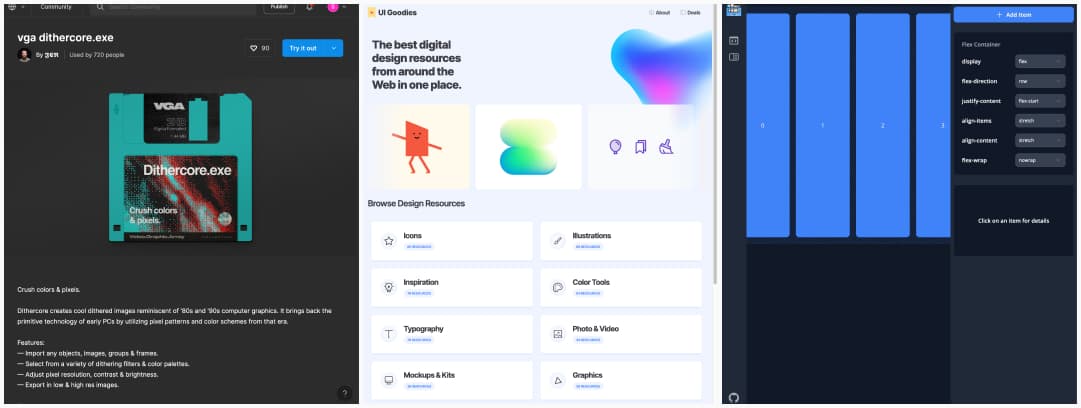
- Flexfun: a flexbox playground where you can add, remove items and test different alignments
- UI Goodies: another list of tools for designers, from icons, illustrations to typography, photos, mockup kits, AI, UX tools and accessibility resources
- vga dithercore.exe: If you want to have fun with a retro ’80s and ’90s computer graphics for your site or visual assets, this Figma plugin is going to be your friend!
Cool and Interesting Videos
Shifting left, or: making accessibility easier by doing it earlier: interesting talk by Hidde de Vries on some tools and techniques to help make the right choice and bake accessibility earlier in your project
Tutorials
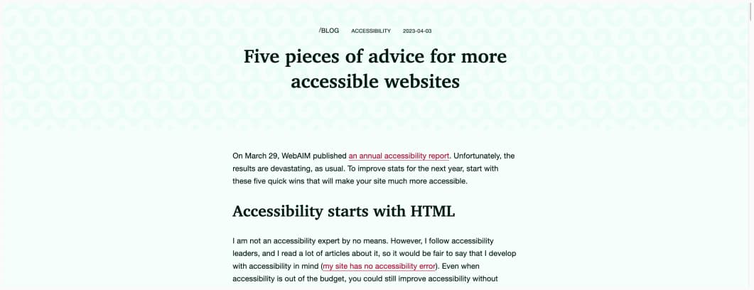
- Five pieces of advice for more accessible websites: the very minimum you can do is document language, skip link, labels linked to inputs, avoiding empty buttons (or adding them some aria) and having an alternative text to images.
- 3 spreadsheet tips to make beginners feel like pros: excel is an awesome tools for UXers (you can fight me all you want, you know I’m right), those are awesome hacks especially the “how to separate phrases into single word cell”
Latest news in the industry
- Solving the CSS layout and source order disconnect: a proposal to provide authors with a method of opting into following the visual order, rather than logical order with grid layout (for accessibility purpose)
- Winamp relaunches — and breaks my nostalgic heart: yep, I agree, where are the cool skins? I want the glossy, I want the plastic, I want the embossed, I want all the photoshop 7 effects in one player, meeeeh
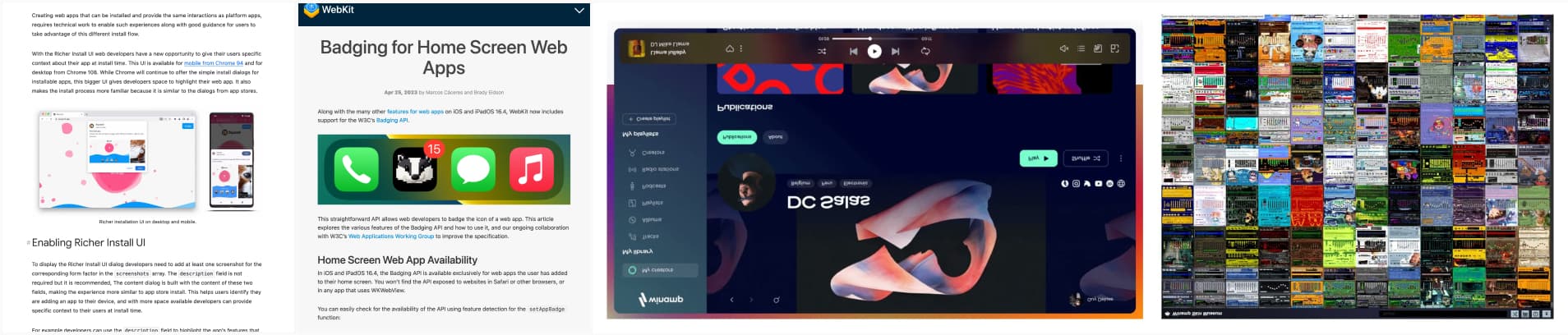
- Badging for Home Screen Web Apps, badger badger badger muushroooms, yeah, badging API is coming to iOS web Apps, whoop whoop!
- Richer UI install available for desktop: PWAs on desktop and mobile chrome get a new “install” dialog with more options like screenshots and description
- ChatGPT now allows disabling chat history, declining training, and exporting data: that’s good news for privacy, one step towards the right direction!