Pixels of the Week – April 7, 2024
Design patterns catalogue, craft beer branding and palette generators
My curated weekly-ish online newsletter, where I share interesting articles, tools, and resources I found during the week. You can expect content about UX, design, user research, accessibility & tech, but also some processes, some inspiration, sometimes books, and a couple of videos and podcasts. Also, don’t forget to, subscribe to the newsletter to get notified, you will get the weekly links directly in your mailbox, and be notified when I publish other articles.
Now: what I’m currently up to

News on the events in 2024:
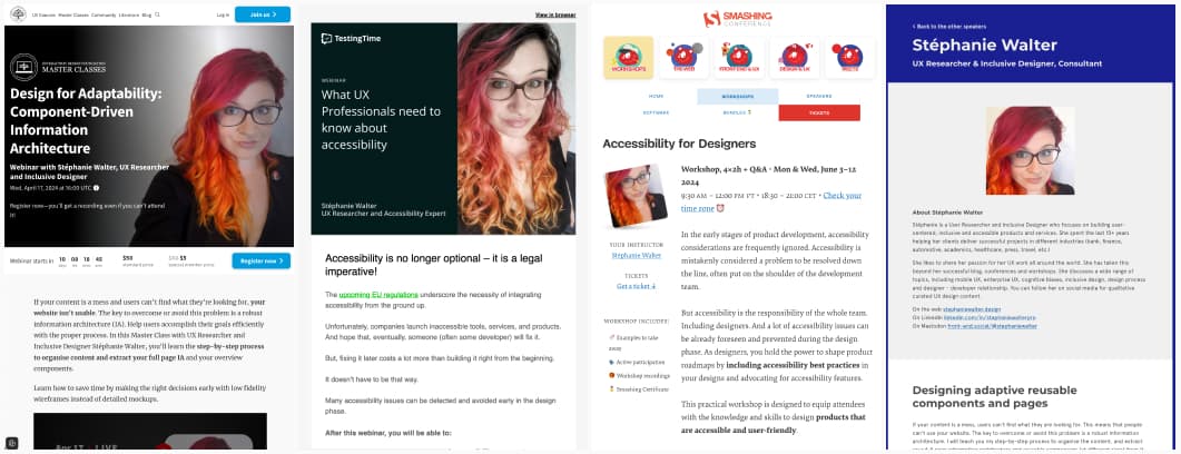
- Next week I’m hosting a ” Navigating Research Biases :Guiding Decisions and Mitigating Risks“. Registration is closed but, if you are interested in such a workshop for you conf / company, let me know and we’ll figure out how to make it happen!
- There’s still some tickets for my “Design for Adaptability: Component-Driven Information Architecture” with Interaction Design Foundation, on April 17. It’s 1h masterclass.
- I’ve partnered with TestingTime to host a free “What UX professionals need to know about accessibility“webinar on May 14
- My workshop “Accessibility for Designers” is coming back, with Smashing, June 3 – 12. The format will be 4x2h of workshop + Q and A, 18:30 – 21:00 CET
- If you prefer workshop, I’m hosting my “Designing adaptive reusable components and pages” twice at UX London, 18 and 20 June
On the craft side, I created new earrings, the process is still the same, paper, hot foil. But I’ve now 3 models: ginkgo, monstera and v-leaf. You can check those on Instagram, XTwitter and Masto
Interesting frameworks and concepts
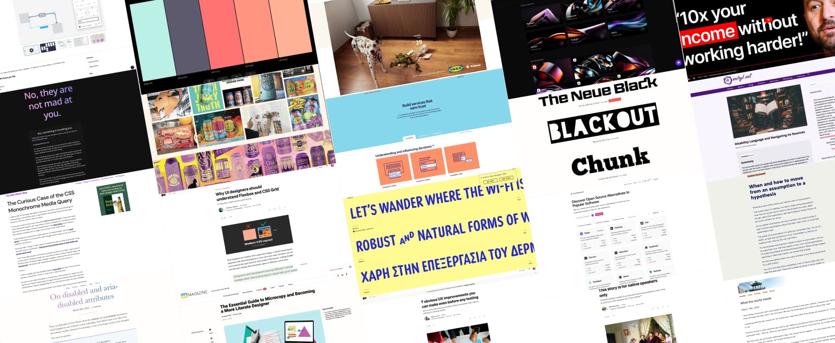
Design Patterns Catalogue This week’s resource you really need to bookmark is a design patterns catalogue, by IF. It offers different detailed patterns for Understanding and influencing decisions, Signing in to a service, Giving and removing consent, Giving access to data, Getting access to data and Doing security checks. Each pattern comes with a detailed description, advantages, limitations and examples.
Most popular content this week
Why UI designers should understand Flexbox and CSS Grid (22min) Christine Vallaure explains how to move away from 12 column grids (inherited from previous CSS tools like bootstrap) in design tools and towards more flexible layouts, how to think in grid lines, not columns. She introduces the concepts of one-dimensional flexbox layouts and two-dimensional grid layouts, fraction units and more. She also explores the concept of breakpoints at layout and at component level.
Interesting articles that caught my attention
UX Research and Design
- Guiding Choices in UX: The Role and Ethics of Nudging (13min) Dr Maria Panagiotidi summarizes the main nudges that you find in behavioral economics (in case you don’t have time to read the book Nudges), warns about the pitfalls and offers principles for ethical nudging
- When and how to move from an assumption to a hypothesis (5min) to mitigate risks, translate assumptions into hypotheses, then you can either prove or disprove them, an act upon your findings.
- 7 obvious UX improvements you can make even before any testing (7min) According to Soyeon Lee, there’s a couple of issues that can be fixed before talking to the users to improve your designs.This includes, not challenging established patterns, keeping information architecture clear (avoid having the same thing in multiple menus), not hiding important information, not compromising usability for aesthethics, making action clears and easily predictable, etc.
- The Essential Guide to Microcopy and Becoming a More Literate Designer (10min) micro copy can make or break your product, it’s important to get it right. David Hall offers 10 rules for good microcopy, from being concise and specific, to the difference between sentence and title case, the “your” vs “my” point of view, negative vs positive constructive message, active vs passive voice and more.
Accessibility
Disability Language: Here’s What to Do (12min) why it’s important to be careful with words. When in doubt, ask the person how they prefer to be referred to. Also, educating people kindly usually helps better than getting angry.
Language, blogging and CSS
- This story is for native speakers only (8min) Rita Kind-Envy explains the challenges she faces, as a non-native English speaker in the content design industry, from biases in the hiring process to the pressure to conform to native English standards. She urges companies to reconsider outdated job descriptions that prioritize “native” English speakers, especially since that too often means “white English native speaker”. How about the Indian states where English is an official language?
- Adactio: Journal—What the world needs (3min) “So, yeah, it’s true that the world doesn’t need you to write and share and publish. Isn’t that liberating? You’re free to write and share and publish for yourself.” a great reminder by Jeremy Keith
- The Curious Case of the CSS Monochrome Media Query: Stephanie Stimac tested the @media(monochrome) on Kindle and it doesn’t look like it’s working, if anyone know how and why, I’m curious too now.
Curiosity cabinet: non-design/tech rabbit holes I enjoyed
30 Everyday Objects You’re Using All Wrong I feel attacked but at the same time, good tips!
Inspiration: fun experiments, beautiful art, and great ideas
- New IKEA campaign finds an original way to talk about its low prices such a fun idea, blaming the pets for breaking things, because that would never happen, right?
- Dog Poo Golf 🐶💩⛳️ a browser game where you throw dog poo and try to get it with as little steps as possible in the trash bin.
- 2024 Craft Beer Branding Trends Review I don’t like beer that much, but, there’s an amazing amount of creativity going on in the visual identity in this industry, especially with IPAs and small brands
Useful tools & resources
- Corsair PE I love handwritten fonts, and this one has the most awesome ligature on the “and”. Love it.
- The League of Moveable Type an open source font foundry with a couple of very nice free open source fonts
- No, they are not mad at you a cute site to remind my neurodivergent friends with Rejection Sensitive Dysphoria, that, no, they are not mad at you. You can add your comforting message to the list.
- I’ve got two color generators for you this week: Colormind that lets you randomly create themes, and AI Color Combination Generator where you can input a prompt to describe what you need.
- AI generated background: a collection of abstract AI generated backgrounds you can use for your next project
- OpenAlternative a repository to discover 144+ (and growing) open source alternatives to tools you might use on a daily basis
- Free AI Image Upscaler Online yet another tool to upscale poor quality pictures into 4k pictures using AI
- Autoflow a Figma plugin to help you build flows in Figma and brings the magic ability to anchor the arrow to an element. Useful I guess in case you don’t have Figjam or Miro?
Cool and Interesting Videos
The Money Making Expert: The Exact Formula For Turning $100 into $100k Per Month! I’ll admit the title is clickbait, but I really liked some advice in here. For example, we often hear “fail fast” and imagine we need to create an MVP. Daniel Priestley argues that don’t even need an MVP to test an idea, you could simply launch a waiting list. And ask people questions when they join to gather tones of data that will help you launch if it’s a good idea.
Tutorials
- How to test 3.3.8 Accessible Authentication (Minimum) (8min) great tips to help you test this new WCAG criteria. Please note that certain fields like personal information or familiar object recognition in CAPTCHA tests are exempt (aka considered as okay)
- On disabled and aria-disabled attributes (4min) when to use HTML disabled vs aria-disabled attribute, by Kitty Giraudel. “If you have a form with plenty fields, and some of them become irrelevant based on the value of other previous fields, using the disabled attribute seems like a good option. If you have a form submit button that is not ready yet because the form needs to be completed first, then aria-disabled attribute is certainly better. This way, the button remains discoverable (it can be tabbed to) and interactive (it can be used to trigger form validation)”
Latest news in the industry
Amazon gives up on no-checkout shopping in its large grocery stores I was wondering if this was going to stick, so, nope, it won’t.