Pixels of the Week – August 10, 2025
Why designers sound negative, accessibility “yes, but…” & storing data in a bird.
Pixels of the Week is my weekly-ish curated newsletter for designers, UX folks, devs, and anyone building accessible, inclusive, usable (and let’s be honest, awesome) digital products. I share interesting articles, tools, inspiration, and resources I found during the week. This is the archive version. If you’d rather get it straight in your inbox (plus be notified when I publish other articles), subscribe to my newsletter
Now: what I’m currently up to
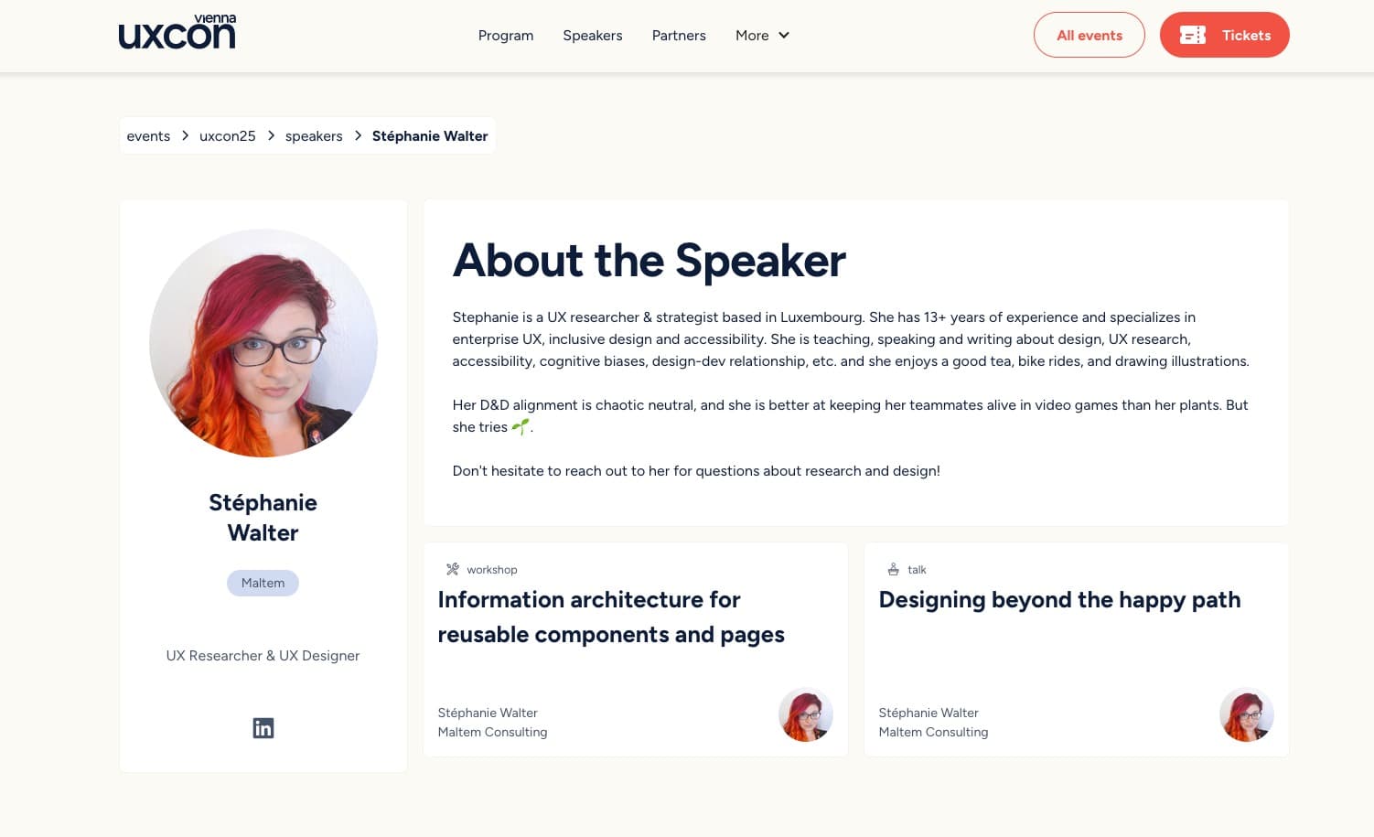
This October, I’m honored to speak at uxcon vienna (Oct 6–8). I’ll be talking about all the little things we forget as designers when we’re too focused on the “happy path”: the perfect flow, perfect content, perfect user. But the real world is messy. My talk is about designing for that mess from the start, not as an afterthought. I’ll share practical tips and a framework to help you do just that. I’m also running a workshop on information architecture for reusable components and pages. You’ll learn how to plan content early, structure it well, and skip the endless mockup cycles. I’ll teach you a Framework I’ve been using for years, to help with complex projects, that you can reuse, for your own. UXcon is turning 5 this year. It’s one of the best UX events out there. If you’re getting a ticket, use the code stephatuxcon25 for a special discount:
Most popular content this week
Why Designers Sound Negative (And Why That’s a Good Thing) (4min) Tired of being called the pessimist just because you’re the one asking the hard questions in the team? Yeah, same. That’s probably why Andy Budd’s article hit home today. People don’t always get, that, designers aren’t negative. We are cautious. We ask “what if?” to prevent problems. Not block progress. But in optimistic teams, that caution can be misread. The best teams listen anyway. A couple of examples from my projects: I once told a client that “having music teachers take pictures of kids, even if it’s to update their app profiles, might worry parents, so maybe check with legal first.” I was called dramatic. I used to work as a summer camp counselor. We had very strict rules about taking photos of kids. Plot twist: legal said no. Another prospect wanted to build an app for collectors (cards, stamps, jewelry, you name it) where users could share how much their collection was worth on Facebook. I said, “Maybe broadcasting what’s valuable in your home on a platform burglars do use to find their next victims, isn’t a great idea.” I was told I was being pessimistic. But, honestly, I’m happy to be all doom and gloom for your product, if it helps you avoid lawsuits later.
Interesting articles that caught my attention
How to Make Accessibility “Stick” (9min) Being the “no” person in accessibility is not often working. How about we try to shift things a little, and say “yes, but…” instead. What goes after the, but, is how to make the component accessible. Every “yes, but” becomes a teaching moment, and helps you build better relationships with the team, reframe accessibility from an obstructive function, to a collaborative process.
“Powered By AI” Is Not a Value Proposition (10min) Saying “powered by AI” isn’t a value proposition. It’s not clear what problem it solves. Users don’t care how the tech works. They care what it helps them do. Products need a clear, focused value. Otherwise, teams risk building features that sound good but don’t help users. Pavel Samsonov
Interfaces That Augment or Replace? (6min) Tools can support our thinking, or replace it completely. David Krakauer calls those complementary interfaces (that augment and support thinking) vs competitive interfaces (that do the task for them). The author, Zeh Fernandes, urges designers to build tools that don’t just do the job, but also help users learn and grow. they should explain, give feedback, and challenge users.
Who Goes MAGA? Mike Masnick, revisits Dorothy Thompson’s 1941 essay “Who Goes Nazi?” and explains that, “Going MAGA” isn’t about education or background, but about wanting easy answers and someone to blame. People who handle complexity and respect others are less likely to join. Mike believes character can change and people can choose differently. I’m skeptical, but, let’s be hopeful?
The Hype is the Product (8min) Big Tech no longer cares if we like their products. As long as we stay. As long as we pay. Their real goal? Please shareholders. Lock users in. Push hype (especially AI) to boost stock prices. The actual service? Just good enough to avoid a painful switch. That’s a sad but accurate summary by Michał “rysiek” Woźniak
Curiosity cabinet: non-design/tech rabbit holes I enjoyed
I Saved a PNG Image To A Bird: for my birb lover friends: a lot of information about how birds make sound, and, a fun experiment
Dude, the history behind the word dude is wild, and has nothing to do with the chill meaning it has today. It was created as a mocking term for overdressed wannabe English city boys in the 1880’s
Inspiration: fun experiments, beautiful art, and great ideas
NYC’s Urban Textscape: media artist Yufeng Zhao fed millions of publicly-available panoramas from Google Street View into a computer program that transcribes text within the images. This helps build maps, with words like pizza, luxury, and more. The data and reveal a lot of things about different neighborhoods. Want to know where all the ACAB graffiti are?
Split Flap an ode to the old train station signs that had the flipping characters, by Hot Page. Fair warning: it’s fun, but might trigger motion sickness so, use with caution.
Useful tools & resources
FliiipBook a fun animation tool in the browser where you draw frame by frame, over 24 frames and 2 full seconds, your animation in black and white.
Cool and Interesting Videos
When and how to use tabindex for better accessibility (5min24) a short video that explains what is tabindex, and how to properly use it to add elements to the focus order, make scrollable elements focusable, and add keyboard accessibility to custom components. Check the blog post on tabindex if you prefer text version.
Interesting frameworks and concepts
Google’s HEART framework helps teams measure UX quality using five metrics: Happiness, Engagement, Adoption, Retention, and Task Success. It guides you through setting clear goals, identifying signals, and defining metrics to track progress.
Tutorials
Rainbow Selection in CSS a fun tutorial by Chris Coyier to get rainbow text selection, yeaah
Conferences
The full schedule of inclusive design 24 is online, and it’s going to be an amazing 24 hours for anyone interested in accessibility. For those not familiar, it’s 24 hours, free conferences on accessibility, available on YouTube. Save the date: 25 September 2025!