Pixels of the Week – August 25, 2024
On asking users to draw the interface, AI half backed product features and Batmobile-Inspired Crocs
My curated weekly-ish online newsletter, where I share interesting articles, tools, and resources I found during the week. You can expect content about UX, design, user research, accessibility & tech, but also some processes, some inspiration, sometimes books, and a couple of videos and podcasts. Also, don’t forget to, subscribe to the newsletter to get notified, you will get the weekly links directly in your mailbox, and be notified when I publish other articles.
Now: what I’m currently up to
So, this week I kind of trolled a little bit about LinkedIn notifications to push you to write for their LLM generated articles on LinkedIn, Mastodon, TwitterX and Bluesky. Then, Zuri on Masto informed me that Josh Collinsworth created a CodePen of what “LinkedIn honest notifications” would look like, and, that’s amazing! This is the social media I’m here for!
Most popular content this week
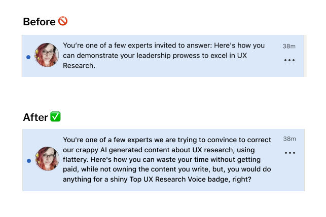
Simple recall testing for B2B UX (11min) what can you learn by asking users to draw an interface from memory? A lot actually! It helps you assess the learnability of an interface, understand user’s mental models (what do people draw first, what do they draw larger aka more important, what words do they use to describe things) and identify potential usability issues. Personal note: we’ve been using this to assess student assessment tools, and it was quite efficient to ensure the interface wasn’t too distracting from their actual task (answering the assessment questions). By Olesia Vdovenko
Interesting articles that caught my attention
Design, Psychology, Information Architecture
- A plea for the lost practice of information architecture (12min) okay, I’m biased because I have workshops on information architecture (IA), but still I 100% agree here. Too many designers want to jump directly into Figma without trying to plan IA first. This often leads to chaos, a giant mess, and a lot of rework. Time to make IA cool again! By Vicky Teinaki
- What Audible Gets Wrong About Repeat Purchases (10min) oh, wow, that Audible case study is a gem of what to not do when it comes to conversion, but also, payment process, but also, poor badge gamification
- Why designers shouldn’t always be designers (8min) on how other skills help, and why hiring someone who used to do another job that designer can be an asset. By Simone Williams
- The 4 components of product quality: performance, bugs, completeness, and consistency (4min). That’s it, you can improve any of those individually and your product will improve. Sometimes, keeping things simple is nice. By Ami Vora
- Craving convenience: the psychology behind fast food kiosks (13min) interesting analysis by Sophia Omarji on how fast food kiosks satisfy user needs of independent ordering and customization. They make it harder to ask for advice though, are often overwhelming and have big accessibility issues, so there’s a lot of progress to still be made in this area.
- Imitation Breeds Mediocrity (5min) by Paul Taylor “Imitation breeds mediocrity. Copying others distracts from developing your own unique strengths and capabilities. True innovation comes from looking inward, understanding your own context and culture, and finding creative solutions that work for you. Copying stifles this.”. Nothing more to add. Yup.
- Freelance Designer 101: Initial Quote and Project Proposal (10min) many super useful tips for aspiring freelancers to help you prepare the initial quote, run a discovery call, and create a project proposal. By Kristina Volchek
AI and Design
- Fire, Ready, Aim. (20min) We can’t deny that we are in a “let’s slap some AI feature on top of this product because it’s hype” area. The rush by companies to integrate AI features neglects the bases of user-centric products: does this address real users needs, the right way? Patrick Sharbaugh criticizes how allowing technology and hype dictate design and product decisions can lead to business failure. I love how he compares the AI hype to the Google Glasses. I think it goes beyond that, of course, but the parallel is interesting. Reckless adoption of AI risks damaging trust from users, especially if it doesn’t work properly. So, yeah, let’s go back to the foundational principles of user-centric design, please?
- We’re in the “Discord bot” era of design (5min) current approach to AI often addresses the wrong problems, such as “black canvas” problem. Language is also an awkward medium for visual ideas. One solution would be to use visual inputs (like screenshots) as base, to go into more visual driven prompts (to be fair, you can already do that with a lot of text to image AI tools, but not the ones used by UI tools)
Browser Industry
The Dying Web (7min) a browser monoculture leads to a less open and more controlled web, with a big lack of privacy. I’m with Matthias Endler here, I love Firefox, but I still have to open Chrome for many things, especially online video chats and it’s annoying. And sadly, a couple of plugins that don’t work on Firefox anymore.
Interesting frameworks and concepts
Using signal detection theory in UX research (10min) you know I love a good framework! The Signal Detection Theory (SDT) gives researchers a way to better understand decision making, by placing them on a 4 quadran matrix: hits (correct identification of a signal), misses (failing to detect a signal), false alarms (incorrectly identifying noise as a signal), and correct rejections (accurate dismissal of noise). It’s been used a lot for areas where decision making is complex, like the medical industry.
Curiosity cabinet: non-design/tech rabbit holes I enjoyed
How to Make an Escape Room on Google Forms haa 100% my kind of vibe.
Inspiration: fun experiments, beautiful art, and great ideas
- Public Work by Cosmos a search engine that lets you retrieve public domain content. A lot of the images are often plate illustrations, engraving and other methods I adore. For example, you could look for mermaids. If like me, you love such historical images, you can also check publicdomainreview.org (and become a donor, they send really nice postcards!)
- Batmobile-Inspired Crocs Actually Look Bad-Ass I hate Batman (sorry not sorry Brucy), I don’t like Crocs, but, even I have to admit that, hum, this is kind of fun
Useful tools & resources
- Deck of Brilliance a collection of tools to help creatives generate ideas. The deck gives you 52 tools for working up ideas in short periods of time, ordered in different categories.
- Animate on Path a Figma plugin, that lets you, well, animate something following a path. A couple of more plugins and we will have rebuilt Flash, haha.
- Netflix Codes you know how Netflix unlocks certain categories for certain users and not the other ones? This site lets you get access to all of them. You can finally explore all the Korean series you were missing!
- All startup marketing ideas: a collection of marketing ideas to reach your first 100 users. Each comes with a dedicated step by step page to help you implement it. I’m going to admit that I find some of them very annoying, as a user. So, be careful.
- Discover what designers are listening to while they work! I participated in a fun project by Fons Mans, where I and a couple of other designer share our playlist. Have fun discovering new songs curated by Soren Iverson, Erik Kennedy, Tommy Geoco, Jorn van Dijk, Christopher Nguyen, Fons Mans, Mohammed Thiam, Sally Carson, Michael Riddering, Karla Fernandes, Frank Bach, Joelle Phua, Ozan Öztaskiran, your truely, Florian Boelter and Krisztina Szerovay!
Tutorials
- The anatomy of accessible forms: Best practices a couple of bad examples and how to fix them to make your forms more accessible.
- The anchor element quick tutorial to remind you how anchor works by Heydon Pickering
- How to design hand icons (6min) I hate drawing hands, seriously, this is why most of my cute stickers are animals. That’s super helpful tips! Also, love the tips on the line vs solid variations!
- Context is king: long live the king! On how to provide context for repeating buttons using CSS techniques and aria (like delete buttons in a list)
- Hacking AI for Typography (YouTube video) 3 ways to use AI and typography together: using AI-generated icons in typography, AI-generated images complementing typography, morphing AI-generated images with letter shapes. And a plea to how AI companies should license fonts and improve typography
Latest news in the industry
- Procreate’s anti-AI pledge attracts praise from digital creatives, you can read the full short pledge here Creativity is made, not generated and check their video on TwitterX.I’ve been using Procreate to design most of my stickers, so, I’m super happy about this news and love them even more
- The artists fighting to save their jobs and their work from AI are gaining ground From a milestone in a class action lawsuit against the AI image companies to animators pushing to contain AI in the workplace, it was a good week for human artists
- Midjourney launches its website and becomes free to use