Pixels of the Week – December 22, 2024
The importance of low fidelity, dataviz accessibility & free icons
My curated weekly-ish online newsletter, where I share interesting articles, tools, and resources I found during the week. You can expect content about UX, design, user research, accessibility & tech, but also some processes, some inspiration, sometimes books, and a couple of videos and podcasts. Also, don’t forget to, subscribe to the newsletter to get notified, you will get the weekly links directly in your mailbox, and be notified when I publish other articles.
Now: what I’m currently up to
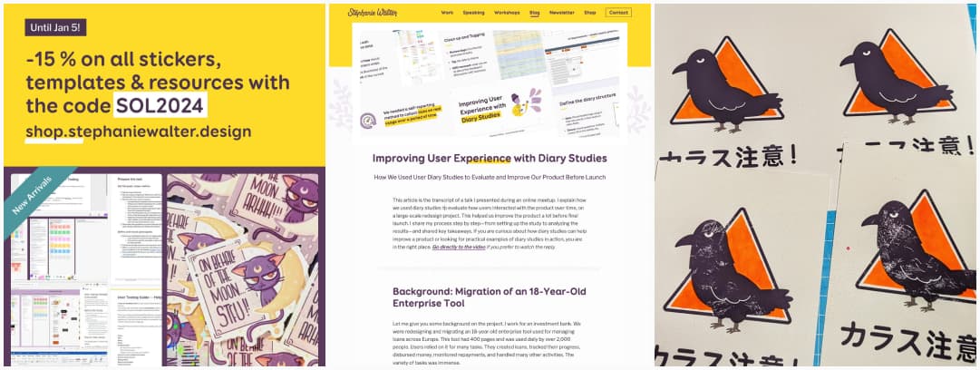
A new article on the blog
The crow print
On the craft side, I’m having a lot of fun with stencils and neon orange. I saw a really fun “beware of the crows” sign in Japan, so, I’ve decided to create and illustration with it. First attempt was printing over the acrylic and canson paper on stencil. You can check it out on Bluesky and Mastodon. Then I got an amazing paper for printing. The crow is amazing. But the washi tape used to hold the stencil in place damaged it. I’ve decided to damage it more on purpose to give it a grunge look. Also, found a way to avoid too many issues by layering prints. Again, check it out on Bluesky and Mastodon. I’ll keep explorer in the next weeks with paper and techniques.
New stickers and a coupon
- User Testing Templates Starter Kit: save time on your next user testing sessions.
- The Luna “On behalf of the moon…”, available in color STFU and ARHHH sticker and purple glow in the dark sticker
- A cute glow in the dark dinosaur sticker named Jean Paul.
Most popular content this week
Stop wireframing (but still start low-fidelity) (12min) I usually stay away from the “to wireframe or not” debate, but I agree for once here with the message of Jason Barrons. Too often do wireframes become a black and white version of the final design that people expect the client to sign off on. I’ve been in situations BAs had a client validate a 10px font wireframe, and then complained that the mockup didn’t follow the guidelines once the visual designer applied the 16 px branded font. This is kind of situation got ridiculous. When used like that, wireframes defeat the purpose of iterating in low fidelity, that tool was perverted over the years. Jason offers low fidelity alternatives, like UX state outlines, whiteboard sketching or “grey blocking”. Which I use a lot, while still calling those “low fidelity zone wireframe”. But, yeah bottom-line, thinking low fidelity helps a lot, and we need to stop with the pixel perfect sign of on wireframes idea. Those tools were never meant to be used that way.
Interesting articles that caught my attention
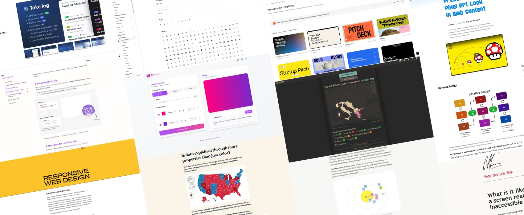
- Dataviz accessibility principles, demonstrated by the 2024 presidential election dashboards (12min) a nice analysis by Sarah L. Fossheim. A couple of things to check: is the content still accessible at 400% zoom, is data explained through more properties than just color, can user navigate to and interact with all the content via keyboard, are data, insights trends and patterns accessible to screen reader users, SVG accessible (including table alternatives), semantics, is chart interaction explained, are additional explanations or more context about the data and visualization needed, etc.
- A Complete Guide To Live Validation UX (22min) Vitaly Friedman explores the benefits and challenges of live validation in web forms. It can improve user confidence when done correctly. But it can also lead to frustration if implemented poorly. Different techniques exist to make it more user-friendly and reduce errors: late validation, just-in-time validation, and validation on submit.
- Stir Up Innovation and Fun with a Customer Day You might be familiar with “bring your kids to work’ day, but did you ever hear of “customer day”? It’s an event where customers visit a company’s office to interact with the team. They come to talk about their experiences with the product. This can help teams better understand customer needs, gather feedback, and innovate collaboratively. Nikki Anderson-Stanier explains how to plan, organize, run and debrief on such a day.
- What is it like to use a screen reader on an inaccessible website? (7min) Navigating with a screen reader is like using a narrow-beamed flashlight in a dark, constantly changing room—you must carefully piece together a mental map while unseen changes make it harder to orient yourself. Dynamic content without clear cues, like vague “aria-live” alerts, can add confusion, but precise and context-aware descriptions can greatly improve navigation and understanding. A great analogy by Craig Abbott.
- Building a flexible UX research roadmap (12min) if you are swamped with requests for research (which is a good thing hehe), you might need to start building a UX research roadmap: begin with a robust backlog, prioritize high-impact projects, and maintain the roadmap as a dynamic, accessible tool you can share with people. By Lawton Pybus
- Designing with LLMs in the toolbox: 6 months later (5min) Mariusz explains how he’s been using LLMs to make his work easier in the last couple of months. I like that we start getting out of the doom and gloom “AI will replace us” and more into “here’s how to use their potential to get more efficient” area. “In the end, it’s just a tool”, he says, and I tend to agree with that.
- User Experience: It’s Deeper Than Design (5min) a great reminder by Elizabeth Laraki that, in order to design, you need to peek behind the curtain, to see the complex systems that powers your products. It helps ask better questions, make more informed decisions. This is even more important in enterprise UX, when your product often has to get plugged with an ecosystem of (legacy) other tools users will need on a daily basis.
Curiosity cabinet: non-design/tech rabbit holes I enjoyed
The Weirdest Thing I Learned This Week Archives if you need some fun facts for Monday Morning coffee, there’s tones in this archive
Inspiration: fun experiments, beautiful art, and great ideas
travle a daily online game where you need to guess which countries you need to cross to travel from one to another. I’m so bad at this, my geography skills are close to non-existent, but it’s fun.
Useful tools & resources
- Octicons did you know that the Primer design system has some nice scalable icons?
- Take Log Advanced an interesting Figma plugin that lets you create logs with time stamp, statuses and more next to your designs. I could totally see that being used on multi teams projects.
- My Year-End Guide to AI, Creativity, and Society Patrick Morgan put together a 4 weeks reading list to help you deep dive into AI, from understanding what it is, to ethics and risks, exploring different aspects, envisioning the future, etc.
- Free Presentation Templates Figma now has Slides, a presentation tool. In case you are looking for some templates, here are a couple of free and paid ones you can use.
- Gradient Generator I can’t resist a nice gradient, so here’s a gradient generator tool, that lets you preview and copy paste the CSS code, By Mohamed El MORJANI
Interesting frameworks and concepts
Parallel & Iterative Design + Competitive Testing = High Usability: 3 ways to test and explore multiple design ideas, when to use each process with pros and limits for each.
Tutorials
- Overflow Clip (16min) Ahmad Shadeed always has the best “deep dive into a CSS feature” tutorials. This time, he explores all the fun with the CSS overflow property, explains the issues with overflow-hidden, and where you can use overflow:clip for nice “out of the box” effects.
- Alt Text: Not Always Needed by Geoff Graham. You always need an alt attribute, but you can leave it blank (alt=””) in certain cases. To help decide, ask yourself, is the image repetitive (then empty), referential (then empty) or efficient (alt should be filled when the image can help visitors efficiently complete a task). Also check, for logo in headers, check A link on a logo in the header, what should the alt-text be? by Rian Rietveld.
- Preserving the Pixel Art Look in Web Content (8min) I’ve never heard of the CSS image-rendering: pixelated; property, this is an absolutely niche and really cool way to keep your pixel art style. by Kirupa Chinnathambi
Books
Responsive Web Design by Ethan Marcotte can now be read for free online
