Pixels of the Week – February 11, 2024
Stop using placeholders, checkboxes history and an infinite fun alchemy game
My curated weekly-ish online newsletter, where I share interesting articles, tools, and resources I found during the week. You can expect content about UX, design, user research, accessibility & tech, but also some processes, some inspiration, sometimes books, and a couple of videos and podcasts. Also, don’t forget to, subscribe to the newsletter to get notified, you will get the weekly links directly in your mailbox, and be notified when I publish other articles.
Now: what I’m currently up to

Following a couple of weeks ago’s book recommendation, I’ve got myself the color print version of House of Leaves. I haven’t started yet, just got a small look, but, it indeed sounds like a fun experience to read. I’ll keep you posted.
I’ve also finished preparing a whole new talk on user diary studies, and how we used them on a complex enterprise project, to better understand how people used the new interface over time. It’s in French, but, if you are interesting for such a talk in a meetup, I’d be happy to translate it to English. Meanwhile, you can also read my article on the topic on Condens.
Interesting frameworks and concepts
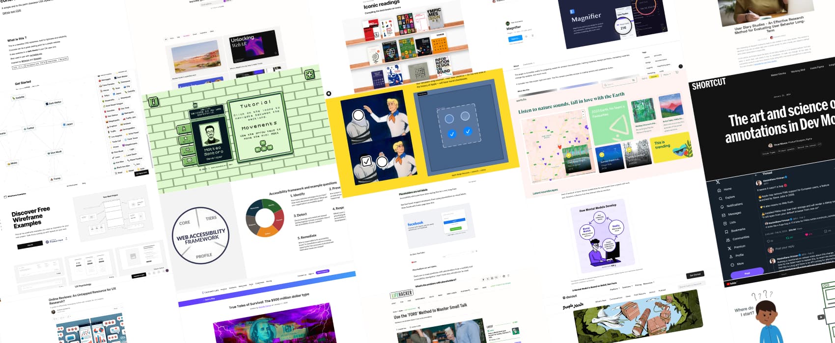
The Web Accessibility Framework is a framework to help be more strategic about accessibility in your organization. Cores is a list of accessibility outcomes, you can do to improve accessibility. Implementation tiers help you understand your organization’s current and desired state for responding to and managing web accessibility. Profiles take an organization’s requirements, objectives, risk appetite, and resources and compare them with the desired outcomes of the Core. Popetech explains how to use this framework in a short video.
Popular content this week
Why you should stop using placeholders in text boxes (10min) monthly reminder that HTML placeholders are not labels, and shouldn’t be used as such. Here are a couple of issues with them: they disappear upon input, so, you are forcing people to remember what they are supposed to fill. They might be confused with pre-populated data, so the user might wonder “wait do I need to fill this?” or skip it, thinking it’s filled. They are also not universally adopted by assistive technology (AT), so some might read those, some might not. Not only that, but they have poor color contrast, so, some users might not be able to read them (and if you make them darker, people might think it’s filled data). Without a label, the clickable area of a text box is decreased. They are also obscured after validation, since user filled content, so, users have to delete their content to get to see them again.
Based on this, according to Daniel Berryhill, placeholders are essentially pointless. I tend to agree here, to the point where I kind of wonder why this ever made it to the browser. But, here we are. So, what to do instead? Use labels, have hints and form instructions outside the field (and link it to the field with some aria).
You can participate in the discussion on LinkedIn , Mastodon and Twitter.
Interesting articles that caught my attention
- Online Reviews: An Untapped Resource for UX Research? (8min) Online user reviews on platforms like app stores, travel sites, and e-commerce sites can become a low cost source to understand user experience, pain point and competitive landscape for your product. Considerations such as selection bias, reporting bias, and ethical concerns must still be addressed. So, while you shouldn’t use this as your unique source of data, you can triangulate it with other methods to get
- True Tales of Survival: The $500 million dollar typo (5min) I love such little stories, and the conclusion is amazing: “ if Ronald Reagan had picked a different day to die, this would have been caught before a single typo cost the USPS 500 million dollars.”
- Studying Users Who Switch Products? Try Jobs to Be Done (14min) interesting way to use the JTBD method to help understand why people switch to a new product, with a lot of question examples that you can re-use for your own projects.
- What are mental models? (11min) Mental models are, what users believe they know about a user interface impacts how they use it. Mismatched mental models are common, especially with designs that try something new. There’s also inertia in it, so any new concept or design pattern might be a challenge, if it’s different from the current mental model. You can either make the system conform to user’s models, or, try to improve those mental models so that they reflect your system. Personal example: my mental model for an ATM is “I’m asked for my pin as soon as I put my card in it”. This is due to years of ATMs in France. When I arrived in Luxembourg, I was quite freaked out when the ATM asked me how much money I wanted to withdraw, how I wanted it (how many 10EUR 20EUR bills do I want), and still no PIN. Turns out: the PIN is asked at the end in those. This clashed with my previous mental models. You get used to it, but, it was surprising at first.
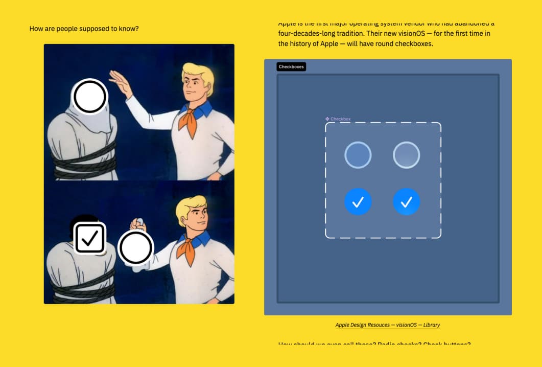
- In Loving Memory of Square Checkbox (5min) Checkboxes are square, radio buttons are round, right? Well… until Apple decided otherwise. They officially bring rounded checkboxes to visionOS. To be fair, I think I’ve seen some rounded ones on Apple touch systems for years, for example, when doing multiple selection. Still, I love the nice collection of screenshots from the history of the design of checkboxes (and radio buttons), with some very retro ones from the 90-s, collected by Nikita Prokopov
Curiosity cabinet: non-design/tech rabbit holes I enjoyed
Use the ‘FORD’ Method to Master Small Talk fellow introverts, behold, the Holly Grail of small talk: family, occupation, recreation and dreams, with a list of questions to help you with each topic. I might need those as small cards for conferences.
Inspiration: fun experiments, beautiful art, and great ideas
- Matteo Santoro has an awesome game developer portfolio with a retro pixel vibe (discovered via Stefan Judis’s newsletter)
- Infinite Craft I’m not very good at alchemy games, but, this one is an endless crafting version with the funniest combos ever. I’m not able to get humans, but, I got time travel, sushi, different version of were-creatures, Tokyo, Godzilla, and, well, the result of merging megalomania and Tesla
- earth.fm a nice site to listen to nature sounds from all over the world
Books
Iconic readings: it’s very niche, but I love the idea of a compilation of the best books on icons.
Useful tools & resources
- Magnifier a Figma plugin to create a magnifying effect on part of your design. This is nice for presentations, but also when you create visuals for training or support pages
- Wireframe Examples “but who would need inspiration for wireframes” you might ask, and you would be mostly right, but I still think it’s interesting to see the same component, with different types of layouts and information architecture, especially if you are a beginner. So, this could be a nice resource for juniors.
- Deck.Gallery a gallery of beautifully designed decks, slides, keynotes for your inspiration. This is very nice if you are starting with public speaking. But also if you have to craft presentations for colleagues or stakeholders.
- concrete.css a nice minimalistic classless CSS stylesheet for your small projects
Latest news in the industry
- The Art and Science of Annotations in Dev Mode. Oh, Figma is bringing annotations to the dev mode. Apparently you will be able to pick from some properties to highlight them in annotations, measurements, and get some free text annotations. How are you going to use this?
- Apparently, Apple may remove PWA support for European users. Maximiliano Firtman wrote a whole thread on Xtwitter about this. Damn, it’s a very bad news for sure.