Pixels of the Week – February 12, 2023
Accessibility bites, color tools, design/dev relationship and plenty of nice tools!
On Twitter, LinkedIn and Mastodon, I share curated articles I read, resources and tools about UX Design, User Research, UI and mobile design, HTML, CSS, the web industry, some process, some inspiration, etc. This is an archive of everything I shared this week. And some extra links that I decided to only share for the blog readers. Also, subscribe to the newsletter to get notified when those are published!
#Now – what I’m up to

Free event: I’ll be talking about scaling accessibility through design systems with awesome folks: Lauren Beatty, Geri Reid, and Aprile Elcich. It’s an online free event, Feb 16th 7 PM CET / 1 PM EST / 10 AM PST via Zoom. Register to the event here.
I updated my list of 10+ resources to help you find the right UX tool and method depending, on your project and needs with some new links! I was also joking around about why UXers love sticky notes on Twitter, LinkedIn and Masto
I needed a pot for my stabilos. And I wanted to test foiling with my hot laminator. So here we go, witchy pattern drawn quickly in Procreate, printed on black paper on a pot model I created before. You check the small video. I’m also preparing some mascots for my mastodon instance. So, here we are, raccoon (and a opossum specific request). I also got some new glossy paper and run some color tests. Turns out printing with the matte option on glossy paper is my favorite color yet.
I also decided to try plant based burgers: the secret is to treat the patty like actual meat with liquid smoke, Worcestershire sauce, garlic powder. It was awesome. I couldn’t find gluten free burger buns, so, bagel is it
TL;DNR the one you should not miss
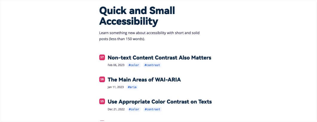
Interesting idea: short articles about specific accessibility concepts, in 150 words or less: Bite Sized Accessibility. Keep in mind that 150 words is short, so, you still need to dig further for most topics.
Interesting articles
UX, Design, devrel and deceptive patterns
- Inclusive design should not be a “specialty” field, and instead be integrated as part of the UX design process. Trina Moore Pervall put together a lot of resources to help get you started with inclusive design
- What it means to design a platform, an inspirational essay on what it means to design for a platform and not just a stand alone UI, with the very interesting examples of Lego
- Hover based dropdown menus can be annoying for users, yet good for exposing sub categories in ecommerce. Here’s how to make them better: have a 300-500ms hover delay to make sure users have time to open and navigate to the sub menus.
- Clickbait title, but the tips are quite legit: how to build more collaboration between design and development teams on your project
- Interesting read on deceptive patterns and how they can manipulate users.
I really like the classification in 6 groups to help identify them: Asymmetric, Covert, Restrictive, Disparate Treatment, Hides information, Deceptive.
Front-end good reads
- inputmode, enterkeyhint and autocomplete: 3 attributes to make your form user experience better. Let the browser do the heavy work for you!
- Container queries are awesome. Here’s some ideas on how to use them for typography (especially headings) that can adapt to its container: Container Queries and Typography
Change, recession and ageism
- The Four Horsemen of the Tech Recession: an interesting attempt at explaining why all of a sudden so many tech companies are firing a lot of people
- Change: Last Year You Said Next Year, a beautiful essay on time, stagnation and change
- “I rarely see the word “age” included in a company’s diversity statement. Why is that?” Yup. Ageism: the last acceptable prejudice
The other interesting articles
- For bike loving friends: an interesting read on helmets, how it’s not enough to insure security (no kidding) and how it’s been used mostly to put the responsibility of the safety on cyclists, instead of infrastructures and cars. I like the idea of the swiss cheese approach applied to bike (and soft mobility) security Bike helmets: what the science really says about an American safety obsession
- Hahaa, I was saying that the other day on Twitter/Masto, especially with the new browser plugins who let you automate answers to tweets, mansplaining is getting automated!
- This is an awesome article that explains how GPT actually works: “So, nanoGPT reproduces something that looks like Shakespeare while GPT-3 something that looks like “text from the Internet”. Anything that looks like it, just as it likes it. They just want to satisfy their urge to continue writing.” I hope this helps you understand why I’m super cautious when people want to have current version of chatGPT predict the future of UX or build user flows. Don’t get me wrong: I’m super curious about the technology. BUT, I’m also really tired of people trying to make us believe it can magically accurately do things it can’t (at least in current version, we’ll see in future ones)
Inspiration, fun experiments and great ideas
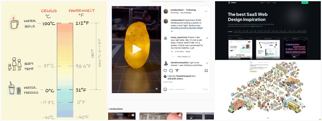
- I mean, at some point, we all need a potato lamp in our life.
- Let’s start the week with a cool site: tilt-studio.fr. Can you spot all the fun little details in that amazing illustration? I’m a big fan of the browser and technology graveyard. Also Choucroute interdite?
- It’s always hard for me to convert to Fahrenheit, this actually helps, knowing where the 0 and the body temperate is is nice, because it’s usually my point of reference too: Celsius vs Fahrenheit.
- Looking for SaaS websites inspiration? Here you go: Sasspo, curated collection of the best SaaS websites on the web
Useful tools and resources that will make your life easy
Color and color themes
- Next time a client asks me how I chose colors, I will answer: I harness the mystical witchcraft of polar coordinates because I’m a Math witch and summoned them in my design files. The tool is quite fun to play with: Poline
- This is very cool: a nice little OKLCH Color Picker & Converter that also shows you which colors are not available for your device and the fallback color your will obtain
- If you need a cute little dark/light mode theme toggle with fun animations, here’s a coupe you can reuse: Toggle collection.
All the other cool tools:
- Soundbetter: nice tool to help you say some things more politely and more professionally. I hate we need that, but it’s nice it exists
- If you like building dashboards, I got tool for you: Dashy, The Ultimate Homepage for your Homelab
- Calligraphy.ai: a fun tool that turns a text prompt into a nice handwritten image you can export as SVG. Too bad it doesn’t support a wider range of characters, like é, è, etc.
- If you need to send some information (password for example) that will auto-destroy after a certain amount of time, restrict number of views, etc, you can use Hemmelig
- I’m sorry but if you give me a AI food generator, I will obviously give it wacky prompts. That smiling tooth is going to give me nightmares. I also wonder on what this was trained to get fake signature on the crême brulée nail one.
- Hahaha, according to this quiz, I’m supposed to be a planner: project management, producer, exec director, big, NOPE. Just because I’m (over) organized on a personal level, doesn’t mean I want to do that for a job.
Videos
- This microscope uses touch: I didn’t know that this existed, and geeky me is super curious about it. So, it’s a microscope, using touch and pressure gel, that can build a 3D version of the objects you inspect and the measure them and characterize the surface (for inspection of aircrafts for example)
- On the topic of AI: I publish a lot of articles on how we need to be cautious with chatGPT, which doesn’t mean I’m against the technology. Au contraire. I have a background in languages, localization and part of my master degree was about computer assisted translation technologies. So, I’m actually fascinated by how it works. So, here’s a video about transformers, how they were invented and how awesome those are: Transformers, explained: Understand the model behind GPT, BERT, and T5
- Super interesting video on why we all need subtitles now. And, no, it’s not you — the dialogue in TV and movies has gotten harder to hear. It’s linked to the microphones we use on today’s movies and TV shows
Conferences
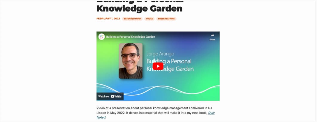
Building a Personal Knowledge Garden, a great talk by Jorge Arango on the tools we used to use through history and those used today to help us deal with the amount of information around us


