Pixels of the Week – February 18, 2024
Figma paper wireframes, floor plans and status plugin, measuring task completion
My curated weekly-ish online newsletter, where I share interesting articles, tools, and resources I found during the week. You can expect content about UX, design, user research, accessibility & tech, but also some processes, some inspiration, sometimes books, and a couple of videos and podcasts. Also, don’t forget to, subscribe to the newsletter to get notified, you will get the weekly links directly in your mailbox, and be notified when I publish other articles.
Now: what I’m currently up to
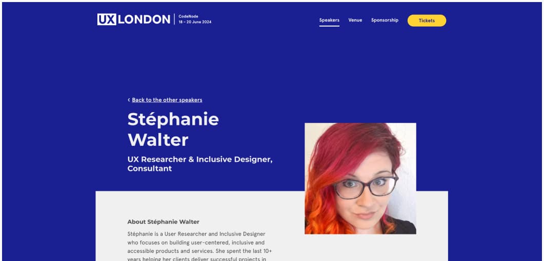
I’m going to London in June! I’ll be speaking at UX London 2024 – a three day celebration of all things digital design. It’s happening on 18 – 20 June 2024. I’ll be running my “Designing adaptive reusable components & pages” twice. Don’t miss it!
Also, reminder for next week’s events:
- February 21, 6:30PM – 7:PM CET, remote, I’ll be participate in the Hi Talks, about about UX design organised by Hi Interactive. You can register on LinkedIn or directly on Hi Interactive YouTube event.
- February 23, 9pm to 11:30 PM, in Paris: I’ll be talking (in French) at the UX Breakfast, organised by User Testing (previously Testapic). It’s free but you need to register online first
Interesting Frameworks
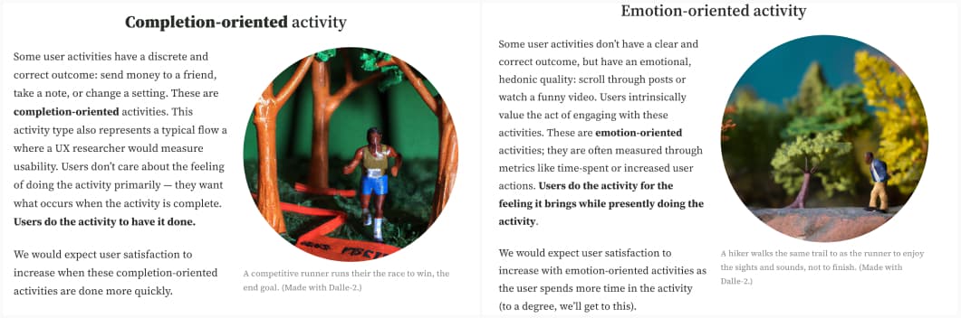
Can longer task times for users be a good thing? (12min) We often use Task Completion Time as a metric: the lower the time, the better the experience, right? Carl J. Pearson introduces the idea that this depends on how the activity is categorized. Lowering the time for completion oriented activities done for extrinsic goals (sending money to a friend) increases satisfaction.
This is also often the type of activity with B2B products. But it might not be the case for emotion-oriented tasks: when the user wants to do the activity, because it’s intrinsically satisfying (listening to music). This model can be useful when defining metric goals, depending on if you want to optimize for speed, or engagement.
Popular content this week
Paper Wireframe Kit. Do you feel nostalgia for the good old low fidelity sketchy paper style wireframes? Method created that wireframe kit for Figma, that brings back those paper style sketchy elements. It has components, icons and uses the Patrick Hand font.
Interesting articles that caught my attention
UX Design and Product Strategy
- Mobile search: which pattern should you choose? Choosing the right search pattern for your mobile app can be a challenge sometimes. Ksenia Toloknova wrote a nice guide to help you here. She breaks down the choice in 5 principles: entry point for search, aka how do you access it? (for example, do you have a search bar always visible, is it hidden behind an icon, etc.). Breadth of results: is the search global or local? Presentation mode: do you present the results in a new screen or the same one? Results Complexity: how much information do you display for each result, do you have categories, filters? Complexity of input fields: do you have a simple of multi search? She also covers, in detail, with multiple UI examples, how to cancel inputs, and exist the search how to present the results and how to present search recommendations to users.
- No, AI user research is not “better than nothing”—it’s much worse (6min). According to Pavel Samsonov, synthetic insights (AI user research, without talking to actual users) are not research. An LLM can’t talk about the last time it had to accomplish a task. Using AI instead of actual users, leads to “commoditized” products that all look the same, yet don’t really solve real users problems and lack a unique selling proposition that will differentiate them on a market. The LLM won’t buy your product. So, who are you going to sell that commodity to?
- Signs of Bad UX Design (10min). Is your software frustrating to use? It might have bad UX. Bad user experience undermines product reliability and trustworthiness. Decisions made on a whim without research, overuse of components and patterns without trying to understand if they actually solve the user’s problems, unpredictable system reactions and lack of consistency, confusing navigation and a chaotic visual design (endless colors, too many fonts, unclear copy, etc.) are usually signs you have issues in that area. Often this is due to UX design being undervalued in organizations and a lack of collaboration between teams.
- Please, don’t force me to log in (5min) I’m with Juha-Matti Santala on this, forcing users to create accounts and log to use light bulbs or a browser sounds very intrusive. So much extra friction added. It also confuses many people. So please, stop with these hostile account requirements that make your products worse for the users.
- Shaping the Future of Design (6min) with emerging technologies, the role of the designer will be gears towards understanding and building models. Going into pragmatic abstractions. And, yes, it might be scary. Shifting from screen-level design to model design won’t be easy. But as technologies evolve, affecting both end-user UI and the designer’s toolkit, designers must dive deeper to ensure continued relevance. That means making models the object of design to continue creating value by satisfying human needs — many of which will remain constant despite ongoing, pervasive change. (by Jorge Arango)
- Accidentally Narrowing Your Market (8min) the danger of talking only to your power users, your champions, because it’s easier, and thus, missing some crucial information from other groups and categories. You might end up over building for them, and missing opportunities for growth in other directions. It might also raise costs of maintenance (by Ibrahim Bashir)
Accessibility
- Don’t Disable Form Controls (3min): most of the time, you don’t want to disable form fields. If the control is part of a form, don’t disable it. If it’s not, maybe don’t, but, test with your users first if you choose too. Good tips from Adrian Roselli.
- Can generative AI help write accessible code? (12min) The unavoidable conclusion is that when you ask a generative AI tool for help writing accessible code, is that you should not trust the response you get and should verify it with sources you do trust. Bard was the less authoritative and at least gave sources (on Tetralogical)
Curiosity cabinet: non-design/tech rabbit holes I enjoyed
Advice for time traveling to medieval Europe, a 1h video, to help you, you know, just in case you ever time travel to medieval Europe. You never know, right? Also, might be useful for my D&D geek friends.
Inspiration: fun experiments, beautiful art, and great ideas
Tim Andraka’s instagram page is full of drawings that look like strange, grotesk and fake natural history illustrations. You can also check his portfolio
Useful tools & resources
Figma
- FigDone: a nice Figma design status plugin that will let you tag your artboards as to do, doing, done, blocked, canceled and more. I also like that it renames the artboard with a custom emoji, corresponding to the status, so that you can find it easily.
- Figarc would you use Figma to design floor plans? Maybe not if you are an architect who needs precision plans. But, I’ve drafted plans of my flat in Figma too, to try to see how some IKEA furniture would fit at scale, so, yeah this makes sense.
- Figicon another place to get free icons for your project, that you can re-use in Figma. You can also download the SVG. The icons are organized by categories and style.
The other tools
- Boba-ipsum in case you are tired of lorem ipsum, this is a fun alternative. Do you prefer milk tea, matcha, taro or thai tea flavor? Personally, I love the thai tea one
- Archive Buttons an online too to remove paywalls if you need to read some articles for some reasons.
- Accessibility testing spreadsheet version 2 a nice excel sheet tracker, to help you with your accessibility testing. You get the type, level, success criterion, status, priority, issue, recommendations, screenshots, source code.
- SVG Flag Icons in case you need country flags, in optimized SVG format, that tool have over 200 of themm
- Vision Directory a repository with Apple vision apps, organized by categories
Tutorials
Doing what’s required: Indicating mandatory fields in an accessible wa (9min): a short tutorial, to help you indicate required fields in different ways, including aria-required=true. The article also cover the accessibility issues of indicating only the optional ones: “When only required fields are present, the approach of indicating only the optional fields does not meet WCAG.”
Conferences
Do You Want to Be a UXR Consultant? The decision to become a UXR Consultant can be a difficult one to make. If you choose to take the leap, when is the best time to do so? Should you start with consulting on a part-time basis or jump right into full-time? Beyond these questions, you will need to look at establishing and building your business and brand, determining which clients and projects to pursue, pricing, and more! Danielle Cooley answers all of those questions in a “must watch before launching your own business” video. I also love how she defines the difference between contractors and consultants: contractors are extra hands, consultants are extra brains.
Latest news in the industry
Apple broke web apps in iOS 17 beta and hasn’t fixed them. I’m curious to see where this is going and if Apple will bring PWAs back, for now they are demoted to “operating within browser”, so no more standalone mode, which kind of defeats the purpose of a PWA.