Pixels of the Week – February 21, 2021
Every day, I share on twitter and LinkedIn a list of curated articles I read, resources and tools about UX Design, User Research, UI and mobile design, HTML, CSS, the web industry, some process, some inspiration, etc. This is an archive of everything I shared this week.
#Now – what I’m up to
Yesterday (Saturday) we had a blast at Students of UXD with my friend Laurence. We talked about cognitive biases and presented our 52 cards to discover cognitive biases deck. We might also have started thinking about an online version of that workshop that is coming soon. Stay tuuuned.
On May 5th I’ll talk about performance and designing the forgotten cases at CNGwebperf meetup. It’s free, please come 🙂
TL;DNR the one you should not miss
#Design #Satire
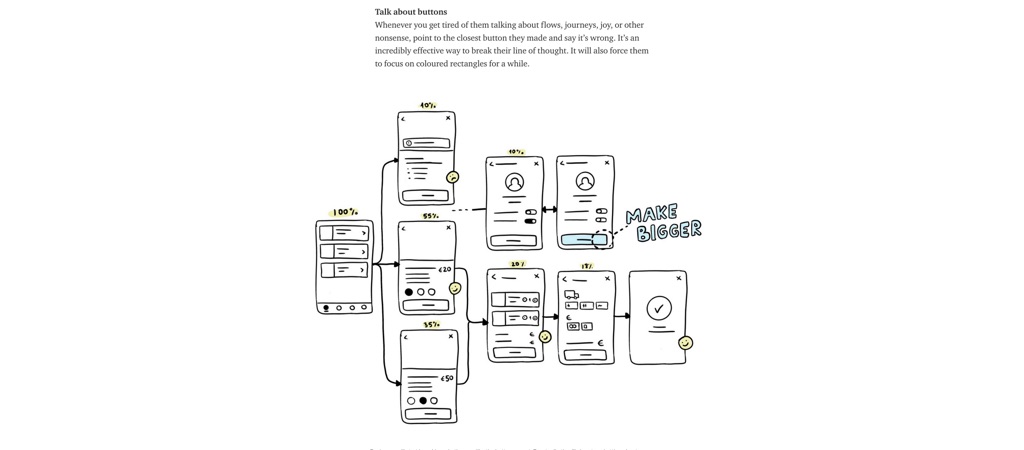
“How to deal with designers in 10 easy steps – This is is a satire.” this is both fun and horrible because most of those happened to me at some point. Please don’t do that to your designers 🙂
Interesting article
#Accessibility
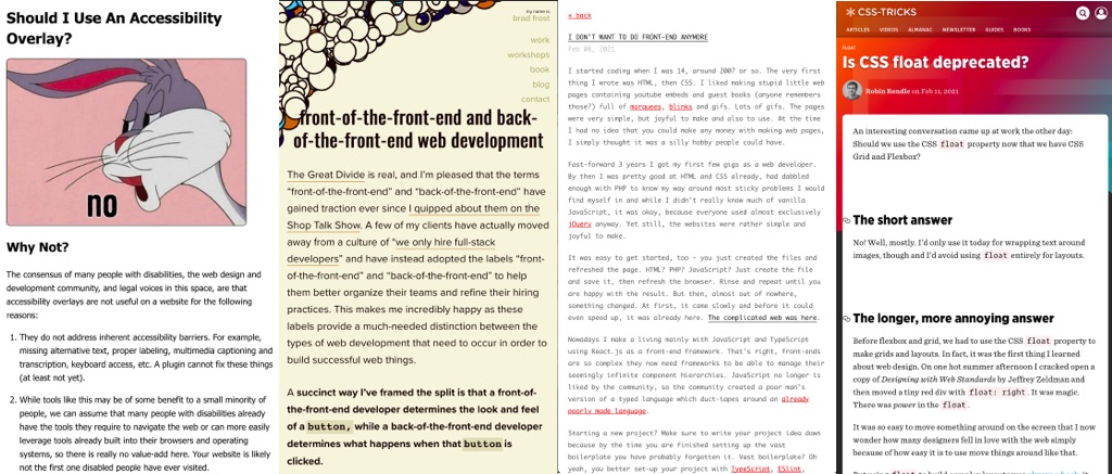
“Should I Use An Accessibility Overlay?“, short answer is no, make your website accessible instead
#FrontEnd #Backend #titles
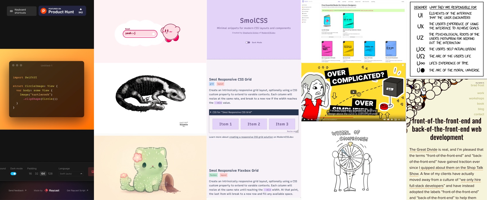
” Front-of-the-front-end and back-of-the-front-end web development ” an interesting article by Brad Frost (@brad_frost) on the split of responsibilities between different flavours of front-end developers
#CSS
Is CSS float deprecated? The short answer: No! Well, mostly. I’d only use it today for wrapping text around images, though and I’d avoid using float entirely for layouts by Robin Rendle (@robinrendle)
#Designthinking
“Design Thinking often over-simplifies the issues that we face. When we opt for creativity, people tend to design an ideal world and the best-case scenario. ” 5 interesting flaws of design thinking by Julia Tsoi
#Selfcare
“It’s Not Just You. A Lot Of Us Are Hitting A Pandemic Wall Right Now” I don’t know about you, but there’s some comfort in knowing that it’s not just me who’s exhausted even if I kind of mastered the “faking that everything is okay” thing. Take care folks.
#Figma
“One Figma component — 3,360 Variants“, really fun exercice, but will your really use those variants in actual designs?
Inspiration, fun experiments and great ideas
#Illustration
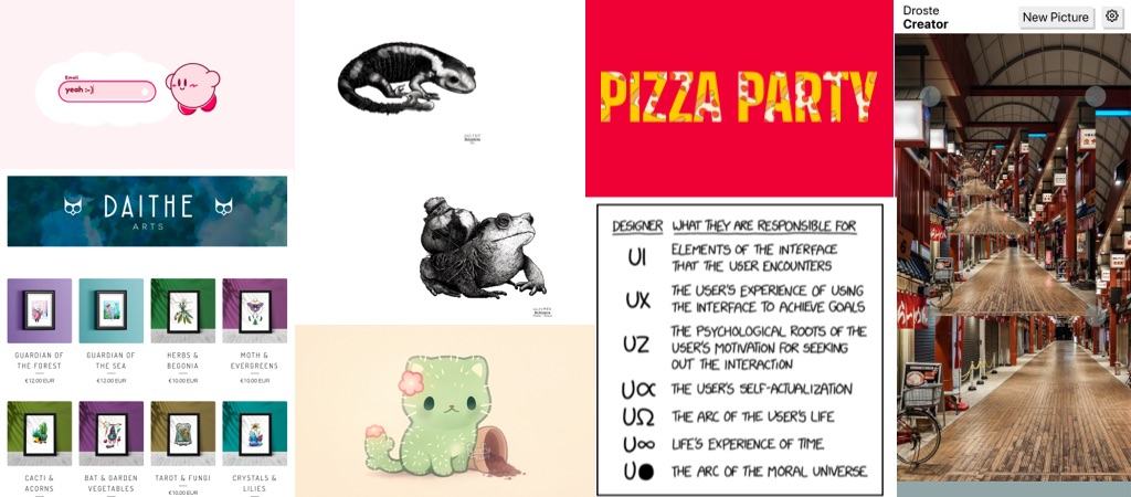
This cute little cat cactus arrived in my timeline and, I love it.
#SVG #demo
Pizza Party SVG text masking demo by @peruvianidol, simple, yet effective this made me laugh (trigger warning: bright colors moving around, could be triggering seizures)
#UX #UI #UZ #Life #Satire
Ha finally a UI vs UX illustration that makes sense! via @xkcdComic
#Watercolor
If you like watercolor illustrations, you should look at Daithe arts.
#Pokemon #Curiosity
A series of Pokemon illustrations in a realistic curiosity cabinet style by Vincent Darnois.
#Codepen #Demo
- What if, the Chrome Dino, with colors, but mooooar? Really fun codepen by @jh3yy
- Kirby will make sure your inbox is full of stars and snacks by @tiffachooo
#RecursiveImages
This is a cool online too to generate recursive images (by @javierbyte)
Video & Podcasts
#UX #Neurodiversity
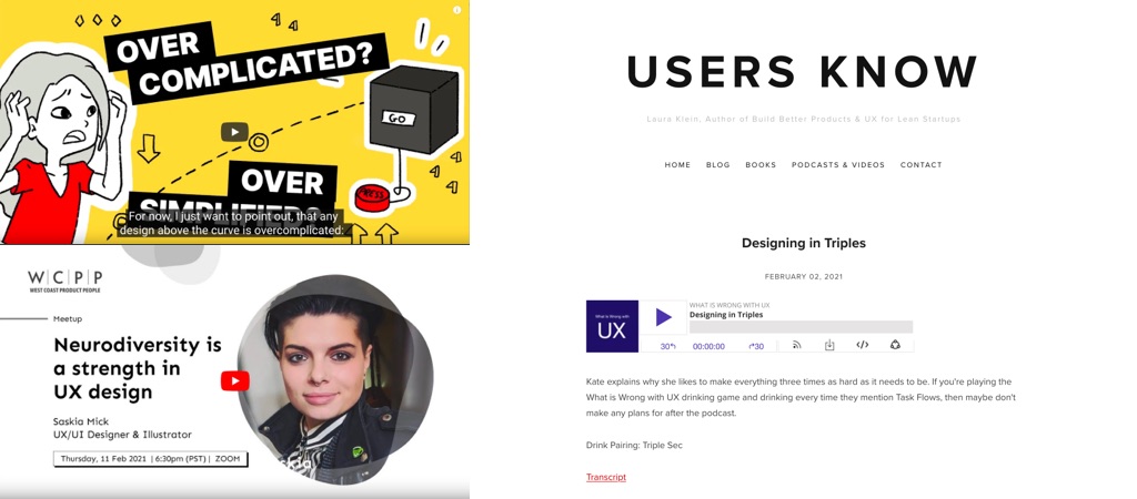
A great 20 minutes talk by @SRemyMick “Neurodiversity is a strength in UX Design“. I love all those little tips!
#Podcast
Another amazing episode of @katerutter and @lauraklein’s podcast where they talk about designing in triples: design stories, task flows, going back and forth and not jumping straight into Figma, this is a must listen for design students, really!
#Talk #ExpertUX
“Over-complicated? Over-simplified? The UX Efficient Frontier” this is an amazing talk by @morganepeng, because not everything needs to be simplified or delighted, don’t spoon feed your interface to your expert users!
Useful tools and resources that will make your life easy
#Books #Freebooks
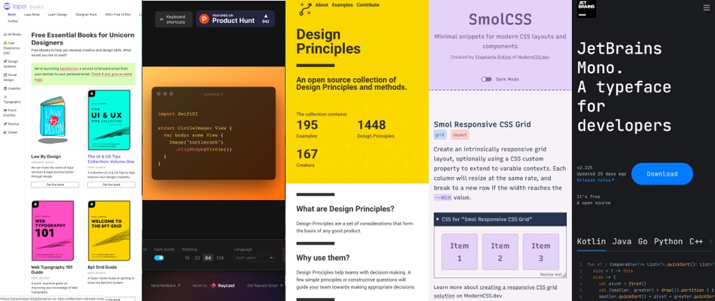
Here is a super long list of free books for designers on different topics: UX, design system, visual design, usability, typography, front-end, etc. (by @lapaninja)
#Code
Remember carbon.now.sh, a tool to create nice imagines code snippets for slides, posts on social media, etc? Meet ray.so by @raycastapp that does something similar but with a more gradient and transparent look
#Design
“An open source collection of Design Principles and methods.” in case you are curious and looking for generic design principle examples from different companies in different domains, that’s a good start
#CSS
SmolCSS – a Minimal snippets for modern CSS layouts and components by Stephanie Eckles (@5t3ph)
#Typography
Boba Date is a cute font with a wide range of glyphs designed for the editorial needs of comic book lettering. It comes with four sets: Regular, Italic, Bold, and Bold Italic. Created by Sara Linsley (@salinsley)
#CSS
I love those little subtle line hover animations by @crnacura
#Typography
JetBrains Mono is a really nice typeface for developers, in case you are bored of your current IDE typeface, give it a try? (via @glyphe)
