Pixels of the Week – February 9, 2020
Every week I share a list of curated articles, resources and tools about UX, UI and mobile design, HTML, CSS, the web industry, process inspiration and more…
This week’s selection: 7 principles of icon design, the Norman doors, design beyond the buttons on the screen, design thinking does not address the complexity of designing a product ready to launch, designing a responsive grid, different opinions about having a “CSS4” marketing flag, Ethical Design book, a few CSS tutorials (line-height, sticky position, etc.), 2 CSS animations tutorials, models of UX Maturity, design system articles, etc.
#Now – what I’m up to
I’m currently teaching mobile usability and responsive web design for a Bachelor and Master Degrees for the University of Strasbourg and that takes me a LOT of time since I update most of the slides and lesson this year. I’m also preparing my workshop on Mobile Design that will take place in Brussels, March 6, 2020. There’s just a few tickets left if you want to learn how to build a mobile usable and delightful mobile apps.
TL;DNR the one you should not miss #Icons
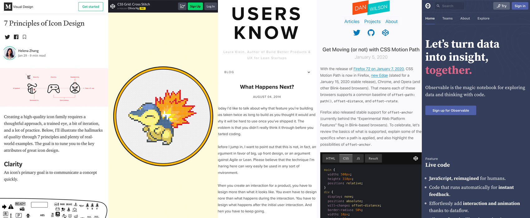
“7 Principles of Icon Design” by Helena Zhang, great wrap up and as she says, pair the icon with a text label or find an alternative if the standalone icon is not the clearest solution (I would ad test your icons with your users)
Interesting article
#UX Design
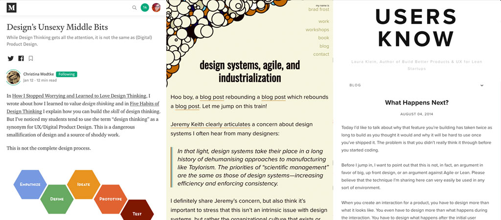
- “What Happens Next?” Enlightening article by Laura Klein to help understand that design goes beyond so much more than adding buttons on the screen. Send this article to colleagues, POs and anyone who still thinks design is about making it pretty
- Design thinking became a synonyme for UX/Product design and we are all designers except that we are not… Christina Wodtke goes beyond the over simplified “Design thinking” and presents and tried to represent a more accurate and full design process: Design’s Unsexy Middle Bits
- UX 101: do you know the concept of the Norman Doors?
- “How UX-mature is your company?” Discover the 6 different levels of UX maturity : 1. Unrecognized, 2. Interested, 3. Invested, 4. Committed, 5. Engaged, 6. Embeded.
- “Design research doesn’t generate hypotheses; you do” quick TLDNR on what user research does and how to design based on your user research
#DesignSystem
- Design systems, agile, and industrialization
- “Figma on Figma: How we built our website design system” and the concept of FLEGOs ^^
#CSS
Different interesting opinions about having a CSS4 “marketing flag”
CSS4 is a bad idea, CSS4 (on CSS-Tricks) and CSS4 is here! I propose CSS-X to settle it. If it worked for the iPhone it can work for CSS ?
#Grid #Responsive
“Designing a Responsive Grid in 2016“, 2016 but still relevant article on building a grid system that works with responsive components
#Ads #Darkpattern
“Google backtracks on search results design” they are removing the favicons they added a few days ago
Inspiration, fun experiments and great ideas
#Cute
Booping cute foxes is the real purpose of the twitter finger stickers!
#CSS
CSS Grid Experiment: Cross Stitch
Books
#Design #Ethics
I know which book I will buy next: The Ethical Design Handbook. A practical handbook on ethical design for digital products. With practical techniques to influence a positive change in your company.
Tutorials
#CSS
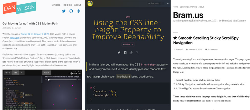
- Sometimes it’s good to go back to basics, this is a nice introduction to line-height property and the different values and units (or no unit): Using the CSS line-height Property to Improve Readability
- “Can you make a countdown timer in pure CSS?” Yes you can, a fun challenge
- “Smooth Scrolling Sticky ScrollSpy Navigation” nice tutorial using IntersectionObserver to accomplish the “spying” part
#CSS #Animation
- “Get Moving (or not) with CSS Motion Path” by Daniel C. Wilson. This reminds me of what I used to do in Flash as a student, it’s amazing to see we can do this now in CSS!!!
- “Staggered Animations with CSS Custom Properties” smart technique, you just need to not forget to change indexes in the HTML when you change link order or add some links (aka document it?)
Useful tools and plugins that will make your life easy
#Shadow
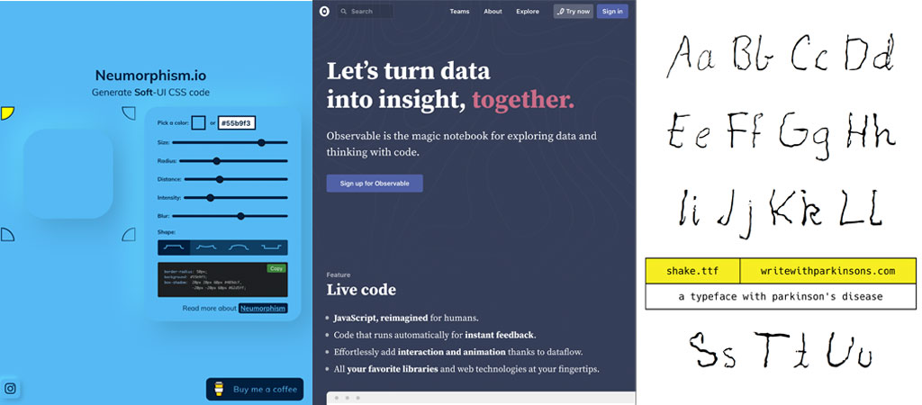
“Neumorphism/Soft UI CSS shadow generator” ok it’s looks cute, but before pushing into production a neumorphic interface check the contrasts for accessibility issues and test it with users to make sure they understand what are the fields, buttons, etc?
#Dataviz
Yesterday I discovered observablehq.com, a sandbox for people who play with dataviz and it’s awesome <3
#Curation
Yeah, people from HeyDesigner created “Vincent” and app assistant inbox that will bring design and front end news directly to your phone!!
#Sketch
One of my favorite plugin in Sketch to manage text, layer styles and symbols: sketchmanager.com (also if you bought individually text style manager, symbol manager and layer style manager you can use your 3 licences to activate them in the all in one plugin!!)
#CSS
A quick reminder of 7 CSS attribute selectors that could be useful to you
#Typography
Shake – The Typeface with Parkinson’s, a nice way to raise awareness towards this disease
