Pixels of the Week – January 11, 2026
The curb-cut effect, why people sound like chatGPT & responsive letter spacing
Pixels of the Week is my weekly-ish curated newsletter for designers, UX folks, devs, and anyone building accessible, inclusive, usable (and let’s be honest, awesome) digital products.
This edition includes content on why accessibility helps everyone, the AI-fueled crash of tech giants, and how AI and algorithms shift our language and consumption habits. Also: placeholder cats, responsive letter spacing, and a critique of Pantone’s 2026 very white color of the year.
Subscribe to my newsletter to get this directly in your mailbox!
Now: what I’m currently up to
Happy New Year!! It’s been a couple of weeks, I hope 2026 starts nicely for you all. On my side, I got some holidays, nice food, a bit of sun in Spain (and rain, haaa), read a couple of books (nothing work related); it was nice to rest and chill. I’m slowly restarting reading about tech, so, the newsletter is coming back, step by step. Also, I’m currently working on bringing a couple of interesting contents to the website, including some content for libraries and museum accessibility. So, stay tuned if you are curious about those domains as well, I’ll add content in my workshops offer and conference talks soon.
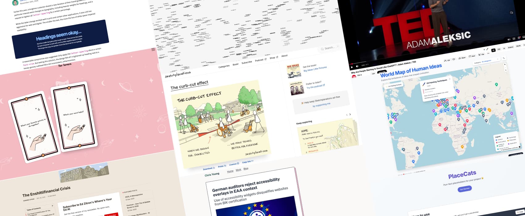
Most popular content this week
The Curb-Cut Effect: when we design for disabilities, we make things better for everyone, a nice illustration. The term was coined by disability students and activists in the 70s, who added curb cuts to the Berkeley sidewalks to make access easier for those in wheelchairs. They discovered those also helped people with strollers, using trolleys for deliveries, etc.
Interesting articles that caught my attention
The Enshittifinancial Crisis a giant article, but super interesting, on how tech giants (Microsoft, Meta, etc.) and finance chase endless growth by hyping AI, even when this makes them lose money and makes products worse. Investors ignore risks. Technical debt piles up. And data centers are built for demand that may not exist. According to Edward Zitron, when funding dries up, the whole system might likely crash.
Germany rejects Accessibility overlays for EAA compliance “As overlays do not modify the original source code or semantic structure of the website, they just add a new layer on top, the overlay cannot reliably fix these core problems for screen readers or other assistive technologies.”, and interesting article by Chris Yoong.
Curiosity cabinet: non-design/tech rabbit holes I enjoyed
World Map of Human Ideas: Explore the birthplaces of ideas that shaped civilization in science, art and more.
Inspiration: fun experiments, beautiful art, and great ideas
Date Night Questions if you need some social icebreakers, for friends, or for lovers, you can flip through those 2 decks of cards, and take turn answering the questions. Lovely idea.
Useful tools & resources
Place Cats a service to get cute images of cats, as placeholders for your project. Miaou yes!
font.fish a fun typography experiment with this browser based tool for exploring thousands of fonts.
Cool and Interesting Videos
Why Are People Starting to Sound Like ChatGPT? (5min video) algorithm and AI show a warped version of the reality, that gets then reinforced, and, create artificially inflated trends and other realities that mostly benefits the platforms. Those are not neutral tools: they subconsciously shape our language, trends, and sense of identity. For example, since chatGPT came out, people everywhere have been saying the word “delve” more (which might be in the training model because people who cleaned it used it a lot).
Tutorials
Responsive Letter Spacing (6min) how to use cal(), progress() and some CSS properties to build a responsive letter spacing system by Tyler Sticka
How to annotate design system components for accessibility (12min) great tutorial by Geri Reid on how to build a systematic approach to accessibility documentation
Latest news in the industry
Pantone’s Color of the Year Sounds About White (6min) Design is never neutral, and the choice of Pantone’s color of the year for 2026 signals a bigger problem. Cloud Dancer feels less like a fresh start and more like a wink at rising extremist trends. It comes off like a clean coat of paint covering a year full of racially loaded decisions. Great opinion article by Rhea Nayyar.