Pixels of the Week – January 12, 2020
Every week I share a list of curated articles, resources and tools about UX, UI and mobile design, HTML, CSS, the web industry, process inspiration and more…
This week’s selection: signification of icons, front-end performance checklist, task flow vs user flow, dark mode, interesting CSS features to play with, min/max-width in CSS, understanding CSS position, hierarchy in UI Design, a guide to theTerminal, measuring the value of design systems, prototyping hover, Svelte framework, Web components, some accessibility checking tools, etc.
#Now – what I’m up to
I’m teaching User Experience for native apps and responsive websites again this year. So I spend some time updating the lessons. Part of this course is teaching students about native and web capabilities on mobile so I asked on twitter “in 2020 what do you think you can do in native apps/with mobiles phones that is not possible on a website on a phone?” Answers are really interesting. Things move fast on the web so I will update my talk “Super Secret Powers of Mobile Browsers” and maybe write an article about all of those capabilities when I find more time.
TL;DNR the one you should not miss
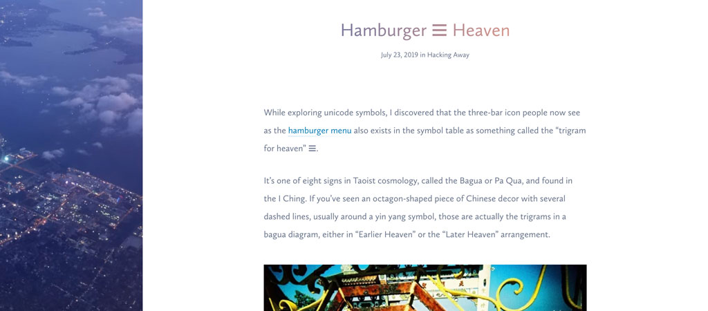
“Hamburger ☰ Heaven” nice article to remind us that what we take for granted like the signification of the burger or the magnifying glasses for search icon might not be understood by people with different cultures and mental models
Interesting article
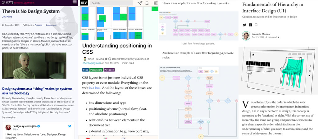
- ⭐ This is a really nice article with an easy to understand example: “UX task flows vs. user flows, as demonstrated by pancakes“
- “Dark Isn’t Just a Mode” a great article on how to design for dark mode beyond the whole trend at the moment, he explains contrast and color really nicely
- Top 10 UX Articles of 2019
#UI Design
- Interesting broad introduction for anyone starting in the UI design field: Fundamentals of Hierarchy in Interface Design (UI)
- Haha looks like I missed this trend, not sure I missed much: Neumorphism will NOT be a huge trend in 2020
- “4 ways to prototype a hover state: InVision, Framer, Sketch, Figma” I’m curious about Adobe XD now. I usually build simple animations directly in HTML and CSS and use Flinto for more complex ones
#DesignSystems
- Measuring the value of design systems: “when participants had access to a design system they completed their objective 34% faster than without a design system.” Interesting data to help you sell a design system to your company
- “There Is No Design System” Move away from thinking of design systems as an actual thing and more as a way of working better, more efficiently, and more creatively so that we can build great experiences for our users.
#FrontEnd
- “Why I moved from React to Svelte and others will follow” oh another JS framework ^^
- “Why We Use Web Components” Viljami Salminen debunking a few myths about Web Components
- “Understanding positioning in CSS” a good article to start the week with quick reminders about CSS. Remember you aha moment when you finally understood relative and absolute and the relationship between?
#Video Games
“Borderlands 3’s Biggest Problem? It Already Feels Dated” I would not say dated but yes all of those problems are annoying and disappointing for a game launcher in 2019
#Hiring
“What I learnt from rejecting design candidates— and what you shouldn’t do as an applicant” point 4. Don’t copy. I repeat. Do not copy, YES YES and YES. It happened to me at least 4 times already, confronted the candidate and he kept lying…
Inspiration, fun experiments and great ideas
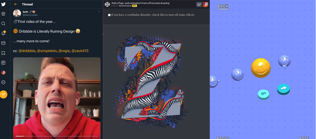
Seth Coolen created a serie of small videos that make fun of designers and it’s hilarious: Figma users, Sketch users, Dribbble is Literally Ruining Design, etc.
#Fun UI
Hooo look flash is back baby 👉👉 “Flat UI and a half”
#SVG
Sarah Drasner created a fun Z Zebra Facts animation in SVG
Tutorials
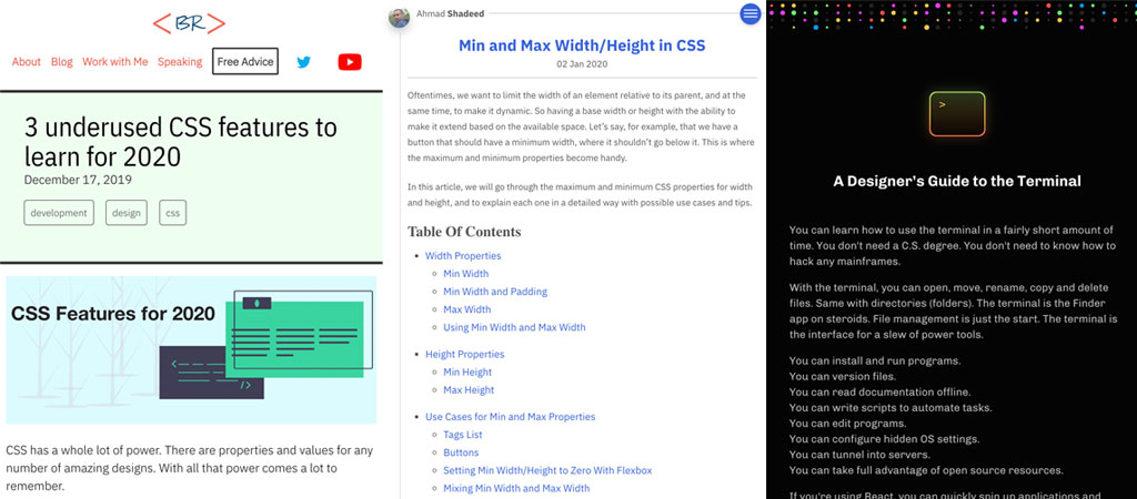
- “3 underused CSS features to learn for 2020” ch units, CSS attribute selectors and multiple columns, again I think the ch trick for typography is quite interesting
- ⭐ This is a great article you should bookmark for future reference: “Min and Max Width/Height in CSS“. I especially love the Max Width and the ch unit trick for typography.
#Terminal
“A Designer’s Guide to the Terminal” I’m not sure why the is a guide for designers I would say it’s a nice introduction yo anyone who wants to understand terminal commands
Useful tools and plugins that will make your life easy
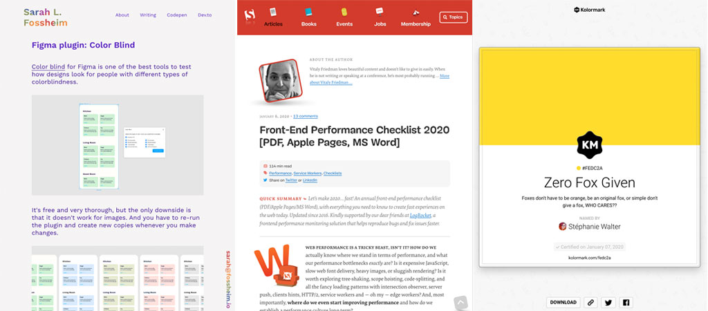
You all love a good checklist so here we go: “Front-End Performance Checklist 2020”
#Design #Accessibility
Some tools to help you build accessible good looking designs