Pixels of the Week – January 22, 2023
On Twitter and LinkedIn and Mastodon, I share curated articles I read, resources and tools about UX Design, User Research, UI and mobile design, HTML, CSS, the web industry, some process, some inspiration, etc. This is an archive of everything I shared this week. And some extra links that I decided to only share for the blog readers. Also, subscribe to the newsletter to get notified when those are published!
#Now – what I’m up to
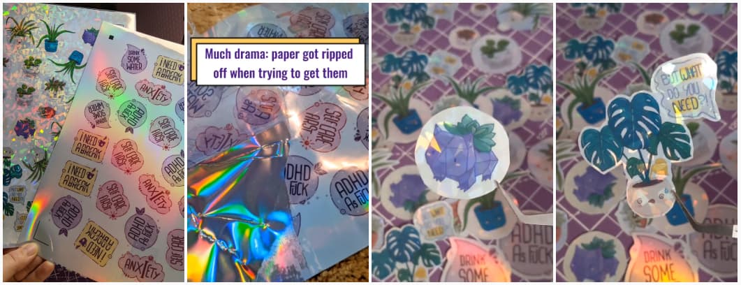
Behind the scenes, I’m preparing some new content, and workshops. So, it’s not visible, but nice things will happen soon!
TL;DNR the one you should not miss
#UX Industry
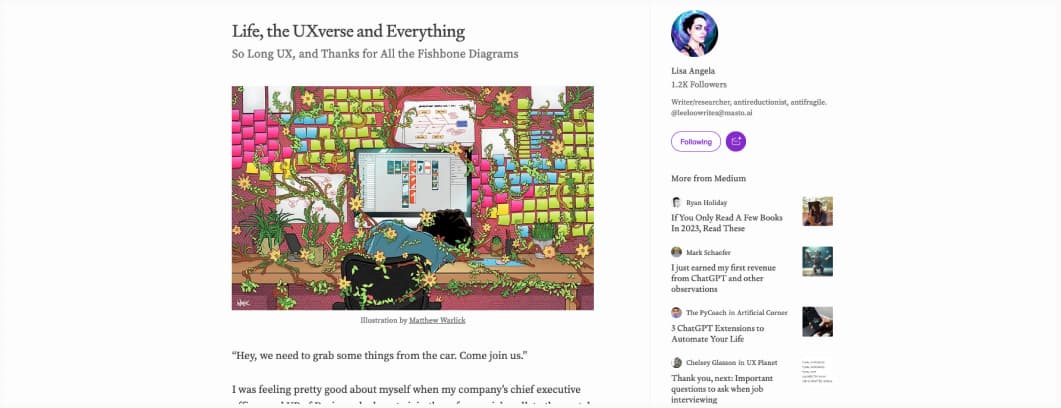
Life, the UXverse and Everything, a powerful article on how exhausting the UX industry is, due to constant gaslighting, people not respect us, lousy leadership, dysfunctional organizations, working without support, being constantly blocked from trying to achieve better outcomes
Interesting article

Designing for the World: An Introduction to Localization a good introduction on localization with many tips to help designers prepare your content for it
#User Experience
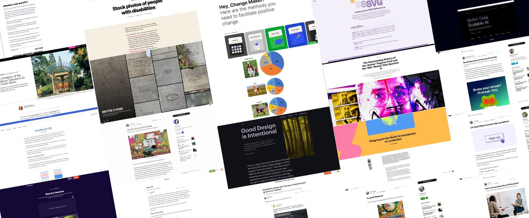
- UX Cheat Sheet: Common sign-up patterns. An interesting analysis of the common UI patterns you can find in sign up forms. I really like the flows, it shows that something as “simple” as a sign up form is actually a lot of screens when you think about user interactions and different cases
- An interesting article on gamification gone wrong, the very artificial concept of “streaks” in some apps (like duolingo), why it has a poor user experience, the psychology behind it.
- A good introduction on how UX researchers ask questions. Happy to see that silence and mirroring is in here. Those are powerful tools, often under used, especially by juniors who are eager to ask a lot. Pause, wait, listen.
#Design
Good design is intentional. Great read on how some of our design and product decisions might “intentionally” harm some users, how to avoid it and to design with intentionality and stop failing to consider the long term consequences of our products
#CSS
The interesting idea of “Conditional CSS”: there is no direct if/ statements is CSS, but you can use certain properties to get conditional results when needed (like mediaqueries, container queries, @\supports, flexbox wrapping, etc)
#Typography
The story behind the first Avatar movie Papyrus font and the Ryan Gosling SNL sketch: “The font that you choose could very much ruin the tone of your piece,” his brother affirms. “You’re at risk of completely throwing the audience.”
#Decision
Interesting alternatives to the RACI (Responsible, Accountable, Consulted, Informed) matrix. I Might give DACI (Driver, Approver, Contributor, Informed) a try.
#JobHunting
A Layoff Playbook: some interesting pieces of advice, to help you get back on track if you get laid off
#AI
- Scientists, please don’t let your chatbots grow up to be co-authors. Oh, gosh, this is scary, scientists are supposed to be people who double check and have reasonable bouts about things. The fact many jump right into automation bias is quite worrying.
- Attention, trust and GPT3 “Creating huge amounts of mediocre material is easier than ever before, If your work isn’t more useful or insightful or urgent than GPT can create in 12 seconds, don’t interrupt people with it.” that burns, but, it’s quite true
- Does terminology affect how we perceive and evaluate intelligent systems? The terms we use to describe a system influence the perception the users and people might have of it, which means that terminology can be intentionally used to engage and change attitude towards a product
#YearOf
Year Of, Choose your own adventure a cute read on deciding what you year will be made of. Strangely the “Year of Accepting That Some People Dislike You And Maybe That’s Actually For The Best Because It Means That You’re Making Yourself Vulnerable And That’s Kind Of Brave If You Really Think About It” kind of resonates with me those days. I’ve spent too much time trying to be nice online, in a secret hope that people will like my work and content. But, I’m slowly coming to terms with the fact that not everyone will, and it’s fine. So, maybe the year of “Zero Fox Given” maybe, or the year of “This is my boundary, respect it or get out” would also be nice.
#Psychology #Research
Lots of bad science still gets published. Here’s how we can change that. A lot of people cite some psychology research findings in the UX fields as “UX laws”, so I’m super curious to know if the research behind some of those is actually replicable.
#eGirl #Army
(trigger warning: army) How E-girl influencers are trying to get Gen Z into the military, this is, uncanny, but, kind of, to be expected at some point, I guess?
Inspiration, fun experiments and great ideas
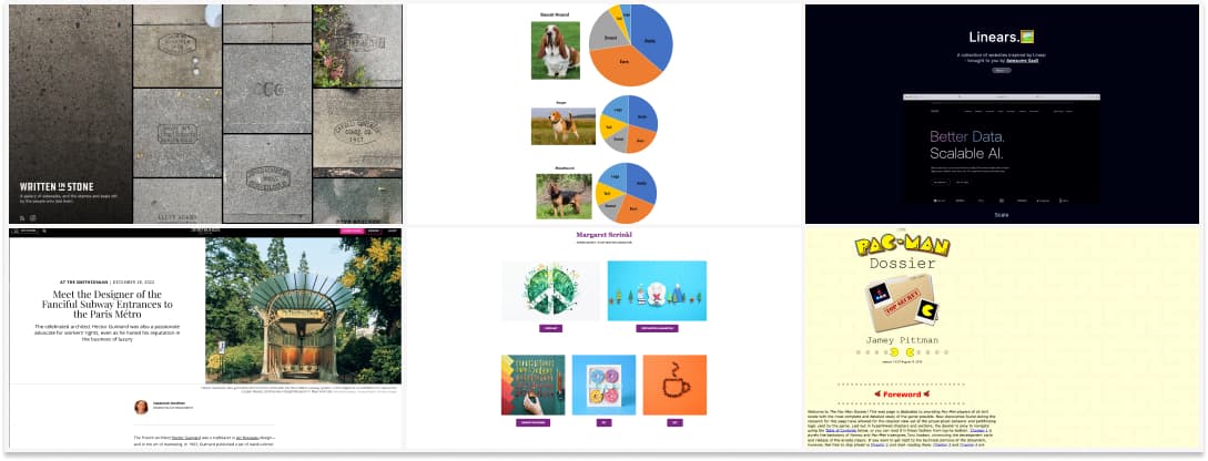
Written in Stones, a gallery of sidewalks, and the stamps and seals left by the people who laid them.
#Subway #Art Nouveau
If you ever were in Paris, you might have noticed the entrances of the subway are gorgeous. They were designed by architect Hector Guimard, in an amazing Art Nouveau style.
#Dataviz
It’s Friday, so, here is some important data viz: Pie graphs for dogs. Have a nice week folks.
#PaperCraft #inspiration
Margaret Scrinkl is a paper artists and stop motion animator, and I love her very colorful work
#Design #Uniformisation
“Design is boring, everything looks the same, it’s the fault of Design Systems / UX / AI / Frameworks” (pick one or all of them). Or, maybe, designers need to stop getting “inspiration” from / stakeholders need to stop asking designers to copy the same site? Here is an example of sites that were all “inspired” by Linears
#From The Past
Pacman Dossier, a little nugget from the past, when some passionate people created very very niche web pages, using tables, with debatable design, but, it was all funny and wacky. Here is one of those
Useful tools and resources that will make your life easy
#SVG
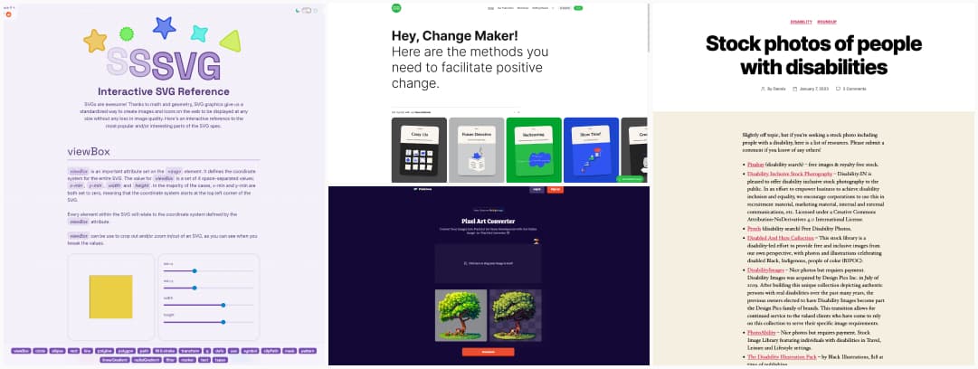
Interactive SVG Reference, a great place to learn more about SVGs, how they work, the mains parts of the spec, with interactive demos you can play with.
#Change
Sensible Futures: Some cards and frameworks to help your team brainstorm and facilitate better futures (more ethical for example) in organizations, but also to foresee complexity and potential issues.
#Inclusion
Inclusion is also about having images that reflects every aspect of like, and including people with disabilities in your images. Here’s a list of places to find photos of people with disabilities
#PixelArt
An online tool to turn any image into nice pixel art
Videos
#Chicken
Another country, another animal helping people. Today: the life saving chickens who are used as early warning systems against some nasty mosquito borne diseases in Australia.
Tutorials
#Figma
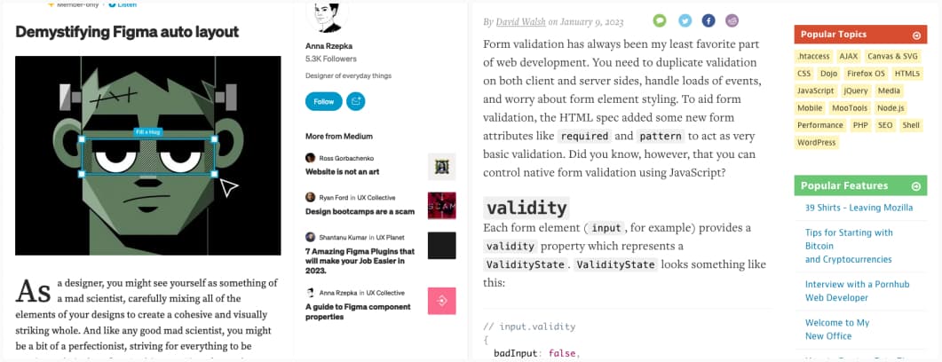
Demystifying Figma auto layout, a few tips and tricks to help you master the auto-layout in Figma
#HTML #Form
Did you know you can customize the little validation messages that you get with HTML5 inputs? Here is how.
Conferences
#UXConference
Here’s a list of some UX conferences you can attend in 2023
News in the industry
#Figma
Interesting for content and resource creators: Figma will support paying content for the community soon
