Pixels of the Week – July 10, 2022
Every day, I share on Twitter and LinkedIn a list of curated articles I read, resources and tools about UX Design, User Research, UI and mobile design, HTML, CSS, the web industry, some process, some inspiration, etc. This is an archive of everything I shared this week.
#Now – what I’m up to
#Workshop
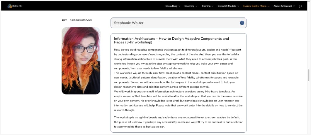
I will be facilitating a workshop on “Information Architecture – How to Design Adaptive Components and Pages” at Concentric on Tuesday 18 October 2022. You can register to mine and other awesome people’s workshops.
Also, I can you believe I did not create an accessibility category on my blog? So, here we go, fixed, accessibility category!
I also talked about accessibility and the words we use in a twitter thread:
We need to unpack a few things about the words we use when talking about web #accessibility.
A thread (maybe an article on the blog one day) on complex topics and things I hear around sometimes
1/— Stef Walter (@WalterStephanie) July 7, 2022
TL;DNR the one you should not miss
#CSS
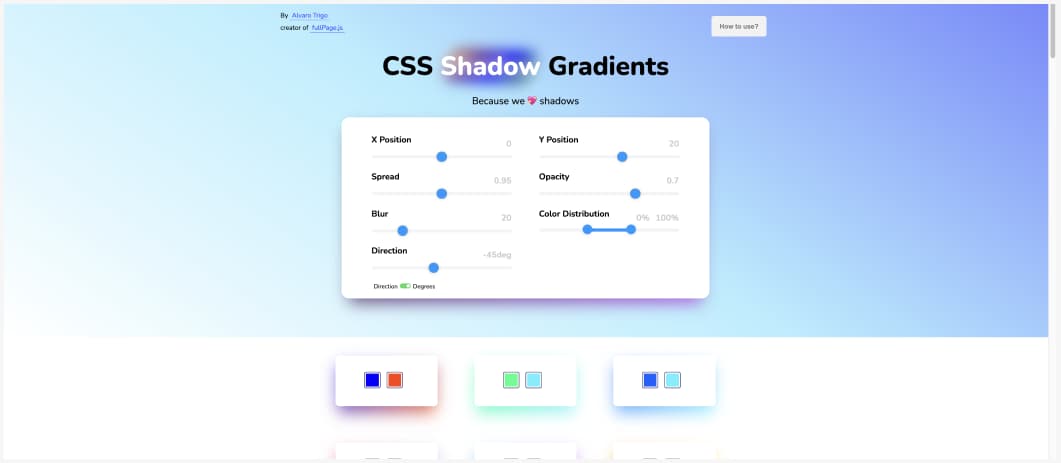
Here is a nice generator to build cute little CSS shadows that use 2 colors
Interesting article
Why do we call it breadcrumbs? Diving into the history of UI components. Fun read on why the radio button is called like that and other UI elements. I still wonder about snack bars and chips (material UI), maybe hungry developers?
#Good Design
- Today’s Design Is Shaped by Likes. And That’s a Problem – Interesting read on performative design, likes focused design, the lack of real feedback and how design has become intertwined with the most harmful dynamics of the social web
- More than making rectangles: a nice love letter to design and bringing back the fun and magic
#Deceptive Patterns
Why it’s time to update our language about bad design patterns
#Button
Designing the perfect button – Interesting article on button that could be sum up by “obvious and labels always win”, yet a lot of sites still have poorly designed buttons so those are good little tips
#Privacy
- I’m not a robot (but, are you?). I really hate this idea of KYC for human beings, I hate sites that ask me to put my real birth date. Can we come up with ways to prove we are no robots while still being able to keep some sense of privacy please?
- Digital Security and Privacy Tips for Those Involved in Abortion Access
#Touch
Touch-First Cursor: Round Pointers vs. Mouse Arrows, interesting article on what is going on with pointers those days
#Diversity
“Beyond Pride: The fight against tech’s brogrammer culture” very interesting article on why we need actual diversity change at work, beyond the fake rainbow flags once a year for pride month
#Accessibility
Wow, there a lot to know but also a lot you can do with Windows High Contrast Mode
#Portfolio
“Should You Have a UX Research Portfolio?” interesting, but from what I discussed with juniors & seniors recently, sadly a lot of companies now expect portfolios, even for research roles. I like the PDF format though, low maintenance is great.
#Crypto
Interesting article on crypto that goes against the “it’s just bad” and tries to shed some light on some of the use-cases in different countries: What is the point of crypto?
#Mobile UX
Interesting article on the strategy between the wikipedia mobile app, how and why they build a native app despite the web having more and more capabilities. I’m still not sure they do anything that could not be done with web though.
#Roles Responsibilities
In case you never heard of RACI (roles and responsibilities) matrices, here’s an example of how this can be applied to define roles in a team, but also responsibilities and accountabilities when sometimes roles overlap between people
Inspiration, fun experiments and great ideas
#SVG Filter
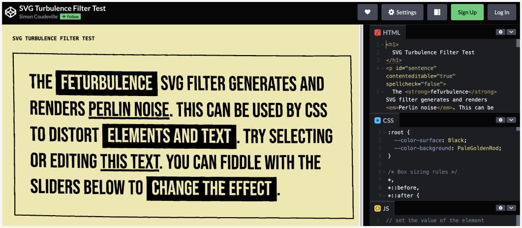
This is really fun (be careful if you use it though it makes the text unreadable pretty fast): a turbulence SVG filter
Useful tools and resources that will make your life easy
12 important feminist tech principles (and a PDF poster). Don’t forget to check the contributor page to discover all the awesome people behind this initiative.
#Tools
A big list of Design tools (UX, UI, Design system, hand-off and more) that you can compare to help you find the one that will fit your needs
#CSS
Defensive CSS: Practical CSS and design tips that helps in building future-proof user interfaces, interesting little site by @shadeed9
to help you prepare you CSS for when things might break
#Privacy #Fonts
If you don’t want to self host your fonts, you could use bunny, a zero-tracking and no-logging font host. Great replacement for Google Fonts
#Tool
For the people who use the pomodoro method, here is a cute little timer in the browser
#Game Design
In case you want to learn game design, here are some books to help you get started (by @schellgames)
Videos and podcasts
#Accessibility
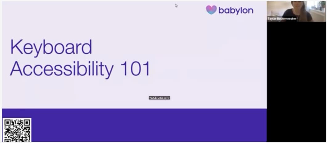
“If it’s clickable it must be get-to-able and operable with they keyboard” says Bruce Lawson and here’s a small video by Bruce and Taylar Bouwmeester to help you understand the why you need to make things keyboard accessibility with a nice demo
#Arcane
Haaa I missed the Arcane honest trailer, and yup, 100%, zero notes this is perfect
