Pixels of the Week – July 16, 2023
Accessibility training, Figma typography tricks and cute sharks
On Twitter, LinkedIn, and Mastodon, I share curated articles I read, resources and tools about UX Design, User Research, UI and mobile design, HTML, CSS, the web industry, some processes, some inspiration, etc. This is an archive of everything I shared this week. And some extra links that I decided to only share for the blog readers. Also, subscribe to the newsletter to get notified when those are published!
Now: what I’m currently up to
If you speak French (or more like listen to French), I participated in a podcast about design and cognitive biases: Design et préjugés : concevoir avec ses biais cognitifs
I also had a couple of issues with my shop recently: I was using Paypal for credit card payments. All of a sudden it stoped working. The payhip team has no idea why (meh??). I switched to Stripe, it’s all good now. Bottom line: if you were trying to buy some resources and could not because your credit card was refused, it should be fixed.
TL; DNR: the one you should not miss
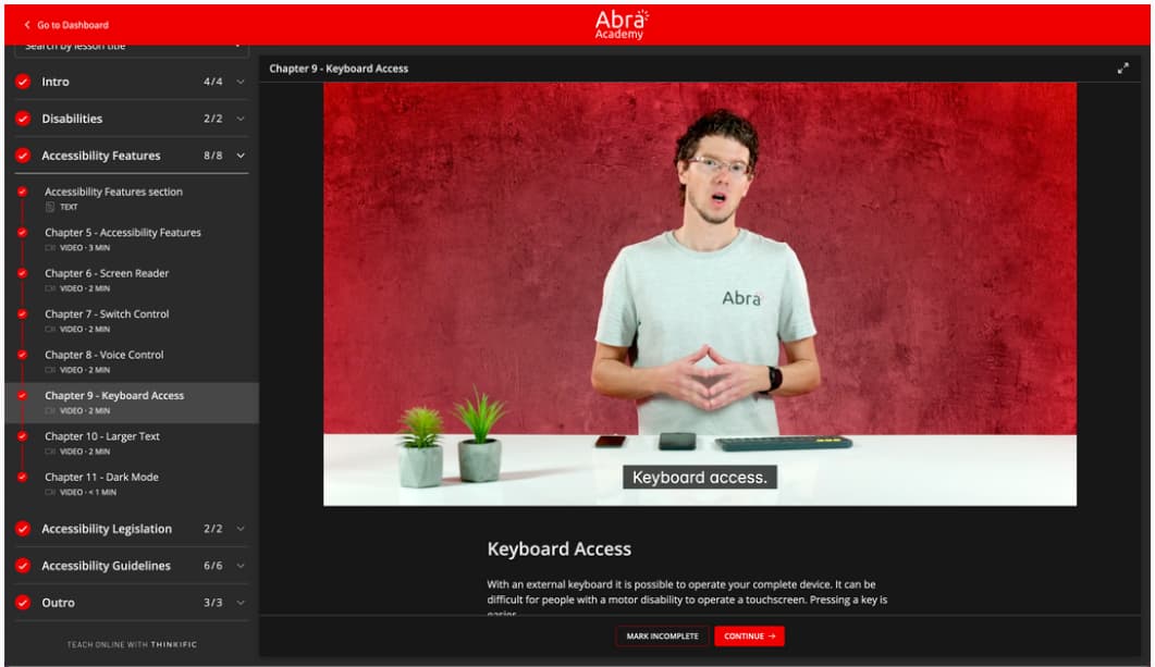
I went through the Kick-off accessibility training from Abra Academy. So, honest opinion: I’m very impressed they were able to put so much content in 45 minutes and make it digestible.
Will it turn you into an accessibility expert? Absolutely not. BUT, it’s a good introduction to a lot of concepts, and you get plenty of links to dig further. I especially liked the section on accessibility features for mobile. Also, it’s free. So, if you can, tell your teams to go through this, if they know nothing about accessibility, it’s a nice place to start.
Interesting articles that caught my attention
UX Research and design
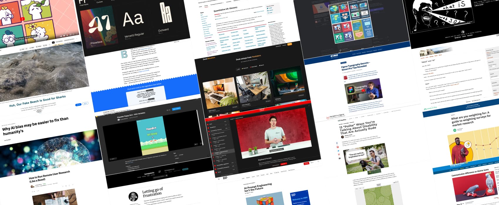
- Letting Go Of Frustration: a couple of tips to help you let go of the frustration of “our work got rejected”. I’m interesting to hear about your own, how do you handle rejection of ideas, project at work?
- A guide to weighting surveys for market research. Never heard of it? The goal when weighting a survey is to make the sample of respondents look more like the broader consumer population you’re interested in learning about.
- How to Run Remote User Research: a couple of interesting tips to help you schedule and conduct remote user research in the most efficient way possible.
- When user testing sessions bring up trauma: very interesting 7 tips to help navigate complex situations where you need to talk about touchy topics like cancer during your user research. Personal (trigger warning “lost of a relative one”) story: when I was a student, I worked for a company running phone surveys. I would call people and “follow the script” (as my manager liked to say). My first survey ever was a longitudinal study involving people who took care of a dying relative. I didn’t write the script. The first question was a screener. Something like “hi, we contacted you before about this, are you still taking care of that person”. If No -> thank them and close, the call was in my script. The main reason someone answered “no” and didn’t take care of that person anymore was, because they lost them. None prepared us for that. And I got scolded by a manger because “You took too much time over a phone with someone who didn’t match our target audience anymore”. Yes, that person clearly needed and wanted to talk about how they lost their loved one. And I could not just stop the call like that. I wish that script had been written with more care. There was nothing in that script helping us deal with that situation. The experience of those people was reduced to a “if No, close the close”. It was a giant mess and I wish they took the trauma more into consideration when designing the script.
Accessibility, inclusion and diversity
- 13 “Polite” Ways You’re Talking About Disability That Are Actually Rude: it might come from a good place in your heart, but there are a lot of things you might do or say that will actually feel rude, intrusive or even be dangerous for disabled people around you. This is must read if you want to understand how to do better.
- Communication differences on diverse teams: succinct vs elaborate, contextual vs personal, instrumental vs affective, direct vs indirect, different communication styles can affect the way you work in diverse teams, especially with people coming from different areas around the world.
AI and all the fluff
- “Web3” and “AI”: yup, Jeremy Keith nailed those definitions (pun intended). “Beware of the Law of the instrument. You know the one: when all you have is a hammer, everything looks a nail. There’s a corollary to that: when the market is investing heavily in hammers, everyone’s going to try to convince you that the world is full of nails. See if you can instead cultivate a genuine sense of nailspotting.”
- AI Prompt Engineering Isn’t the Future: if the future of AI is actually problem formulation, I think a lot of UX researchers will thrive. It’s, basically, our job, and we were trained to do so: problem diagnosis, problem decomposition, problem reframing, problem constraint design. I really like the new perspective in here.
- The dark side of Figma’s Dev Mode a long read on the change in Figma’s business model with the new developer mode and how it might impact teams
- AI bias may be easier to fix than humanity’s By analyzing the common characteristics of inequitable outcomes, and by putting sensitive information back into datasets, we can help address AI bias.
- How much should we fear artificial intelligence?: interesting podcast on Europe, China and USA market regulations strategies and most broadly, market strategies when it comes to AI
Curiosity cabinet: non-design/tech rabbit holes I enjoyed
- Huh, Our Fake Beach Is Good for Sharks: how the diving community plays a huge role in finding and tagging the angelsharks, hidden in the sand, and how the population of sharks adapted to different changes in their ecosystems
Inspiration: fun experiments, beautiful art, and great ideas
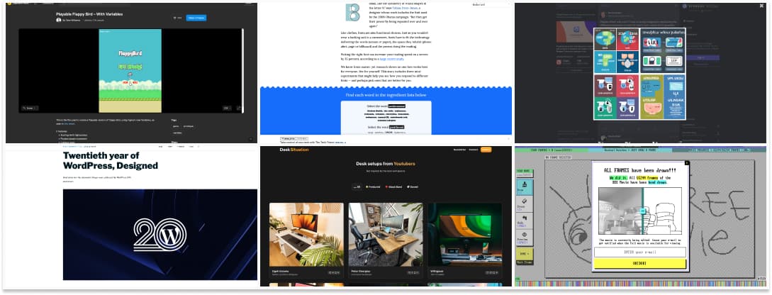
- Playable Flappy Bird – With Variables, because, why not?
- Twentieth year of WordPress, Designed: the visual identity for the 20th anniversary of WordPress is very nice, I’m going to need one of those little badge!!
- What’s the best font? a cool interactive article that explains the characteristics of different fonts, how other people perceive them differently. In the end, it’s like glasses, everyone has different prescription needs and preferences.
- DeskSituation: some inspiration from other people’s desks. I love how they are all clean and tidy, hahaa, I doubt those look like that most of the time.
- 1999 Toyota Corolla – Fine AF: one of the best and wittiest add on craigslist. Designer me just loves the “This car’s exterior color is gray, but it’s interior color is grey.”
- The free Movie: a hand drawn / crowd pirated / frame-by-frame recreation of the entire BEE Movie Everyone draws a frame, until every frame is done. The 65244 frames in total were draw, and you can leave your email to get notified when the movie is ready.
- Bruce Lawson: asked Firefly the difference between UI and UX It doesn’t disappoint
Useful tools & resources
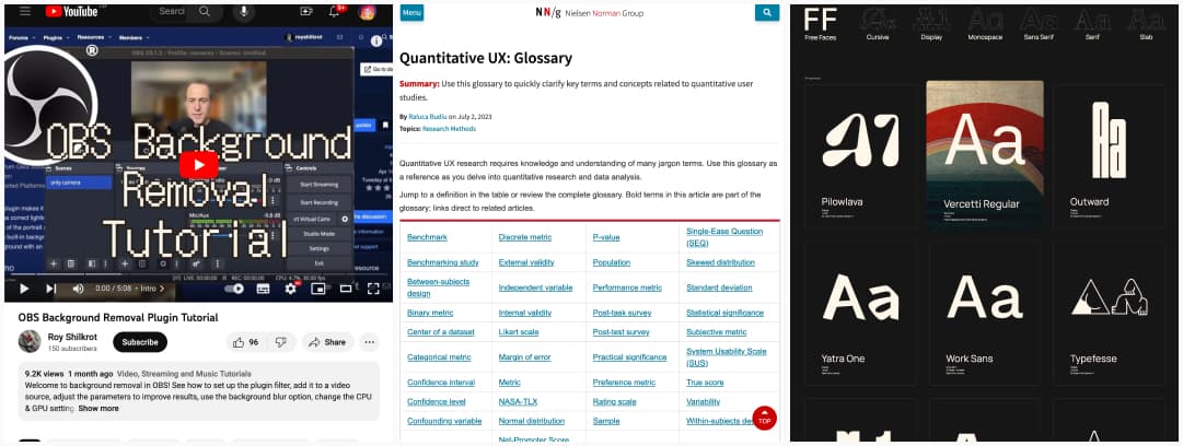
- OBS has a “background removal” plugin now that is perfect if you just want a light “blurred background” effect.
- Quantitative UX: Glossary: use this glossary to quickly clarify key terms and concepts related to quantitative user studies.
- Free Faces: a repository of free fonts you can use for personal and commercial projects, categorized by type (cursive, display, monospace, etc.)
Interesting Videos & Podcasts
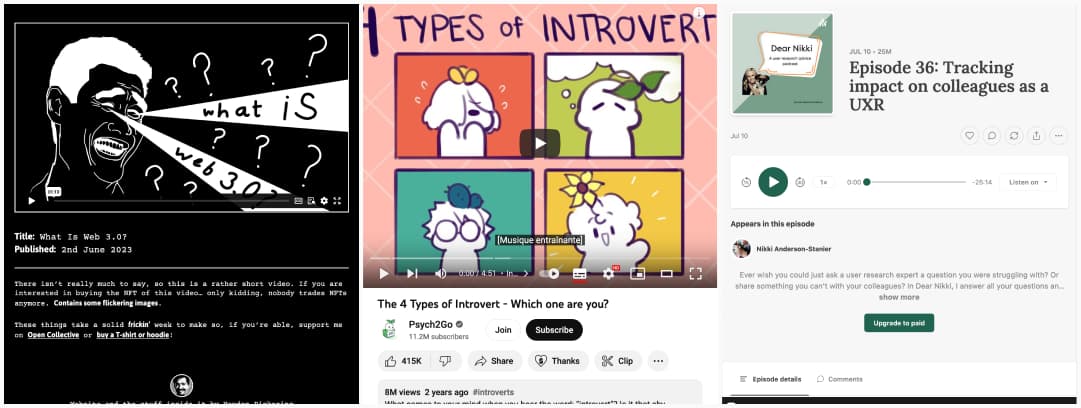
- What is Web 3.0? I think Heydon Pickering found the best definition here.
- The 4 Types of Introvert: introversion is a spectrum, from social introverts (yup) to thinking introvert, anxious introverts (shy introvert) and restrained introverts. Also, I’ve never heard the word “ambivert”, I’ll need to search more about that to check if it’s an actual thing or yet again pseudo psychology.
- Tracking impact on colleagues as a UXR: a podcast episode with Nikki Anderson-Stanier where she explains how user research help decrease design and development time/ rework on a project, by extension, saving costs: (# of errors) x (avg. repair time) x (employee cost) x (# of employees) = cost savings. It also helps decrease cost of support and helps speed up decisions making (aka, what can be prioritized) and generally helps with productivity, because, you have more impact and avoid wasting time when you build the right thing the right way from the start.
Tutorials
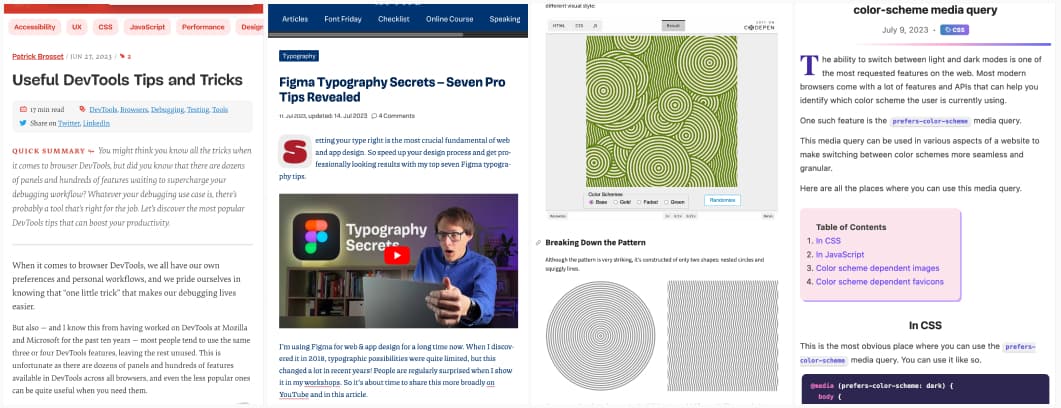
- Useful DevTools Tips and Tricks: 15 quite handy little tricks to make the best out of the devtool.
- Figma Typography Secrets: 7 tips to help you handle typography in Figma. Wow, the “use percentage on line-height” tips is going to save me. It’s close to what you can do in CSS but I never thought of that. Also, open type all the way!!!
- Coding Randomized Zelda Patterns: this is an awesome way to use SVG
- All the places where you can use prefers-color-scheme media query: did you know you can apply it to not only CSS but also JS, SVG and even images and favicons?
