Pixels of the Week – July 21, 2024
Mobile accessibility, design exercise & deceptive patterns
My curated weekly-ish online newsletter, where I share interesting articles, tools, and resources I found during the week. You can expect content about UX, design, user research, accessibility & tech, but also some processes, some inspiration, sometimes books, and a couple of videos and podcasts. Also, don’t forget to, subscribe to the newsletter to get notified, you will get the weekly links directly in your mailbox, and be notified when I publish other articles.
Now: what I’m currently up to
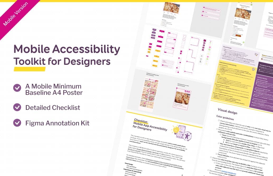
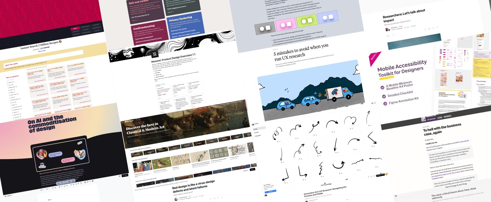
I’ve been working on an accessibility mobile (native apps) checklist for a while, but it was never published due to lack of time. The other reason is that, honestly, the mobile version of the checklist is 90% the same as the desktop one. Because WCAG is quite device-agnostic. There are a couple of differences, like target size on mobile guidelines from iOS and Android, the fact that in natives apps you don’t have landmarks, and heading levels, only headings. So, if you are interested in a mobile native application accessibility checklist for designers (full checklist + small A4 printable sheet), and a Figma mobile annotation kit (including target sizes for iOS and Material UI), here you go:
Mobile Accessibility Toolkit for Designers
Most popular content this week
Monowi: Product Design Exercises 1.1: a selection of hands-on exercises to help you progress as a designer. Each exercise has some guidance, included detailed instructions, resources needed, expected outcomes and tips.
Interesting articles that caught my attention
Design and UX research
- On AI and the commoditization of design (14min) Scott Riley argues that, AI generated UI will be just like the “Fiverr” cheap design wave: design that “doesn’t give a fuck about your business goals, your desired outcomes, about accessibility and the real-world impact of their work” In the end, we will focus on the human skills, like system thinking, creative problem-solving, to differentiate ourselves from AI cookie cutter designs. Another interesting argument is the “garbage in, garbage out” theory. Most Figma templates are average, which means, the AI Figma tools will copycat mostly average designs. Not much innovation going on there as well.
- Great design isn’t pixel perfect (4min) perfectionism can be an issue on project, because it might stop you from getting things done.
- The most critical lesson about Data: think indirectly (8min) Focus on what you want to learn before looking at the data: writes down specific questions (queries) to know what you are looking for. Then look for expected signals in metrics, to again make it easier to find what you are looking for.
- Bad design is like a virus: design defects and latent failures (13min) The 737 MAX, for example, was a poorly designed aircraft. They tried to add some software to compensate for the issue, but it didn’t work. As designers, we need to be proactive and consider potential failures, anticipate and try to mitigate them: situation based training, simulations (in case of planes for example), good error handling and adaptive situational modes (procedures put in place to avoid errors from occurring). By Michael Parent
- Generative AI in UX Research: Navigating the Promise and Pitfall (9min) such tools can help researchers with literature reviews, gap analysis, research design, and data analysis, but they might also bring inconsistencies, inaccuracies and lack context. We must approach these tools with a balance of curiosity and caution, always prioritizing the human element in our research and design processes.
- Researchers: Let’s talk about Impact (8min) when building a portfolio / interviewing, focus on the impact your research had on the project / for the company. Things like increased visibility of the research team, creation of new programs, or unblocking team decision-making. What measurable improvement did you work bring? If you can’t measure impact (it happens), you can emphasize on your adaptability and problem-solving skills instead.
- 5 mistakes to avoid when you run UX research (12min) when doing UX research, avoid being too attached to familiar methods, advocate for the user, avoid unfeasible or actionable recommendations (focus on behavior instead), plan for data analysis upfront, and build human relationships with stakeholders.
Accessibility
To hell with the business case, again (6min) When diversity, equity, and inclusion (DEI) are pushed to companies, using the basis of business profitability, companies often abandon these initiatives when profits drops: “The moment you frame the case for any kind of inclusion or equity around the money an organization stands to gain (or save), you have already lost. What you have done is turn a moral case, one where you have the high ground, into an economic one, where, unless you have an MBA in your pocket, you are hopelessly out of your depth”. Sadly true. (by Matt May)
Inspiration: fun experiments, beautiful art, and great ideas
Artvee: a place to discover the best in classical and modern art, by browsing and downloading high-resolution, public domain paintings, posters and illustrations
Useful tools & resources
- Typesense Recipe Search a search engine for cooking recipes!!
- Handy Arrows: a collection of SVG hand drawn arrows you can copy paste or download for your projects
- Figgy if you want to track your Figma contributions, github mozaic style
- Dark Patterns Hall of Shame a place that collects deceptive patterns and exposes how they are trying to manipulate users: bait and switch, nagging, confirmshaming, primary zuckering, disguised ads, roach model, hidden costs, sneak into basket, misdirection and trick questions. (by the way, Dr. Harry Brignull renamed Dark patterns into Deceptive patterns, so, I’m keeping the name of the tool, but, I’m using deceptive patterns instead).
- Mazeletter is a collection of nine infinitely tiling maze pattern fonts. This means: you can write something, to build fun geometric patterns, you can then download.
- dDocs: “Just like G*ogle D*cs, minus the surveillance”, haha. A P2P, encrypted and decentralized version of Google Docs, to collaborate in real time, online with other people on documents.
Tutorials
- Does WCAG 2.2 Level A apply to Native apps? an list of the WCAG A criteria that do apply directly to mobile native apps, and the ones that need some adaptation, and those that don’t Conferences
- Beautiful shadows have beautiful colors cool tutorial using CSS customer properties and oklch() to have shadows that also transpose the color of the object, making them closer to actual shadows of objects in the non-digital world. By Koos Looijesteijn