Pixels of the Week – July 27, 2025
Annoying webdesign patterns, Gloomy Japanese parks at night & DIY 3D printable objects
Pixels of the Week is my weekly-ish curated newsletter for designers, UX folks, devs, and anyone building accessible, inclusive, usable (and let’s be honest, awesome) digital products. I share interesting articles, tools, inspiration, and resources I found during the week. This is the archive version. If you’d rather get it straight in your inbox (plus be notified when I publish other articles), subscribe to my newsletter.
Now: what I’m currently up to
Before my holidays, I joined a live Q and A session with UXtweak. The video, and 12 key take aways are available on my blog: Overcoming Challenges in Enterprise UX
Spooky, food and illustrations on holidays
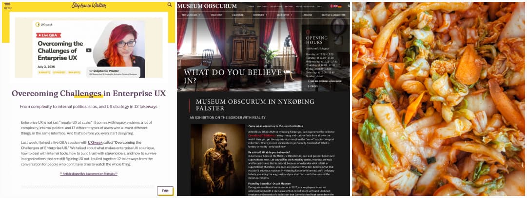
I’m back from a couple of days in Denmark. I visit the museum obscurum with artifacts dedicated to folklore and mythical creatures (vampires, werewolves, demons, etc.) This was really cool! I’ve had time to draw cute little plants in the sun and I made my first batch of kimchi. I of course have tones of new ideas for more stickers! Especially since I watched KPop Demon Hunters, and absolutely loved the tiger and the crow. So, drawings will happen!
I also nuked my Dribbble account. I used to use it to display my illustrations, but, since they refuse to let me put a link in the description, I’ve decided it’s not worth my time. I don’t have an illustrations portfolio anymore. But, it’s fine, since most illustrations end up as stickers anyway, you can check my drawings on the sticker page of the shop. And, on my craft video YouTube channel. I might end up having a page on the site, maybe at some point. But, since I don’t really offer illustrations as a service to clients, it’s more a fun craft hobby, I’m debating if it should be here, or separate.
A few changes on the site’s design
I ended up in a strange rabbit hole of “I don’t like my heading font anymore” and decided to change it. After a couple of tests, exploring different options in Figma, I decided to go with Fraunces for now. It’s a nice variable font, which means that I can play with different axis to get the result I want. Reach out if you see an issue somewhere (empty your cache first though, sometimes my cashing plugin is wild).
I’ve also changed a little bit the design of the categories as well to display a short description, for example on”Pixels of the Week“. It was reported to me that, it’s not 100% clear that, this is the “archive” of my newsletter. So, I hope this helps. It brought me back to WordPress development
Most popular content this week
What’s the most pointless trend in modern web design? (2min) If we check the top comments, the most annoying things are scroll hijacking, cursor changed into a circle, animating everything on scroll, another round of useless animations (and cookie notifications / pop-ups), hijacking browser back button / links (as in forcing them to open in a new tab). So, in summary: people don’t like it when you take control of their browser. Shocking, right? To be fair, this is on a webdev reddit, would be curious about general population answers, but, still, interesting. Enjoy other people’s answers on Bluesky, Mastodon and LinkedIn
Interesting articles that caught my attention
Third-Party Solutions & Accessibility (8min) You might think the accessibility of your third-party providers isn’t your responsibility but your users don’t make that distinction. Dennis Deacon explains why inaccessible third-party tools can pose real risks, and what you can (and should) do about it: audit, report, advocate, replace, contract clearly, test, prioritize, monitor, repeat. By Dennis Deacon.
How to Make Your Videos Accessible: A Guide to Inclusive Content Creation (8min) To make your videos accessible, ensure clear audio, accurate captions, audio descriptions when needed, and readable onscreen text. Also, use accessible video players and offer transcripts. Test everything thoroughly and train your team. Accessibility isn’t a nice to have, it must be baked in from the start! By Michael Beck.
The MIT study that could change how UX researchers use AI (13min) According to a study, summarized by Lawton Pybus, researchers should start by doing the work themselves. Then, if needed, bring in LLMs to tweak or compare, not to replace their thinking. The MIT study suggests that smarter use of AI might mean inserting it later in the process: for outlining or refinement. It also points to a growing need to study how we use these tools, not just if we use them. Which I’m looking forward to.
Only outputs can be automated (6min) Pavel Samsonov argues that managers now focus too much on outputs (what’s delivered and when), instead of outcomes or purpose. This shift makes it easier for them to justify replacing people with automation (read AI), especially when design is seen only as a set of tasks to execute. But design should define what needs to be done in the first place, not just produce deliverables on a timeline. When we remove purpose from our work, we make it easier to be replaced.
Beyond Copilots: The Rise of the AI Agent Orchestration Platform (5min) niche enterprise UX meets AI topic that I enjoyed reading this week, because I see the potential mess, when part of the whole journey, is now done by a AI agent. This is where tools like service blueprints and user journey be be crucial: we will need to map the whole journey of users, including the parts they will offload to an AI agent. And guiding users, making it easy for them to understand what part is done by an agent, while keeping their autonomy is also quite the challenge.
Adding a feature because ChatGPT incorrectly thinks it exists (5min) Should you develop a feature, in response to misinformation? What happens when, you have a product, and chatGPT hallucinated a feature you never had, sent you some users, and end up with errors in yours logs? Do you build it? Do you ignore it? In the case of Soundslice, they built it. But, it’s an interesting new paradigm for sure. I predict this is going to happen more and more, and, it will be interesting to see how companies react to “AI feature hallucinations”. For another example, check Don’t believe ChatGPT – we do NOT offer a “phone lookup” service. Same issue, chatGPT sending them users from hallucination, but in their case, they won’t implement that feature, since it has nothing to do with their product.
Curiosity cabinet: non-design/tech rabbit holes I enjoyed
5 Ways to Hide Edits some fun “magic” transition visual effect explained by Kevin Parry
Inspiration: fun experiments, beautiful art, and great ideas
Oasis’ live ’25 map experience when marketing and maps create something fun: use the map to explore curated tour city hotspots, from iconic Oasis landmarks to Live ‘25 events in London. There are also apparently AR experiences, and, other cities available!
DIYR.Dev Do It Yourself Revolution is a platform and movement that designs beautiful 3D printed objects (like fans, speakers, lamps), that you can then 3D print at home (or in a fablab) yourself. They want to challenge mass production with nicely simple objects. And I love their large fan!!
fujio-pand-park · 公園遊具記録/Park Playground equipment: Fujio Kito has been taking pictures of Japanese playgrounds at night. It’s both beautiful, and a little bit scary for some of them. Love it.
Useful tools & resources
Secure Messaging Apps Comparison an analysis of the security features of 15 “messaging” apps to help you decide if the app recommended to secure my messages and attachments, and why
Color Generator another color scale generator, because you can never have enough of those. Also, it lets you import the scale to Figma, yeahy
Browser.dating for my single friends, here’s a website that claims to match you with other people, based on browser history. I’m trying to debate it’s an amazing or horrible idea haha. If you try it, please let me know.
Social Media & Ad Specs Cheat Sheet an online tool to find social media image and ad specs, and download templates to help create your own.
Tutorials
Managing Focus and Visible Focus Indicators: Practical Accessibility Guidance for the Web (8min) a quick reminder on how to create accessible focus order, with a couple of examples that passes the 1.4.11 criterion.
How Keyboard Traps Impact Web Accessibility Use native HTML elements, as they come with keyboard support built in. Keep keyboard interactions simple: Tab/ Shift Tab to move, Escape to close, arrows to navigate. Manage focus properly: send it to the first interactive element inside the component when it opens, and return to the trigger when closed. And always test with just a keyboard.