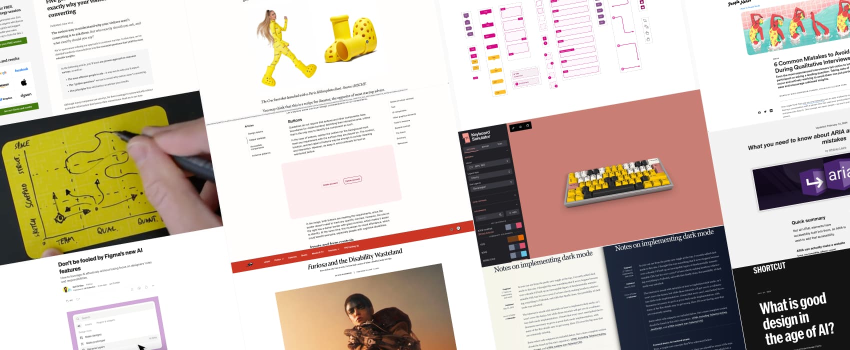
Pixels of the Week – July 7, 2024
Accessible color contrast guide, keyboard simulator & Figma's AI critique
My curated weekly-ish online newsletter, where I share interesting articles, tools, and resources I found during the week. You can expect content about UX, design, user research, accessibility & tech, but also some processes, some inspiration, sometimes books, and a couple of videos and podcasts. Also, don’t forget to, subscribe to the newsletter to get notified, you will get the weekly links directly in your mailbox, and be notified when I publish other articles.
Now: what I’m currently up to
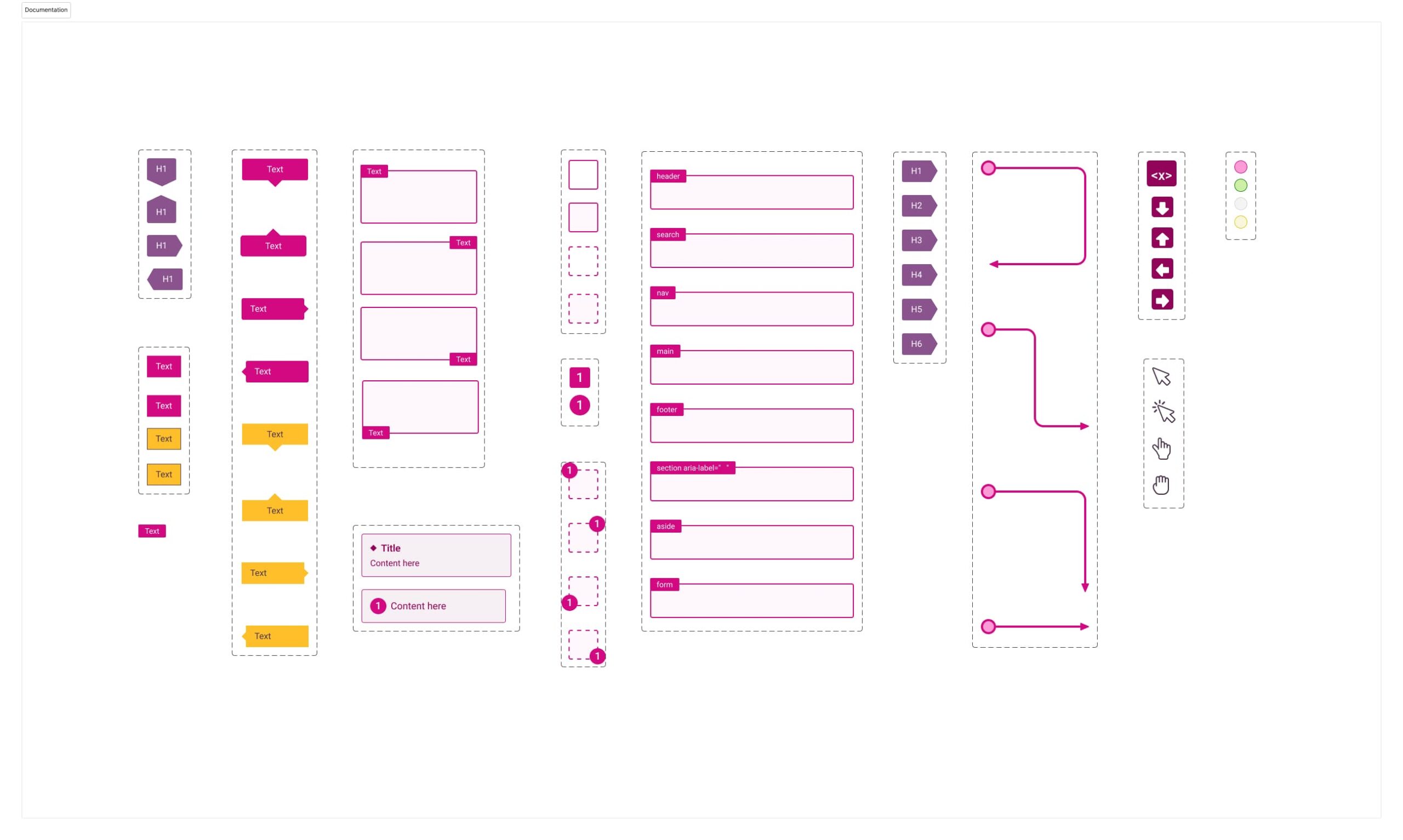
This week, I put the final touch to my How to check and document your design accessibility? webinar. I’ve been expanding my accessibility documentation toolkit to add new components to make documentation easier. But also, to check new things like touch areas for links and buttons. I’ve been posting a video to show the new additions on LinkedIn, TwitterX and Mastodon. I’m not 100% convinced about having the checklist as “Figma prototype”, but I’ll figure something out to make it better. If anyone has an idea.
Interesting frameworks and concepts
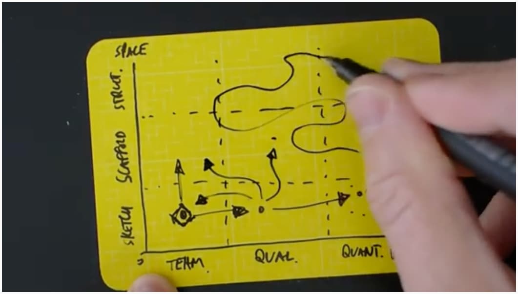
Zenko Mapping: A tool developed over the last 6 years by John V Willshire to help you do the next right thing for your project, organization, etc. It accounts for the fact that a project rarely follows a linear process. The map is available on his site, along with a very nice video to explain the whole concept.
Most popular content this week
Colour contrast a nice guide to help understand all the different color contrast rules to make your components more accessible. Most designers are familiar with the text on background one, but, there’s way more. There are rules for link color vs text color, focus state, adjacent colors for UI elements and interface elements that convey information, etc. By Javier Cuello
Interesting articles that caught my attention
UX research and conversion
- 6 Common Mistakes to Avoid During Qualitative Interviews (9min) when leading user interviews or usability testing sessions, avoid diving straight into questions without a warm up, interruptions, using positive acknowledgment and leading questions, awkward transitions and trying to relate because it will go against neutrality.
- Five golden questions that reveal exactly why your visitors aren’t converting (13min) to understand why visitors aren’t converting, you could survey recent buyers who overcame obstacles to purchase, and ask them things like how they found the site, what nearly stop them from buying. Interesting technique.
Design and AI
- What is Good Design in the Age of AI? (9min) Interesting read, but sentences like “Websites and apps may seem infinitely varied, but we found that pretty much all of the software we use can be boiled down to just a few core layouts” make me wonder about specific complex B2B and enterprise products. I’m sure the dataset to train the AI models for an e-commerce website might work. But, what about complex enterprise interfaces? Health tech? Etc. I would love some AI help on some complex things, I’ve been playing around with a couple. But, often, AI UI generator want to oversimplify. Or can’t grasp what I need because (I assume) they are mostly trained on generic B2C sites. Still, looking forward to seeing where this will bring us. I would love some AI help on some complex things, I’ve been playing around with a couple. I also get a feeling that AI will be the next curl pit for “buhuu everything look the same because [find something to blame]”, after UX and design system. So, at least UX will be off the hook?
- Don’t be fooled by Figma ‘make design’ new AI feature (7min) a nice complement to previous article. Raff Di Meo encourages designers to think critically about the new Figma AI tools: it should be used an aid in visualizing concepts and gaining stakeholder buy-in. But it should not replace user research, digging into details as designers. And this is the part I’m a little afraid of: stakeholders who might think the work is all done, when you present those nice AI generated mockups. While it was just, 2% of the whole design solution. I’m honestly not a big fan of “iterating in high fidelity”, because it often backfired for me. So, I would be careful even about using AI for presenting concepts to get buy-ins. For more on that topic (haha), check Low fidelity design is higher up the value chain: designers going all-in on user-facing high fidelity visuals are abandoning their most powerful tool for influencing strategy by Pavel Samsonov.
- The Art of Scaling Taste (22min) a very interesting read on how MSCHF (an artist collective known for its unconventional products,) turns irreverent ideas into a real business by Evan Armstrong
Accessibility
Furiosa and the Disability Wasteland (5min) “Furiosa is a testament to disabled resilience. Our disabilities are so often borne from trauma—even when we are born with our disabilities, the people who gave birth to us, who witnessed our bodies when they were small and vulnerable, saw us as traumas. Tiny traumas in blankets. … Furiosa is our first disabled heroine who is reliant upon no one.”
Inspiration: fun experiments, beautiful art, and great ideas
Keyboard Simulator: why would you need an online keyboard simulator? I’m not sure. But it’s still a very cool idea and technically impressive.
Tutorials
- Notes on implementing dark mode. Brandur wrote a really nice one, that uses prefers-reduced-motion and some local storage, plus some JavaScript to make a tri-state toggle to keep user preferences between always light, always dark, and follow device theme. Love it, especially since some of you asked for one, when I wrote Dark mode & accessibility myth and explained it’s good practice to let user chose between dark and light mode.
- A quick and easy guide to Markdown (8min) new to markdown? Andy Bell got you covered with this very nice comprehensive guide.
- What you need to know about ARIA and how to avoid common mistakes (10min) quick introduction to ARIA with examples of how you might break things if used improperly. You can also check the video format of this post.
Latest news in the industry
- Figma launched Figma Slides. It makes sense, a lot of designers have been doing presentation in Figma as well.
- Mattel will make 80% of its games color-blind accessible by the end of the year, good news for colorblind board gamers!