Pixels of the Week – June 28, 2020
Every week I share a list of curated articles, resources and tools about UX, UI and mobile design, HTML, CSS, the web industry, process inspiration and more…
This week’s selection: inclusive and accessible SVG checkboxes, UCD vs empathy, what it’s really like to be a designer, Journey mapping, racial biases in machine learning, avoiding spammy notifications, CSS grid and Flexbox for components, cool canvas demo, scroll position technologies, accessibility, dark mode tutorial, a guide to all the media queries (not just the ones for responsive), the history of Cooper Black, SVG portfolio, illustrations inspirations, a nice GSAP “apps have feelings” demo, Bootstrap 5, hybrid form elements, etc.
#Now – what I’m up to
My podcast with Debbie from DeltaCX is online: “Ep 51: Surveys: Easy to Run, But There’s a Catch“. It was a lot of fun to prepare and do and we even had a “bad survey examples” quizz prepared!
TL;DNR the one you should not miss
#InclusiveDesign #Accessibility
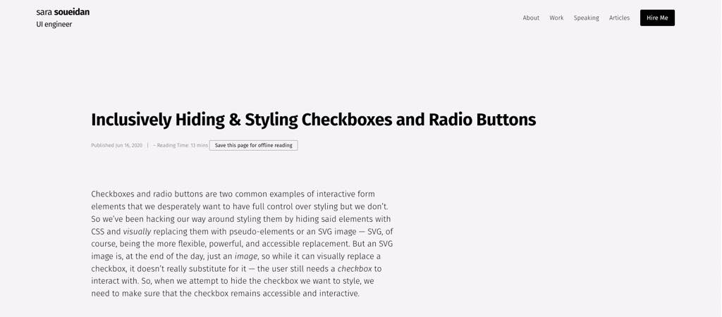
Inclusively Hiding & Styling Checkboxes and Radio Buttons – Sara Soueidan shows you how to use SVG and CSS to create custom accessible checkboxes (and radio buttons) that will look good and behave nicely with screen readers
Interesting article
#Biases #Racism #Machine Learning
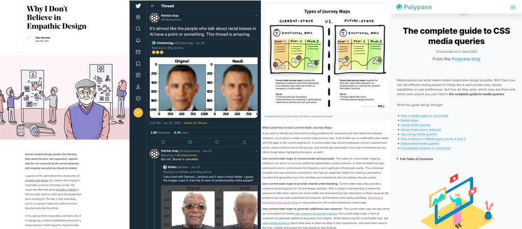
Some examples of what happens when you have a lot of racial biases in your machine learning dataset, the picture of Obama gets identifies as a white person, same for Samuel L Jackson.
#Empathy
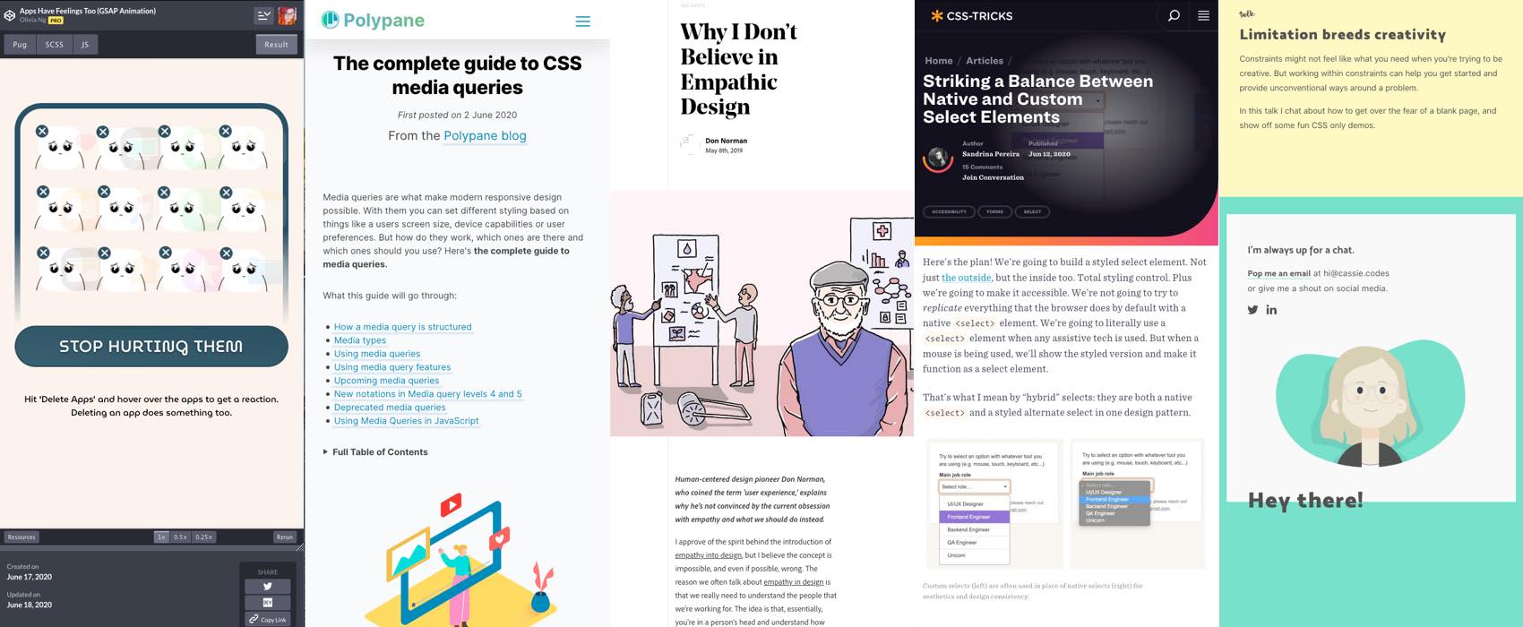
Human-centered design pioneer Don Norman, who coined the term ‘user experience,’ explains why he’s not convinced by the current obsession with empathy and what we should do instead.
#JourneyMap
Approaches to Journey Mapping. Before beginning any journey-mapping initiative, teams must decide between (1) a current-state or future-state map, and (2) an assumption-first or research-first approach. A hybrid approach for each decision works well for most teams.
#Design Thinking
“Design Thinking Isn’t User Experience” and how design thinking differs from UCD (User Centered Design)
#UX #Notifications
“How To Notify Users Without Being Spammy” a small checklist to do respectful email notifications!
#Design
“Nobody told me UX would be like this” Chris Kiess talks about preparing for rejection, the need to iterate, good designs dying in bad cultures, learning to sort ideas, the ability to sell a concept, UX being UI in lots of places,…
#Scroll
” An Overview of Scroll Technologies ” position sticky, CSS parallax, CSS scroll snap points, Smooth scrolling and different technologies for scroll behaviors (like intersection Observer), it’s all about the scroll 😀
#CSS
The complete guide to CSS media queries: it’s not only about size, there’s a lot of other media queries you can (will be able to) use: prefers-color-scheme, prefers-reduced-motion, resolution, pixel-ratio, pointer, hover, contrast, light level, etc.
#Accessibility
“Color Craft & Counterpoint: A Designer’s Life with Color Vision Deficiency” by Noah Glushien
#Apple
“Simple design is dead. Welcome to Apple’s era of customization“, aka welcome to Android. Joke aside it’s nice to give power to the users to customize the experience (how many of use have a “useless apple stuff” folder on the homescreen?)
Inspiration, fun experiments and great ideas
#Canvas #DemosExcuse me while I spend the day looking at this cool fascinating demo
#ADHD
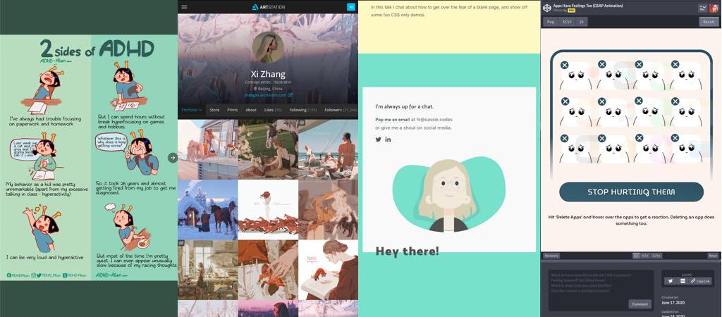
Some cute little illustrations that explain the different sides of ADHD
#Typography
“Why this font is everywhere“, the history of Cooper Black in a small 10 minutes video. I LOVE that font but hated it when a client wanted to use it on call to action because making call to actions work on mobile with this one, nope!
#Portfolio
Cassie has a cute playful portfolio full of whimsical small little animations
#illustration #inspiration
A quick beautiful fox that jumps out of a book, a big cat and a little girl having a picnic on a roof, discover the amazing illustrations of Xi Zhangn, concept artist and illustrator
#GSAP #Animations
A cool little demo of what happens to your poor little apps when you want to delete them
News in the industry
#HTML #CSS
The end of jQuery dependency and Internet Explorer support for Bootstrap 5, haa the end of an era
Tutorials
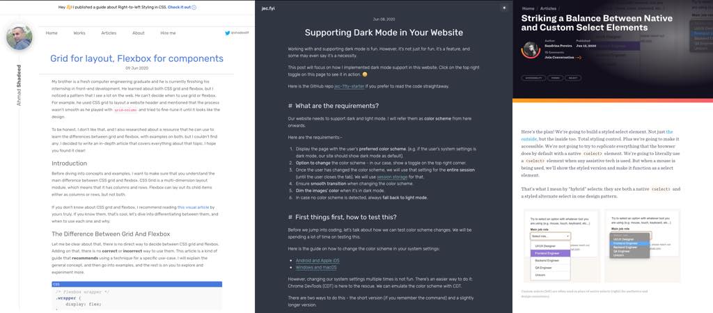
“Supporting Dark Mode in Your Website” a cool guide by Jecelyn Yeen (@jecelynyeen
) to help you build and test that dark mode you’ve always dreamed of for your website 😀 Jecelyn makes it look so easy that I think I want one as well now
#CSS
“Grid for layout, Flexbox for components” a good introduction that should help you decide which one you want to use based on different situations
#Form #Accessibility
I like “hybrid” select idea (custom when users use a mouse, native for the other cases) by Sandrina Pereira, it’s quite elegant. I just wonder if users who sometimes use mouse & sometimes keyboard might be confused
Useful tools and resources that will make your life easy
#Learn
Microsoft Build is over but you can keep on learning and access all the sessions in replay here mybuild.microsoft.com/sessions
